
pro
Karen López
Graphic Designer | Editorial, Branding & Digital Design
New to Contra
Karen is ready for their next project!
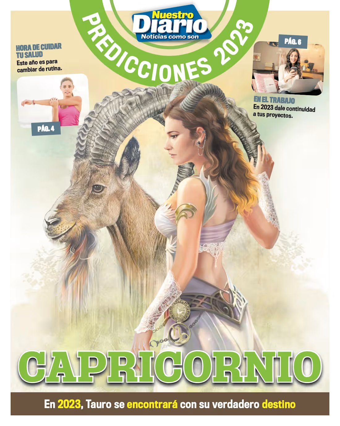
Zodiac Sign Supplements — Nuestro Diario
A series of special, high-importance supplements published in Nuestro Diario, one of Guatemala’s leading newspapers.
I was responsible for developing the visual identity and graphic direction for the entire series, establishing a color palette and adapting the visual style according to each zodiac sign’s element: Earth, Water, Air, or Fire.
I worked closely with the illustrator to achieve the final visual result, developing each publication based on the available content and materials for each zodiac sign. The supplements were designed and published sequentially, following the order of the zodiac signs.
My credit can also be found on the final page of each published supplement.
View the complete publications at the following link: https://acrobat.adobe.com/id/urn:aaid:sc:VA6C2:c6a268b9-f66d-4d3e-bfd7-74d3c820c385
0
7
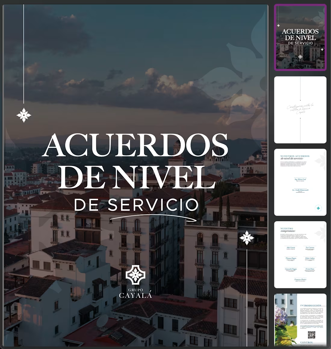
Service Level Agreement — Grupo Cayalá
A client-facing editorial document designed for Grupo Cayalá (Ciudad Cayalá), outlining the company’s service standards and commitment to providing responsive, high-quality customer service.
My role: Editorial design, layout, typography, and visual organization.
View the full brochure at the following link: https://acrobat.adobe.com/id/urn:aaid:sc:VA6C2:48d4e29b-742a-46a5-ad5f-85993eb65fa0
0
13
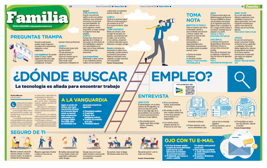
FAMILIA — Editorial Content & Visual Adaptation
These pages are an example of how I worked with editorial content provided by the newspaper and adapted it into cohesive, engaging layouts according to the needs and visual language of the Familia section.
The content covered topics related to health, wellness, family life, nutrition, self-care, and healthy habits, with the goal of presenting useful information in an accessible and visually appealing way.
For each page, I adapted and developed the layout, color palette, typography, icons, illustrations, visual hierarchy, and supporting graphic elements, ensuring that the information remained clear while maintaining a consistent editorial identity. The design approach combined informative content with a warm, approachable, and family-oriented visual style.
Selected Pages
"Looking for a Job?" & "Where to Find Employment"
Editorial magazine spreads created for Nuestro Diario’s Family section, focused on job searching and career preparation. “Looking for a Job?” provides practical advice on preparing for the job market, including soft skills, personal presentation, stress management, and creating an effective cover letter, while “Where to Find Employment” explores job-search strategies, interview tips, online platforms, common interview questions, and ways to use technology to find employment opportunities.
The “Familia” Section
The Familia section of our newspaper was dedicated to topics that connected with everyday family life. As its name suggests, the section had a strong family and lifestyle focus, covering health, wellness, nutrition, self-care, and practical advice for the home.
Visually, the section embraced a warm, welcoming, and home-oriented aesthetic, making the information feel approachable and relatable while still maintaining the structure and clarity expected from a newspaper publication.
1
22
FAMILIA — Editorial Content & Visual Adaptation
These pages are an example of how I worked with editorial content provided by the newspaper and adapted it into cohesive, engaging layouts according to the needs and visual language of the Familia section.
The content covered topics related to health, wellness, family life, nutrition, self-care, and healthy habits, with the goal of presenting useful information in an accessible and visually appealing way.
For each page, I adapted and developed the layout, color palette, typography, icons, illustrations, visual hierarchy, and supporting graphic elements, ensuring that the information remained clear while maintaining a consistent editorial identity. The design approach combined informative content with a warm, approachable, and family-oriented visual style.
Selected Pages
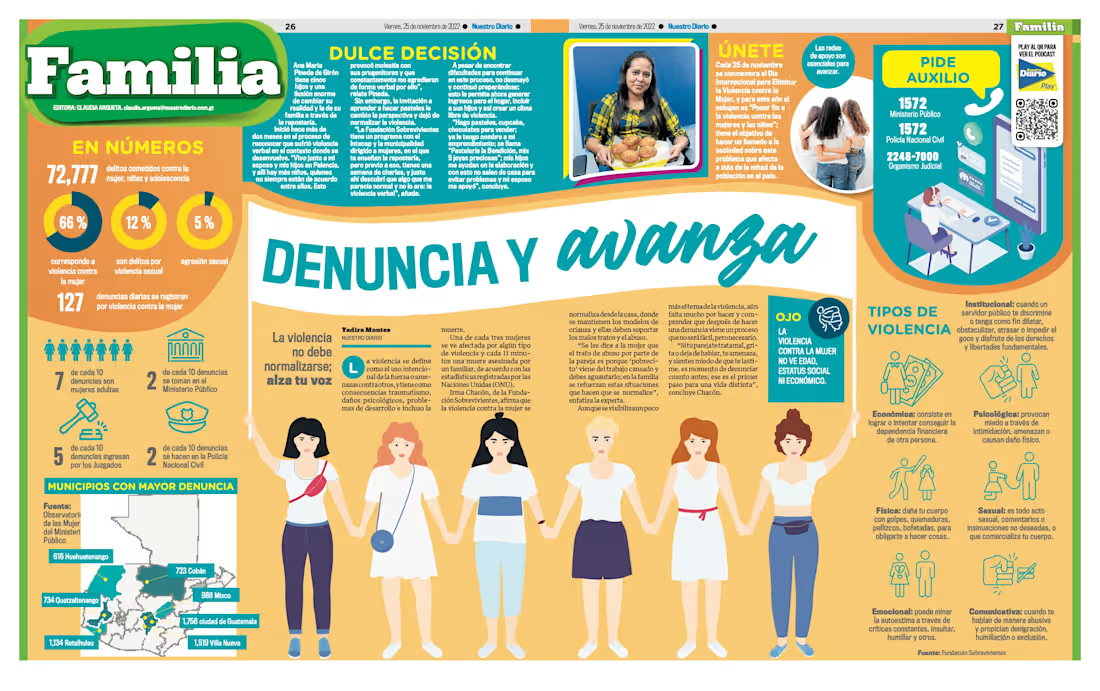
"Love Is Blind" & "Speak Up, Move Forward"
Editorial magazine spreads created for Nuestro Diario’s Family section, addressing domestic violence and the importance of recognizing, reporting, and seeking support in situations of abuse. The designs combine informative content, statistics, illustrations, testimonials, and practical resources with strong visual hierarchy to communicate a sensitive topic in an accessible and impactful way.
The “Familia” Section
The Familia section of our newspaper was dedicated to topics that connected with everyday family life. As its name suggests, the section had a strong family and lifestyle focus, covering health, wellness, nutrition, self-care, and practical advice for the home.
Visually, the section embraced a warm, welcoming, and home-oriented aesthetic, making the information feel approachable and relatable while still maintaining the structure and clarity expected from a newspaper publication.
0
26