
Kamal Verma
Data Analyst | Excel, Python, SQL & Power BI
New to Contra
Kamal is building their profile!

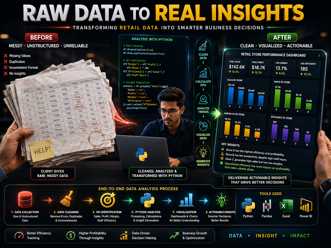
Retail Store Performance Analysis | Python, Excel & Business Analytics
I analyzed 10 days of retail store performance data to uncover the factors driving sales, profitability, margins, and staff efficiency.
Using Python, Pandas, Excel, data cleaning, KPI analysis, and data visualization, I transformed raw business data into a structured analysis and clear, actionable insights.
🔍 Key Insights
Store D achieved the highest operational efficiency and profitability.
Store B showed low productivity despite higher staff hours.
Store C generated strong sales but struggled with lower profit margins.
Operational efficiency had a stronger relationship with profitability than sales volume alone.
🛠️ What I Worked On
Data cleaning & preprocessing
Exploratory Data Analysis (EDA)
KPI identification & calculation
Sales & profit analysis
Margin analysis
Staff productivity & efficiency analysis
Business insight generation
Data visualization & reporting
💡 Business Value
The analysis demonstrates how businesses can move beyond simply tracking sales revenue and use profitability, margins, productivity, and operational KPIs to identify improvement opportunities and make better data-driven decisions.
Tools: Python • Pandas • Excel • Data Analysis • Data Visualization
Data Analyst, Business Analytics, Retail Analytics, Data Analysis, Exploratory Data Analysis, Python Data Analysis, Pandas, Excel Analysis, KPI Analysis, Sales Analysis, Profit Analysis, Data Cleaning, Data Visualization, Business Intelligence, Performance Analysis, Retail Data Analysis, Dashboard & Reporting, Actionable Insights
1
39
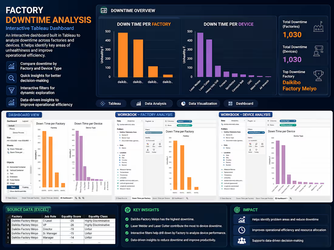
Factory Downtime Analysis — Tableau Project
An interactive Tableau dashboard designed to analyze manufacturing downtime across different factories and device types. The project transforms raw operational data into visual insights that help identify major sources of downtime and potential areas for improving efficiency.
Key Features:
Analyzed downtime across multiple factories and device types.
Compared factory-level and device-level downtime.
Identified high-downtime factories and equipment.
Created interactive Tableau dashboards with filters.
Used Excel data preparation and Tableau for visualization.
Presented key findings to support data-driven operational decisions.
Tools: Tableau • Excel • Data Analysis • Data Visualization
Outcome: The analysis highlights where downtime is concentrated, helping businesses prioritize maintenance, resource allocation, and operational improvements.
1
60