
Kajal Kirpekar
UI/UX designer creating clear, thoughtful digital products.




Freelancers: how many invoices are you actually tracking right now? 👀
Because I lost count. Which client paid, which one's ghosting, which invoice I forgot to even send, all living in my head and three different notes apps.
So I built Ledgerline.
A clean, dead simple invoice and client manager that does the boring but critical stuff:
→ Manage all your clients in one place
→ Build invoices with auto calculated totals
→ See what's paid, pending, and overdue at a glance
But here's the part I'm actually proud of 👇
It's built on a tokenized design system, which means anyone can remix the whole template and reskin it to their own brand in seconds. Not hours. Seconds.
It even ships with real sample data, so it works right out of the box. Clone it, drop in your details, start invoicing.
Built entirely in @Replit for the Replit Buildathon. 🛠️
Would you use something like this? Genuinely curious. 👇
[https://freelancer-suite--kirpekarkajal.replit.app/ ]
0
124

Pepdose — a peptide dosage calculator that should already exist
The problem
Peptides have exploded in popularity, but the way people access them is messy. Not everyone goes through a telehealth provider like Hims, Ro, or Eden, where everything arrives pre measured with instructions printed on the box. A lot of people source their peptides another way, through their own doctor, a compounding pharmacy, or online. And the moment they do, they are on their own.
Those people are left doing the hardest part by hand. They have a vial of powder, a bottle of bacteriostatic water, and an insulin syringe, and they have to figure out how much water to add, what concentration that creates, and how many units to actually draw for their dose. Get it wrong and the consequences are real. Right now they do this math on spreadsheets, in their heads, or by copying strangers on forums. There is no calm, trustworthy tool made for them.
Why I built it
I kept coming back to how strange it is that this gap exists. There are beautiful apps for tracking your steps, your water, your sleep, but for something as precise and high stakes as reconstituting a peptide, people are left with a calculator and a prayer. The task is intimidating, the information is scattered, and the tools that do exist look like clinical spreadsheets that make an already nerve wracking moment feel worse.
So I wanted to make the opposite. Something that takes a scary, technical task and makes it feel calm, clear, and safe. A tool a real person would actually reach for, made specifically for the people the big providers ignore.
The most important decision
The obvious version of this app is one that tells you what to take and how much. That version is also dangerous and irresponsible, and it is the reason a good version of this does not exist yet. So I drew a hard line early. Pepdose does the math and the tracking. It never gives medical advice, never recommends a peptide, never suggests a dose. The user brings their own dose, the one their provider gave them, and the app simply executes it accurately and keeps a record. That one constraint is what makes it safe enough to actually ship, and every screen respects it.
The process
I started by getting clear on who this was really for, and that took a while. I explored a lot of directions before landing on the people who self source outside the big providers, because that is where the real unmet need was.
Once I had the user, I designed the core flow. The heart of the app is simple. You enter your vial amount, your water, and your target dose, and it shows you exactly how much to draw, down to the units on your syringe. I made the calculator the home screen, so a returning user opens straight into the thing they came to do, with recent calculations right below for one tap reuse.
I built and prototyped everything in Flowstep, and I worked with it the way you work with a junior designer who is fast but needs direction. Its first instincts were generic. It reached for clinical purple, dense layouts, and cold medical styling. I pushed it, screen by screen, toward something warmer and more human. Soft greens, rounded friendly type, gentle language like store your reconstituted vials in the fridge and give them a little swirl, never a shake. Every time it drifted back to a sterile default, I corrected it. The app you see is the result of that back and forth, and the parts I am proudest of are exactly the places where my judgment overrode the tool's instinct.
I also cleaned up the logic as I went. Early versions crammed the calculated results, the concentration and draw volume, onto the input screen before the user had even entered anything, which made no sense. I separated inputs from outputs, so the calculator only asks for what you give it, and the answer gets its own clear moment on a dedicated result screen with a syringe drawn to the exact mark.
The final app covers the whole journey. A gentle onboarding that sets your peptide and your syringe type, the calculator itself, a result screen that shows your draw amount clearly, vial tracking so you know how many doses you have left and when to reorder, a history of past calculations, and a profile for your preferences. Everything wrapped in a safety first framing that keeps it firmly a calculator, never an advisor.
Public Link - https://app.flowstep.ai/file?activeFileId=9e9c6abd-2e7c-4185-a1c4-02f4681f8346
2
4
165

Stay Leisurely: Brand Book & Visual Identity
Stay Leisurely is a luxury travel brand built around calm escapes, curated stays, and a slower way of discovering places. The brand book was designed to bring this feeling into a clear visual system, covering the logo, color palette, typography, brand usage, social media direction, and merchandise applications.
0
68
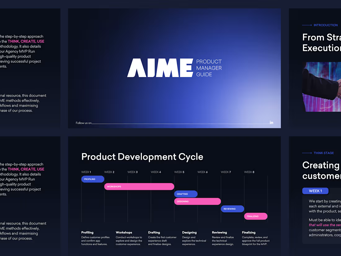
A modern presentation redesign created to make a product management learning guide clearer, sharper, and easier to present.
0
76