Juwairiya Zaid
Crafting high-end visual identities for modern brands
New to Contra
Juwairiya is ready for their next project!

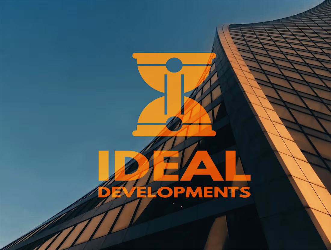
Ideal Developments is a forward-thinking brand operating at the intersection of modern engineering, sustainability, and technological innovation. The goal of this branding project was to elevate the traditional construction and development aesthetic, transforming it into a sleek, modern identity that speaks to precision, reliability, and the future of the built environment.
At the core of the visual identity is a highly intentional and clever logo design. I developed a conceptual mark featuring an inverted construction helmet that masterfully utilizes negative space to form an hourglass shape. This hidden, structural detail serves as a powerful symbol for the brand’s core operational pillars: uncompromising efficiency, strategic time management, and a commitment to delivering projects on schedule.
To ground this conceptual logo, I curated a strong, industrial yet sophisticated color palette. Featuring Golden Ochre, Midnight Slate, Foundation Charcoal, and Steel Mist, the brand colors were specifically chosen to evoke a sense of structural stability, premium quality, and industrial strength. Together, these elements create a cohesive, authoritative brand presence that confidently positions Ideal Developments as an innovative leader in modern construction.
0
36
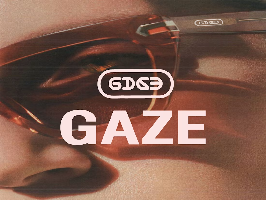
Gaze is a lifestyle eyewear brand born from a desire to strip away industry noise and focus entirely on vision, both literally and stylistically. Inspired by a sunset conversation in Lisbon among a designer, a photographer, and a product engineer, the brand was created to offer a clean lens for self-expression rather than just following fleeting market trends.
To cut through a crowded market saturated by overpriced and cluttered designs, the brand strategy focuses on owning your presence through intentional minimalism and conscious materials. The visual identity translates this philosophy into a sleek, optical-inspired design system that communicates confidence, clarity, and sophistication.
The core visual features an optical capsule emblem paired with a bold, clean geometric wordmark, capturing the essence of modern vision and structural precision. Every touchpoint is carefully crafted to reflect a modern, minimalist aesthetic, proving that stripping away excess leaves a brand that is bold, intentional, and beautifully clear.
0
40
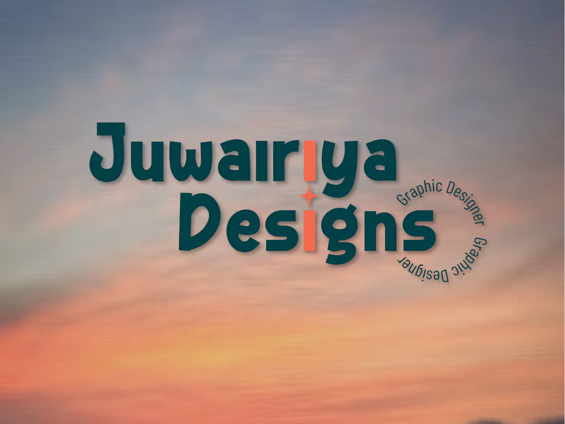
Juwairiya Designs is a personal branding project built to reflect my identity as a freelance graphic designer, serving as a creative home for bespoke, high-end visual solutions. Rather than treating design as just a service, the brand is rooted in intentionality, elegance, and the core philosophy of passing inspiration forward to clients and audiences alike.
To stand out in the competitive freelance design space, the visual identity embraces a refined, minimalist aesthetic that merges organic warmth with professional structure. The brand draws subtle inspiration from the meaning of the name, symbolizing a rose; using delicate abstract petal motifs and a candle symbol to represent creativity as a powerful spark that illuminates a brand's true potential.
The overall identity is unified by a sophisticated, carefully curated palette and clean typography that projects quiet luxury and modern confidence. Every element, from the layout strategy to the visual touchpoints, is designed to translate intangible creative visions into striking, memorable brand identities that help businesses own their unique presence.
0
47
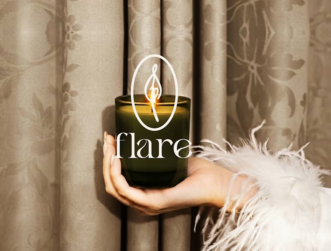
Flare is a sensory-driven home fragrance brand designed to transform living spaces and elevate everyday rituals. Rather than treating candles as a basic commodity, the project positions the brand as an immersive experience focused on comfort, memory evocation, and mindful living.
To help the brand stand out in a crowded market, the visual identity centers around a "quiet luxury" aesthetic. The custom logo merges the organic shape of a flickering candle flame with subtle botanical elements inside a clean vertical frame, paired with an elegant editorial serif wordmark that reflects the natural movement of wax and light.
The brand experience is unified by an evocative, nature-inspired palette featuring Golden Amber, Forest Canopy, Sage Herb, Midnight Wick, and Soft Smoke. Together, these design elements translate intangible feelings of warmth and joy into a cohesive, sophisticated identity that turns a simple home accessory into a ritual of self-care.
0
52