
I'm working on a Tinder - styled recruitment landing page. As a product designer I can create experiences.
2
132
Awa Lawa - Affiliate Web & Dashboard Design
Overview
Awa Lawa is a high-performance affiliate platform designed to help users promote multiple brands and earn commissions seamlessly. It allows affiliates to choose from different platforms, generate referral activity, and track earnings in real time through a unified dashboard experience. The goal was to create one of the most engaging and conversion-focused affiliate systems in Nigeria.
Problems
A. Existing affiliate systems were fragmented and difficult to manage
B. Users lacked clarity on earnings, clicks, and performance tracking
C. Poor dashboard structure made navigation overwhelming
D. Low engagement due to lack of motivation and transparency
E. No centralized system for managing multiple brand promotions
Solutions
A. Designed a clean, unified affiliate dashboard for all platforms
B. Simplified user flow from selection → promotion → earnings tracking
C. Introduced clear analytics for clicks, conversions, and commissions
D. Created a motivational interface with real-time performance feedback
E. Structured navigation for easy access to different affiliate programs
Tools & Stack
A. Design: Figma
C. Research & Testing: User feedback, competitor analysis
D. Focus Areas: UX strategy, dashboard design, conversion optimization
Outcome
A. Improved clarity and usability of affiliate management system
B. Increased engagement through real-time earnings visibility
C. Simplified multi-brand promotion into one streamlined platform
D. Delivered a scalable dashboard system ready for growth and expansion
1
600
Santiloto — Lottery Web & Mobile Application
Overview
Santiloto is a web and mobile lottery platform that allows users to participate in digital lottery games in a simple, secure, and engaging way. The platform is designed to make gaming more accessible by enabling users to select games, place bets, and track results seamlessly from their devices.
The goal was to create a smooth, trustworthy, and easy-to-use experience that encourages participation while maintaining clarity around gameplay and outcomes.
Problems
A. Lottery platforms often feel complex and difficult for new users
B. Lack of trust and transparency in digital gaming systems
C. Poor mobile experience reduces user engagement
D. Confusing game flows make it hard to place bets quickly
E. No clear feedback system for results and user activity
Solutions
A. Designed a simple and intuitive game selection and betting flow
B. Improved transparency with clear game rules and result displays
C. Created a mobile-first interface for smooth gameplay on all devices
D. Structured navigation to reduce confusion and improve speed
E. Introduced clear feedback states for wins, losses, and active games
Tools & Stack
A. Design: Figma
B. Research & Validation: User feedback and usability testing
C. Focus Areas: UX design, mobile optimization, interaction design, system clarity
Outcome
A. Improved user experience across web and mobile platforms
B. Increased clarity and trust in the lottery process
C. Faster game participation through simplified flows
D. Delivered a scalable gaming interface ready for future expansion
1
561
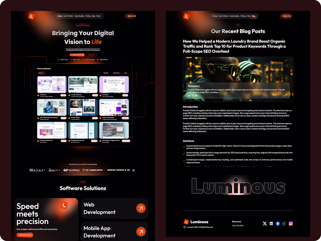
Luminous — Full-Service Digital Agency Platform
Overview
Luminous is a full-service digital agency platform that provides end-to-end solutions across design, software development, SEO, email marketing, and other digital growth services. It is built to help businesses scale faster by giving them access to a centralized team for all their digital needs.
The goal was to create a professional, conversion-focused platform that clearly communicates services, builds trust, and drives client acquisition.
Problems
A. Businesses struggle to find one reliable provider for multiple digital services
B. Agency offerings are often fragmented and poorly structured
C. Lack of clarity in service positioning reduces conversions
D. Weak online presence limits client trust and acquisition
E. No centralized system to showcase services and case studies
Solutions
A. Designed a clear, structured multi-service platform experience
B. Organized services into well-defined categories for easy understanding
C. Built a strong, conversion-focused landing and service flow
D. Improved credibility through clean UI and professional presentation
E. Created a scalable structure for adding future services and case studies
Tools & Stack
A. Design: Figma
B. Prototyping: Framer
C. Research & Validation: Competitor analysis and client behavior insights
D. Focus Areas: UX design, service design, conversion optimization, branding
Outcome
A. Improved clarity and positioning of agency services
B. Increased potential for client acquisition through structured messaging
C. Enhanced trust and professionalism of the brand
D. Delivered a scalable platform ready for growth across multiple digital services
1
481
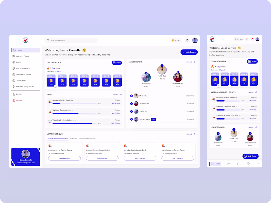
Bovell — Health Awareness & Engagement Platform (Web & Mobile Dashboard)
Overview
Bovell is a web and mobile platform designed to educate, engage, and support individuals around cancer and diabetes awareness. It combines learning, interactive gaming, community discussions, and real-life testimonies into one unified dashboard experience. The goal is to make health education more accessible, engaging, and community-driven.
Problems
A. Low awareness and understanding of cancer and diabetes
B. Traditional health education feels boring and hard to retain
C. Limited access to reliable, interactive health resources
D. Lack of community support and shared experiences
E. Minimal engagement with existing awareness platforms
Solutions
A. Designed an interactive learning system with structured health content
B. Introduced gamified experiences (quizzes, levels, rewards) to boost engagement
C. Built a Q&A section for users to connect with support and get answers
D. Created a testimonial hub for sharing real-life success stories
E. Developed a centralized dashboard to manage learning, discussions, and activities
Tools & Stack
A. Design: Figma
B. Prototyping: Framer / Protopie
C. Research & Validation: User feedback and health content structuring
D. Focus Areas: UX design, gamification, community systems, health education
Outcome
A. Increased user engagement through gamified learning experiences
B. Improved awareness and understanding of cancer and diabetes
C. Built a supportive community through discussions and testimonies
D. Delivered a scalable platform combining education, interaction, and support
1
465
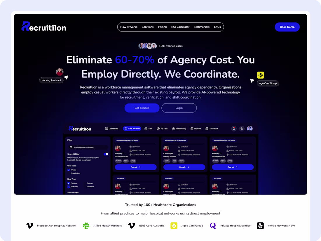
Recruitilion - A Workforce Management Platform
Overview
Recruitilion is a modern workforce management platform designed to help businesses source, manage, and scale their workforce without relying on traditional agencies. It streamlines hiring, onboarding, and workforce coordination into one centralized, efficient system.
The goal was to create a seamless experience that reduces dependency on third-party recruiters, lowers operational costs, and gives businesses full control over their workforce. I led the product design from UX strategy to high-fidelity execution, focusing on clarity, efficiency, and scalability.
Objective
A. Simplify workforce sourcing and management in one platform
B. Reduce reliance on external recruitment agencies
C. Create a fast, intuitive, and scalable user experience
D. Improve hiring speed and workforce coordination
E. Increase operational efficiency and cost savings
Challenges
A. Businesses relied heavily on fragmented and expensive agency processes
B. Complex hiring workflows slowed down recruitment and onboarding
C. Lack of visibility into workforce performance and management
D. Need to design for multiple user types (admins, employers, workers)
E. Ensuring simplicity despite complex backend processes
Solution
1. UX Strategy & Workflow Optimization
A. Mapped end-to-end workforce journeys from hiring → onboarding → management
B. Simplified workflows to reduce friction and manual processes
C. Designed clear dashboards for quick decision-making
2. High-Fidelity Design
A. Created clean, structured interfaces focused on usability and efficiency
B. Designed role-based dashboards tailored to different users
C. Used clear CTAs and data visualization to guide user actions
3. Scalable & System-Driven Experience
A. Built responsive, mobile-friendly designs
B. Established a scalable design system for consistency across features
C. Designed interactive prototypes to simulate real workforce operations
Tools & Stack
A. Design: Figma
B. Prototyping: Framer / Protopie
C. Research & Validation: User feedback, testing
D. Focus Areas: UX, workflow optimization, scalability, efficiency
Outcome
A. Streamlined hiring and workforce management processes
B. Reduced dependency on external agencies, lowering operational costs
C. Improved visibility and control over workforce operations
D. Delivered a scalable platform ready for business growth
1
424
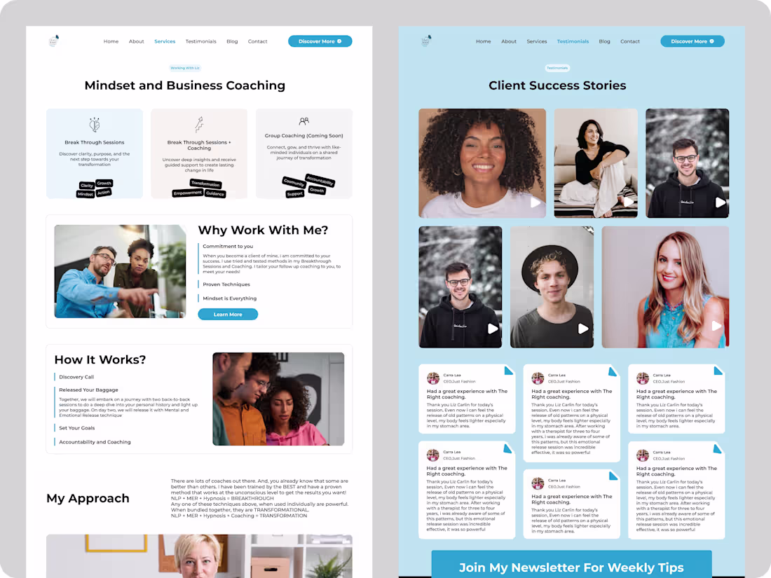
That’s Right Coaching — Emotional & Psychological Support Landing Page
Overview
That’s Right Coaching is a US-based landing page designed for a coaching platform that supports individuals dealing with emotional, psychological, and personal life challenges. It connects users with professional coaching services that help them navigate stress, anxiety, self-development, and mental clarity through structured guidance.
The goal was to create a calm, trustworthy, and conversion-focused landing experience that encourages users to seek support and book coaching sessions.
Problems
A. Users struggle to find accessible emotional and psychological support online
B. Mental health and coaching services often feel overwhelming or clinical
C. Low trust in online coaching platforms reduces engagement
D. Lack of clarity in service offerings and how coaching works
E. Poor conversion from visitors to booked sessions
Solutions
A. Designed a calm, minimal, and emotionally safe landing page experience
B. Simplified service messaging to clearly explain coaching benefits
C. Built trust through structured content, testimonials, and clear positioning
D. Created strong call-to-action flows for booking and consultation
E. Improved user journey from awareness → understanding → conversion
Tools & Stack
A. Design: Figma
B. Prototyping: Framer
C. Research & Validation: User behavior insights and competitor analysis
D. Focus Areas: Landing page design, UX writing, conversion optimization, trust-building
Outcome
A. Improved clarity and trust in the coaching service offering
B. Increased user engagement through simplified messaging
C. Enhanced conversion flow for booking coaching sessions
D. Delivered a high-converting landing page optimized for emotional comfort and action
1
352
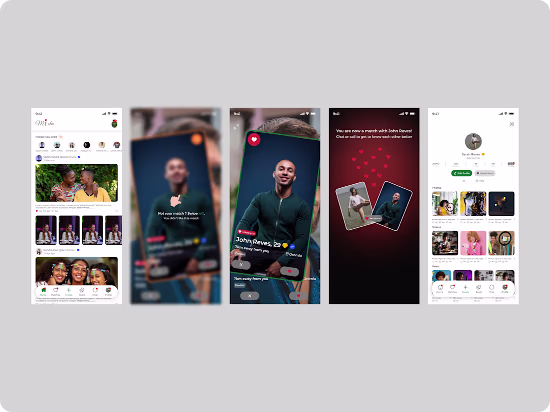
Michu — Social Dating App
Overview
Michu is a social dating mobile app designed to connect people in Uganda through meaningful interactions and shared interests. It focuses on creating a safe, engaging, and culturally relevant platform where users can discover, match, and build relationships.
Problems
A. Limited access to localized and culturally relevant dating platforms
B. Low trust and safety concerns in online dating
C. Poor matching systems leading to low-quality connections
D. Cluttered interfaces that reduce user engagement
E. Lack of meaningful interaction features beyond basic matching
Solutions
A. Designed a clean, user-friendly interface tailored to local users
B. Introduced profile verification and safety-focused features
C. Built a smarter matching system based on interests and preferences
D. Simplified navigation for seamless browsing and interaction
E. Added engaging features to encourage real conversations and connections
Tools & Stack
A. Design: Figma
B. Prototyping: Framer / Protopie
C. Research & Validation: User feedback and behavioral analysis
D. Focus Areas: Mobile UX, social interaction design, engagement optimization
Outcome
A. Improved user trust and onboarding experience
B. Increased engagement through better matching and interaction flows
C. Delivered a culturally relevant dating experience for Ugandan users
D. Built a scalable social platform ready for growth and feature expansion
1
360
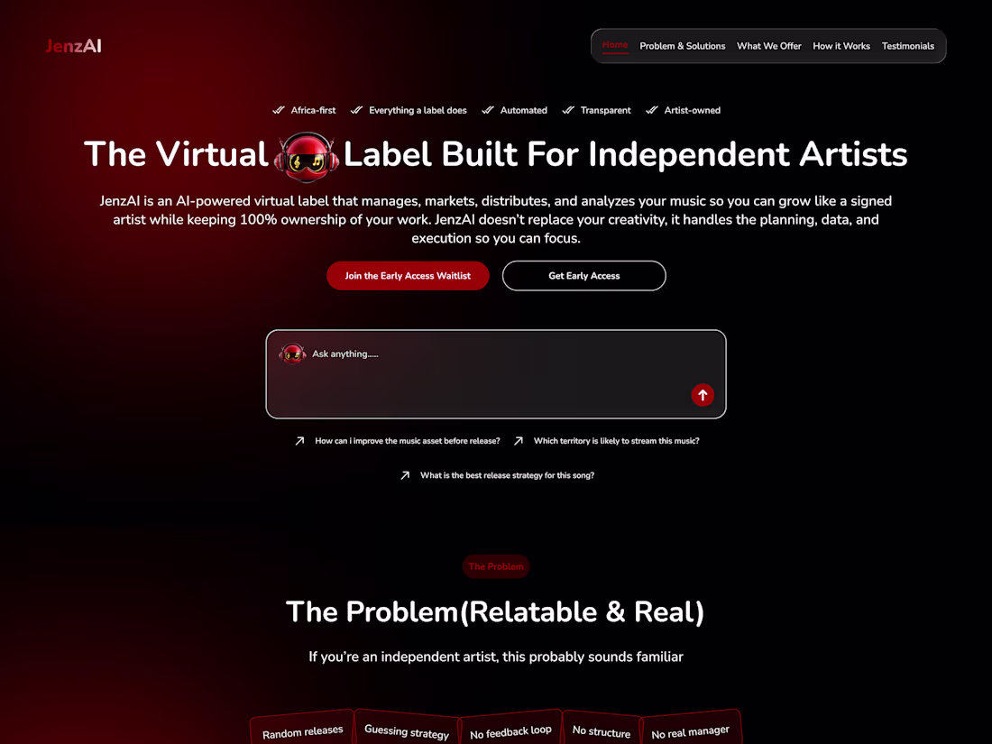
JenzAI - AI-Powered Music Growth Platform
Overview
JenzAI is an AI-powered virtual label that helps artists manage, market, distribute, and analyze their music all while retaining full ownership of their work. It empowers independent artists to grow like signed professionals by handling strategy, data, and execution, so they can focus on creativity.
Problems
A. Independent artists struggle with marketing and promotion
B. Music distribution and analytics tools are often fragmented
C. Lack of data-driven insights limits artist growth
D. Managing releases, campaigns, and performance is overwhelming
E. Traditional labels take ownership, reducing artist control
Solutions
A. Built an AI-powered system to automate marketing and campaign planning
B. Unified music distribution, analytics, and management in one platform
C. Provided data-driven insights to guide artist growth decisions
D. Simplified release and performance tracking workflows
E. Enabled artists to retain 100% ownership while scaling like a label
Tools & Stack
A. Design: Figma
B. Prototyping: Framer / Protopie
C. Research & Validation: User feedback, artist workflow analysis
D. Focus Areas: UX design, AI systems, data visualization, growth optimization
Outcome
A. Simplified music management and distribution for independent artists
B. Increased visibility through structured, data-driven promotion
C. Empowered artists with full control and ownership of their work
D. Delivered a scalable platform for long-term artist growth and success
1
344
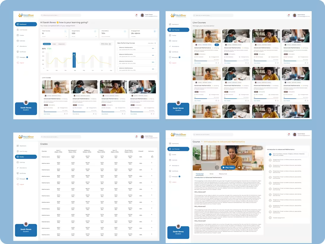
World Over - Kids Learning Platform (US)
Overview
World Over is a learning platform designed specifically for kids in the United States, offering a wide range of engaging and educational courses. It provides a fun, interactive environment where children can learn new skills, explore different subjects, and grow at their own pace.
The goal was to create a safe, intuitive, and engaging platform that makes learning enjoyable while supporting educational development for young users.
Problems
A. Many learning platforms are not tailored specifically for kids
B. Low engagement due to boring or complex learning experiences
C. Difficulty in navigating educational content for younger users
D. Lack of interactive and fun learning methods
E. Limited personalization for different learning levels
Solutions
A. I designed a kid-friendly interface with simple navigation
B. I introduced interactive and engaging course structures
C. I organized content into clear categories for easy exploration
D. I used visual elements and gamified experiences to boost engagement
E. I created a flexible learning system suitable for different age groups
Tools & Stack
A. Design: Figma
B. Research & Validation: User testing and learning behavior insights
C. Focus Areas: UX design, edtech, gamification, child-friendly interfaces
Outcome
A. Improved engagement and learning retention for kids
B. Simplified navigation and course discovery
C. Delivered a fun and interactive educational experience
D. Built a scalable platform for expanding courses and features
1
276
1
1
293
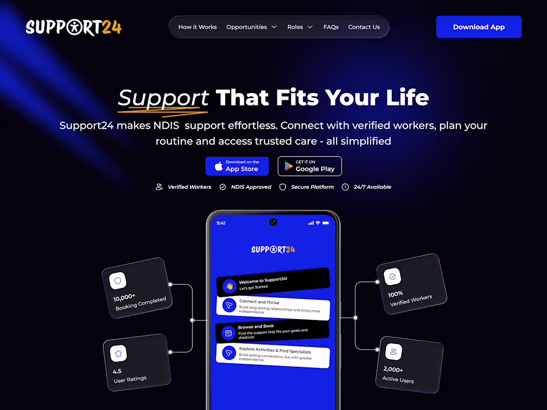
Support24 — Inclusive Support & Care Management Platform
Overview
Support24 is a comprehensive support platform designed to assist the elderly, individuals with autism, wheelchair users, and others requiring specialized care. It connects participants, support workers, coordinators, and service providers through a centralized dashboard, making care management more organized, accessible, and efficient.
The goal was to create an inclusive, easy-to-use system that improves coordination, enhances care delivery, and supports both caregivers and participants.
Problems
A. Fragmented communication between caregivers, coordinators, and participants
B. Difficulty managing care schedules and support services
C. Limited visibility into participant needs and progress
D. Lack of accessible and inclusive digital platforms
E. Complex systems that are hard for non-technical users
Solutions
A. I designed a centralized dashboard for all user roles (providers, participants, workers, coordinators)
B. I simplified scheduling and care management workflows
C. I created clear visibility into participant activities and support plans
D. I built an accessible, inclusive interface for users with different needs
E. I streamlined communication across all stakeholders
Tools & Stack
A. Design: Figma
B. Research & Validation: User feedback and accessibility considerations
C. Focus Areas: UX design, accessibility, healthcare systems, dashboard design
Outcome
A. Improved coordination between all care stakeholders
B. Simplified management of care services and schedules
C. Enhanced accessibility and usability for diverse users
D. Delivered a scalable and inclusive care management platform
1
252
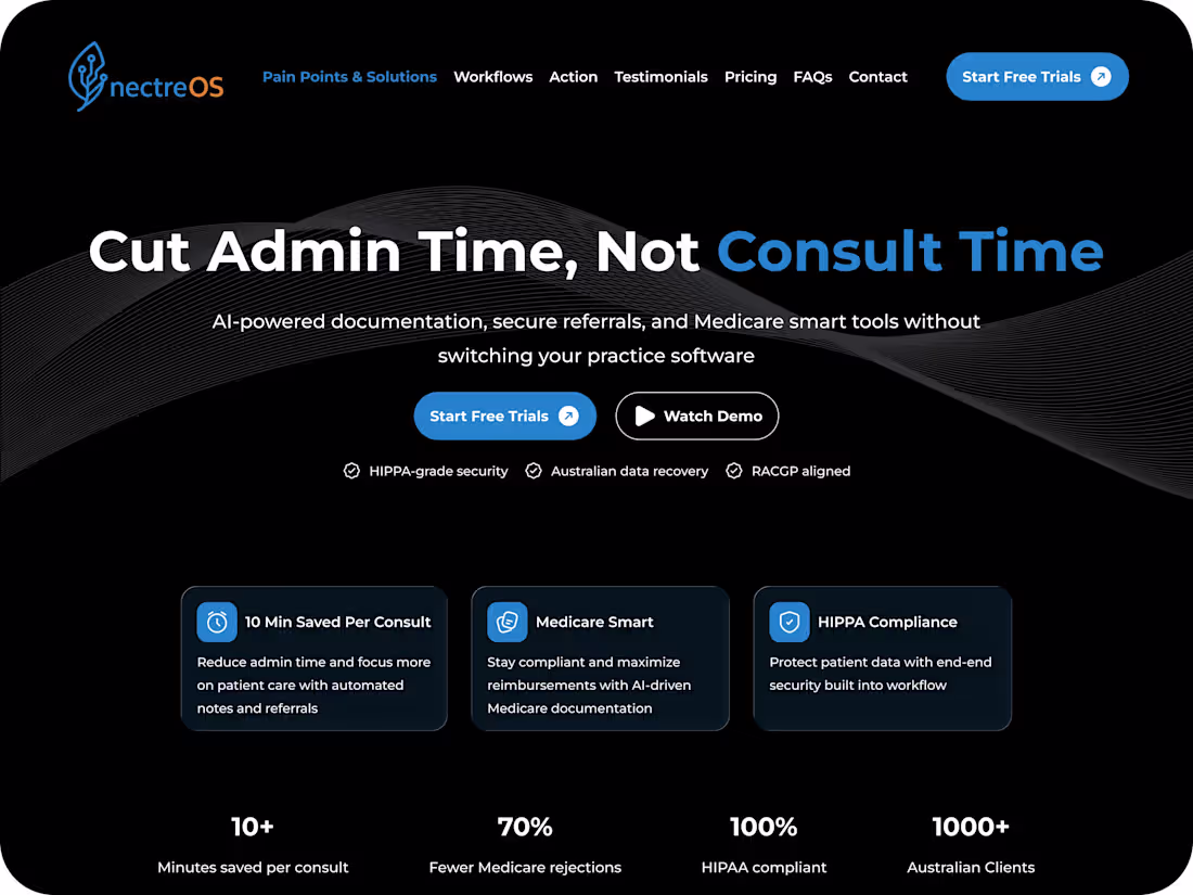
NectreOS — AI-Powered Healthcare Operating System
Overview
NectreOS is an AI-powered healthcare operating system designed to streamline clinical documentation, secure patient referrals, and provide smart Medicare tools—all without requiring doctors to switch their existing practice software. It acts as an intelligent layer that enhances healthcare workflows, improves efficiency, and reduces administrative workload for medical professionals.
Problems
A. Doctors spend too much time on manual documentation
B. Patient referral systems are slow and insecure
C. Medicare processes are complex and time-consuming
D. Existing tools require switching between multiple platforms
E. Inefficient workflows reduce time spent with patients
Solutions
A. Introduced AI-powered documentation to automate clinical notes
B. Built a secure referral system for fast and safe patient transfers
C. Integrated smart Medicare tools to simplify claims and processing
D. Designed a seamless overlay that works without changing existing software
E. Streamlined workflows to reduce administrative burden on doctors
Tools & Stack
A. Design: Figma
B. Research & Validation: User interviews and healthcare workflow analysis
C. Focus Areas: UX design, AI integration, healthcare systems, workflow optimization
Outcome
A. Reduced time spent on documentation and admin tasks
B. Improved speed and security of patient referrals
C. Simplified Medicare-related processes for healthcare providers
D. Enhanced overall efficiency without disrupting existing practice systems
1
303
P-FLO - Healthcare Workflow Management Platform
Overview
P-FLO is a healthcare software solution designed by practitioners with patients in mind, built to support healthcare organizations in delivering efficient, organized, and patient-centered care. It streamlines clinical workflows, improves coordination, and enhances the overall experience for both providers and patients.
Problems
A. Inefficient and fragmented healthcare workflows
B. Difficulty managing patient information and processes
C. Poor coordination between healthcare teams
D. Time-consuming administrative tasks
E. Lack of patient-centered digital systems
Solutions
A. Designed a centralized system for managing healthcare workflows
B. Simplified patient data access and process management
C. Improved collaboration across healthcare teams
D. Reduced administrative workload through structured systems
E. Built a patient-focused interface to enhance care delivery
Tools & Stack
A. Design: Figma
B. Research & Validation: User feedback and workflow analysis
C. Focus Areas: UX design, healthcare systems, workflow optimization, usability
Outcome
A. Improved efficiency in healthcare operations
B. Enhanced coordination among medical teams
C. Reduced administrative burden for practitioners
D. Delivered a scalable, patient-centered solution for healthcare organizations
1
255
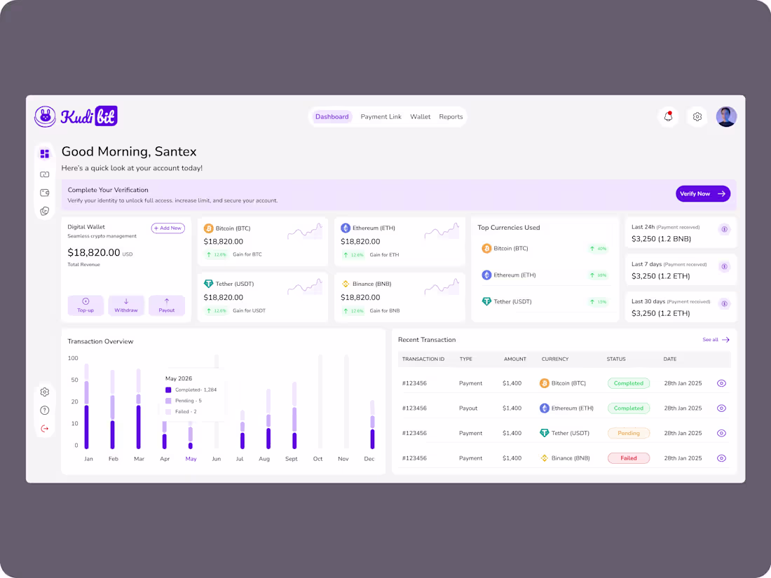
Kudibit Crypto Dashboard
Overview
Kudibit is a crypto dashboard designed to simplify how users track, manage, and interact with their digital assets. It provides a clear, real-time view of balances, transactions, and market trends in one intuitive interface.
Problems
A. Users struggled to understand complex crypto data
B. Poor navigation made tracking assets confusing
C. Lack of clear insights for decision-making
D. Overloaded dashboards reduced usability
Solutions
A. Designed a clean, minimal interface for easy asset tracking
B. Simplified navigation and user flows
C. Introduced clear data visualization for better insights
D. Structured the dashboard to reduce clutter and improve focus
Tools & Stack
A. Design: Figma
C. Research: User feedback & testing
Outcome
A. Improved clarity and usability of the dashboard
B. Faster navigation and better user engagement
C. Enhanced user confidence in managing crypto assets
D. Delivered a scalable and user-friendly product experience
1
282
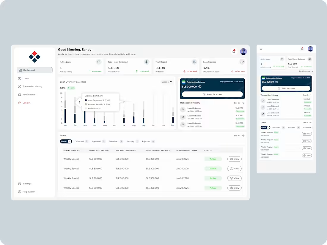
Monex — Loan Application & Management Platform
Overview
Monex is a digital loan platform that enables users to apply for loans, track their applications, and manage repayments in one simple and secure system. It is designed to make access to credit faster, more transparent, and more user-friendly, removing the stress of traditional loan processes.
The goal was to create a seamless experience where users can easily apply for loans, understand their eligibility, and monitor repayment progress without confusion.
Problems
A. Traditional loan processes are slow and paperwork-heavy
B. Users struggle to understand loan eligibility and requirements
C. Poor visibility into application status creates anxiety
D. Complex repayment tracking reduces user confidence
E. Lack of trust in digital lending platforms
Solutions
A. Designed a simple step-by-step loan application flow
B. Introduced clear eligibility checks and requirements upfront
C. Created real-time application tracking for full transparency
D. Built a clean repayment dashboard with schedules and reminders
E. Improved trust through clear status updates and user feedback states
Tools & Stack
A. Design: Figma
B. Research & Validation: User interviews and usability testing
C. Focus Areas: UX design, fintech flows, dashboard systems, conversion optimization
Outcome
A. Simplified loan application and approval experience
B. Improved user trust through transparent tracking
C. Reduced confusion around repayments and loan status
D. Delivered a scalable fintech platform ready for expansion (wallets, savings, credit scoring)
7
4
299
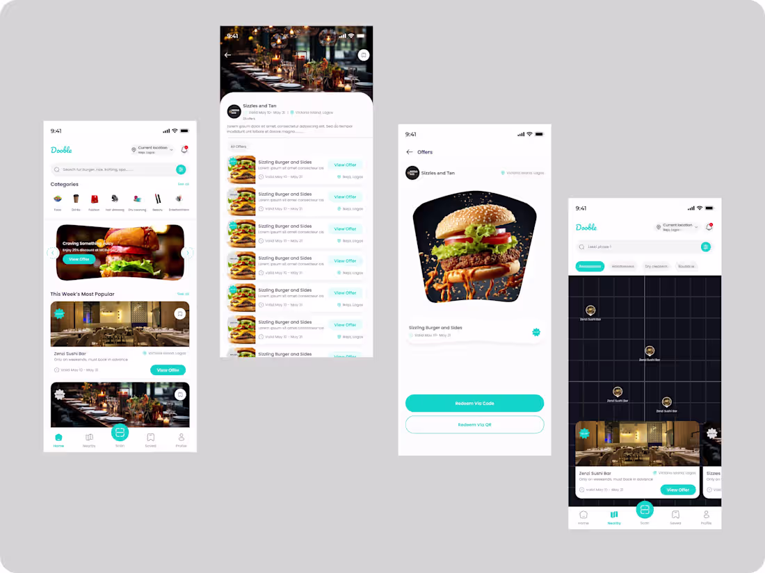
Dooble — Exclusive Discount Marketplace App (iOS & Android)
Overview
Dooble is a mobile application that connects customers with local merchants through exclusive, time-based discounts that can be redeemed in-store or via delivery. It is designed to make everyday spending more affordable while helping merchants attract and retain customers through targeted offers.
The platform serves young people, students, working professionals, and bargain hunters, while giving merchants a powerful tool to drive foot traffic and sales.
Problems
A. Customers struggle to discover reliable and affordable deals in real time
B. Merchants lack an effective way to consistently attract new customers
C. Existing discount systems are fragmented and hard to track
D. No centralized platform connecting offers, users, and redemption
E. Poor user engagement due to lack of exclusivity and urgency
Solutions
A. Designed a unified marketplace for discovering verified discounts
B. Created a seamless redemption flow via QR/app verification in-store or delivery
C. Introduced clear merchant dashboards for managing offers and performance
D. Built urgency-driven UI with time-limited deals and exclusivity tagging
E. Simplified navigation for fast discovery based on location and category
Tools & Stack
A. Design: Figma
B. Research & Validation: User surveys and competitive analysis
C. Focus Areas: Mobile UX, marketplace design, conversion optimization, merchant systems
Outcome
A. Improved accessibility to real-time discounts for users
B. Increased customer engagement through exclusive, time-sensitive offers
C. Helped merchants boost visibility and customer acquisition
D. Delivered a scalable mobile-first marketplace for long-term growth
1
248
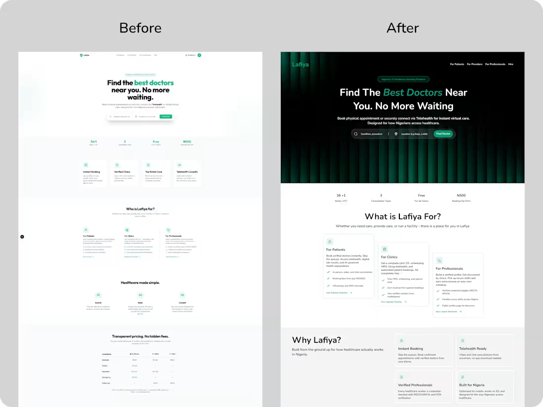
Lafiya - Telehealth Landing Page
Overview
Lafiya is a human-centered telehealth platform designed to simplify how patients access healthcare. It enables users to find trusted doctors nearby, book consultations instantly, and receive care without unnecessary delays.
The goal was to create a seamless digital experience that eliminates long wait times, improves access to quality healthcare, and builds trust between patients and medical professionals. I led the product design from UX strategy to high-fidelity execution, focusing on accessibility, usability, and conversion.
Objective
a. Simplify how patients discover and connect with verified doctors
b. Reduce friction in booking consultations (physical & virtual)
c. Create a fast, intuitive, and mobile-first experience
d. Improve patient trust through clear information and transparency
e. Increase appointment bookings and user retention
Challenges
a. Patients struggled to find reliable doctors quickly
b. Complex booking flows discouraged users from completing appointments
c. Low trust in digital healthcare platforms
d. Need for a seamless experience across different user types (patients, doctors, labs)
e. Ensuring accessibility for users with varying levels of tech familiarity
Solution
1. UX Strategy & User Flow Optimization
a. Mapped out patient journeys from search → doctor discovery → booking → consultation
b. Simplified navigation to reduce decision fatigue
c. Designed a clear, step-by-step booking experience
2. High-Fidelity Design
a. Created clean, intuitive interfaces focused on clarity and ease of use
b. Designed doctor profiles with key details (ratings, specialization, availability)
c. Used strong visual hierarchy and clear CTAs to guide user actions
3. Scalable & Interactive Experience
a. Built responsive designs optimized for mobile-first users
b. Designed interactive prototypes to simulate real consultation flows
c. Ensured consistency through a scalable design system
Tools & Stack
a. Design: Figma
b. Research & Validation: Surveys, user testing
c. Focus Areas: UX, accessibility, mobile optimization, conversion
Outcome
a. Streamlined doctor discovery and booking experience
b. Reduced user friction, leading to higher appointment completion rates
c. Improved user trust through transparent and structured information
1
312
Agroplus — Agricultural Management Platform
Overview
Agroplus is an agricultural platform designed to help farmers and agribusinesses efficiently manage farm operations, track livestock and crops, and gain insights through data-driven tools. It simplifies farm management by providing a centralized system for monitoring activities, improving productivity, and making informed decisions.
I led the end-to-end product design, focusing on creating a structured, easy-to-use system that supports both small-scale farmers and large agricultural operations.
My Role & Contributions
A. I led the UX strategy and product design from concept to execution
B. I designed user flows for farm tracking, reporting, and management
C. I created high-fidelity UI designs and interactive prototypes
D. I collaborated with stakeholders to align product goals with user needs
E. I conducted user research to understand farming workflows and pain points
Problem Statement
A. Farmers struggled with managing farm activities manually
B. Lack of centralized systems for tracking livestock and crops
C. Poor visibility into farm performance and analytics
D. Difficulty accessing real-time farm data
E. Inefficient record-keeping and reporting processes
Empathy Map (Target Users)
Says:
“I need an easier way to manage my farm”
“I want to track my farm activities in one place”
Thinks:
“How can I improve my farm productivity?”
“Am I making the right decisions for my farm?”
Does:
Keeps manual records of farm activities
Tracks livestock and crops using basic tools
Feels:
Overwhelmed by manual processes
Uncertain about farm performance and outcomes
Solutions
A. I designed a centralized dashboard for managing all farm activities
B. I introduced tracking systems for livestock, crops, and farm operations
C. I created clear analytics and reporting features for better insights
D. I simplified navigation for easy access to key farm data
E. I built a scalable system to support different farm sizes and needs
Tools & Stack
A. Design: Figma
B. Prototyping: Framer / Protopie
C. Research & Validation: User interviews and workflow analysis
D. Focus Areas: UX design, dashboard systems, data visualization, agriculture tech
Achievements & Impact
A. I improved farm management efficiency by up to 45%
B. I reduced manual record-keeping efforts significantly
C. I increased user engagement through simplified workflows
D. I enabled better decision-making with real-time data insights
E. I delivered a scalable agri-tech solution adaptable to multiple use cases
Outcome
Agroplus evolved into a structured and user-friendly agricultural platform that empowers farmers to manage their operations more efficiently. By focusing on simplicity, visibility, and data-driven insights, I helped transform traditional farming processes into a modern, digital experience.
1
173
Job Seekers— Job Discovery & Application Dashboard
Overview
Job Seekers is a web-based dashboard that helps users discover job opportunities, track applications, and manage their job search in one centralized platform. It is designed to simplify the hiring journey by providing a structured and user-friendly experience for job seekers.
I led the end-to-end product design, focusing on making job discovery faster, application tracking clearer, and the overall experience more efficient.
My Role & Contributions
A. I led the UX strategy and product design from concept to execution
B. I designed user flows for job search, application, and tracking
C. I created high-fidelity UI designs and interactive prototypes
D. I collaborated with stakeholders to align features with user needs
E. I conducted user research to understand job seeker behaviors and pain points
Problem Statement
A. Job seekers struggled to find relevant opportunities quickly
B. Managing multiple job applications across platforms was confusing
C. Poor visibility into application status caused frustration
D. Cluttered job platforms reduced usability and engagement
E. Lack of organization in tracking progress and opportunities
Empathy Map (Target Users)
Says:
“I want to find jobs that match my skills quickly”
“I need to track all my applications in one place”
Thinks:
“Am I applying to the right jobs?”
“What’s the status of my applications?”
Does:
Applies to multiple jobs across different platforms
Tracks applications manually or through notes
Feels:
Overwhelmed by the job search process
Anxious about application outcomes and responses
Solutions
A. I designed a streamlined job search experience with filters and categories
B. I introduced a centralized dashboard for tracking all applications
C. I created clear status indicators for each job application
D. I simplified navigation for quick access to opportunities
E. I designed a clean, intuitive interface to improve engagement
Tools & Stack
A. Design: Figma
B. Prototyping: Framer / Protopie
C. Research & Validation: User testing and behavioral analysis
D. Focus Areas: UX design, dashboard systems, job platforms, usability optimization
Achievements & Impact
A. I improved job discovery efficiency and user navigation
B. I reduced confusion in application tracking
C. I increased user engagement through simplified workflows
D. I enhanced user confidence with clear status visibility
E. I delivered a scalable job management platform
Outcome
Job Seekers evolved into a structured and user-friendly dashboard that simplifies the job search process. By focusing on clarity, organization, and usability, I helped create a platform that empowers users to manage their job journey more effectively.
1
159
Chop Chop — Food Discovery & Ordering Platform
Overview
Chop Chop is a food platform designed to help users discover a variety of restaurants across Sierra Leone and choose between dining in or ordering takeout. It also features a vendor side, enabling restaurant owners to manage their listings, orders, and customer interactions seamlessly.
I led the end-to-end product design, focusing on creating a smooth discovery and ordering experience for users while building an efficient management system for vendors.
My Role & Contributions
A. I led the UX strategy and product design from concept to execution
B. I designed user flows for restaurant discovery, ordering, and vendor management
C. I created high-fidelity UI designs and interactive prototypes
D. I collaborated with stakeholders to align user and business needs
E. I conducted user research to understand both customer and vendor behaviors
Problem Statement
A. Users struggled to discover reliable restaurant options in one place
B. Limited flexibility between dine-in and takeout experiences
C. Vendors lacked a centralized system to manage orders and visibility
D. Poor user experience in existing food platforms led to drop-offs
E. Lack of real-time updates on orders and restaurant availability
Empathy Map (Target Users)
Says:
“I want to easily find good restaurants near me”
“I need a quick way to order or decide where to eat”
Thinks:
“Is this restaurant reliable?”
“Will my order be processed smoothly?”
Does:
Browses multiple platforms before deciding
Checks menus, reviews, and availability
Feels:
Frustrated with limited options and slow platforms
Uncertain about order reliability and quality
Solutions
A. I designed a seamless restaurant discovery experience with clear categories
B. I introduced flexible flows for both dine-in and takeaway options
C. I built a vendor dashboard for managing orders, menus, and availability
D. I created real-time order tracking and status updates
E. I designed a clean, intuitive interface to improve user engagement
Tools & Stack
A. Design: Figma,
B. Prototyping: Framer / Jitter
C. Research & Validation: User testing and market analysis
D. Focus Areas: UX design, marketplace systems, dashboard design, conversion optimization
Achievements & Impact
A. I improved user engagement and restaurant discovery efficiency
B. I reduced ordering friction through simplified flows
C. I increased vendor visibility and order management efficiency
D. I enhanced user trust with clear navigation and real-time updates
E. I delivered a scalable food marketplace platform for future growth
Outcome
Chop Chop evolved into a user-friendly food platform that connects customers with restaurants seamlessly. By balancing user experience with vendor needs, I helped create a system that supports both discovery and efficient food ordering in a growing market.
1
151
JoyPay — International Money Transfer Application
Overview
JoyPay is an international fintech application that enables users in Nigeria to send money to anyone across the world seamlessly. It is designed to provide fast, secure, and reliable cross-border transactions while maintaining transparency and ease of use.
I led the end-to-end product design, focusing on simplifying global transfers, reducing friction, and building user trust in international payments.
My Role & Contributions
A. I led the UX strategy and product design from concept to execution
B. I designed user flows for international transfers and recipient management
C. I created high-fidelity UI designs and interactive prototypes
D. I collaborated with developers and stakeholders to ensure smooth delivery
E. I conducted user research to understand cross-border payment challenges
Problem Statement
A. Users faced difficulties sending money internationally from Nigeria
B. High fees and unclear charges reduced trust
C. Complex transfer processes led to drop-offs
D. Limited transparency on exchange rates and transaction status
E. Slow transaction speeds affected user confidence
Empathy Map (Target Users)
Says:
“I want to send money abroad quickly”
“I need to know exactly what I’m paying”
Thinks:
“Are the fees too high?”
“Will the money arrive on time?”
Does:
Compares multiple transfer platforms
Checks exchange rates and fees before sending
Feels:
Frustrated with delays and hidden costs
Concerned about transaction reliability
Solutions
A. I designed a simplified international transfer flow with fewer steps
B. I introduced transparent fee and exchange rate breakdowns
C. I created real-time transaction tracking for better visibility
D. I optimized onboarding for faster verification and usage
E. I designed a clean, trust-focused interface with clear feedback states
Tools & Stack
A. Design: Figma
B. Prototyping: Framer / Jitter
C. Research & Validation: User testing, surveys, and competitive analysis
D. Focus Areas: UX design, fintech flows, cross-border payments, conversion optimization
Achievements & Impact
A. I improved transaction completion rates significantly
B. I reduced user drop-offs during international transfers
C. I increased user trust through transparent design
D. I enhanced overall speed and usability of the platform
E. I delivered a scalable global payment solution for Nigerian users
Outcome
JoyPay evolved into a reliable international payment platform that simplifies sending money across borders. By focusing on speed, transparency, and usability, I helped create a seamless experience that users can trust for global transactions.
1
143