Joshua Dagogo-George
UiUX Designer & Motion Graphics Expert for startup
- $1k+
- Earned
- 1x
- Hired
- 5.00
- Rating
- 83
- Followers
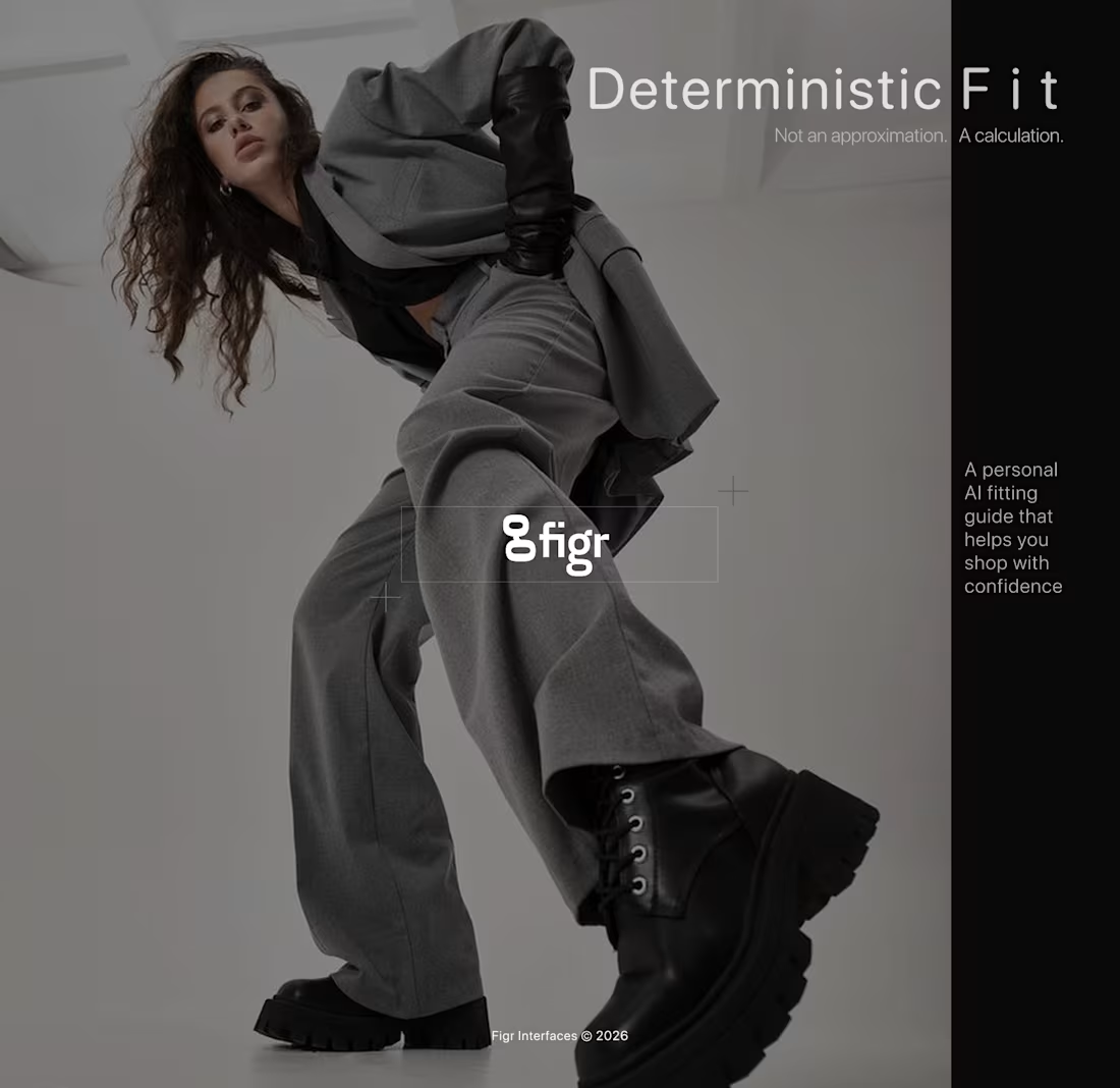
A recent project reminded me that high-end design isn't just about "vibes", it’s about mathematical certainty.
I was tasked with translating a complex AI utility into a visual language that a shopper can understand in less than a second. Most brands lean into "mystery" and "hype." I chose precision.
The Challenge:
How do you explain an "AI fitting engine" without using a wall of text?
The Execution:
Reframing the Hook: Swapping "AI recommendations" for "Deterministic Fit." It moves the needle from a guess to a calculation.
The Narrative Hierarchy: Leading with the technical promise (Precision) and following immediately with the human result (Confidence).
Native Identity: Instead of using clinical wireframes, I built a "Styled Checkout" aesthetic. The fit experience should live natively inside the brand’s luxury DNA, not feel like a third-party plugin.
The Takeaway: Design "standards" are often a moving target. But when you ground your work in system logic and clear visual hierarchy, the story tells itself.
#ProductDesign #AIAutomation #UIdesign #VibeCoding #SystemDesign
1
33
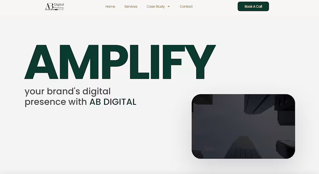
Website Redesign for AB DIGITAL
1
0
Imagine your homepage reacting to your hand movements…That’s exactly what I built
Just wrapped an interactive hero section animation for a client using Three.js
A client wanted a hero section that didn’t just look good but actually responded to the user something futuristic, dynamic, and unforgettable.
So I built a particle based animation that reacts in real time to hand movements using the user’s camera. As you move your hand, the particles shift and flow instantly, creating a smooth, immersive experience from the very first second on the site.
This kind of interaction is perfect for brands that want their landing page to feel alive and truly pull users in especially AI products, Web3 platforms, and creative tech companies.
I’ve attached a video showing how it works.
0
134
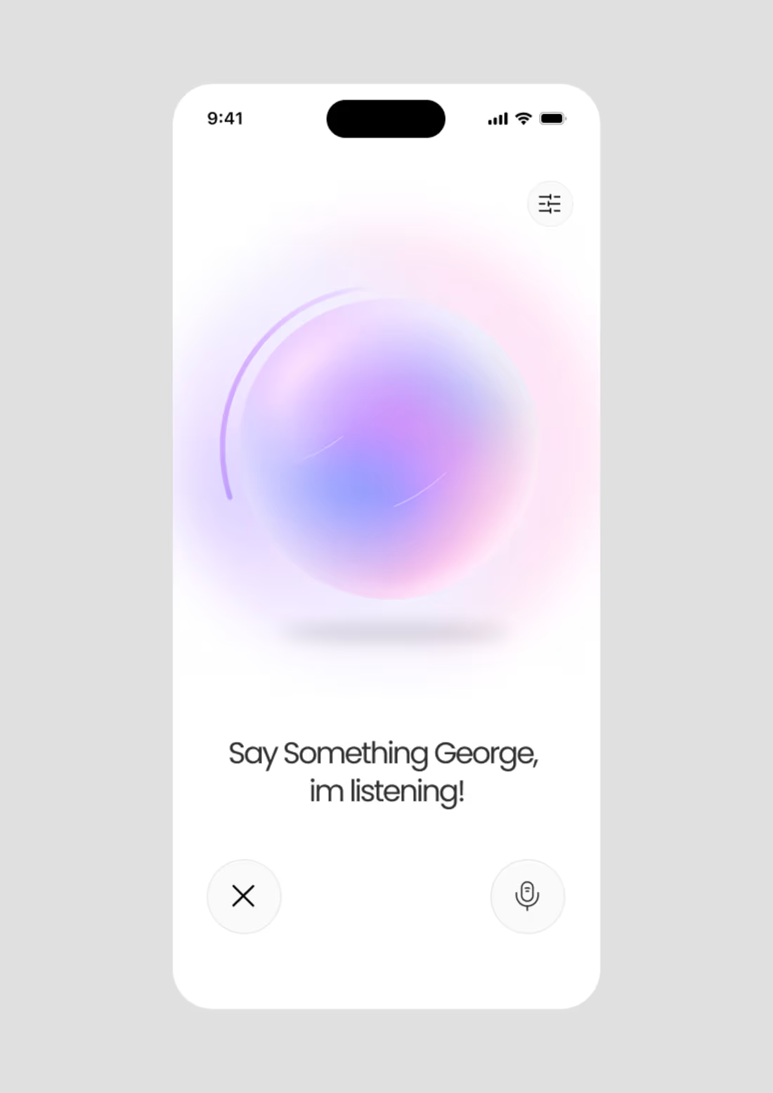
I’ve built a fully interactive 3D Voice Orb in Three.js for clients, designed to feel alive and responsive. The orb has four core states, each giving users visual feedback on what the system is doing:
Idle: a calm breathing animation, keeping the orb alive without demanding attention.
Listening: the orb tightens and brightens slightly, showing it’s focused and ready for input.
Speaking: fully audio-reactive, it pulses, glows, and moves based on real-time volume and frequencies, giving the “voice” a visual personality.
Thinking: looping subtle animations like swirling cores or orbiting rings, signaling background processing.
The goal was to make an interface that communicates state and emotion without words, and all of it runs smoothly in Three.js.
4
175
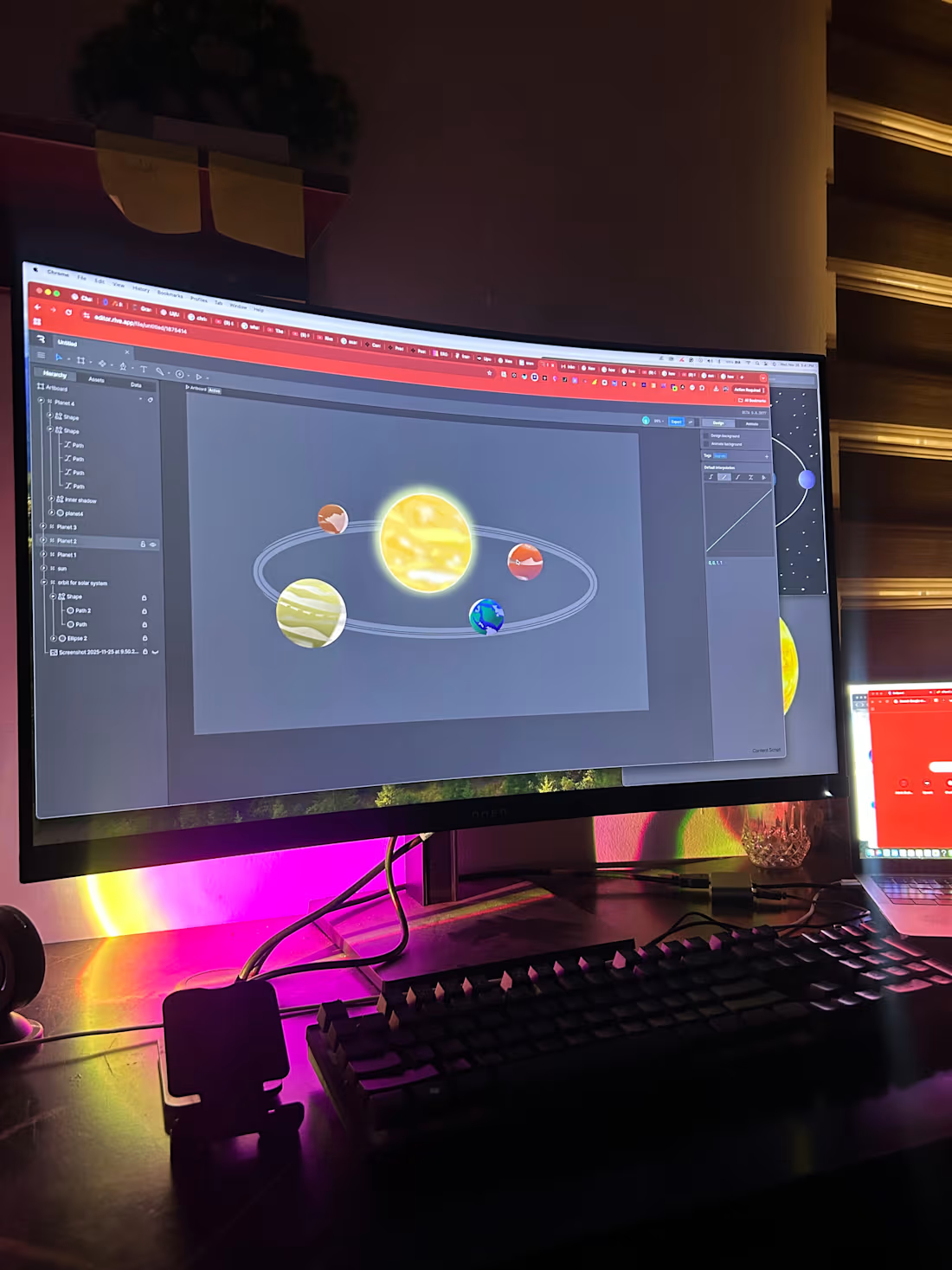
Unveiling My Rive Contest Entry: A Galactic Adventure for Young Learners!
I’m beyond excited to present my animation on Rive, crafted especially for young explorers eager to learn about our solar system! Through the magic of data binding, I’ve created an engaging and interactive platform that makes learning about planets, moons, rings, and orbits fun and accessible for kids.
Why This is a Game-Changer:
• Child-Friendly Learning: Young learners can dive into the wonders of the solar system,
• Developer-Friendly Magic: By leveraging Rive’s data binding, I’ve streamlined the animation process, making it easier for developers to create captivating educational experiences.
Join me on this cosmic journey and see how we can make learning about space an adventure for the next generation!
2
7
348
I was buried in work all weekend, but I’m grinding to finish the Rive challenge before the deadline. Data binding has been a wild ride 😅. See you at the top… or maybe somewhere near it lol.
2
247
this will be my entry for the rive animation. I can’t wait to show everyone how it works
8
439
I whipped up a little portfolio of what I’ve been up to these past few months, excited to finally share it here! 🚀
2
2
184
Wrapped up the animation for this Rive project and finally brought the character to life! 🕺🔥
The client loved it, and seeing the walking loop come together for the loading screen made all those little rigging tweaks worth it.
On to the next motion challenge 👀
4
248
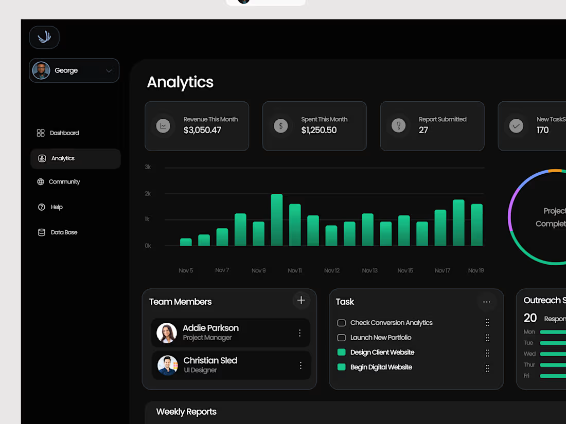
When I started working with teams on their internal dashboards, I noticed something strange.
They all had data, tools, and trackers, yet no one actually felt in control.
One team had five analytics dashboards.
Another had three project trackers and still asked, “So… what’s our progress this week?”
That’s when the idea for Ops Central was born.
A single command center, where performance, tasks, and reports come together in one calm view.
No clutter. No chaos.
Just clarity.
I wanted it to feel like the cockpit of a plane dark, minimal, and built for focus.
Because sometimes, design isn’t about adding more widgets.
It’s about removing the noise so teams can actually see what matters.
Ops Central is my take on that.
A workspace that helps teams think, plan, and build smarter.
2
5
218
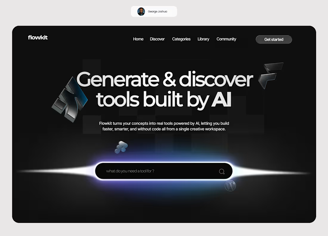
I worked on a concept for a founder who had a simple question:
“Why can’t AI just build the tools I need?”
That became Flowkit. a platform where AI helps you generate and discover the exact tools your workflow needs.
Clean, smart, and built for creators.🙌
6
199
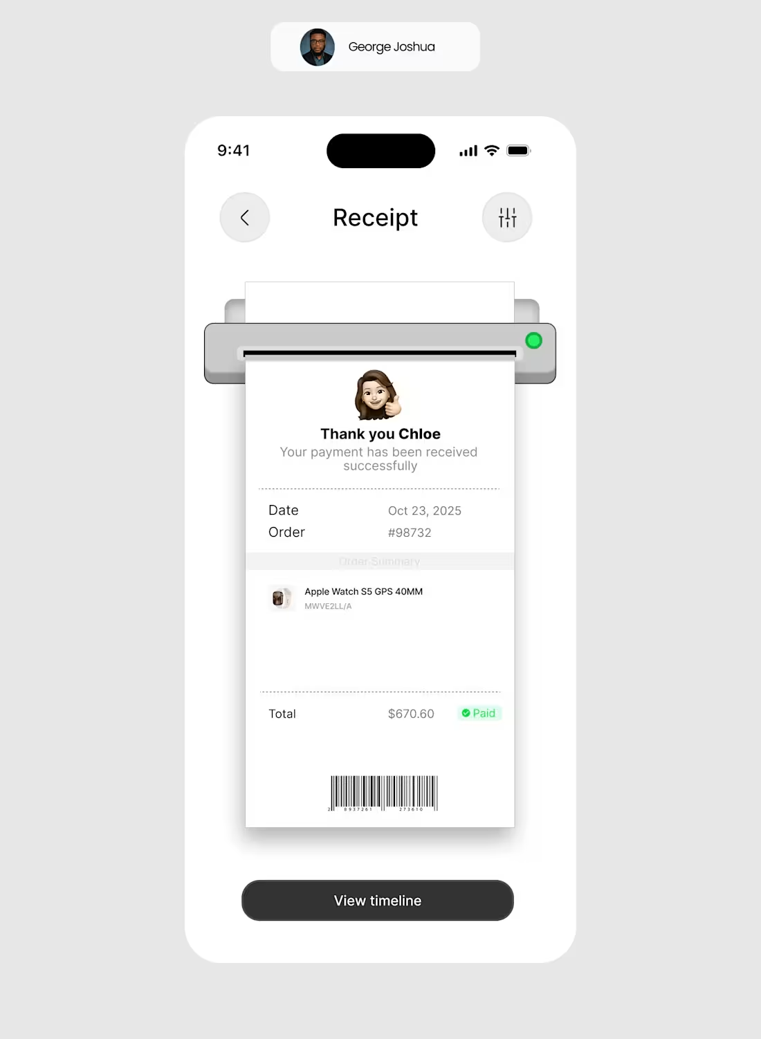
When my client saw this receipt screen, he said “wow.”
A client should feel appreciated after every purchase. That’s called emotional design.
It’s about being empathetic toward the person spending their money, one of the core principles of design: empathy.
This screen isn’t just a receipt; it’s a small moment of gratitude designed into the experience.
1
9
209
I Just wrapped up this animation for a children’s book brand on here,
I made the from scratch then animated it on Rive.
if you are building a website, Animations like this can increase user Engagement on your site by 65% therefore increase the time spent on your page which can lead to conversion.
Watch how the eyes react to the cursor movement
You could use this animation in any website or mobile app development software and it will react the same way it did here.
rive is a powerful tool.
2
5
180
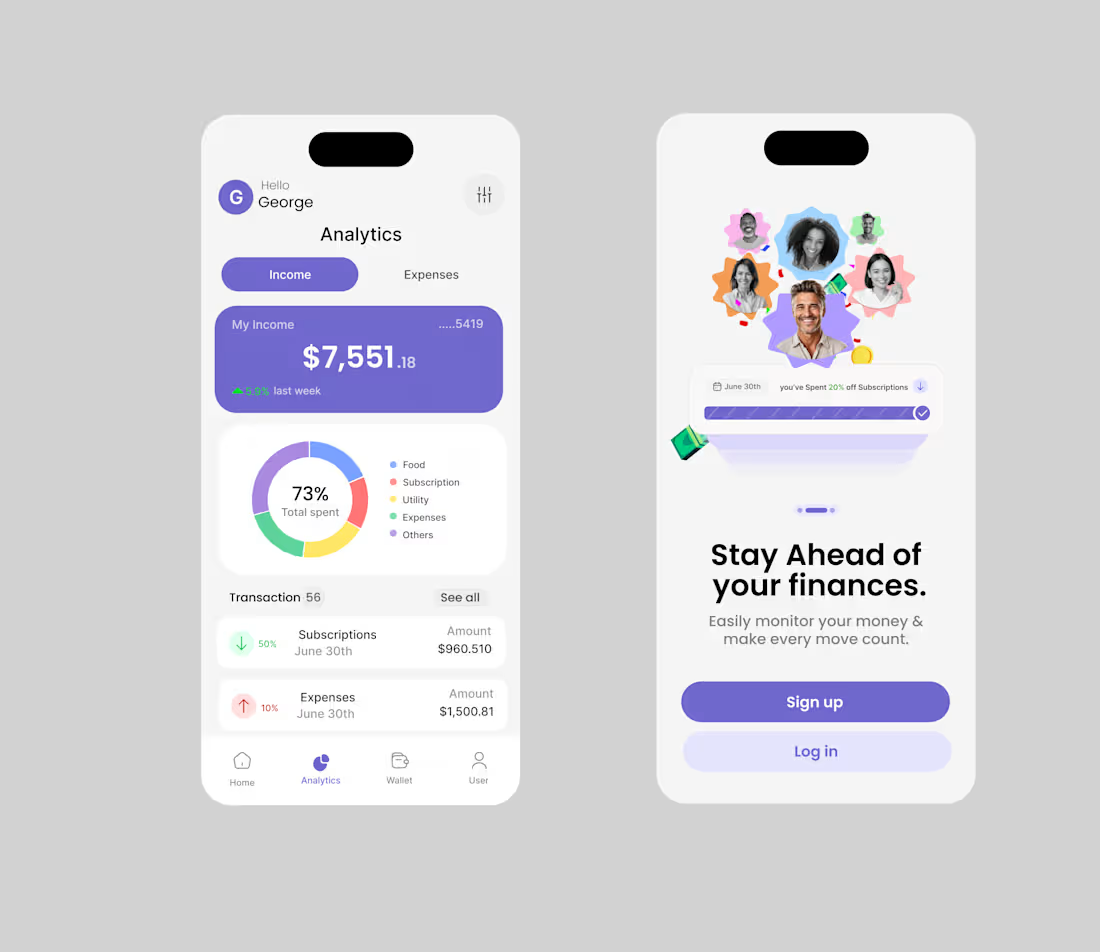
i Designed a solution that solved a million dollar problem with your finances
4
161
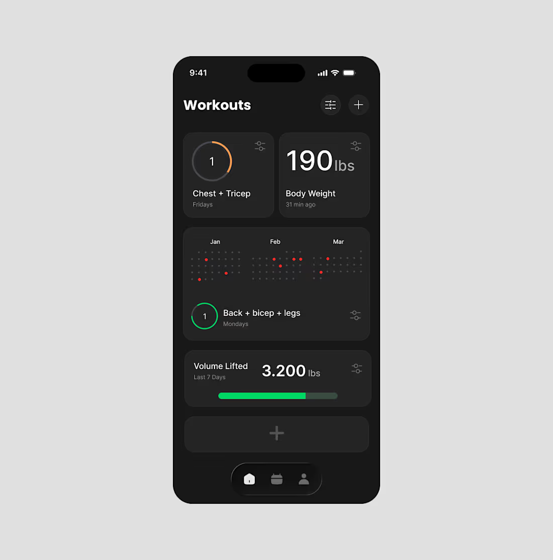
Last month a founder in the gym sector came to me with a problem:
“I’ve tried all the fitness apps out there… none of them actually show progress in a way that keeps people consistent.”
He asked if I could help bring his idea to life before development.
So I designed a solution.
The app doesn’t just log workouts it tracks body weight, shows total volume lifted, and lights up a calendar with receipts of consistency.
After just a week of testing, he finally had what he was looking for.
a product that made progress visible, not hidden.
Problem solved.
Idea brought to life.
And a clear path to build from.
3
5
155
#AI (https://www.linkedin.com/search/results/all/?keywords=%23ai&origin=HASH_TAG_FROM_FEED) is only as powerful as it feels human.
If you’re building an AI product, don’t just focus on the backend the interface is the experience.
This screen was designed to make the AI feel present, warm, and approachable not cold or robotic.
Because when users trust your interface, they trust your product and trust equals conversion.
As a hashtag#founder (https://www.linkedin.com/search/results/all/?keywords=%23founder&origin=HASH_TAG_FROM_FEED), remember:
Good design doesn’t just make things look better it makes people stay longer.
Activate to view larger image,
2
5
140
This project showcases a full uiux design and development for Bear Nation, a web3 platform combining Defi Mechanics, NFT Integration and strong Brand Identity.
The aim was to create a sleak, approchable interface with a touch of personality anchored by bold blue colors pallette that evoke clarity, trust and digital fluency.
2
5
145
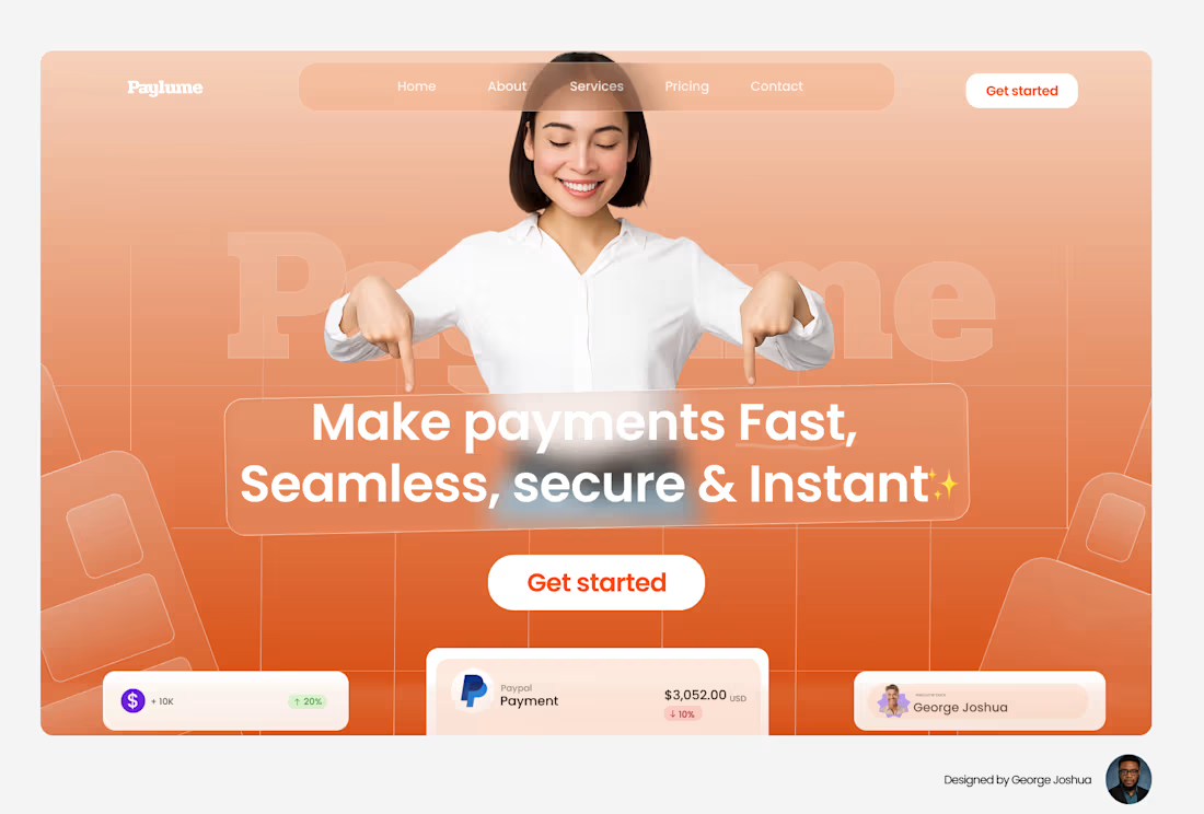
I made a hero section that actually converts.
Here’s the pain point it’s built around.
Sasha always complains about how payment apps promise “instant” but never deliver.
She’ll send money, stare at the screen, refresh twice, then say, “I knew it.”
We’ve all been there waiting for payments that were supposed to be instant.
That frustration is exactly why we built Paylume a system where transactions actually move in real time.
No delays. No hidden fees. No drama.
Just clean, secure payments that arrive when you send them.
2
5
119
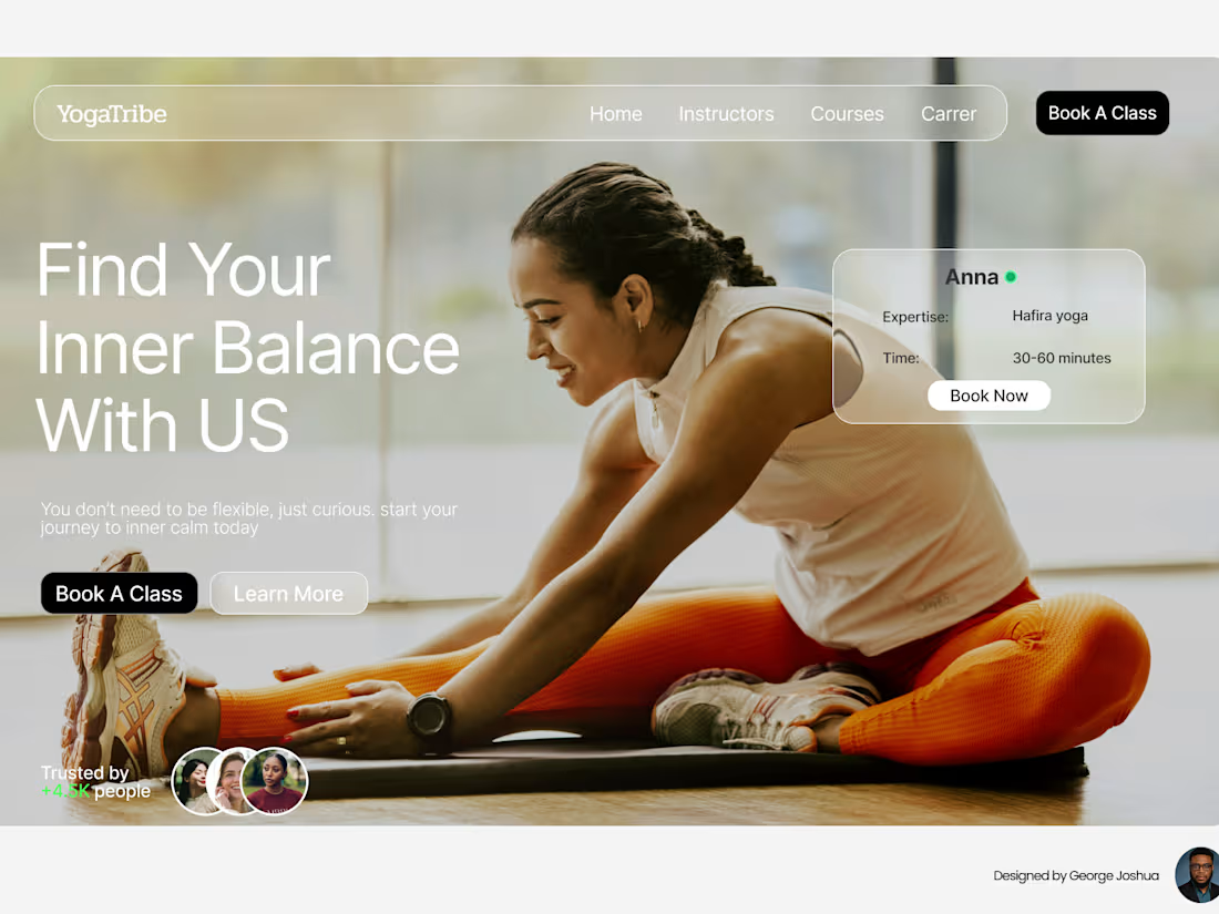
Designing for wellness isn’t about beauty, it’s about belonging.
Natalie joined her first yoga class unsure if it would make any real difference.
She wasn’t chasing enlightenment just a break from the noise.
But after a few sessions, she found more than flexibility.
She found presence, calm, and a community that felt real.
That simple transformation is what inspired this design.
It’s not selling yoga it’s inviting people to breathe again.
Because sometimes, the best designs don’t sell a product
they remind people what they’ve been missing. 🌿
Activate to view larger image,
4
112
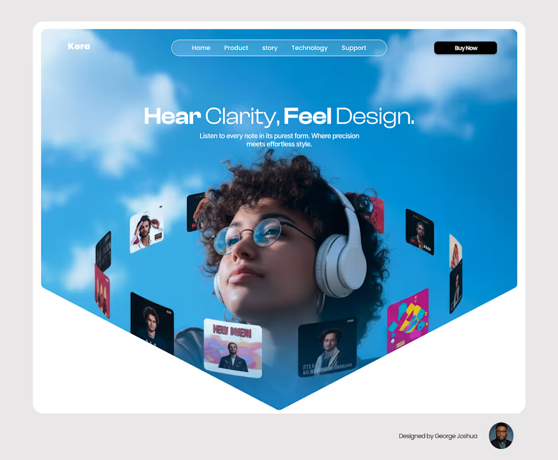
I increased sales by 30% with website Development.
I recently Developed a concept website for a headset brand called Kora, and it’s easily one of my favorite explorations yet.
The goal wasn’t just to make another sleek audio site…
It was to make people feel sound before they even clicked “play.”
Everything from the layout to the subtle animations was built around the idea:
“Hear Clarity. Feel Design.”
Because when design is done right, it doesn’t just tell you what something does. It makes you believe in it.
2
6
129
