
pro
Joshua Samson
Brand Strategist || Building Structure for founders
Ready for work
Joshua is ready for their next project!
Punch: Designing a structured product for parcel booking and tracking.
Most logistics products don’t fail because of features.
They fail because the system behind the experience isn’t clear.
For Punch, the goal was to build from the ground up:
Product frameworks
App design system
A clear user flow for booking and tracking parcels
The focus was simplicity — allowing users to create delivery routes and track parcels seamlessly using a registered Delivery ID.
Every decision was made to reduce friction and improve clarity across the experience
2
55
Framus; building a platform for creators to own and monetize their AI artwork.
For this project, the focus wasn’t just on visuals, but on creating a clear brand and product experience that supports how creators showcase and sell their work independently.
I worked on both the brand system and product design, ensuring the identity and UI align with the platform’s core idea, simplicity, ownership, and creative control.
This is a preview of the front page UI.
Another project where brand and product were designed to work as one system.
1
2
63
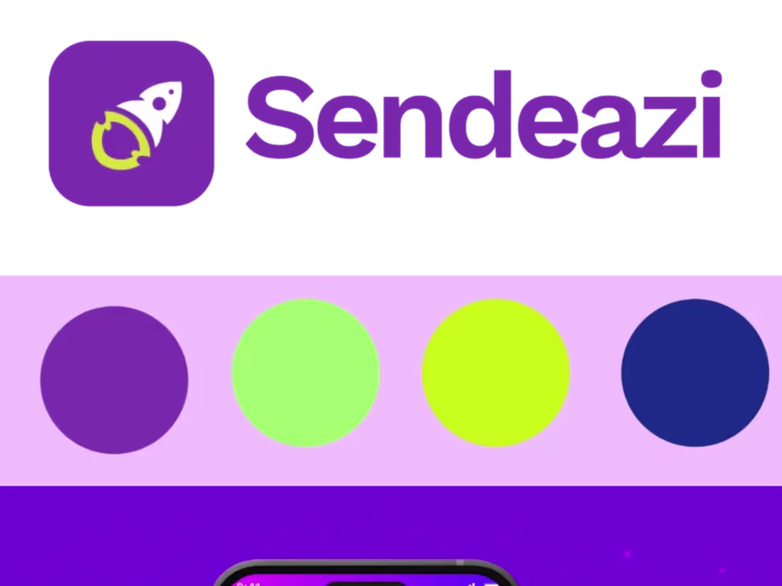
After a Successful branding project, I also created a one-page website and app design for Sendeazi. Both designs featured both light and dark screens for user experience. What do you think?
1
47
Introducing Tranarc Academy.
Tranarc Technologies is expanding into education with the launch of its new academy, and I had the opportunity to evolve the brand for this next chapter.
I originally designed the logo for Tranarc Technologies, and for the academy branch, I refined and adapted the mark while building a supporting brand system tailored to the education space.
The goal was simple: keep the core identity recognizable while giving the academy its own clear voice and structure.
Curious to hear your thoughts
1
2
87
Introducing the rebrand of Yepi → Steminai
The company was preparing for global expansion after securing its first seed round of funding. At that stage, the challenge wasn’t just growth; it was building a brand that could scale internationally.
My role was to develop a structured brand system that aligns with their new direction and positions the company for the global market.
Here’s a preview of the work.
I’m new to Contra and excited to collaborate on new projects. If you're building a startup or preparing your brand for scale, I’d love to connect.
Please engage this post to boost my discovery score.
1
1
77
I started working on this Real estate brand in late February, and I have yet to complete the brand system. This is my first moodboard for this design.
I am new to Contra and in search of branding projects to boost my profile. I have experience and can deliver great work.
Please engage this post to boost my discovery score.
2
2
67
I built this logo for a crypto send platform. What do you guys think?
1
4
123
Introducing Datacode X — a coding platform built for the future.
For this project, the goal wasn’t just to design a logo, but to build a futuristic brand system that reflects innovation, technology, and the energy of modern developers.
From the logo concept to the full brand guide, every element was designed to capture the language of code, structure, and digital evolution.
Another brand built with clarity, structure, and vision.
2
3
87
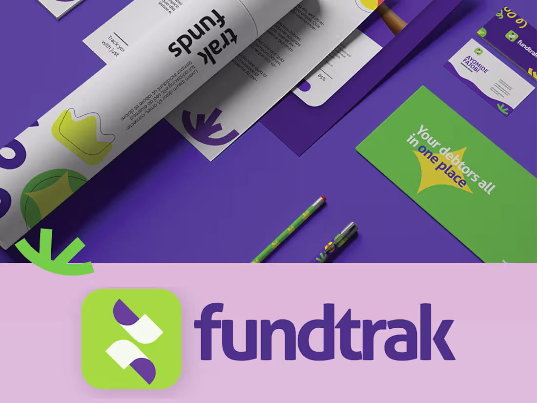
Fundtrak is a fintech platform designed to help businesses and individuals track funds, loans, and payments more efficiently. When approaching this project, the goal was to build a brand that communicates clarity, trust, and financial control, which are essential qualities for any platform handling financial data and transactions.
The logo was developed to be distinctive and purposeful, reflecting the idea of tracking, movement, and financial transparency.
Today, Fundtrak has grown to over 250,000 users and is preparing for expansion across Africa, demonstrating how a well-structured brand foundation can support both credibility and scale in the fintech space.
1
70
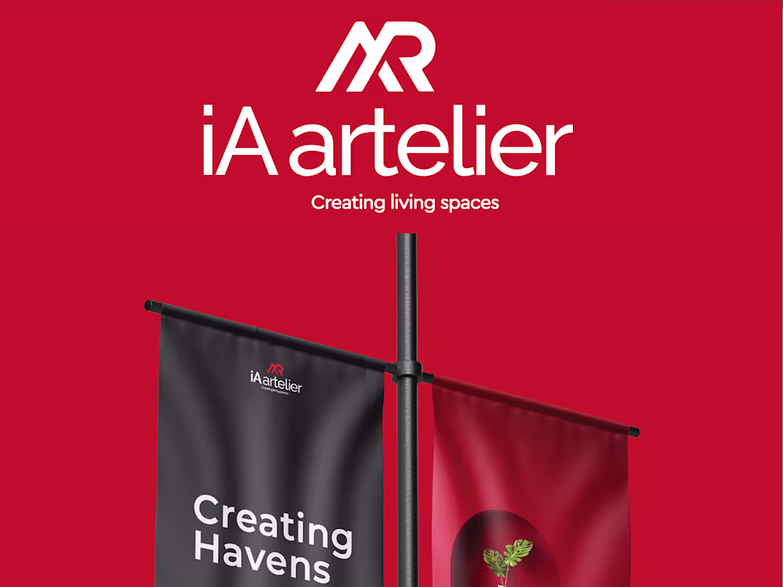
IA Artelier is an interior décor and design company that wanted to stand out in a highly saturated market. The objective of the project was not just to design a logo, but to position the brand in a way that communicates refinement, creativity, and premium design thinking.
The identity system was developed to reflect the brand’s design philosophy, clean, elegant, and intentional. The logo was crafted to feel sophisticated yet memorable, ensuring it could become a recognizable mark within the interior design space.
As a result, the brand quickly gained an outstanding reputation in its market, and over time, the structured positioning and identity system contributed to the company closing more clients and strengthening its presence in the industry.
1
1
95
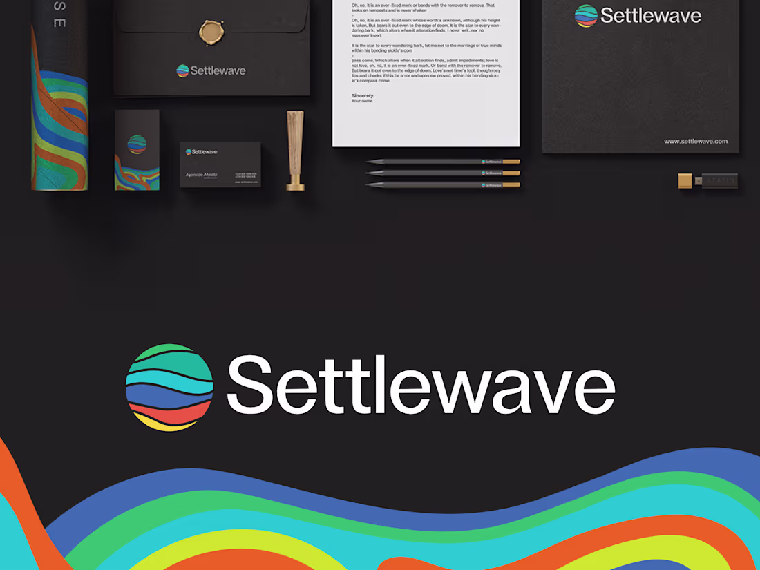
Settlewave is a fintech platform built to help SMEs streamline payments and trade transactions. When working on this project, the objective wasn’t just to design a logo, it was to establish a credible and scalable fintech brand system that could operate confidently in the financial technology space.
The strategy focused on building a brand that communicates trust, efficiency, and innovation, which are essential signals for any fintech platform working with businesses and financial transactions.
The logo was developed to be simple, distinctive, and meaningful, reflecting the idea of seamless financial movement and structured transactions. Its originality wasn’t just visual; it was designed to help the brand stand out in a highly competitive fintech ecosystem.
1
72
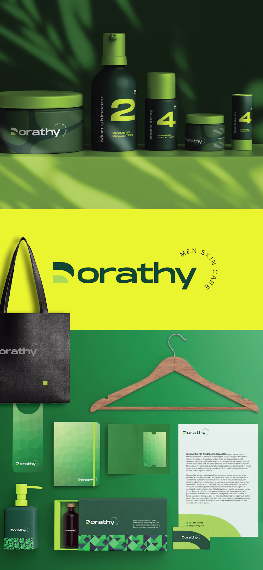
Dorathy Men Skin care Full branding and structuring. In this project we redefined the way the men skin care is perceived, by giving this brand a unique appearance.
1
67
Behance
0
7
Behance
0
8
Behance
0
1