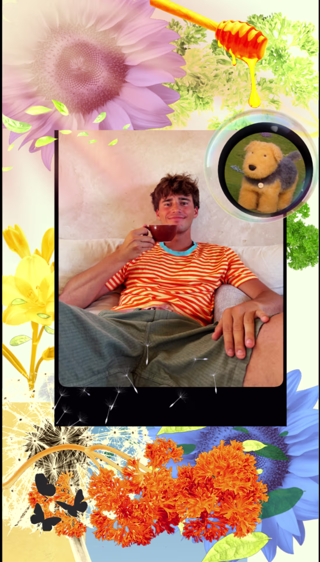
Josh Aku
Photo Editor & Visual Designer for Fashion & Beauty
Ready for work
Josh is ready for their next project!
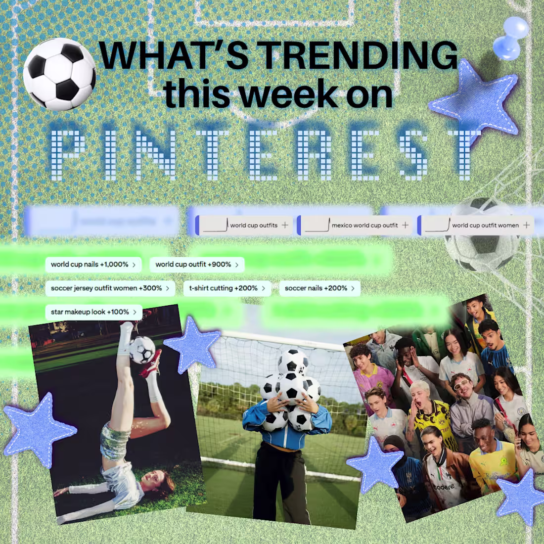
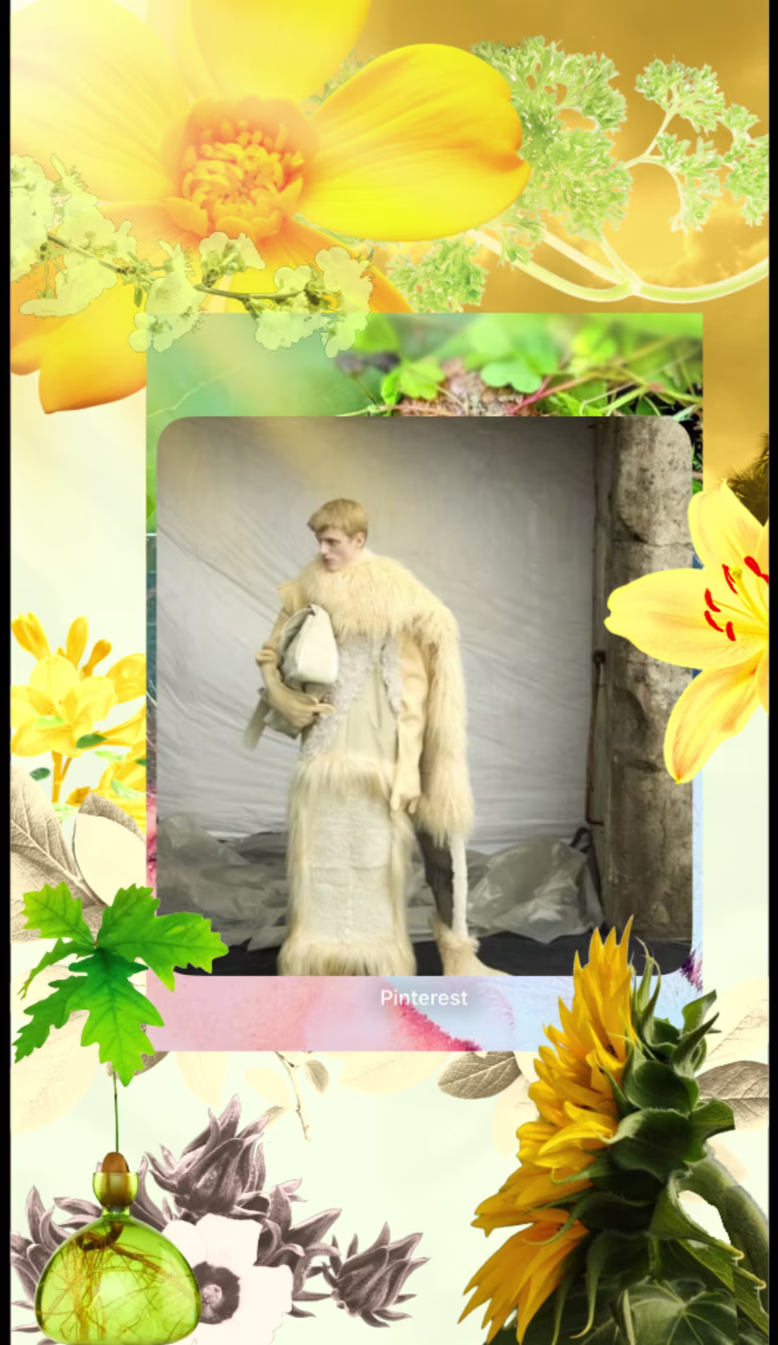
This is how the world cup is Influencing fashion on PINTEREST :
The popularity of the World Cup is pushing a new wave of fashion & beauty searches on Pinterest —
Here's What’s trending:
World Cup outfits — sporty layers + streetstyle
Soccer jersey looks — vintage kits, oversized fits
Soccer nails — team‑color micro‑art
World Cup 2026 fashion — sporty‑lux, tunnel‑walk energy
1
49
Color analysis of my MINI- Summer Skincare Guide🧴🧖♀️
Left Visual — “Citrus Equilibrium” Palette ☀️
Solar Amber #E89C3C
Hydration Green #B9D6A3
Porcelain White #F6F6F4
Tangerine Peel #F47A42
or
Right Visual — “Radiant Focus” Palette 🔆
Lemon Arrow #F4E26B
Apricot Serum #E8A36A
Hydration Green #B9D6A3
Soft Clay #D9BFA3
1
4
191
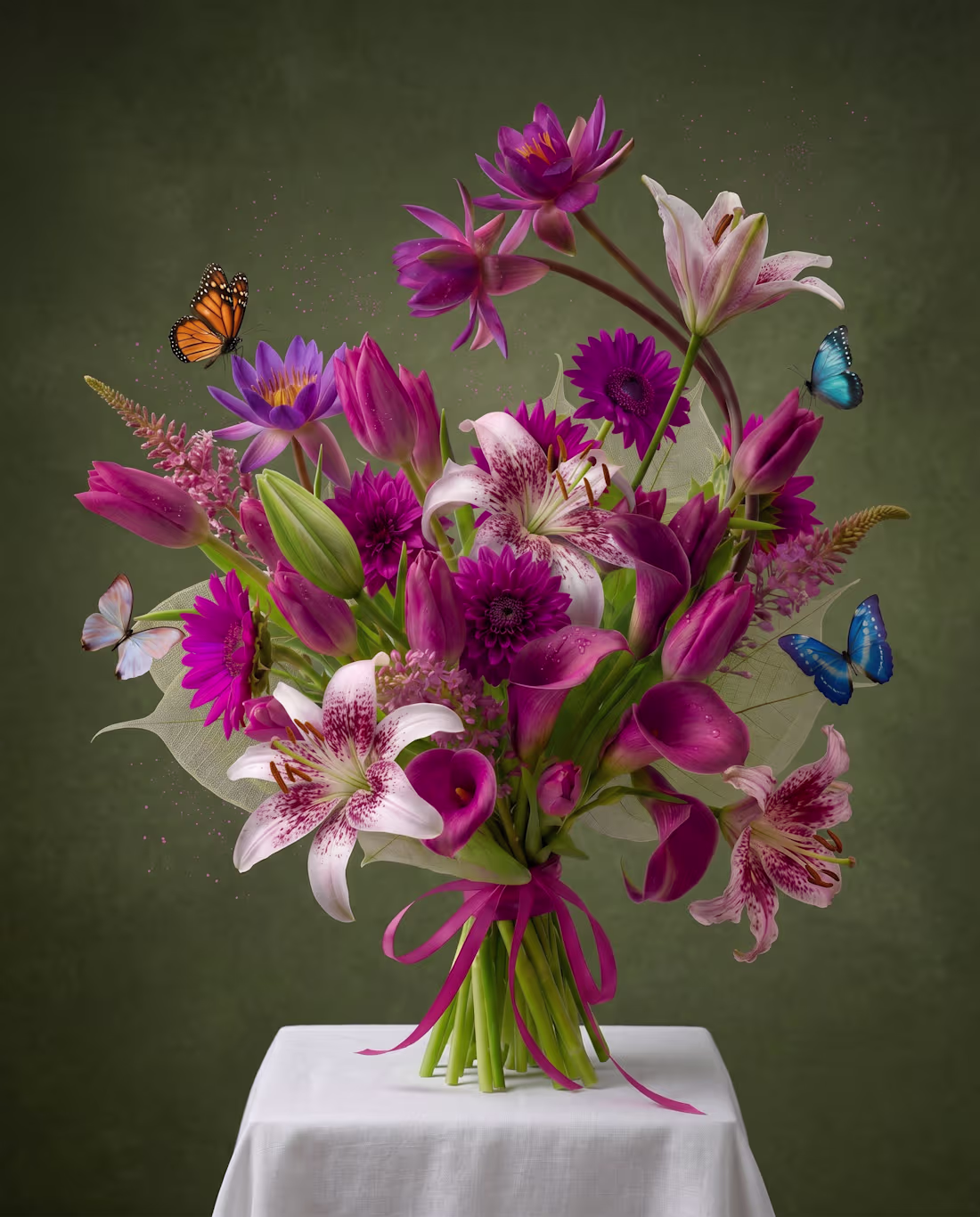
These two bouquets came together through FLORA, each unfolding with its own quiet, distinct energy.
Please LMK which one feels more alive to you.
2
5
180
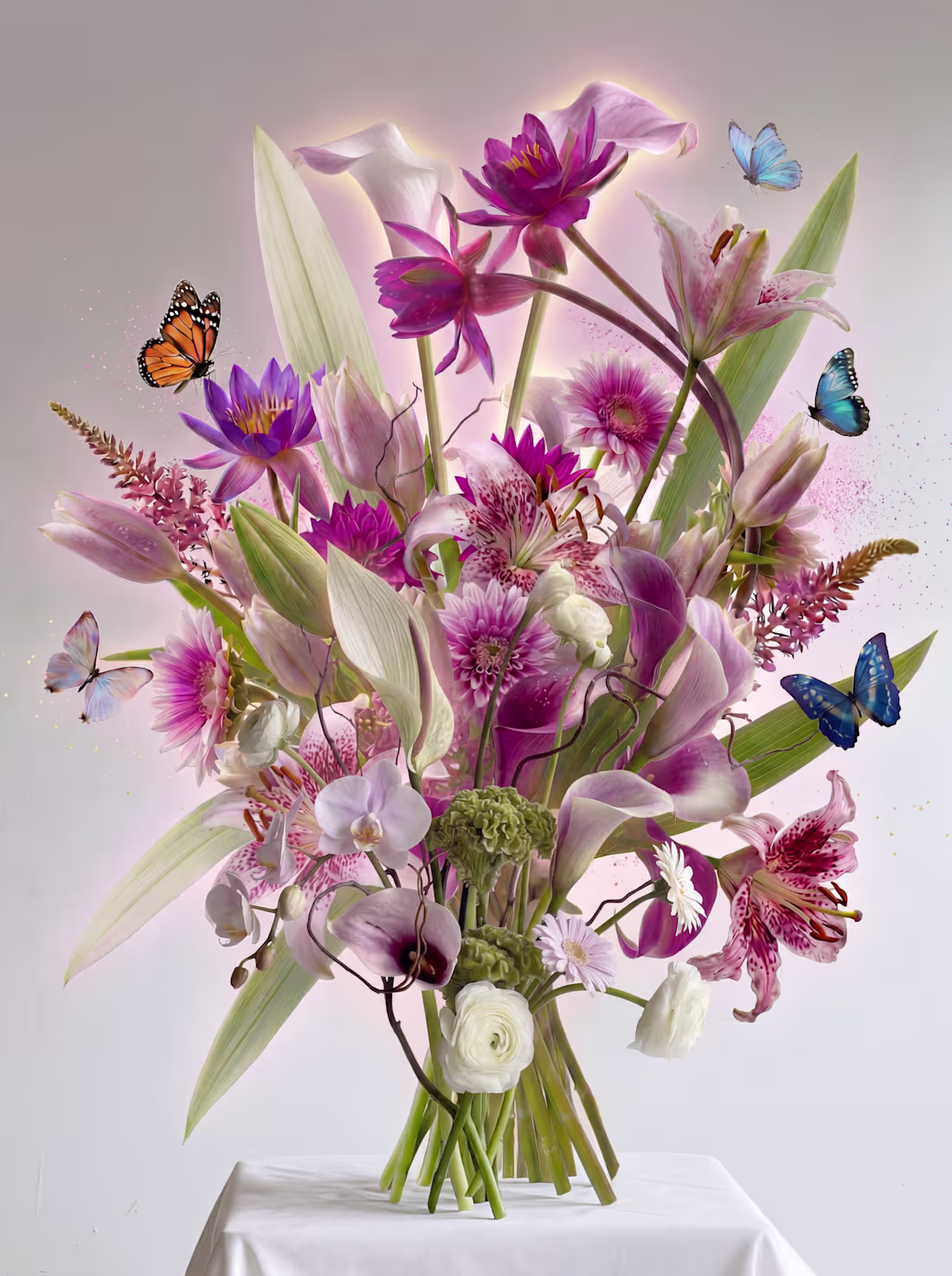
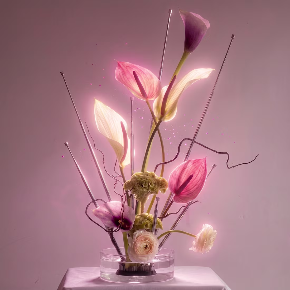
The Concept - A floral composition I assembled one bloom at a time
The Finished Result - A Magenta Masterpiece !
Which one do you prefer !?
2
5
215
A floral arrangement reinterpreted through a futuristic lens — meet Neo Flora🪄. Which version feels more magnetic to you ?
16
13
540
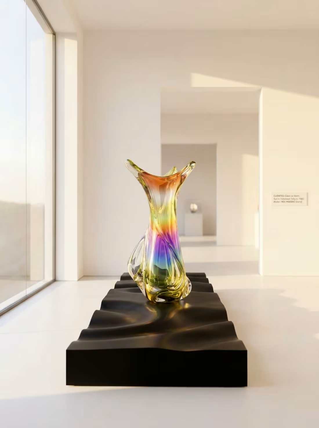
Here are the finishing touches on my vase Reconstruction ! I wanted to see what the vase would look like in more of a realistic scene - so I let the vase step into a natural gallery setting to see how it carries itself in real space; & now it has even more of an organic look, feel & prescence.
0
58
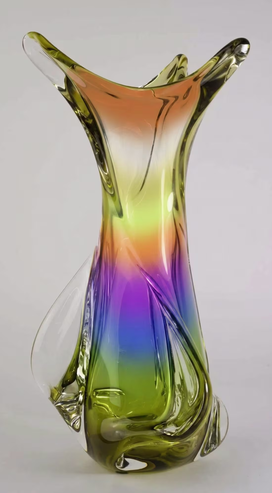
I came across this vase on pinterest & I gave it a bit of a makeover in FLORA - Which one would you prefer?!
7
15
366

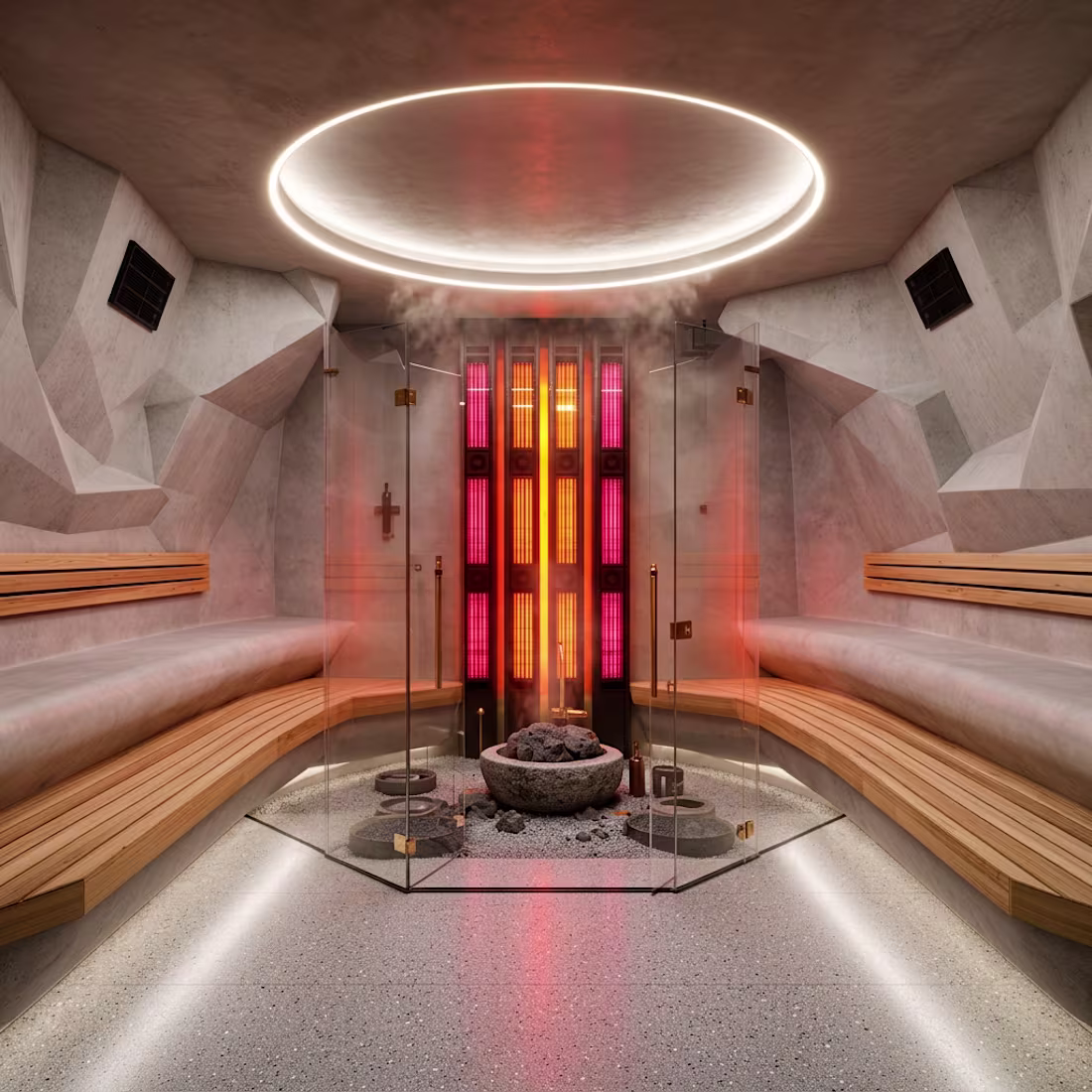
Introducing My conceptual wellness space - PHOBOS Wellness NYC-
PHOBOS Wellness is my take on what the next era of fitness spaces could feel like; as a space where light, color, and spatial proportion shift the way we experience movement.
Developed using FLORA + GEMINI, the space draws from restorative red‑light therapy technology , futurist architecture paired with the warmth of the various art installations of James Turrell to create a controlled, atmospheric training zone; existing as a private retreat woven into the fabric of the city.
2
264
Introducing My conceptual wellness space - PHOBOS Wellness NYC-
PHOBOS Wellness is my take on what the next era of fitness spaces could feel like; as a space where light, color, and spatial proportion shift the way we experience movement.
Developed using FLORA + GEMINI, the space draws from restorative red‑light therapy technology , futurist architecture paired with the warmth of the various art installations of James Turrell to create a controlled, atmospheric training zone; existing as a private retreat woven into the fabric of the city.
2
240
Currently working on a conceptual wellness space in FLORA
which do you think is a better fit!
11
16
958
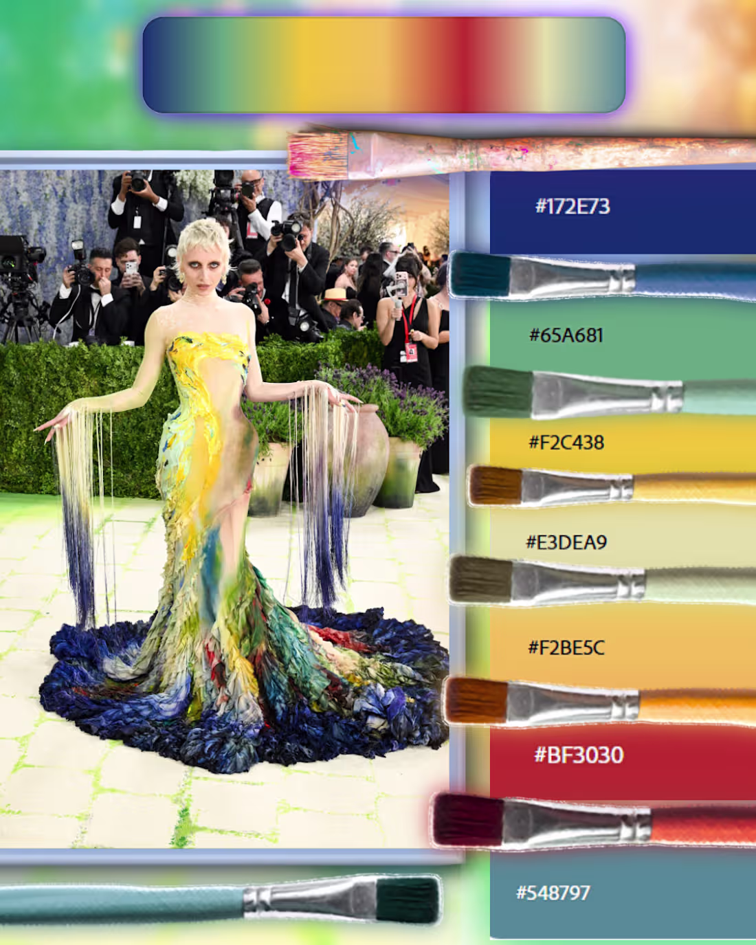
Color palette Analysis : The Living Masterpiece
Where fashion meets fine art: tonal contrast, painterly motion, and color that directs the moment with quiet precision.
[Deep / Grounding Tones🫐]
Cerulean Depth — #172E73 —
Crimson Undercurrent — #BF3030 —
Ocean Patina — #548797 —
[Warm / Radiant Tones✨]
Golden Impasto — #F2C438 —
Amber Stroke — #F2BE5C —
[Soft / Neutral Tones🌿]
Porcelain Mist — #E3DEA9 —
Verdant Veil — #65A681 —
1
100
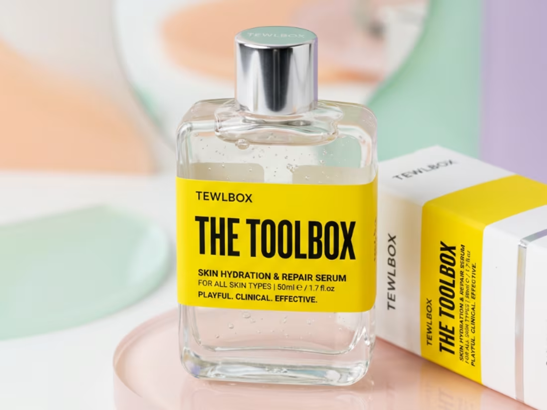
Here's a Product Concept that I made for skincare inspired by the Transepidermal Water Loss [TEWL] regulation - to slow the amount of water that naturally escapes from your skin's outer layer- Made in kittl
4
132
The Cyborg Dentist - A created using capcut VID ai
2
4
192
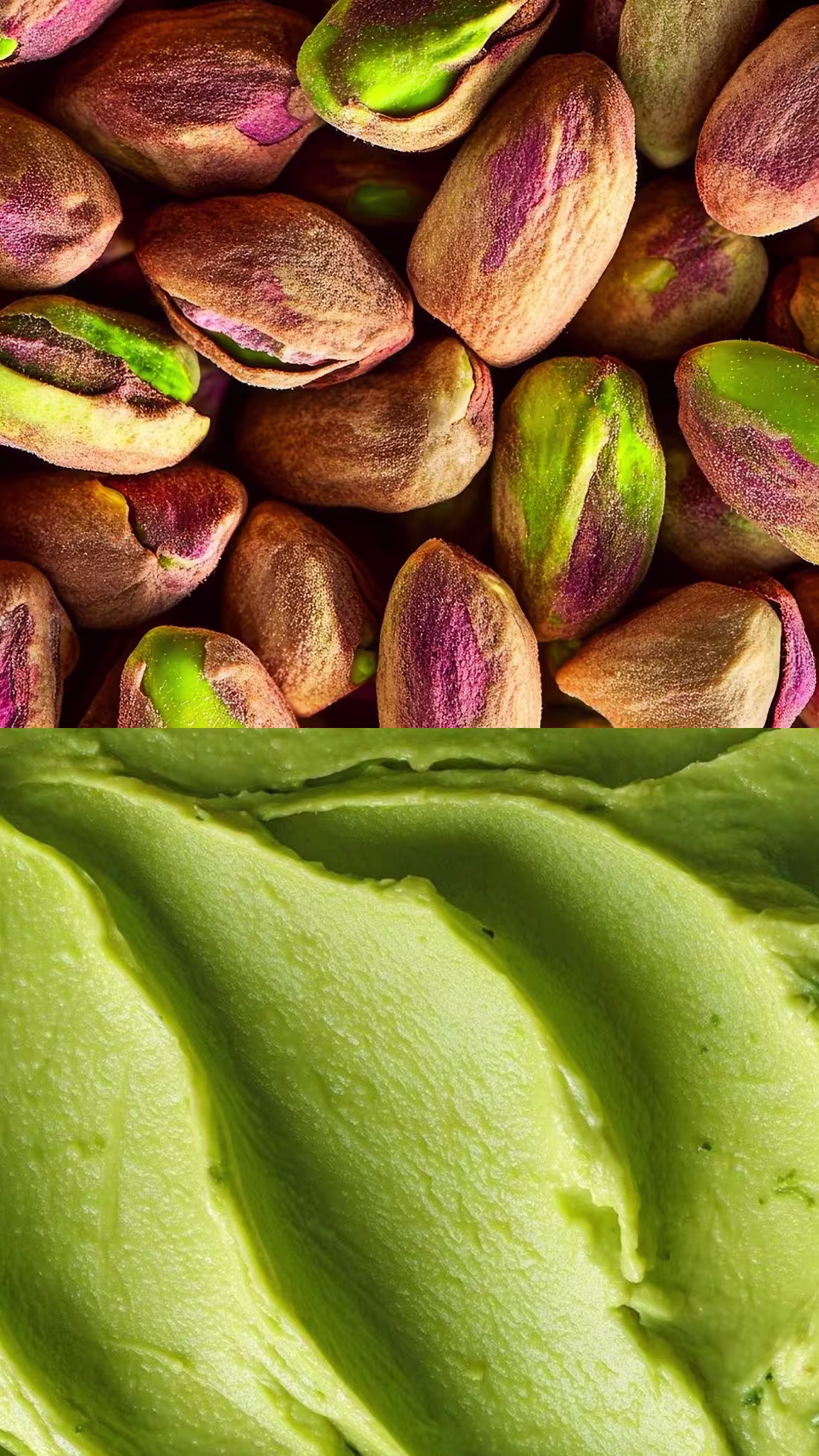
🌿 Color Palette Analysis: Pistachio Essence & Creamed Velvet
In honor of national pistachio day : From pistachio shell to gelato swirl, a modular palette unfolds: dusty greens, plum‑hued skins, and creamed pistachio highlights.
Primary Palette:
Pistachio Husk — #A7B88A
• Soft Olive Dust — #9CA77A
These tones come from the outer nut flesh—muted, matte, and organic.
2. Inner Skin Mauves
• Muted Orchid Skin — #A67C86
• Dusty Plum Shell — #8B5A63
The natural mauve–plum tones inside the pistachio give the palette its unexpected sophistication.
3. Shell Neutrals
• Warm Shell Beige — #D8C9B4
• Toasted Almond — #C7B39A
These neutrals anchor the palette and add editorial softness.
4. Gelato Cream Greens
• Creamed Pistachio — #C9D7A8
• Velvet Mint — #DDE7C4
Together they form a palette that feels earthy & softly artisanal.
5
369
Color Alchemy : The Monarch‑Inspired Hue Study🦋
Twelve hues shaped by the soft bloom of 2026’s pink Pantones, In honor of National Monarch Day
[All Color Names Below 👇]
Peony Spectrum 🌸
Pomegranate #C23A52
Dusty Rose #D8A3A8
Tea Rose #F6D1D6
Peony #F4B7C8
Petal Bloom #F7CBD4
Blush Veil #F9DDE4
Plum‑Earth Range 🎨
Cassis #5A2A5C
Orchid #D9A4DD
Mulberry #7A3B5A
Luminous Neutrals🖌️
Oat Milk #F4EFEA
Cloud Silk #F7F5F3
The full spectrum: Pomegranate, Cassis, Orchid, Tea Rose, Mocha Mousse, Oat Milk, moves like a living gradient. Each hue transitions into the next with velvety softness, creating a romantic, cinematic bloom.
#MotionOcean #Framer #DesignTrends #graphicdesign #flora
1
1
124
🎨Color Palette Analysis — Flora Kling 01 x Seedream Workflow
This AI-driven sequence blends soft botanicals with a touch of digital magic. Flora’s workflow and Kling’s animation engine bring the lilacs and shimmering dragonfly to life through Pantone’s standout 2026 hues, creating a palette that feels both romantic and dreamy.
🧪 Editing Precision — Flora Workflow Breakdown
• Seedream Motion Pass: Dragonfly flight path generated with randomized loop arcs and velocity modulation.
• Kling Image-to-Video Layering: Wing flutter animated with frame interpolation and sparkle emission mapped to motion blur.
🖌️Primary Palette: Lilac Bloom & Ethereal Flight
#D6A5B6
#E7A3B2
#F0F0F0
#007A74
#B5332A
✨Accent Sparkle Tones
#4F84C4
#F6A96B
#F6E27F
2
3
222
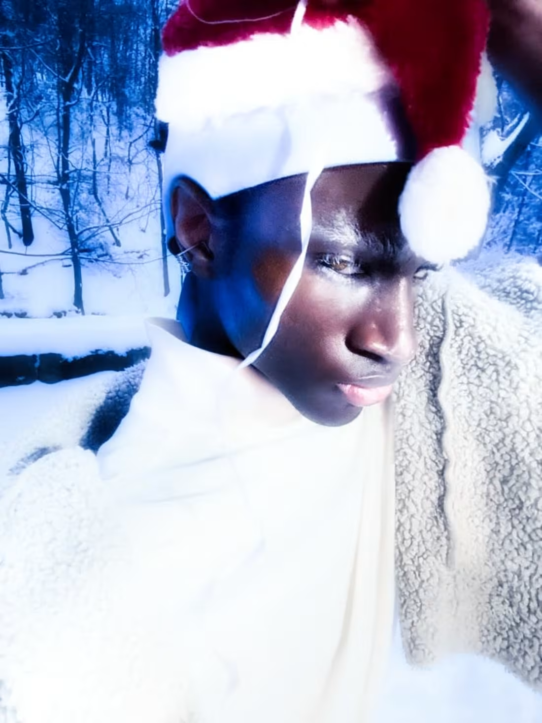
Winter Fantasy Color Mastery!
This collection is part of my Winter Frost Fantasy series a world that I styled and edited, are a part of my Winter Frost Fantasy series, shaped by the crystalline fantasy of Narnia and the dreamlike elegance found in the artwork of Yoshitaka Amano.
A Study into Color Palettes
Three bold, cohesive palettes for visual impact: Color Palettes
[Hexes Below]
❄️ Frosted Jewel Tones
🌲 Winter Triad
🌅 Snowfall Glows
Editing Precision using:
Luminar Neo & Photoshop. Techniques include:
AI Structure & Relight for depth
-Glow & Bloom Effects for softness
-Color Grading for contrast
**Final Touches
-Overlay blend modes for depth
-Vignette + Micro-sharpening for polish
-Balanced color harmony for impact.
#designtrends #ColorPaletteDesign #yearofthefirehorse #Designcommunity #youwarechallenge #photoshop
1
1
111
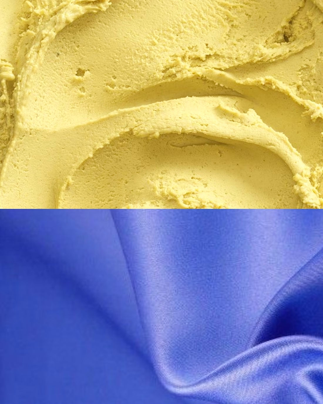
2026 Color Palette: A Fresh Fusion of Vibrancy
Matcha Green (#9AE055) pairs beautifully with Dark Mocha (#210906) for an earthy, sophisticated contrast. This combination brings natural elegance with depth, perfect for designs seeking balance between freshness and warmth.
Lilac (#C8A2E0) and Butter Yellow (#F4E4A6) create a unique pairing that radiates optimism and creativity. The soft purple tones ground the cheerful yellow, making this duo ideal for contemporary branding.
-Key Pantones-
Matcha Green (#9AE055)
Dark Mocha (#210906)
Lilac (#C8A2E0)
Butter Yellow (#F4E4A6)
#tastetest #motionocean #Framer #flora #contraquest
26
351
Color Mastery: A Study in Ethereal Depth [Designed By Me]
A curated exploration of palette design and tonal storytelling .
[All Color Names Below 👇]
Twelve hues crafted for cinematic softness and sovereign contrast:
Radiant Lilacs (Lilac Colors) 💜
#D8B7DD #B78CBF
Petal & Veil Tones (White‑Pink Colors) 🌸
#FCE9F1 #F8DDEB #F6C7D9
Sovereign Magentas (Magenta‑Purple Colors) 🔮
#C03A9B #A12C7F #7E1E5F
Earthen Shadows (Brown Colors) 🪵
#A9746E #8B5E5A #6E3F3B #4B2C28
The fluid motion-gradient flows from lilac to magenta to blush, creating a sense of continuous movement. Curves blend into organic waves that feel alive. Color shifts stay intentional, preserving depth while maintaining smooth, velvety flow.
#ColorPaletteDesign #MotionDesignDaily
#UIUXInspiration #GradientArt
#VisualExploration #youwarechallenge
#DesignCommunity
1
14
221
My Fall PC Wallpaper🍁🌂 :
A break down of the Warm fall Tones
Color Palette Breakdown (Pantone-Inspired):
Full list below
Warm Earth Tones:
#D46A3C,#A89363,#C9A97C,#3B3428 ,#E2A694,#8E3D2A
Vibrant Accents: = #D9381E,#F4B942 ,#E77299,#F4B942
Cool Background: #5A7CA8,#5C6F4F,#5D7394
Neutral Base: #F2F0EB
#youwarechallenge #creativearena #Design #ColorTheory #Minimalism #Aesthetic #BraveSearch #CreativeProcess #ContentCreation
1
2
136
Pattern in Motion:📐 A dynamic study in geometric rhythm and depth (mailto:Joshaku@proton.me?)
Color Mastery 🖲️: Bold blues meet crisp whites in this dimensional exploration
🎨Primary Palette: #1A4B8C, #2E6BB8, #4A8DD9, #FFFFFF, #0D2847, #7BA5D1
Design Precision Layered rectangular forms create infinite depth through perspective gradient lighting.
Animation Vision Perfect for motion design:
Each layer pulses independently-Perspective shift creates mesmerizing parallax potential. Clean, tech-forward aesthetic ideal for UI/brand animation
The interplay of scale and shadow turns simple rectangles into a portal of gradient depth.
#MotionDesign, #3D
#MotionDesign, #3DAnimation, #GeometricArt, #Contra, #BlueAesthetic, #DigitalArt, #PatternDesign, #CreativeDirection
1
14
175
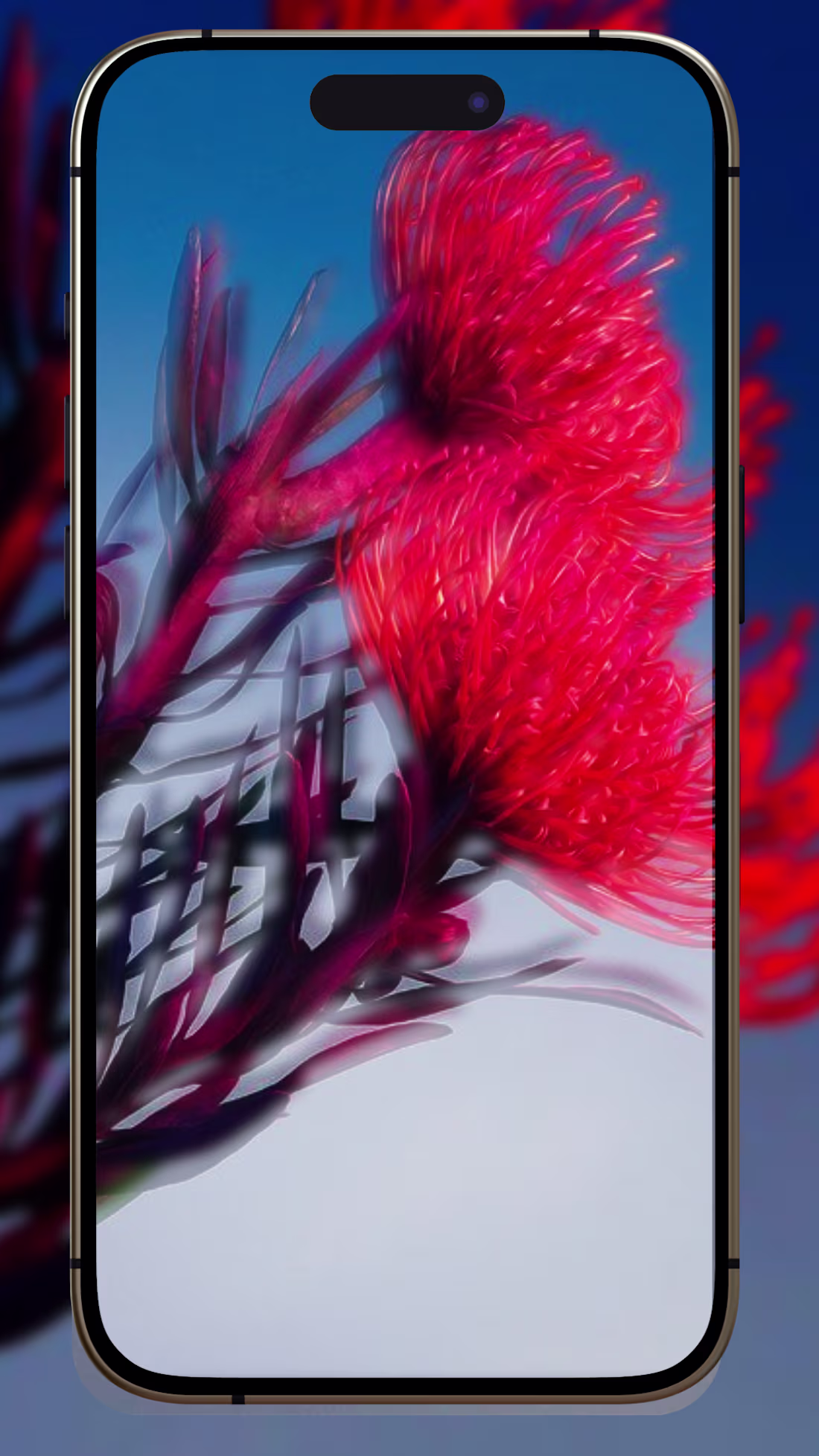
Color Mastery**
A Study into Color Palettes
Three bold, cohesive palettes designed for visual appeal
Fiery Reds: #E94E2F, #B22234, #5A7CA8, #F2F0EB
Warm Triad: #E94E2F, #F6C85F, #B89A7C, #5A7D3B, #D8C4A3, #2E2E2E
Sunset Clay: #D9381E, #8B1A2B, #4A6A89, #EDEAE6, #5C6F4F, #F4B942
📸 Design Precision
Images placed behind the iPhone frame for clean alignment and minimalist aesthetic
Enhanced contrast & refined midtones preserve petal texture
Highlights lifted to accent specular points—blues stay vibrant, not washed out
✨ Final Touches
Overlay effect with reduced opacity for depth
Subtle vignette + micro-sharpening for cinematic, high-res finish
Perfect blend of color, contrast, and composition—where every detail serves the vision.
#Design #ColorTheory #Minimalism #Photography #Aesthetic #BraveSearch #CreativeProcess
21
429
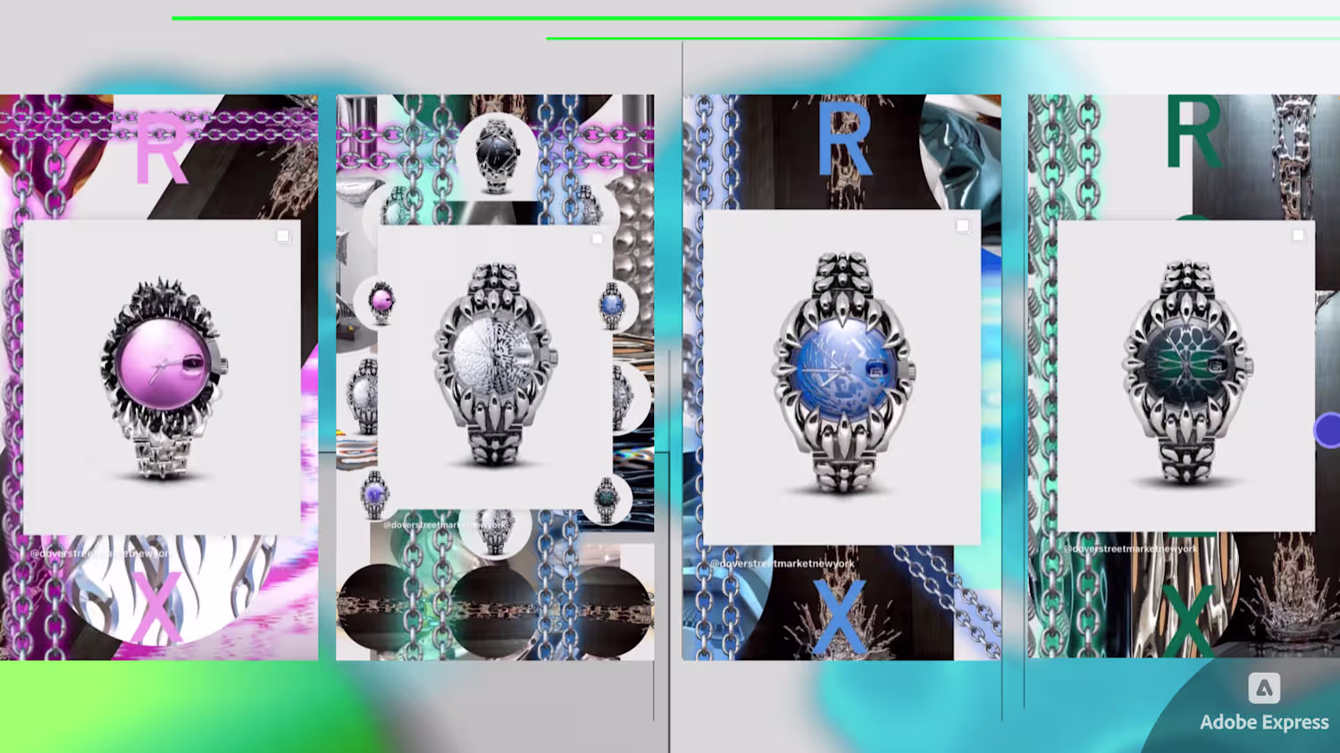
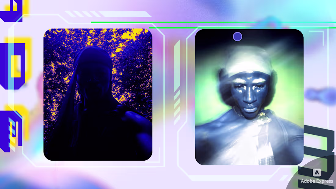
Templates that I made in Adobe EXPRESS !
0
104
Templates that I made in ADOBE EXPRESS : thoughts?
0
98
Campaign shoot generated with Adobe firefly
1
4
Promotional campaign for Skincare Brand Activation
1
2
Page Sample of creative portfolio made for design agency
1
3
Promotional Video for small clothing brand
1
4
Fashion Website Home page /Theme
1
2