
Jose Perez
UX for higher onboarding & checkout completion
Ready for work
Jose is ready for their next project!
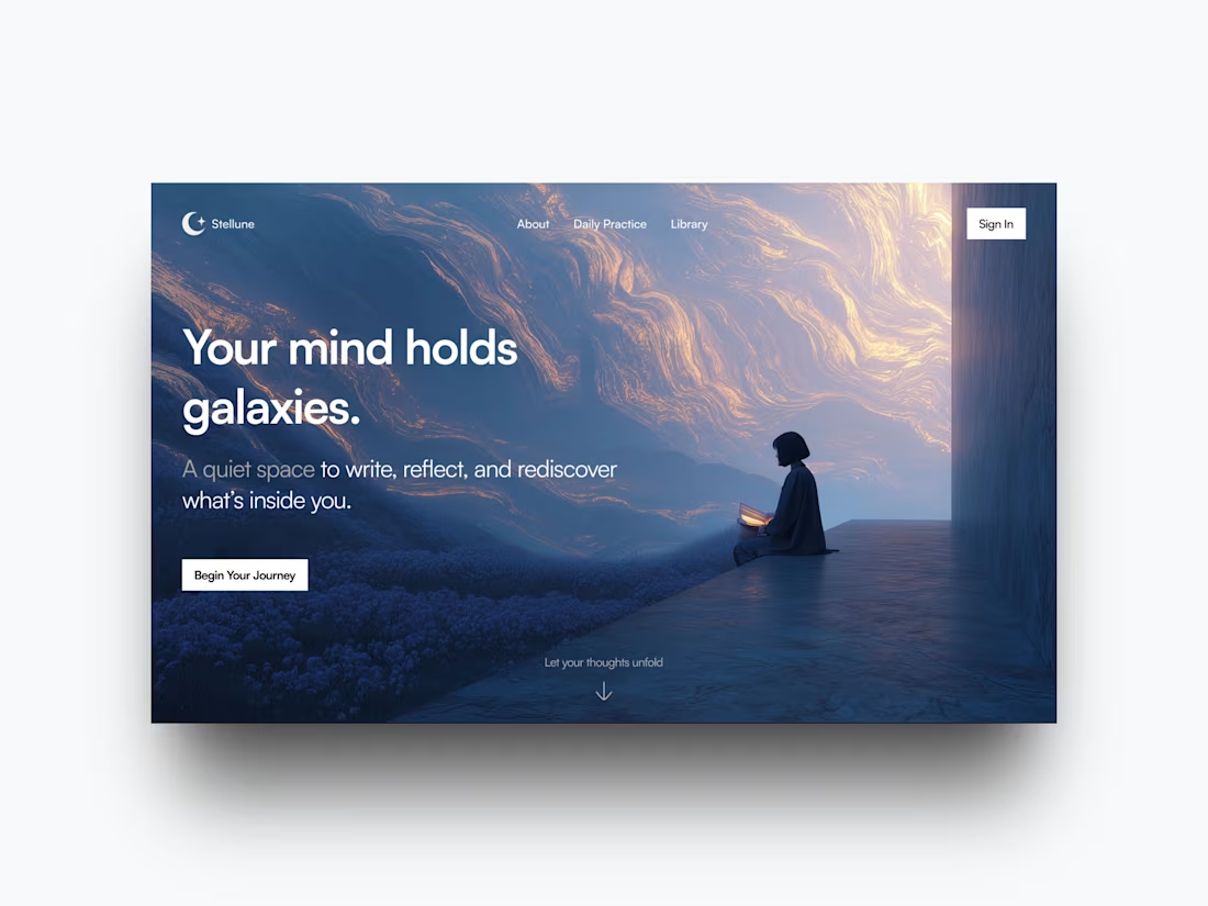
This hero section invites users into a moment of stillness, reflection, and space to reconnect with their best self.
The design focused on:
- Generous whitespace to reduce cognitive load
- Ambient visuals that tell a quiet story
- A friction-free experience anchored by a clear CTA
Great design doesn’t need to say much, it simply creates room for users to breathe, reflect, and return to themselves without judgment.
18
338
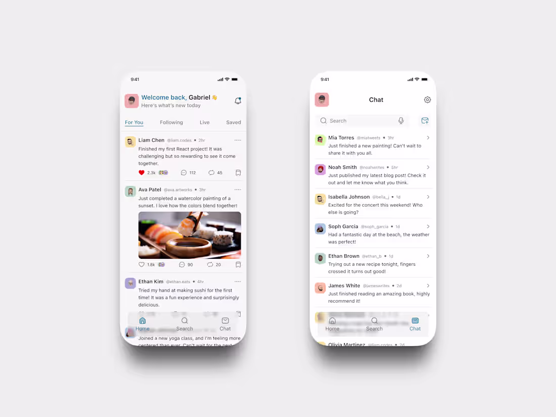
A friendly and frictionless feed experience that feels like home.
This concept reimagines social updates and lightweight conversations.
What I focused on:
• A warm welcome screen personalized for the user
• Clear content hierarchy with subtle social signals
• Soft shadows and pastel accents for visual comfort
• A lightweight chat tab to keep things flowing without feeling noisy
Ideal for early-stage platforms prioritizing community, casual sharing, and user joy over algorithmic clutter.
4
19
512
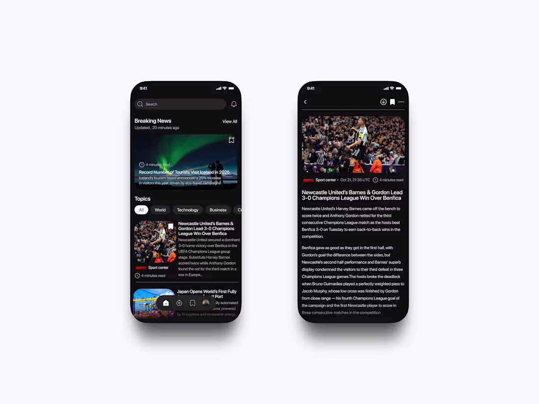
A clean news experience built for fast, interruption free reading.
This format offers an optimal quench of real-time updates and readability, especially for you dark mode folks.
What I achieved for you is:
• Bold headlines for hierarchy
• Scrollable topic filters for control
• Visuals that command your attention without being distracting
• A clean reading mode with generous margins
This UI could work for any content-heavy app that desires structure, clean visuals, and low cognitive cost of interaction.
2
23
524
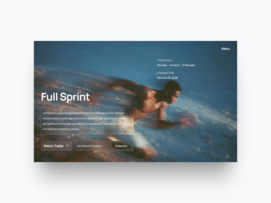
An elegant, cinematic page for a psychological sports film.
In this instance, I prioritized:
Visuals that are emotive and set the mood
A minimalist countdown component
Sharp and focused CTA hierarchy
An immersive hero section that draws you in immediately
This layout could easily be applied to any brand in entertainment, media, or the creative space that wanted to leave a mark immediately from the first scroll.
18
468
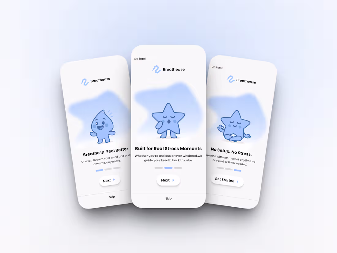
One of my favorite designs I did a while back, not because it was flashy, but because of what it stood for. I created this onboarding for stressed students and ADHD users who needed relief, fast.
My goal was simple : to make it so that no account is needed at the start, so the users could access a calming experience immediately without friction.
Once they pass onboarding, they're guided into a quick, simple breathing exercise. Only after that, the option to create an account.
It was about respecting the user's state of mind.
17
361
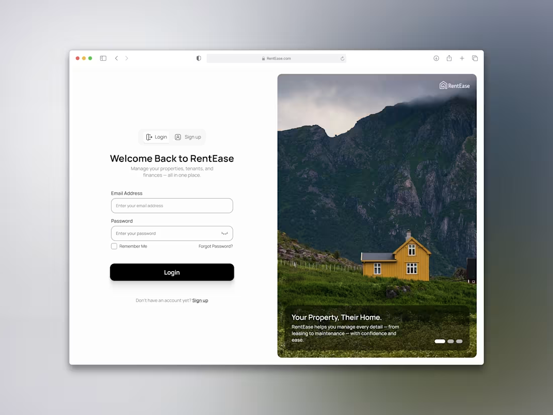
This was a fun one. I wanted to design a login screen that felt light, honest, and trustworthy without overdoing it.
The product helps property owners and managers handle everything in one place, so the goal here was to:
- Make the layout feel effortless
- Keep the tone clear, not corporate
7
16
378
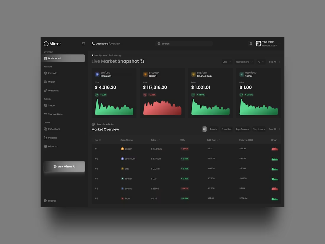
When working with live data, it’s tempting to overdesign. But good dashboards don’t scream, they guide
13
362
I designed the UX/UI for a job tracking platform focused on reducing stress and confusion in the hiring journey.
It’s built for people navigating ghosting, retaliation, and hidden pay with features designed to bring clarity and emotional support.
Design Priorities:
- A calm, mobile-first layout
- Easy-to-use flows for reporting job outcomes
- Friendly visual hierarchy with no clutter or overwhelm
2
4
263
I recently designed a dashboard for an AI assistant that helps users with thier daily productivity.
The goal was to create a layout that felt:
- Smart, but not robotic
- Friendly, but not childish
- Clean, but not boring
Key UX decisions included:
- Balanced visual hierarchy for clarity
- Thoughtful spacing and rhythm using icons & text
- Soft, trust-focused color system
2
22
355
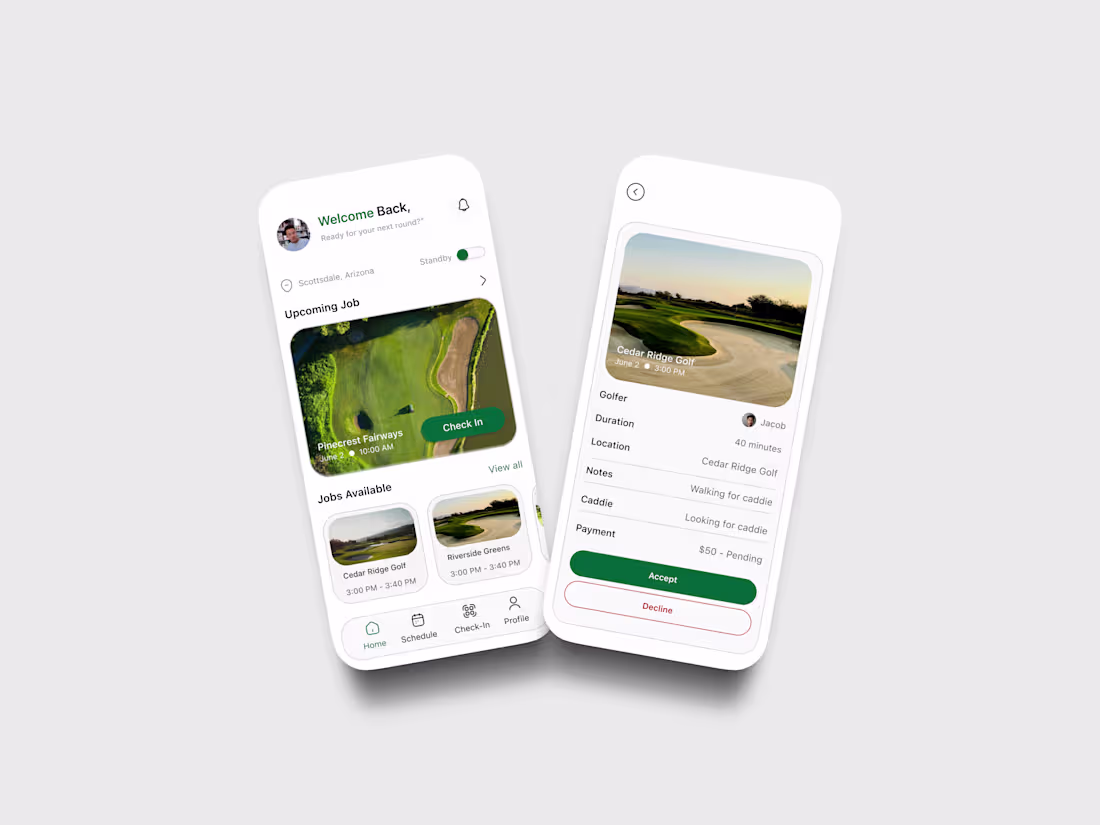
Schedflow – Smart Scheduling for Golf Club Caddies
1
9
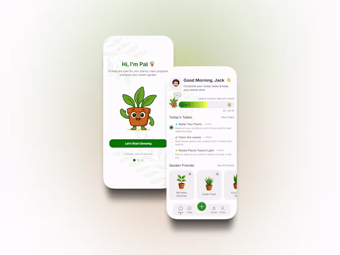
MyPal – A Friendly, Gamified Plant Care App
0
3
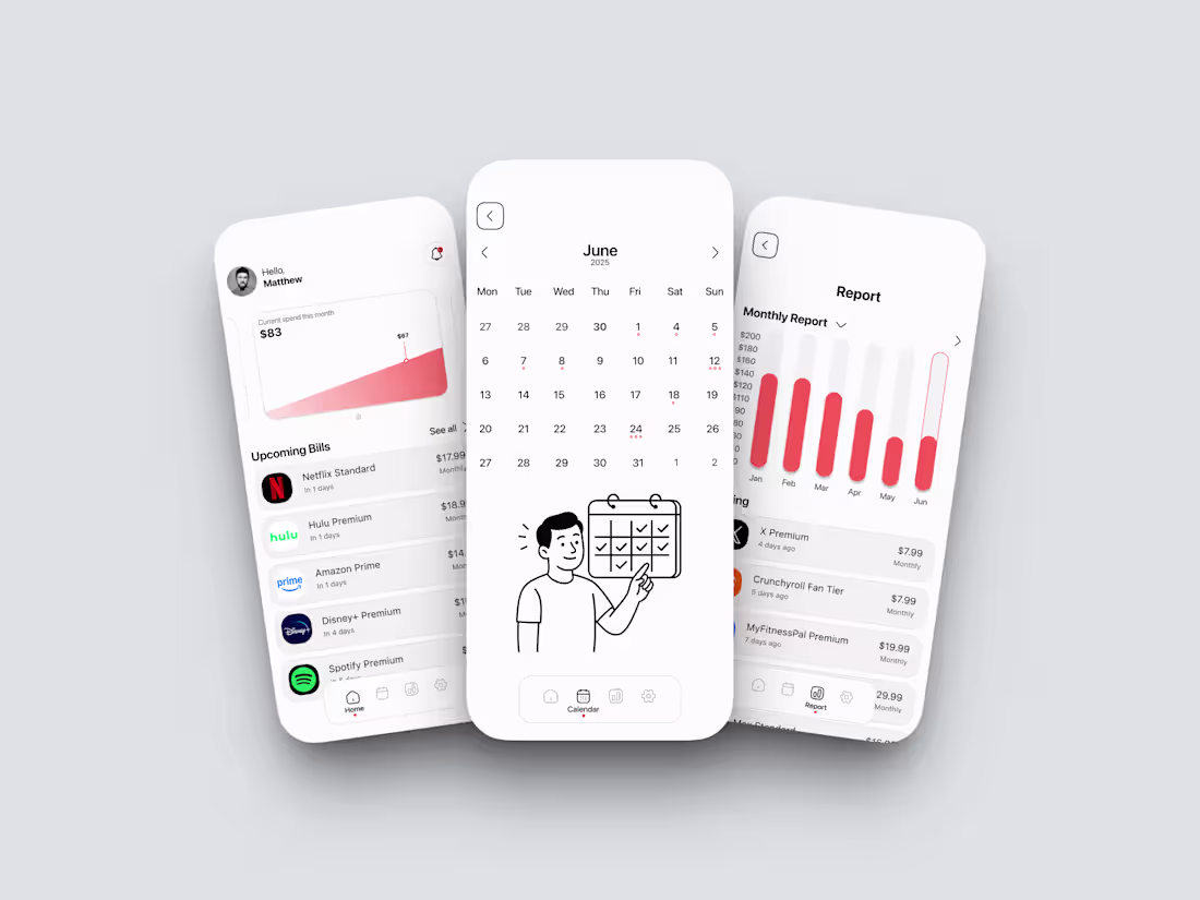
Billie – Subscription Management Made Simple
0
5