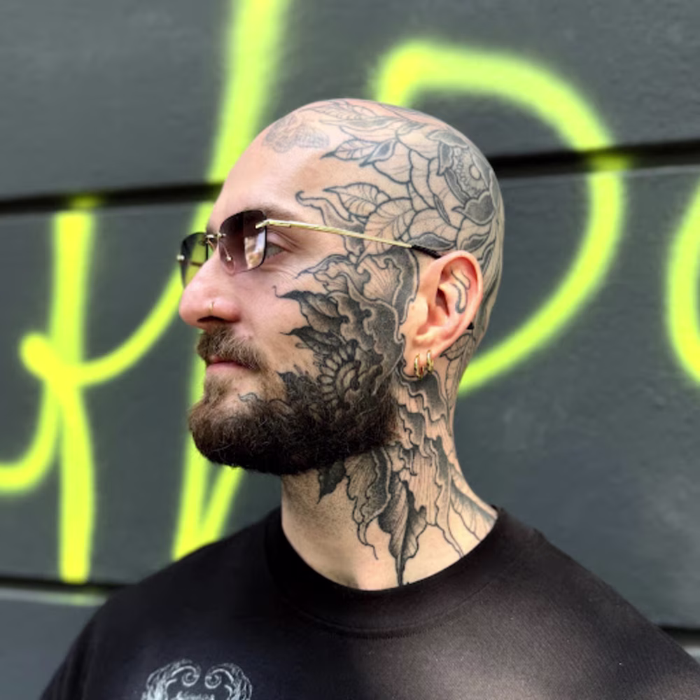
Jonathan de Kalbermatten
Multidisciplinary artist
New to Contra
Jonathan is ready for their next project!
In parallel, I also designed a series of promotional visuals created to announce my (tattoo) guest spots and international appearances as a tattoo artist. These communication materials were developed for social media, posters, and digital promotion, with the objective of creating a recognizable visual identity around each residency and collaboration with studios across different cities and countries.
1
11
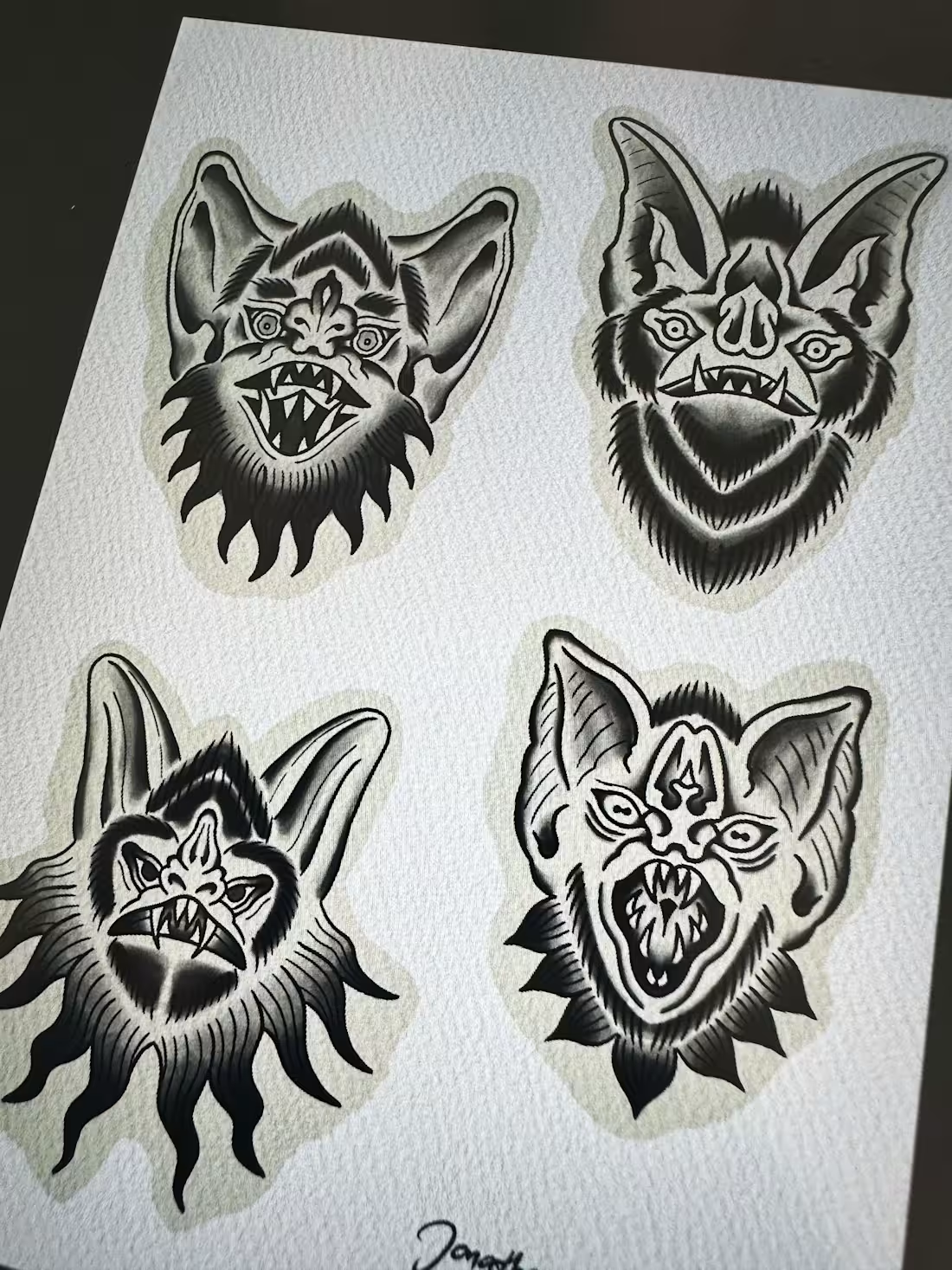
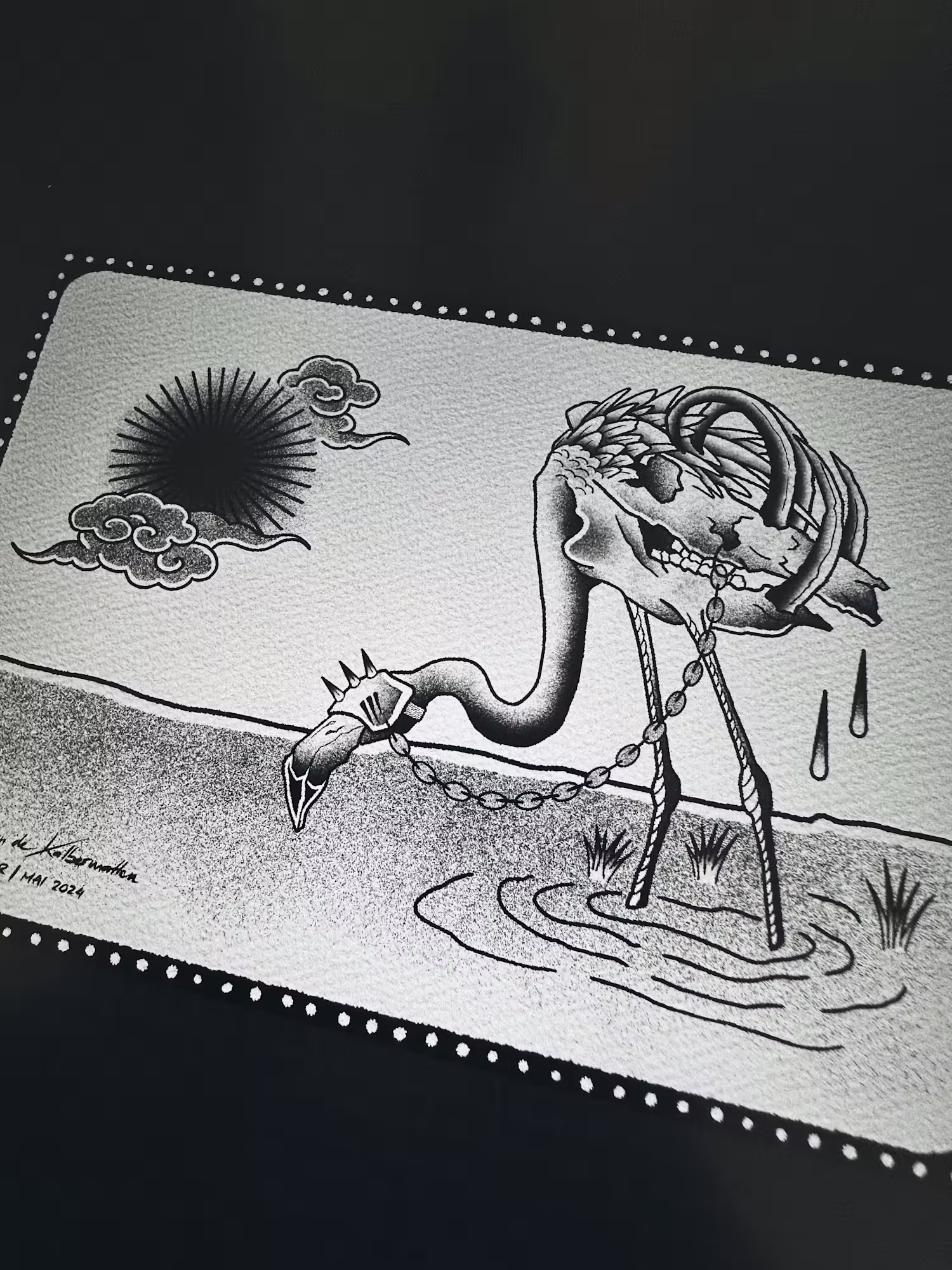
I created a series of illustrations as part of my work and ongoing practice as a tattoo artist. These artworks explored a wide range of visual influences, combining elements drawn from underground culture, contemporary illustration, traditional tattoo imagery, and graphic experimentation.
The illustrations were developed both as original tattoo concepts and as standalone visual pieces, allowing me to expand my artistic language beyond tattooing itself while maintaining a strong connection to the aesthetics and storytelling associated with tattoo culture.
1
15
While working at the Berliner creative agency The Beast, I was commissioned to design a collection of greeting cards for Christmas and New Year celebrations.
The project focused on creating visually distinctive and playful seasonal designs aligned with the agency’s creative identity. The cards were developed for both printed and digital distribution, combining graphic experimentation, typography, and festive visual elements while maintaining a clean and contemporary aesthetic.
1
19
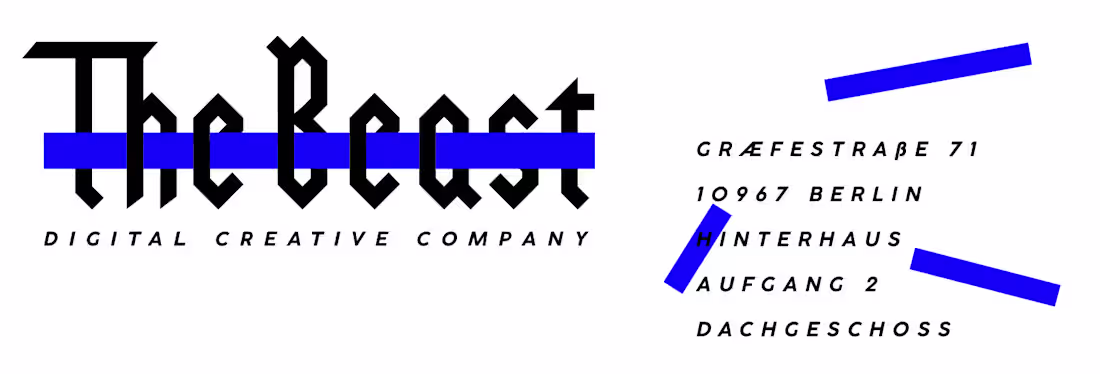
During my internship at the creative agency The Beast, I was tasked with revisiting and redesigning the agency’s logo and visual identity.
The project involved exploring multiple creative directions and developing a series of refined logo variations that modernized the brand’s image while preserving its strong and recognizable character. The final proposals focused on creating a more contemporary, adaptable, and visually cohesive identity suitable for both digital and print communication.
Additionally, while working at The Beast, I was commissioned to design a collection of greeting cards for Christmas and New Year celebrations.
The project focused on creating visually distinctive and playful seasonal designs aligned with the agency’s creative identity. The cards were developed for both printed and digital distribution, combining graphic experimentation, typography, and festive visual elements while maintaining a clean and contemporary aesthetic.
1
22
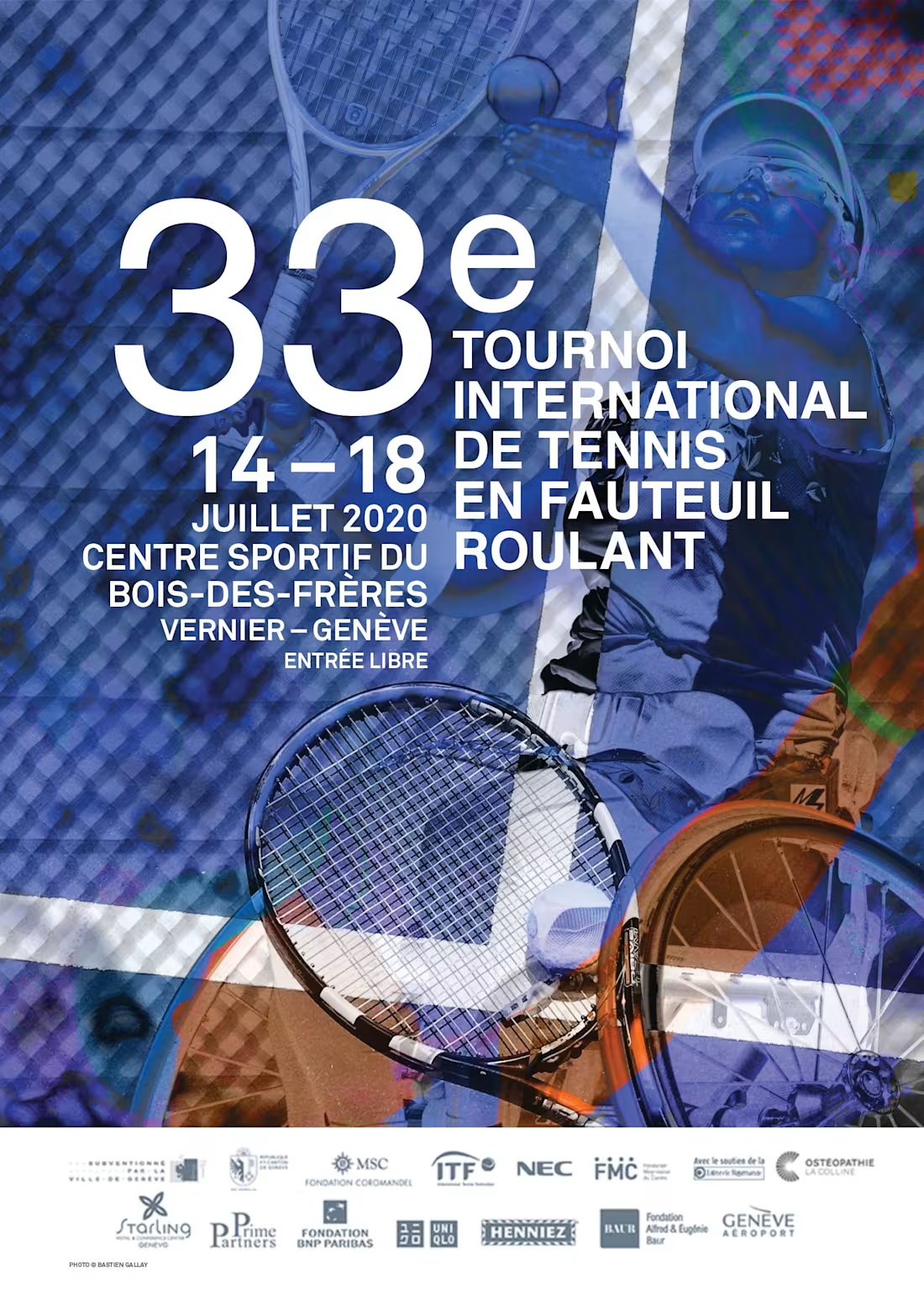
I was commissioned by the Swiss Open to design the official poster for the International Wheelchair Tennis Tournament, creating the key visual identity for the event’s 33rd edition.
The project focused on developing a dynamic and impactful poster that could reflect both the competitive intensity of wheelchair tennis and the prestige of an international sporting event. The visual direction combined strong graphic composition with clear communication elements, ensuring the artwork could effectively function across promotional materials, print formats, and event-related communication.
1
22
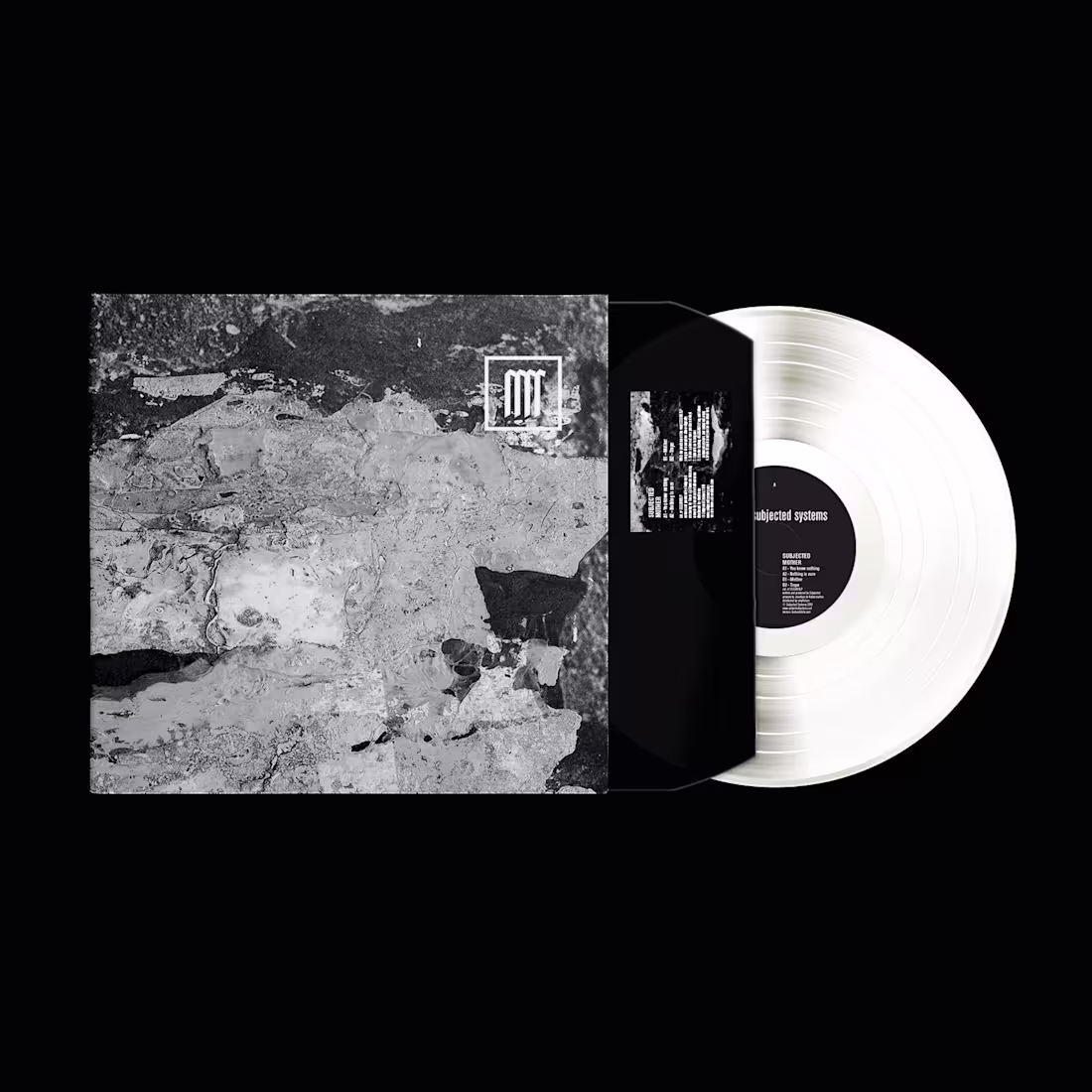
I designed the logo and platinum cover artwork for Subjected as part of the visual development surrounding his LP "Mother".
The project focused on creating a strong and distinctive visual identity aligned with Subjected’s approach to techno music. The artwork was developed to reflect the emotional intensity and sonic atmosphere of the release while maintaining a refined and contemporary graphic aesthetic suitable for both physical and digital formats.
1
26
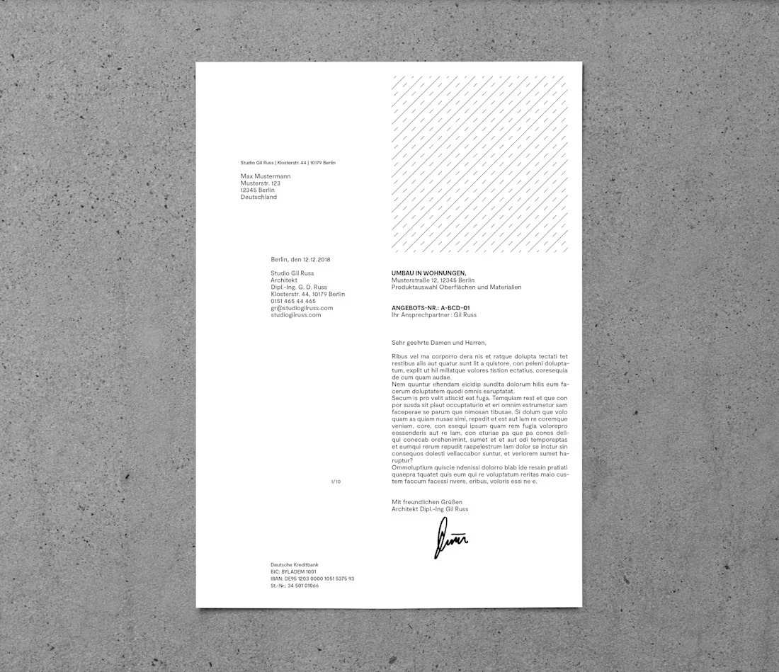
In addition to developing the corporate identity for Studio Gil Russ, I was also commissioned to create an advertising campaign for publication in a magazine promoting the studio’s architectural work and services.
The project involved designing multiple visual concepts and layout variations, exploring different approaches to communicate the studio’s identity in a clear, contemporary, and visually impactful way. The objective was to create a refined editorial advertisement aligned with the studio’s architectural philosophy while ensuring strong readability and visual presence within the magazine format.
1
29
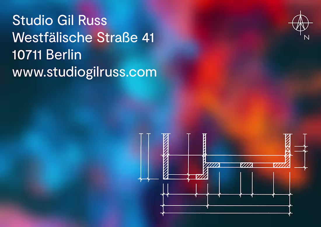
I was commissioned by Studio Gil Russ to develop the complete corporate identity for the architect studio.
The project included the creation of the logo, business cards, visual identity system, and the overall graphic direction applied across professional communication materials such as stationery, letterheads, corporate documents, and printed layouts.
The objective was to establish a clean, timeless, and professional identity reflecting the architectural approach of the studio while ensuring consistency and clarity across all branding and administrative materials.
1
33
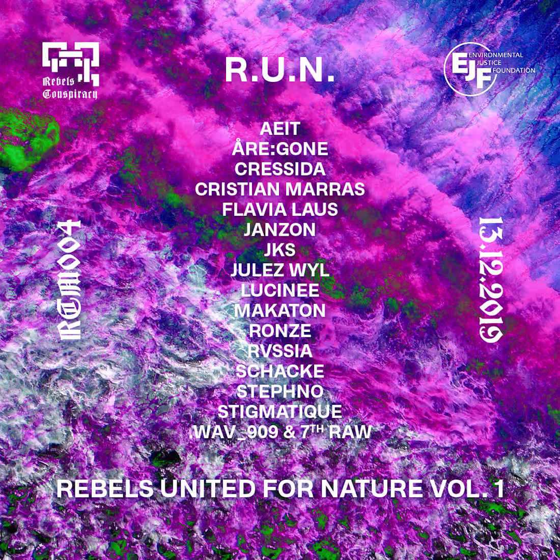
I was commissioned by Rebels Conspiracy to create the cover artwork for R.U.N. — Rebels United, Volume 1, a collaborative project developed in partnership with the Environmental Justice Foundation.
The release was created as a fundraising initiative supporting environmental protection and awareness efforts. The visual direction aimed to reflect both the activist dimension of the project and the collective energy behind the release, combining contemporary electronic music aesthetics with themes connected to environmental responsibility and social engagement.
The artwork was designed to function across digital platforms and promotional material while giving the release a strong and recognizable identity aligned with the message and purpose of the collaboration.
1
35
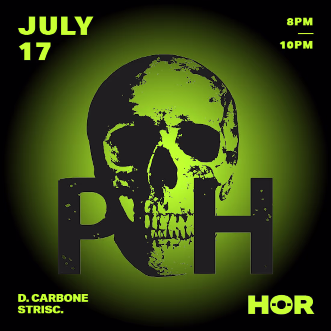
I created a series of visual assets for Pure Hate in preparation for their showcase appearance at HÖR Berlin.
The project focused on developing visuals that reflected the raw, intense, and contemporary aesthetic associated with both the collective and Berlin’s underground techno scene. The designs were created to support the showcase’s online presence and visual communication, reinforcing the atmosphere and identity of the event across digital platforms and promotional content.
The objective was to create a strong and recognizable visual language aligned with the energy of the performances while maintaining coherence with the visual culture surrounding HÖR and contemporary underground electronic music.
1
35
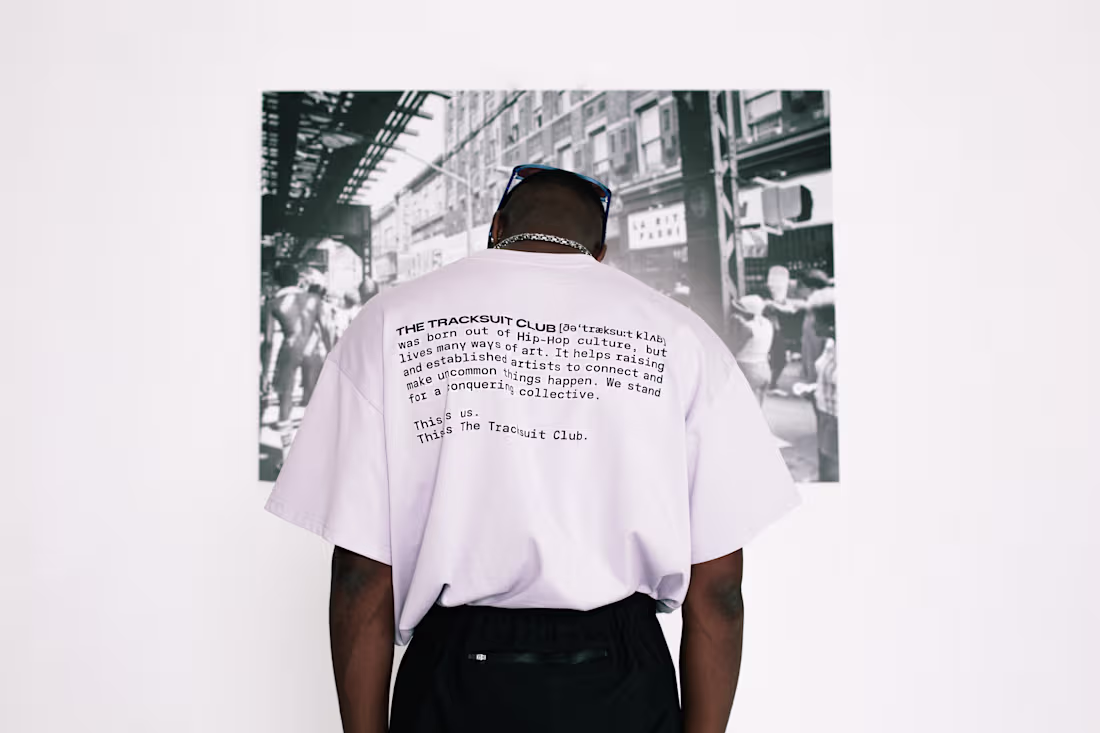
I was responsible for the complete artistic direction, corporate design, and visual identity for The Tracksuit Club, initially launched as a tracksuit-focused label before evolving into a broader streetwear brand based in Berlin.
My work included the creation of the logo, branding system, graphic assets, visuals for the tracksuits, and the overall creative direction surrounding the brand’s image and communication. A key aspect of the project was highlighting the brand’s sustainable approach, as all garments were produced using recycled PET bottles.
I also contributed to the creative direction of the first collection’s photoshoot, produced in Berlin and photographed by Johanna Berghorn. The campaign featured rapper Symba alongside top model Kasia Lenhardt, helping establish a strong visual identity positioned between contemporary streetwear, Berlin club culture, and sustainable fashion.
1
38
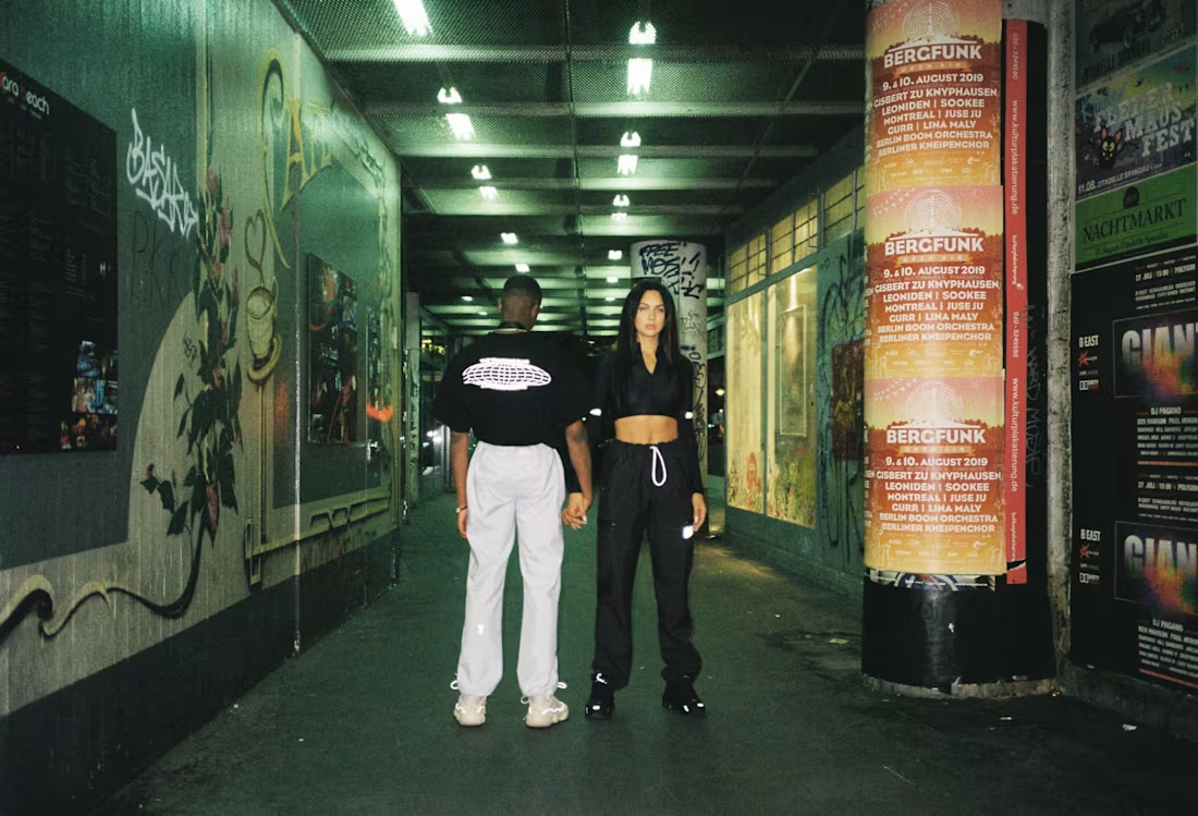
The first collection developed for The Tracksuit Club was conceptually inspired by the 1977 New York City blackout, a historical event that became closely associated with the rise of underground urban culture and the raw social energy of the city at the time. During the blackout, the temporary collapse of surveillance and security systems led crowds from the outer boroughs and suburbs into the city center, where widespread looting and unrest unfolded.
The visual direction of the collection explored themes of rebellion, chaos, nightlife, and street culture through graphics integrated directly onto the garments as well as through the broader promotional campaign. The objective was to reinterpret this iconic moment in New York history within a contemporary streetwear aesthetic.
To accompany the launch of the collection, two separate photo shoots were organized in Berlin, both photographed by Johanna Berghorn. The first shoot took place in a controlled studio environment, focusing on the graphic details and silhouettes of the garments, while the second was produced outdoors at Kottbusser Tor in the Kreuzberg district — one of Berlin’s most emblematic urban locations — reinforcing the project’s connection to street culture and metropolitan nightlife.
1
40
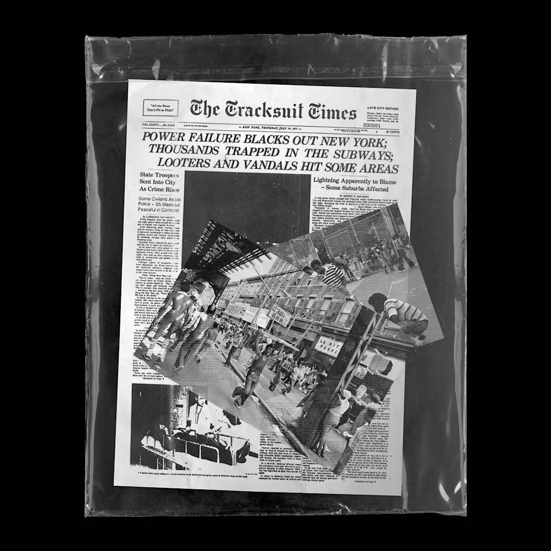
For The Tracksuit Club, I developed a series of visual assets and graphic designs created for promotional campaigns as well as for direct integration onto the garments themselves.
The creative direction for the first collection was inspired by the 1977 New York City blackout, a moment that became deeply connected to the emergence of underground urban culture and the social dynamics surrounding the city at the time. During the blackout, large groups from the outer boroughs and suburbs entered the city center and looted stores while the absence of electricity disabled surveillance systems and cameras.
The collection visually referenced this historical moment through graphics and promotional visuals that explored themes of rebellion, street culture, chaos, and the raw energy of late-1970s New York. The objective was to translate this atmosphere into a contemporary streetwear aesthetic while maintaining a strong and recognizable visual identity across both clothing and campaign materials.
1
46
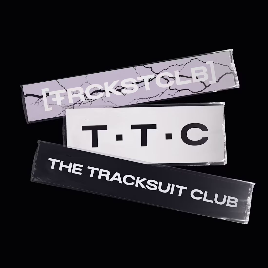
As part of my work for The Tracksuit Club, I designed a dedicated collection of stickers developed to extend the brand’s visual identity beyond clothing into everyday urban culture.
The sticker series drew inspiration from Berlin’s underground street aesthetics and contemporary graphic design, combining bold typography, symbolic elements, and playful visual references connected to the brand’s identity. The objective was to create collectible graphic pieces that could organically circulate through clubs, public spaces, laptops, and street environments, reinforcing the brand’s presence within Berlin’s creative and nightlife communities.
1
46
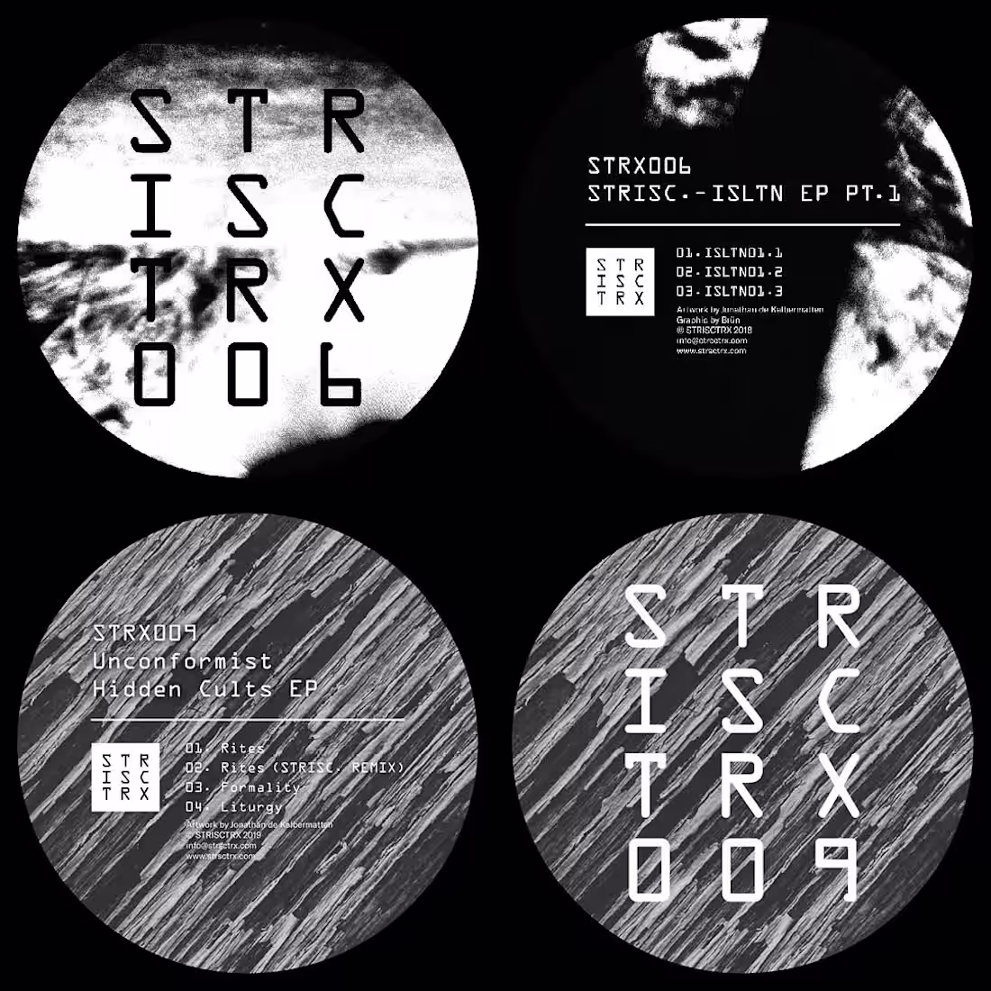
I developed the complete artistic direction, logo design, and vinyl cover artworks for STRISC and his label STRISCTRX.
The project focused on building a cohesive and recognizable visual identity aligned with the producer’s sonic universe and the label’s contemporary techno aesthetic. Alongside the creation of the main logo and branding elements, I designed multiple visuals and vinyl release covers intended for both physical and digital formats.
The artistic direction emphasized a strong, minimalist, and impactful graphic language that could consistently represent the label across releases, promotional materials, and online communication platforms.
1
54
I created the visual identity and logo design for Sløth, a bass music producer whose artistic universe blended influences from electronic music and heavy music culture.
The project was developed during a period when the aesthetics of metal and electronic music were increasingly intersecting, which strongly influenced the creative direction of the branding. The objective was to design a logo that felt powerful, recognizable, and inspired by the visual codes commonly associated with underground music scenes.
In addition to the main logo, I also developed a secondary graphic pattern based on elements of a sloth’s head anatomy, creating an extended visual language that could be adapted across merchandise, promotional visuals, and digital communication assets.
1
57
During my work with seen.by (http://seen.by), a platform dedicated to selling original artworks from various artists, I was given significant creative freedom to develop graphic concepts inspired by contemporary music and pop culture.
Among the projects I created were a triple portrait artwork of Kanye West and a poster inspired by Candy Shop by 50 Cent.
The overall intention behind these works was to explore the visual language of hip-hop culture through highly creative and experimental graphic design approaches, combining strong visual composition, typography, and contemporary aesthetics to reinterpret iconic figures and references from the genre.
1
60
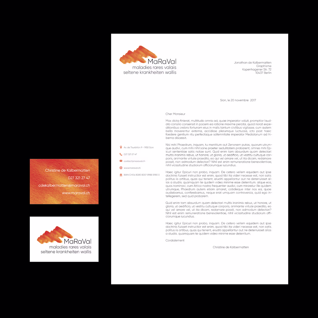
I have been involved with MaRaVal since its beginnings, contributing to the development of its entire visual identity and communication strategy. Based in Valais, Switzerland, the association supports families whose children are affected by rare diseases and works to raise awareness, provide assistance, and create community support initiatives.
My role focused on the project’s artistic direction and corporate identity, including the creation of the logo, branding guidelines, flyers, business cards, posters, and a wide range of communication materials for events and campaigns developed throughout the years.
The objective was to build a visual identity that felt professional, approachable, and emotionally sensitive while helping strengthen the association’s visibility and long-term presence within the local community.
1
56
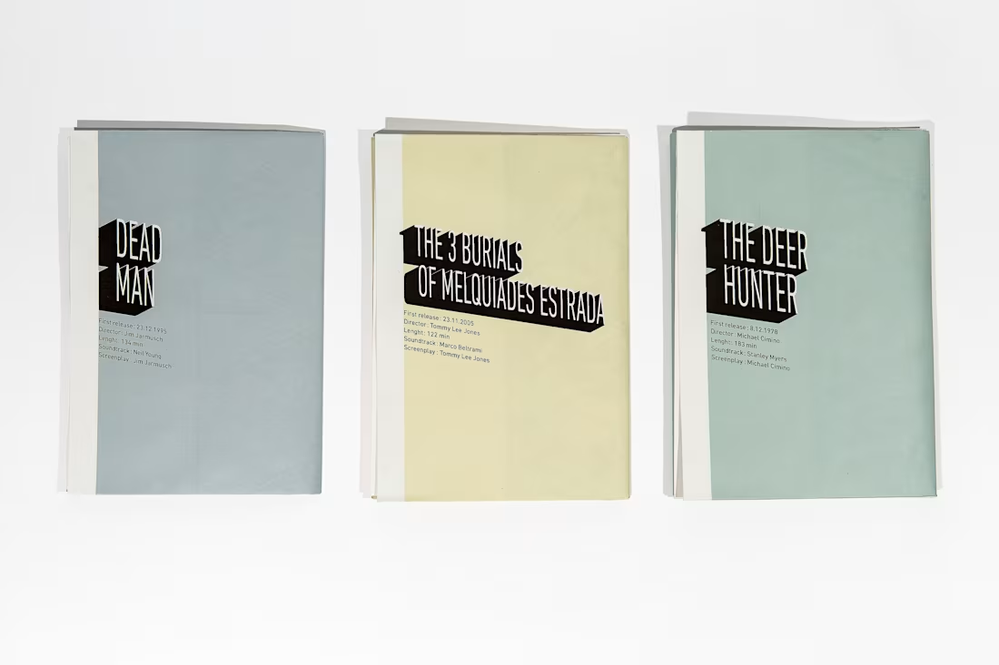
Initiation was a study project focused on designing a conceptual packaging system for a trilogy of films: The Three Burials of Melquiades Estrada, Dead Man, and The Deer Hunter.
The objective of the project was to rethink traditional DVD packaging by combining editorial design, collectible objects, and film poster aesthetics into a single format. The concept merged informative cinematic posters featuring key scenes, visual references, and contextual information about each film, while also functioning as practical physical media packaging.
Each design was developed as a foldable poster structure with the disc fixed at the center, allowing the object to transform from protective packaging into a large-format collectible poster. The project explored the relationship between storytelling, graphic design, and physical interaction, while emphasizing strong visual composition and cinematic atmosphere.
1
47
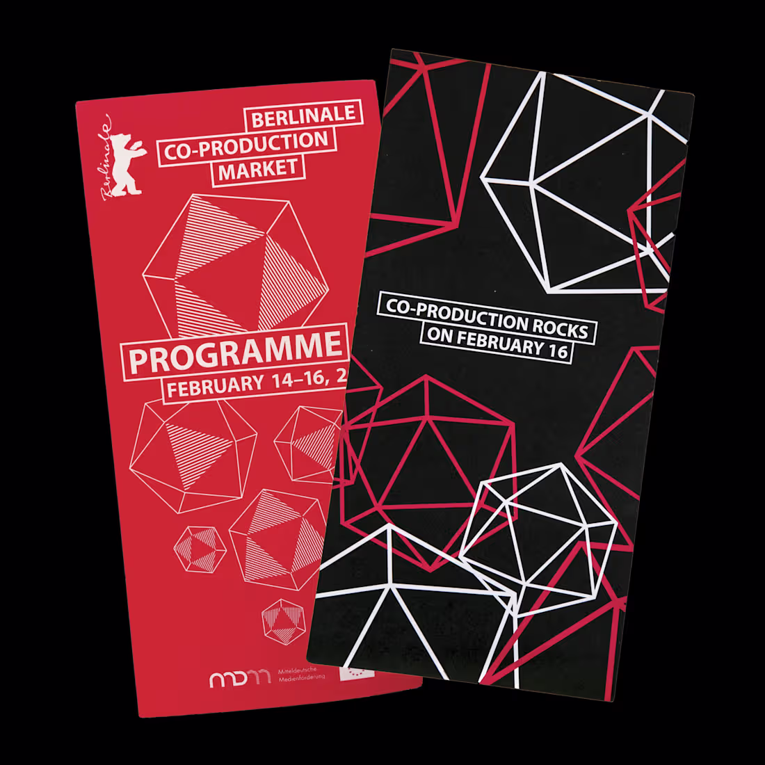
During my first professional internship at the Berlin-based agency Panatom, I had the opportunity to work on communication materials for Berlin International Film Festival (Berlinale), one of the world’s most renowned film festivals.
My work included the design of flyers and printed booklets produced for the festival. Being involved in such a large-scale and internationally recognized cultural project at the very beginning of my career was both a formative experience and a significant honor. It allowed me to gain early experience working within a professional creative environment on high-level editorial and event-related design projects.
1
42
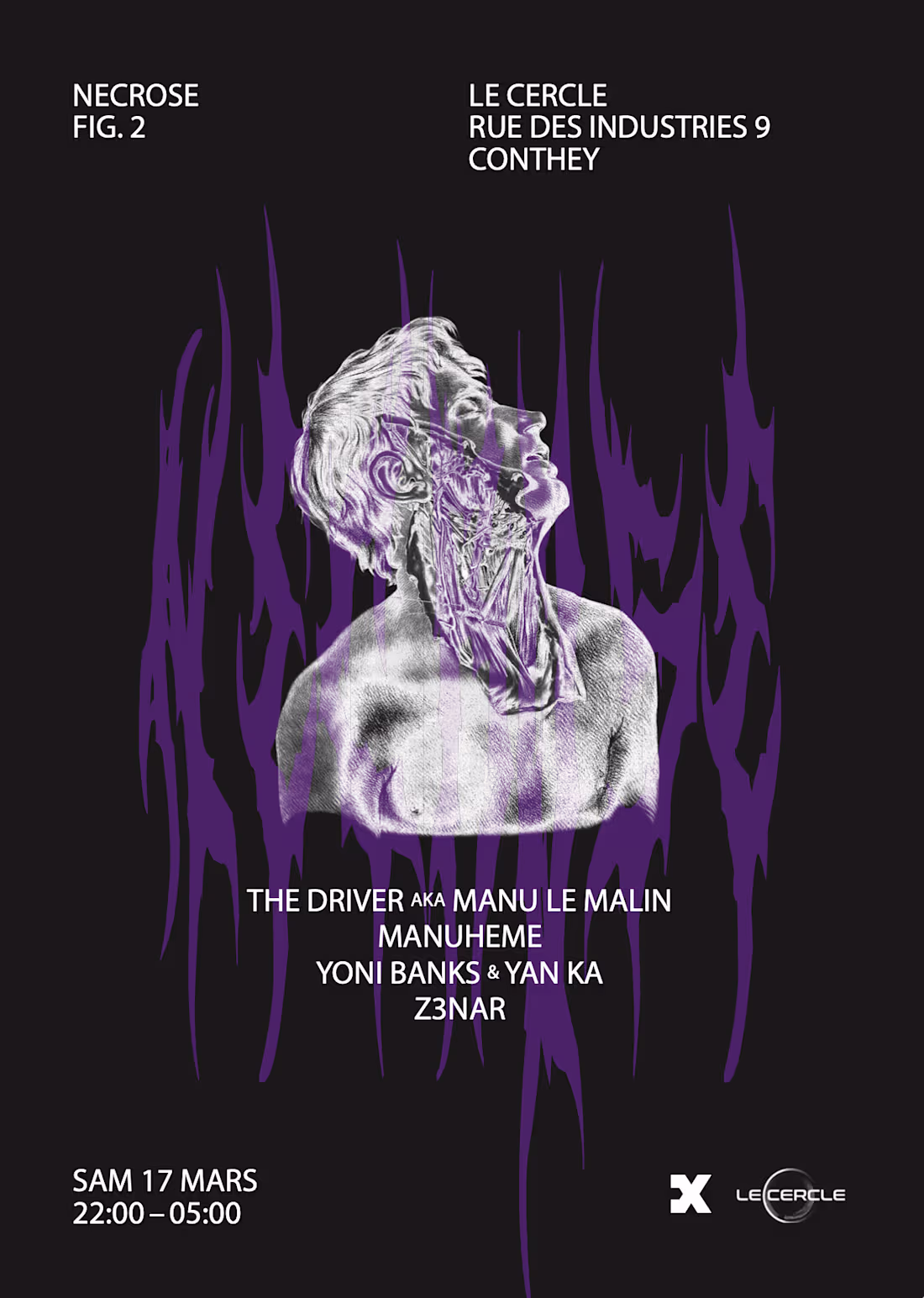
I was commissioned by a Switzerland-based promoter and DJ to create the visual identity and artworks for a series of events called Nécrose, focused on industrial and experimental techno music.
The artistic direction of the project aimed to reflect a more dissected, cerebral, and uncompromising vision of electronic music; something sharper and more concept-driven than the mainstream techno aesthetics that were common at the time. Through the visual work, the goal was to translate the raw intensity and mechanical atmosphere of the music into a distinct graphic language.
The project stood out for its forward-thinking approach, as the concept and musical direction anticipated many of the darker and more industrial trends that would later become prominent within the contemporary rave and electronic music scene.
1
46

La Flemme was a creative side project developed with a group of friends around our shared passion for discovering and sharing music. The concept originated from the fact that people would constantly come to us for new tracks and recommendations, which led us to create curated playlists and a visual identity around the project.
The name “La Flemme” — a French expression referring to the feeling of being too lazy to do something — brought a playful and self-aware tone to the concept. I was responsible for designing the logo and visual assets, including the project’s recognizable bucket hat-inspired identity, which became a central visual element of the branding.
The project combined music curation with graphic design, creating an online platform where we regularly shared our favorite tracks, visual content, and influences with our community and friends.
1
46
I designed the cover artwork for All the Things She Said remix by Introversion. The project originally started as a joke during a conversation, before quickly turning into an actual release concept.
Following the discussion, Introversion asked me to create the artwork for the remix, and I enthusiastically took charge of the visual direction. The objective was to reinterpret the iconic imagery surrounding the original track through a darker and more contemporary techno aesthetic, while maintaining a strong visual connection to the emotional intensity and recognizability of the original song.
1
46
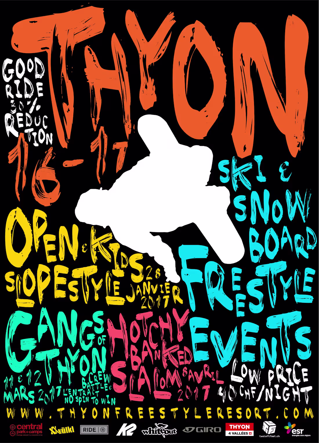
I worked over several consecutive winter seasons with Central Camps, a collective organizing freestyle ski events at the Thyon snowpark in the Swiss Alps, located in Valais.
For the project, I designed promotional posters and visual communication assets for multiple events, developing graphics that reflected the energetic and youth-driven atmosphere of freestyle snow culture. The events were sponsored by Red Bull, which added an international action sports dimension to the visual direction and overall branding of the campaigns.
1
45
I was commissioned by Casey Spooner, pop artist and activist, to design a series of posters for his 2020 presidential campaign in the United States.
The project focused on translating Casey Spooner’s provocative artistic universe and political messaging into bold visual communication pieces. The designs combined elements of contemporary pop culture, activism, and campaign aesthetics, creating visuals intended to challenge traditional political imagery while maintaining a strong graphic impact across print and digital formats.
1
45
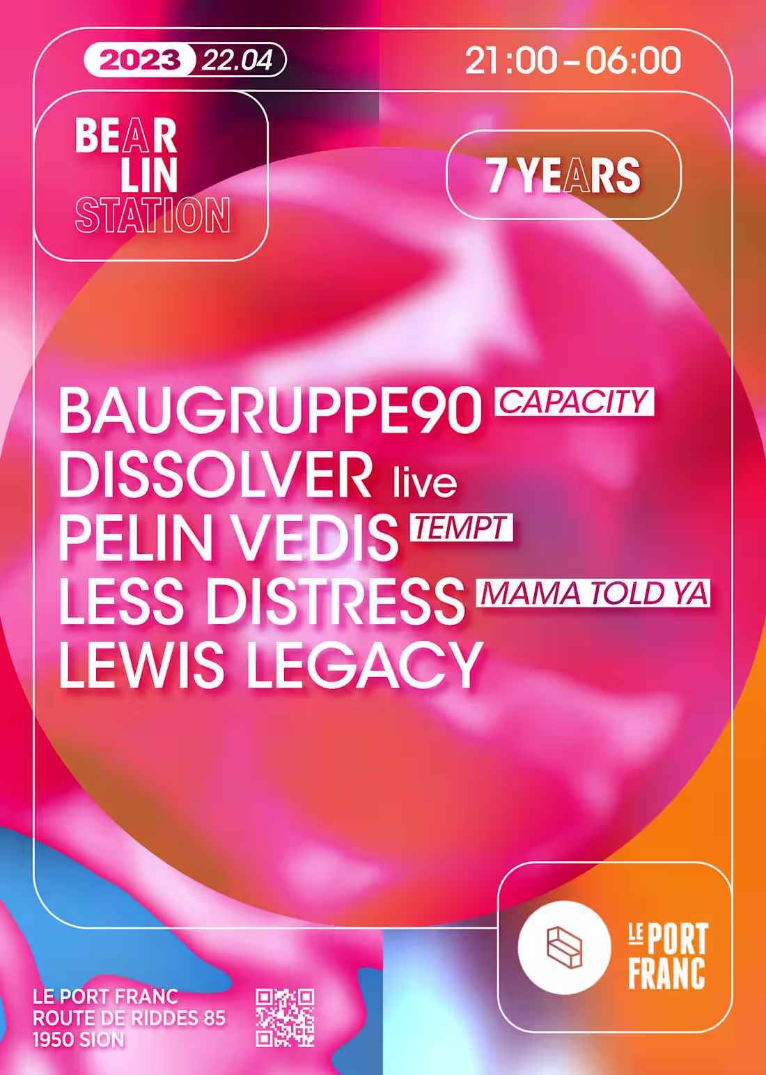
I co-founded Bear’lin Station in 2015, a techno collective based between Berlin and Switzerland. What initially started as a group of friends organizing underground events quickly evolved into an internationally active collective and event platform.
The project began in the Swiss Alps, with the concept of transforming a local mountain resort club into an authentic Berlin-style techno experience, both musically and visually. As the collective grew, we organized events across multiple cities including Lausanne (CH), Geneva (CH), Brno (CZ), Poznań (PL), and Berlin (DE), developing a strong identity within the European underground electronic music scene.
My role within the collective covered artist management, booking coordination, and overall art direction. I was responsible for designing event posters, social media campaigns, merchandise, and the broader visual identity surrounding the events and the collective itself. The goal was to create a cohesive aesthetic that reflected the raw and immersive atmosphere of the events while building a recognizable brand across different countries and audiences.
I remained actively involved in the project from its foundation in 2015 until 2019, when I left the collective to focus on new creative and professional ventures.
1
45
I created the logo and visual identity for Bad Medic Records, a record label founded by Nika D from Virus Syndicate and launched in March 2023. The label is dedicated to Rap & Bass music, with a strong focus on the underground UK scene and its raw, high-energy aesthetic.
The objective of the project was to develop a bold and recognizable identity that could visually represent the fusion of underground rap culture and heavy bass-driven electronic music. The logo was designed to feel impactful, aggressive, and contemporary while remaining versatile enough to be used across digital releases, merchandise, promotional assets, and social media platforms.
1
46

I was commissioned to create the visual identity and logo design for Advance The Dance, an artist logistics and management company operating within the electronic music industry. Launched in 2024, the company required a strong and professional visual identity that could reflect both the fast-paced nature of international artist logistics and the contemporary aesthetic of the electronic music scene.
The creative direction aimed to merge a refined, sophisticated aesthetic with the energy and atmosphere of club culture, reflecting the personality and vision behind the brand. Inspired by Sonja’s elegant and sophisticated image, the identity was designed to bring a sense of chic minimalism into the electronic music world while remaining modern, recognizable, and adaptable across multiple communication platforms.
1
44
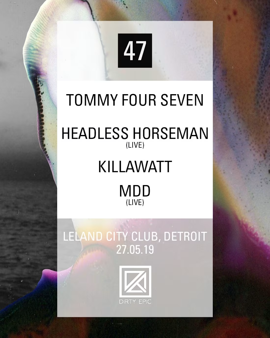
47 is the record label founded by techno DJ & producer Tommy Four Seven, for which I worked extensively on visual direction and graphic design. My work included creating artworks and layouts for label releases, showcases, and live events, ensuring a strong and cohesive visual identity across both digital and print formats.
The creative process was highly collaborative, involving close work with other visual artists and photographers to develop collages, layouts, and mixed-media compositions. The projects covered a wide range of formats, from vinyl covers and release artwork to promotional material for social media platforms such as Facebook and Instagram. Together, we created visuals that reflected the label’s raw, experimental, and forward-thinking aesthetic while reinforcing its presence within the international electronic music scene.
1
40