that uiguy
Product designer crafting intuitive digital experiences
Ready for work
that is ready for their next project!


Saw this concept on X and decided to give it my own spin. 👀✨
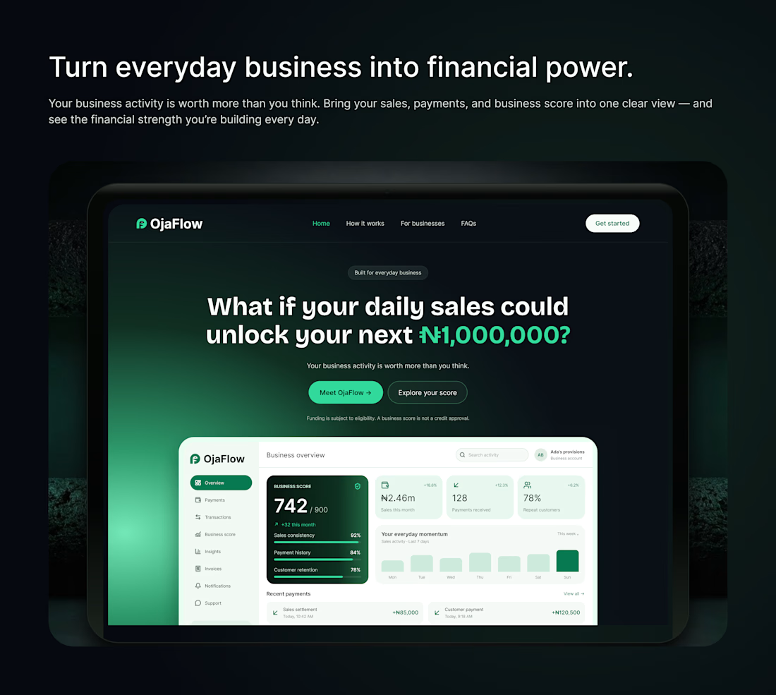
I chose it to explore how better visual hierarchy, cleaner layouts, and a stronger product showcase can make a fintech landing page feel more premium and intuitive.
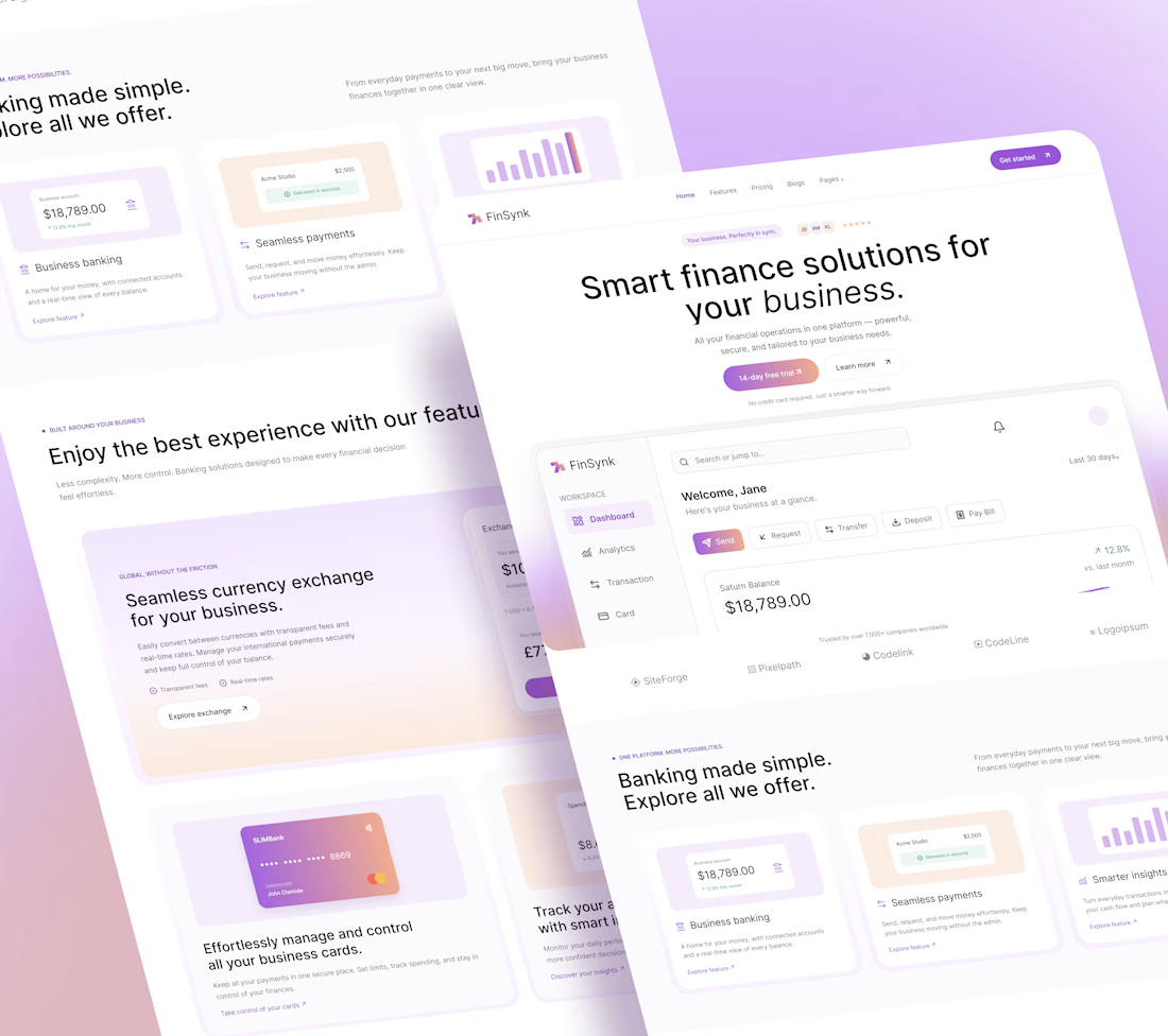
Inspired by the original work by [@emonuxui]. What do you think of my take? 🔥

Not everything needs to shout to make an impression. ✨
Subtle motion. Smooth transitions. Thoughtful details. A clean interface designed to make business finance feel effortless.
Meet OjaFlow 💚 where thoughtful design meets financial clarity.
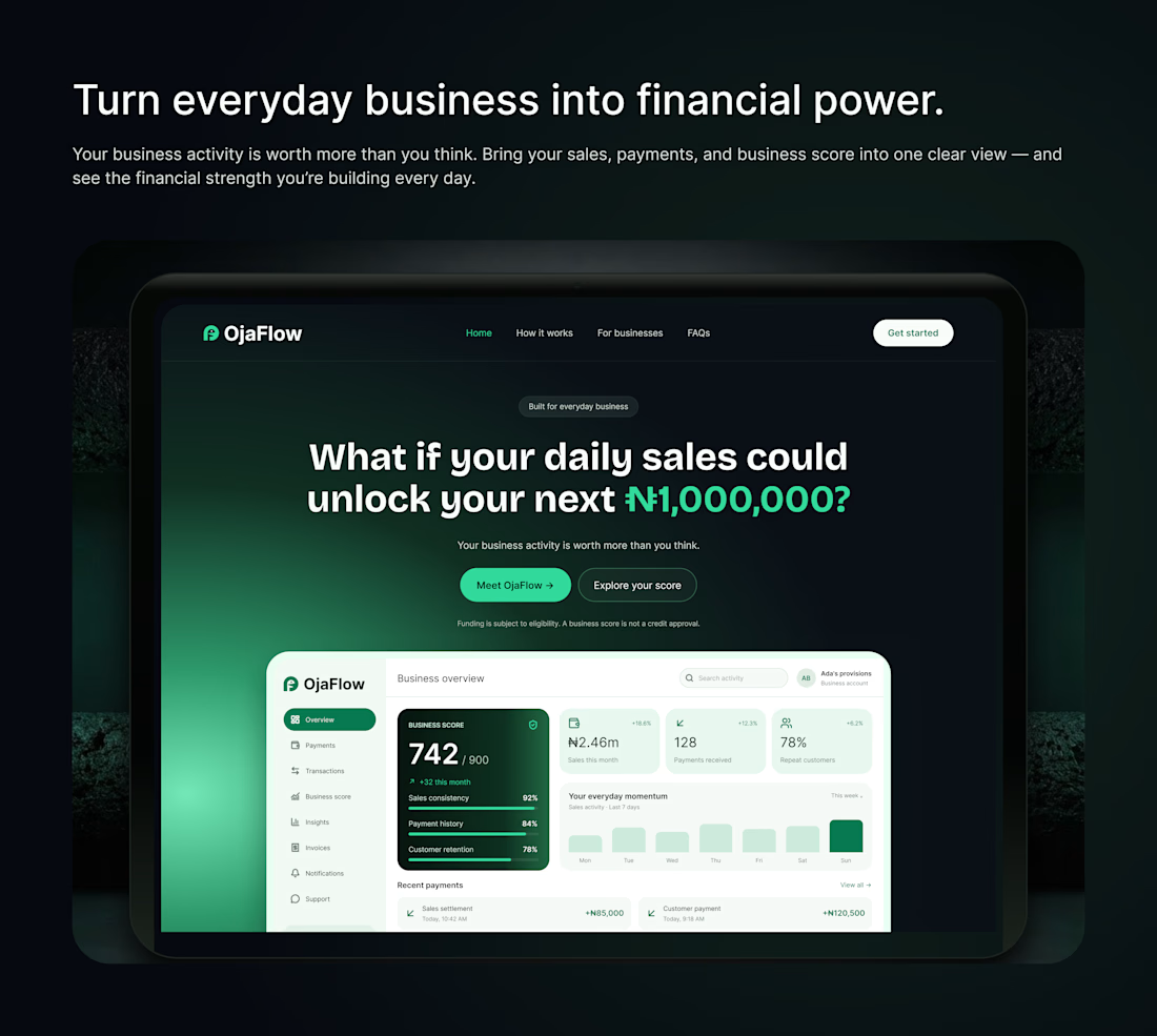
Not everything needs to shout to make an impression. ✨
Subtle motion. Smooth transitions. Thoughtful details. A clean interface designed to make business finance feel effortless.
Meet OjaFlow 💚 where thoughtful design meets financial clarity.
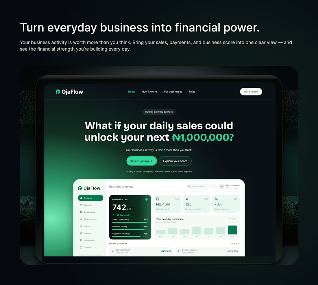
Not everything needs to shout to make an impression. ✨
Subtle motion. Smooth transitions. Thoughtful details. A clean interface designed to make business finance feel effortless.
Meet OjaFlow 💚 where thoughtful design meets financial clarity.
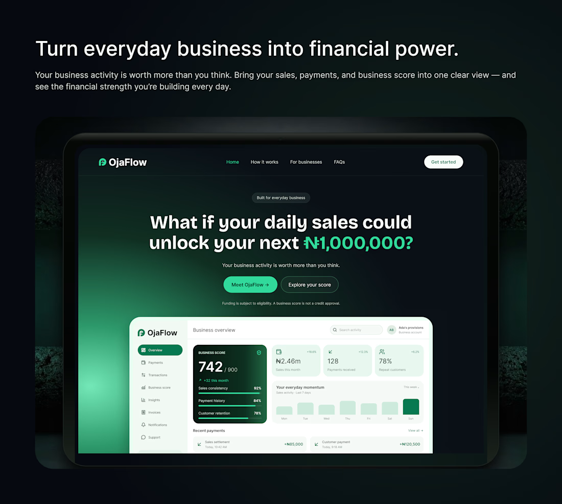
Not everything needs to shout to make an impression. ✨
Subtle motion. Smooth transitions. Thoughtful details. A clean interface designed to make business finance feel effortless.
Meet OjaFlow 💚 where thoughtful design meets financial clarity.