
Johanna Roussel
Art Director & Brand Designer | Brand Identity & Packaging
New to Contra
Johanna is building their profile!
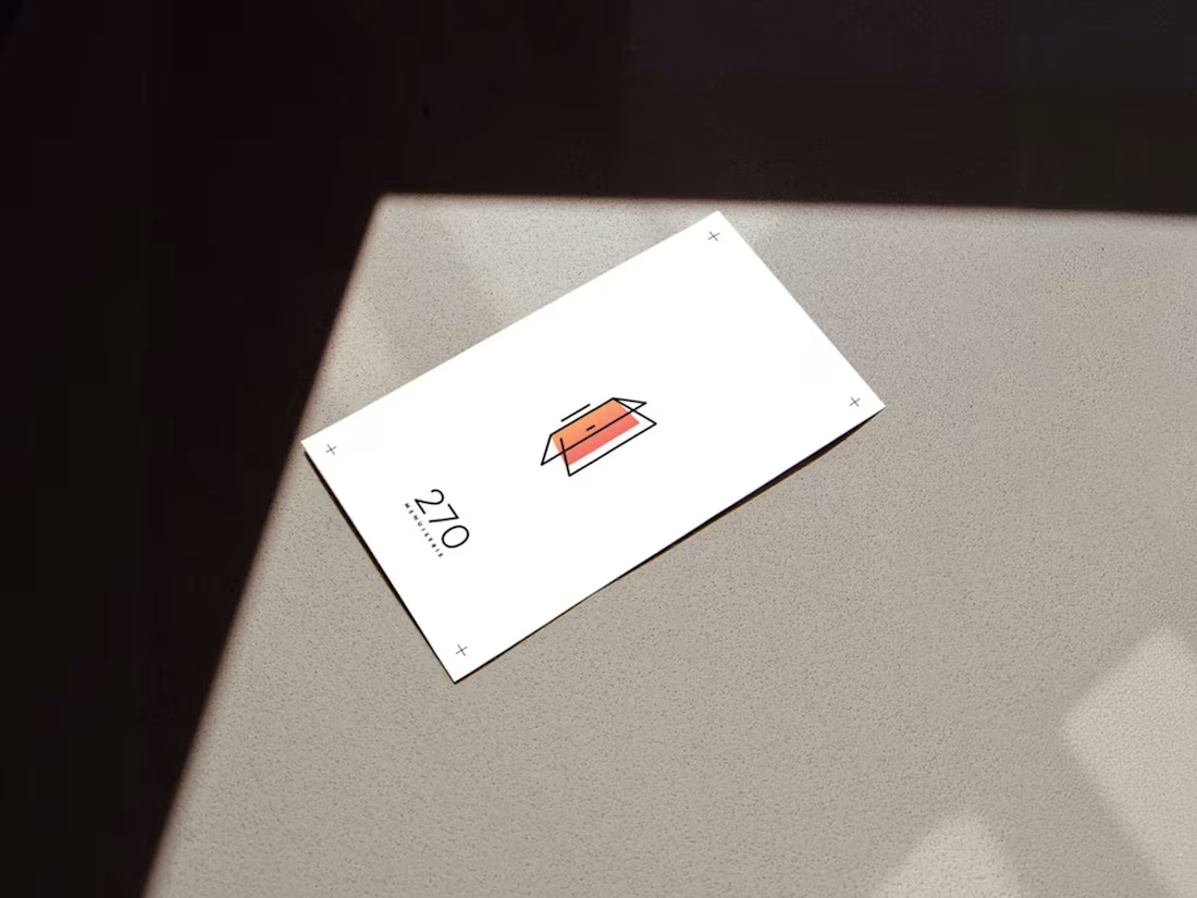
Most people don't buy windows or doors.
They buy what comes with them.
More light. More comfort. A different feeling of home.
For 270 Menuiserie, the challenge was to create a visual identity that went beyond craftsmanship and technical expertise to communicate transformation itself.
Inspired by the movement of opening and closing, the identity evolved into a symbol that bridges architecture and nature — precision and change.
Projects like this remind me that good branding isn't always about what a company does.
Sometimes it's about the change it creates.
What's the most transformative brand project you've worked on?
0
15
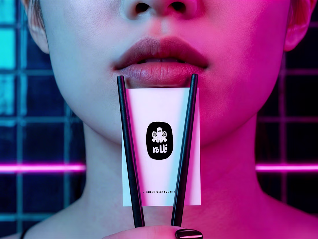
Most sushi brands look remarkably similar.
Black. Red. Chopsticks. Japanese patterns.
For Rolli, the goal was different.
The challenge was to create a brand that felt contemporary and approachable without relying on the visual clichés often associated with the category.
The result was a flexible identity system designed to work across packaging, takeaway, delivery, and digital touchpoints while keeping the experience simple, bold, and recognisable.
Looking back, I'm always interested by projects where the challenge isn't creating something completely new — but finding a fresh perspective on something people already know.
What's a category you think is overdue for reinvention?
0
80
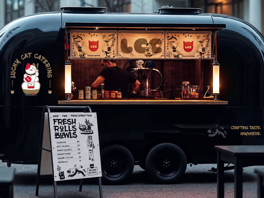
Great hospitality begins long before the first plate arrives.
Lucky Cat Catering was developed to capture the experience surrounding food — the atmosphere, the anticipation, and the attention to detail that turns an event into a memorable occasion.
The visual identity was designed to balance elegance and personality, creating a brand that feels both refined and approachable across print, packaging, and event touchpoints.
Some of the most rewarding branding projects are the ones that help create experiences rather than simply sell products.
What's the most memorable hospitality experience you've had recently?
0
29
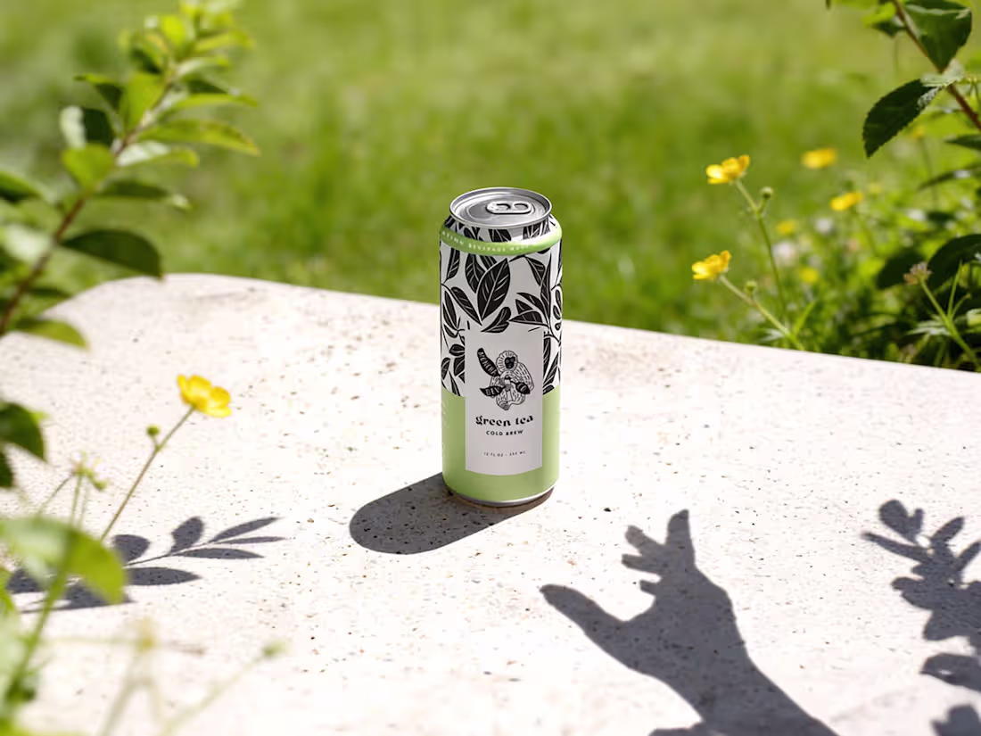
A great brand doesn't just tell people what a product is.
It makes them feel something before they've even tried it.
Moncha was developed as a beverage brand designed to create an emotional connection through personality, colour, and visual storytelling.
The goal wasn't simply to package a drink, but to build a brand people could recognise, remember, and relate to.
Looking back, these are often my favourite projects — the ones where strategy, branding, and packaging come together to create a complete experience.
What do you think people remember most: the product itself, or the feeling a brand creates around it?
2
1
86
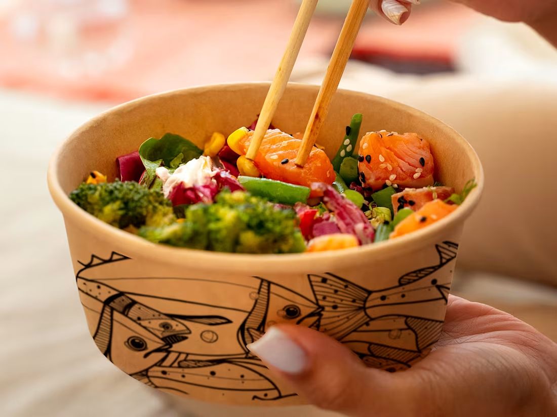
Some brands are built around a product.
Others are built around a feeling.
Poke Guru was designed to capture the energy of fresh food shared casually — colourful ingredients, vibrant flavours, and the relaxed atmosphere that makes people come back.
The identity combines bold typography, playful visual elements, and a flexible packaging system designed to work across multiple touchpoints while maintaining a strong and recognisable presence.
From the logo to the packaging, every element was created to feel approachable, contemporary, and full of character.
Credits:
Fish illustration - Marta Plusa
0
80
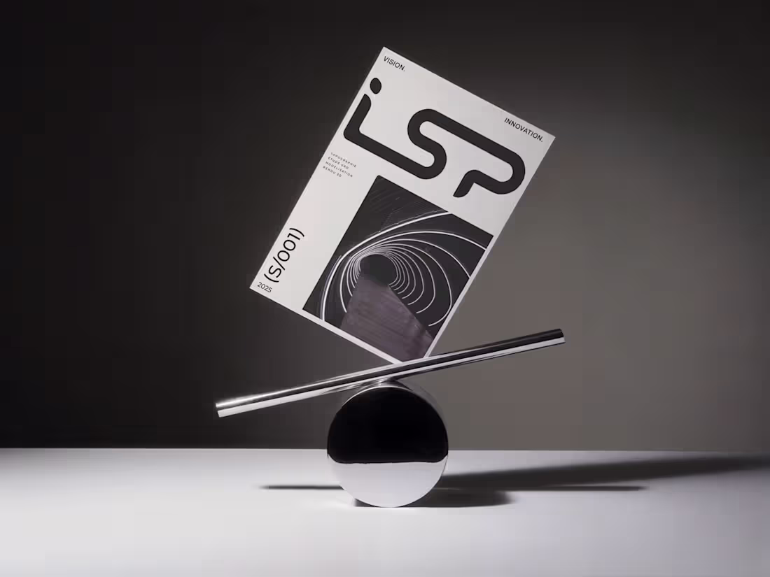
Every project starts with a direction.
ISP was developed for a French company specializing in topography, surveying, 3D modeling, and visualization.
The challenge was to create an identity that could reflect both technical precision and forward-thinking innovation without relying on industry clichés.
Through a highly structured visual system, the brand balances clarity, movement, and confidence across digital and print applications.
Looking back, I'm always fascinated by projects where complex expertise needs to be translated into something simple and immediately understandable.
What's the most challenging industry you've ever had to communicate visually?
1
1
52