pro
Joey Gross
Product Designer and Frontend Developer.
New to Contra
Joey is ready for their next project!
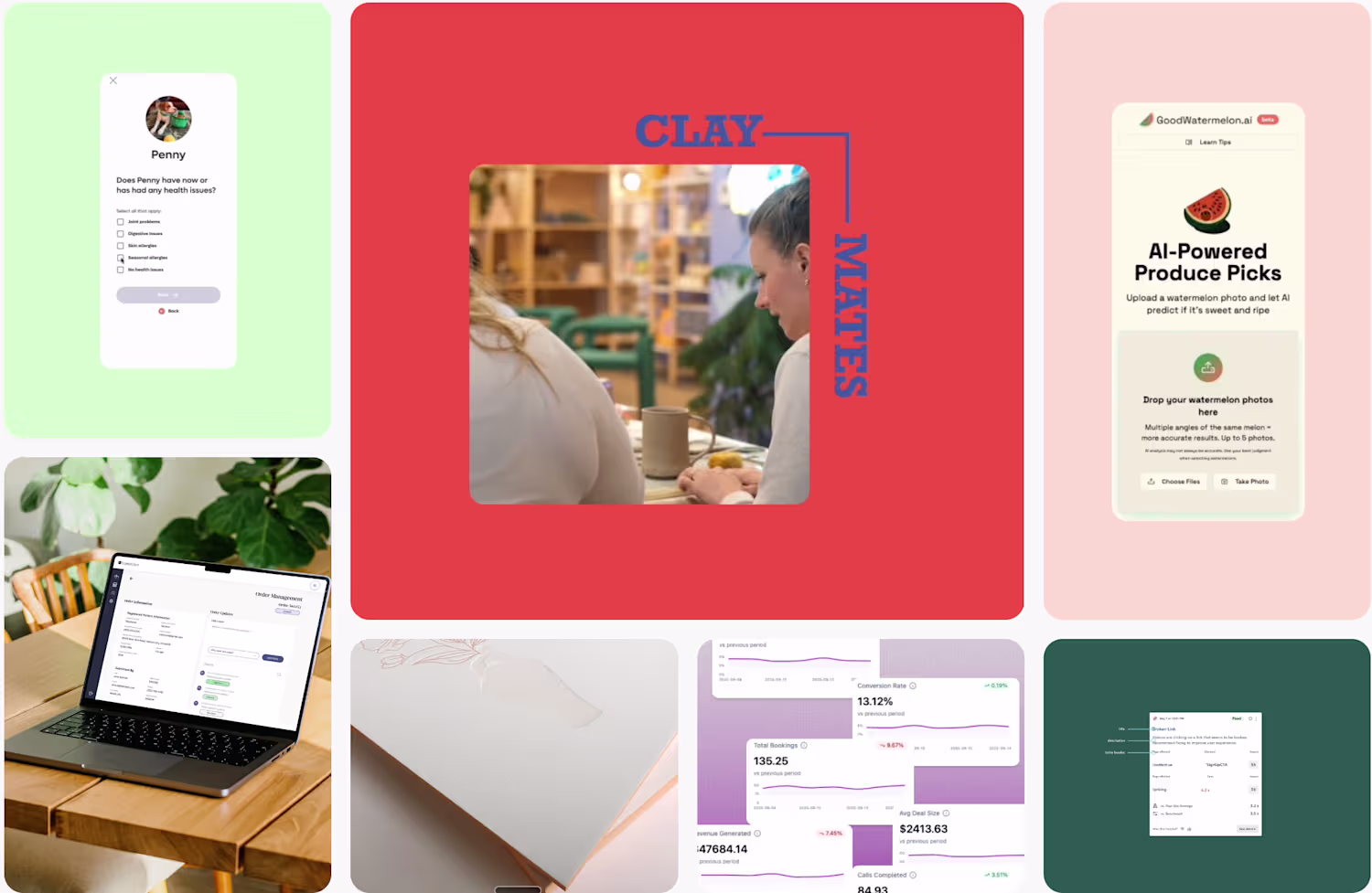
A social media launch kit for SalesKick, a SaaS that helps sales teams cut no-shows and lift show rates. They were starting their social presence close to scratch and needed to look consistent and credible fast, without a full content team behind it.
So I built more than a batch of posts. I designed a complete system: a brand voice, platform-specific styling for LinkedIn versus Facebook and Instagram, content pillars, a realistic posting cadence, and modular templates for features, stats, and testimonials. On top of that, a set of finished example posts across formats, static graphics, carousels, and short-form video concepts, plus a simple week-one rollout plan.
The result is a presence the team can run on their own: lean, on-brand, and built to stay consistent week to week.
1
9
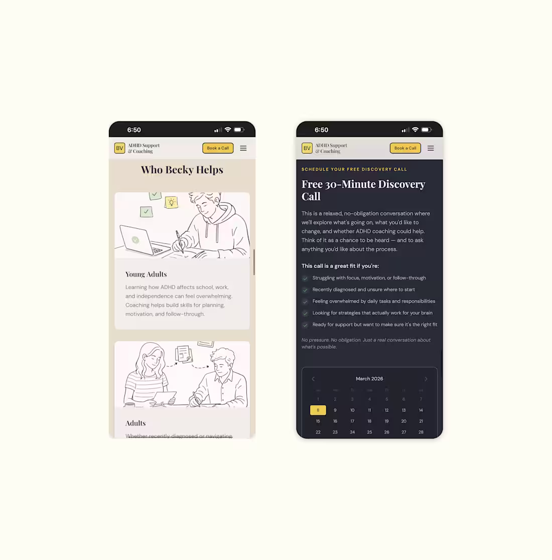
A personal website for Becky, an ADHD coach and consultant, designed and built end to end. She needed a home online that felt warm and trustworthy, and a simple way for new clients to find her and book a session.
Because the people she works with have ADHD, I kept the design calm and focused: clear hierarchy, an easy path to booking, and nothing fighting for attention. The site leads with Becky herself, so it feels like meeting someone who truly gets it rather than a generic coaching template.
I handled all of it, website design, brand design, frontend build in React, and the setup behind the scenes: domain, email, and her scheduling tool. She went from nothing to a working practice site that takes bookings, with no technical lift on her end.
0
6
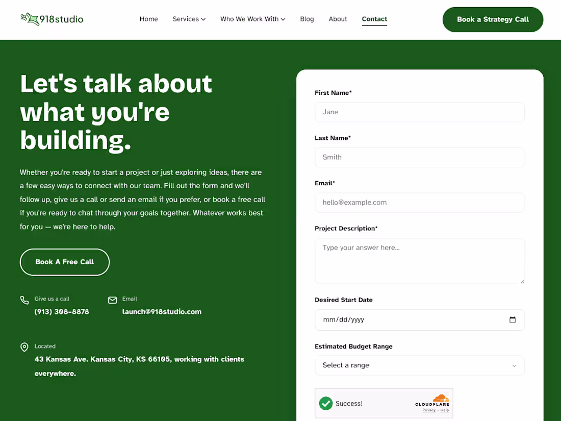
The marketing site for 918 Studio, an AI-native MVP agency. They needed a site that made their pitch land fast, that they build real, scalable products in a fraction of the usual time, and turned founders browsing the page into booked calls.
I designed and built the whole thing: a brand-forward homepage, services and who-they-work-with pages, an about section, and a CMS-driven blog for ongoing content. I also wired in an interactive founder's quiz that qualifies leads and generates a tailored build plan before anyone talks to the team.
Built on a modern stack, Astro, Sanity, and Vercel, so it loads fast and the team can update content without touching code.
0
14
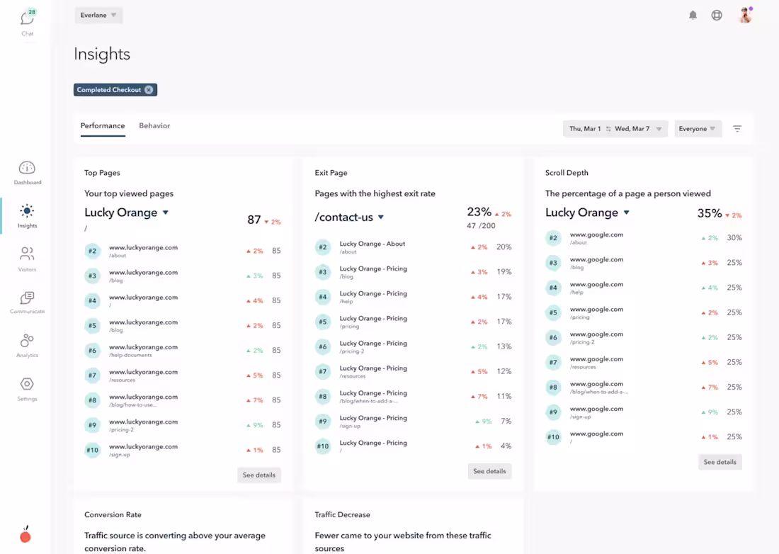
At Lucky Orange, similar to Google Analytics but with our unique flair, I embarked on one of our most ambitious projects: Insights. This feature is the heart of our analytics tool, where users can delve deep into website performance and visitor behavior. My role was crucial in designing an interface that not only surfaces insights like page load speeds and console errors but also uncovers complex behavioral patterns, such as high rates of page abandonment or rage clicks. The challenge was to present these intricate datasets in a way that was both meaningful and accessible, allowing website owners to pinpoint and resolve specific issues effectively.
A significant aspect of my work on Insights at Lucky Orange was creating a workflow that facilitates seamless team collaboration. I designed a system that allows users to share specific insights directly within their Lucky Orange account. This means, for example, if a JavaScript error is causing trouble on a webpage, it can be easily flagged and shared with the development team for a swift resolution. This feature not only enhances internal communication but also accelerates the problem-solving process, making it a valuable tool for teams of all sizes.
Designing the Insights feature was a complex puzzle, involving the aggregation of diverse data points and the integration of advanced filters like insight types and date ranges. My focus was on creating an interface that was not overwhelming despite its complexity. The goal was to craft a user experience that is intuitive, allowing users to effortlessly navigate through layers of data to find the precise information they need. This balance of complexity and usability is what sets Lucky Orange’s Insights apart, offering our users a powerful tool to improve their website's performance and visitor engagement.
0
22
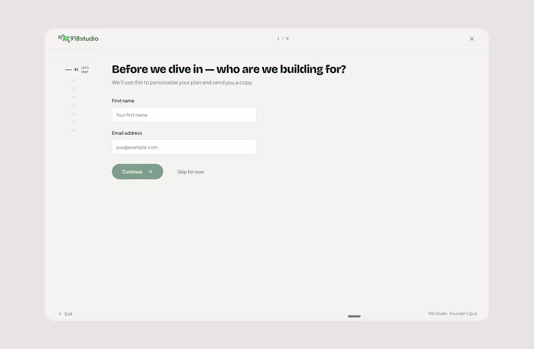
A lead gen tool I built for 918 Studio, an AI-native MVP agency. They wanted a smarter top of funnel than a basic contact form, something that could qualify leads and warm them up before a sales call ever happened.
So I built them an interactive founder's quiz. It walks a prospect through a few quick questions about who they're building for, where they're starting from, and which features matter most. At the end it uses AI to generate a personalized build plan on the spot: a project summary, a recommended technical approach, a scoped investment range, and a clear next step to book a strategy call.
The payoff is that a cold lead turns into a qualified one who already understands their own scope before they talk to anyone. Built in Lovable with an AI layer wired in to generate each plan dynamically from the quiz answers.
0
28
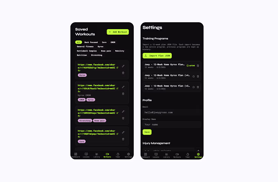
A Hyrox training app I built in Lovable. I race Hyrox myself, so this came straight out of my own training. I wanted one place to plan programs, log sessions, and track progress instead of juggling a notes app and a couple spreadsheets.
It's got a workout library with saved sessions and benchmarks, structured training programs, and a dashboard that shows where you are in a plan. There's also an injury management section, which came directly from working through my own shin splints mid block.
Dark, high contrast UI on purpose so it's readable mid workout when you're gassed and checking your phone between stations.
0
30
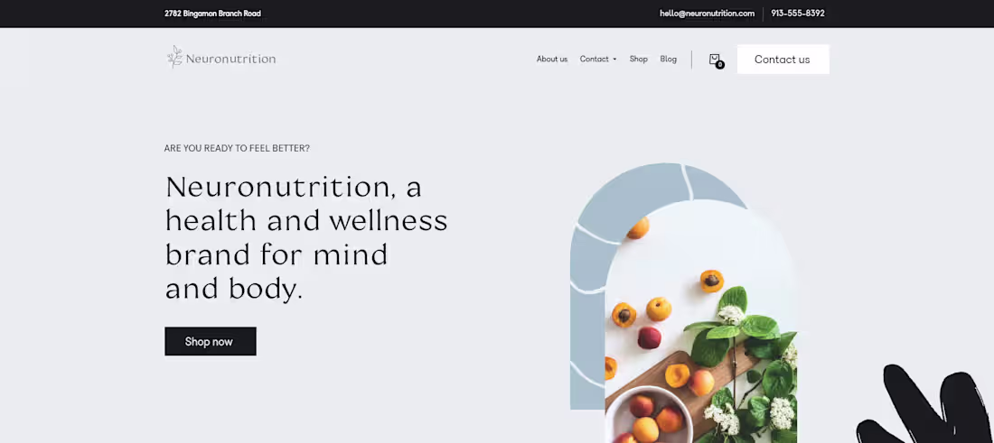
At Neuronutrition, a brand dedicated to enhancing wellness through scientifically backed nutritional supplements, I undertook the comprehensive task of creating a brand identity that reflects the intricate link between nutrition and cognitive health. This project encompassed not only the branding but also the design of various assets and the development of a user-centric website.
The challenge was to visualize the concept of Neuronutrition in a way that communicates the fusion of neural health and nutrition. The logo design, with its clean and organic elements, represents growth and connectivity, mirroring the company's philosophy of natural, science-driven solutions for mental and physical well-being. The color palette—subtle, earthy tones alongside calming blues—was chosen to evoke a sense of tranquility and trust, vital for a brand in the health and wellness sector.
For Neuronutrition's website, the goal was to design a space that not only serves as a point of sale but educates its visitors on the importance of nutrient-based interventions in mental health. The layout was structured to guide users through informative content to product selections seamlessly, facilitating an educational journey complemented by easy navigation. The incorporation of interactive elements, such as detailed product filters and a rich blog space, allows users to engage with the content meaningfully, aligning with their personal health journeys.
0
41
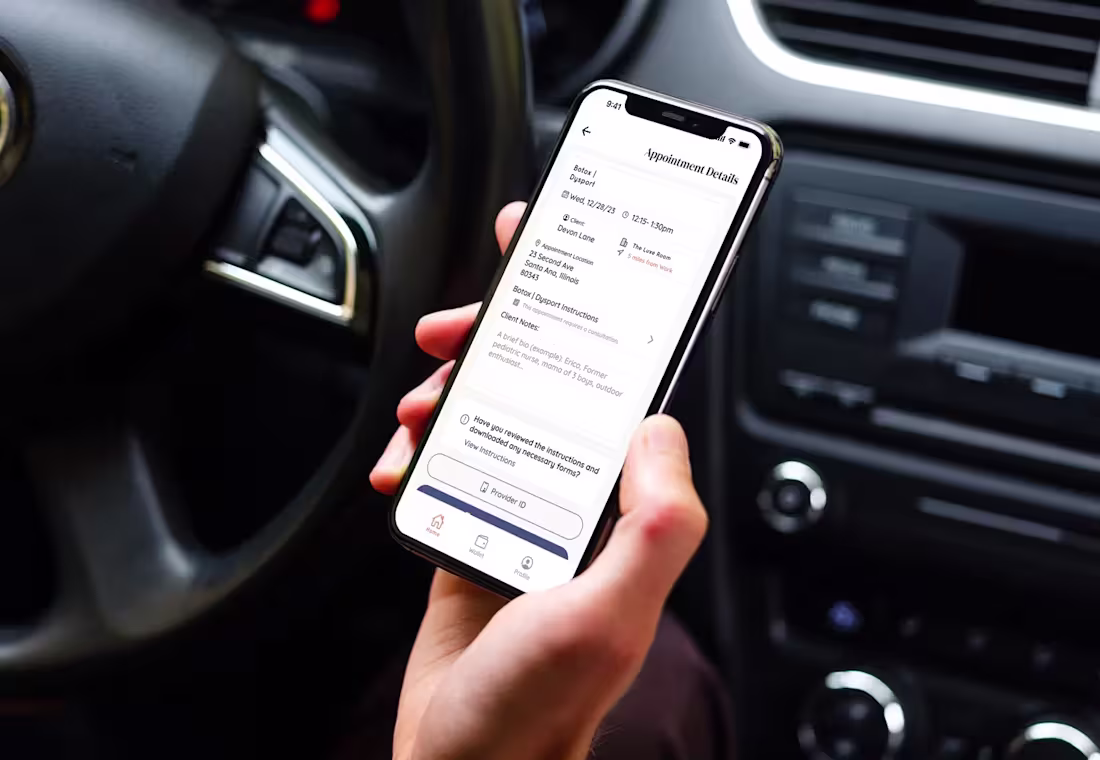
At Haled, we identified an opportunity to extend our technology to Medical Spas through myMedSpa. As the lead designer, I not only steered the development of this innovative service line but also took charge of the marketing dimensions. This included crafting a client-facing mobile app that is custom-tailored and white-labeled for each spa, enhancing the privacy and convenience of in-home treatments. My role expanded to designing the marketing website, overseeing our social media presence, and orchestrating effective paid advertising campaigns on platforms like Meta and Google, ensuring a cohesive and impactful brand message.
MyMedSpa is a testament to our dual-focused approach: delivering excellent user experiences and robust marketing strategies. I managed the development of a user-friendly, web-based booking platform and an online portal for spa businesses. These tools are pivotal in managing appointments and provider activities. Parallel to this, my responsibility included driving the marketing strategy, creating visually compelling content for social media, and designing targeted ad campaigns. This blend of design and marketing ensures that both spas and their clients enjoy a seamless and engaging interaction.
In crafting myMedSpa's provider app, I focused on functionality and ease of use, essential for providers on the move. This app is a crucial part of a larger ecosystem that includes the white-labeled mobile app and the web booking platform. Balancing this, I also spearheaded the marketing efforts, from the website's design to the execution of finely-tuned ad campaigns. This holistic approach in design and marketing underscores our commitment to providing an end-to-end solution, making the myMedSpa experience intuitive for users and advantageous for businesses.
0
45
At SalesKick, I played a key role in transforming the platform from an internal tool into a customer-facing self-serve web application. As the Fractional Head of Design, my primary focus was on creating a seamless user experience that allows businesses to sync their Typeform data, assign scoring criteria for lead qualification, and integrate AI-driven analysis into their sales process. One of my core responsibilities was designing an intuitive UI that enables users to map form fields efficiently and configure how AI evaluates responses. This included building an interface where users could designate questions as Immediate, Analyze with AI, or Ignore, ensuring the AI could intelligently assess responses based on custom scoring parameters.
A significant part of my work involved leveraging AI to enhance the frontend experience. I explored ways to streamline the AI prompt creation process by integrating a “Generate Prompt with AI” feature directly within the configuration UI. This function allows users to quickly generate complex AI prompts based on their company’s data and form structure, reducing the friction of manually crafting effective queries. By incorporating guidance fields and dynamic prompt suggestions, I ensured that even users unfamiliar with AI prompt engineering could benefit from the system’s capabilities. Throughout this process, I collaborated closely with engineering, product, and leadership to validate feasibility and refine the implementation.
0
48
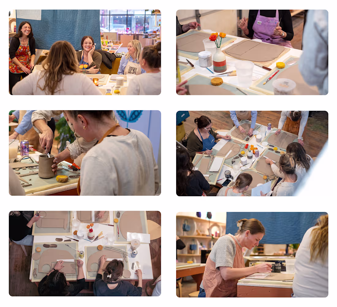
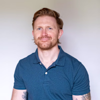
Claymates is a community-focused ceramics workshop brand designed to make learning pottery approachable, modern, and fun. I led the full digital experience, starting with brand development and visual identity. From logo and color palette to voice and messaging, I created a cohesive system that feels creative, welcoming, and easy to engage with. To bring the brand online, I designed and built a Shopify website tailored to showcase workshops, products, and the studio’s unique personality.
Beyond branding and e-commerce, I implemented a scheduling and booking platform that streamlined the workshop sign-up process, reducing friction for both participants and administrators. I also manage ongoing digital marketing campaigns through Meta Ads, targeting local audiences and driving consistent workshop bookings. This combination of design, technology, and growth strategy has allowed Claymates to establish a strong online presence, attract new students, and grow its community of makers.
0
47