Joaquin Cardelli
Graphic designer focused on branding, web, and UX/UI.
- $1k+
- Earned
- 2x
- Hired
- 4.90
- Rating
- 21
- Followers
So grateful for this feedback from Eli at WWWONDER! 🚀 Delivering high-quality design is just one part of the job; for me, ensuring a clear and detailed process for the client is just as important. Excited for the next steps on our projects!
RECOMMENDED
“Joaquin was a pleasure to work with! Not only did he pay great attention to detail in his work, but also in the way he explained his process. I was very happy with the delivered work and I'll definitely use him again in the future!”
Eli Ankutse
WWWONDERTo me, design is as much about the process as it is about the final result. I take immense pride in knowing that my clients and colleagues enjoy the creative journey as much as I do.
It was a privilege to be hired by Dinara (a talented designer herself) to collaborate on her...
RECOMMENDED
“I loved working with Joaquin. He was very organized and punctual and always brought a good spirit to the work. He has a diverse knowledge in many programs, which allowed us to experiment with a lot of mediums. Definitely recommend.”
Dinara Guzhavina
EnfoldHello Contra Community!
I’m reaching out with a genuine question to all the established professionals here. I’ve just landed on the platform and finished uploading my first case studies, focusing on strategic design and system thinking. While I’m new to securing clients...
Hermitype Hotel is not just a typeface; it is a tribute to the rhythm and architectural opulence of Mar del Plata.
Its typographic structure is born directly from the detailed observation of the monumental façade of the iconic Hermitage Hotel. The font seeks to capture the...
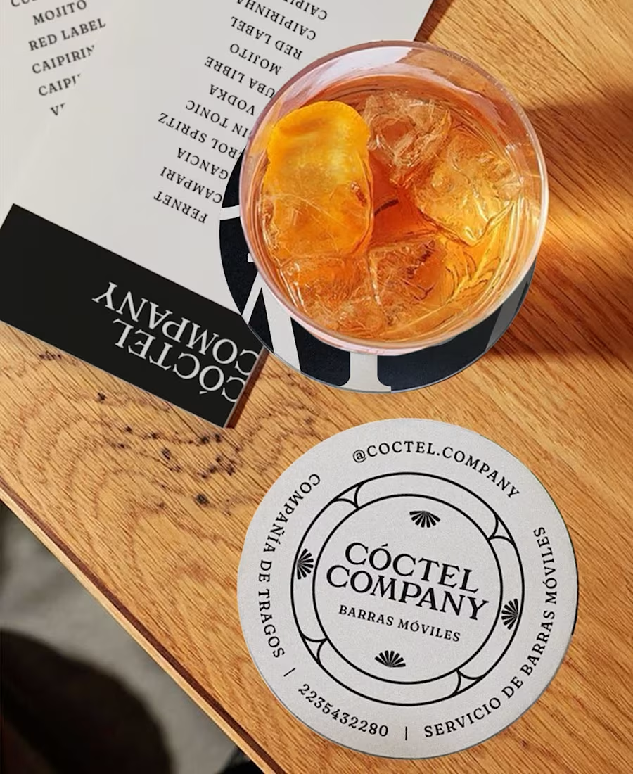
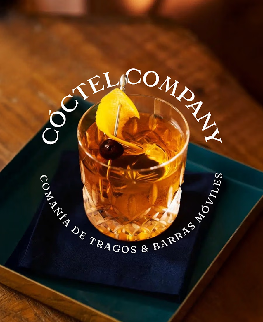
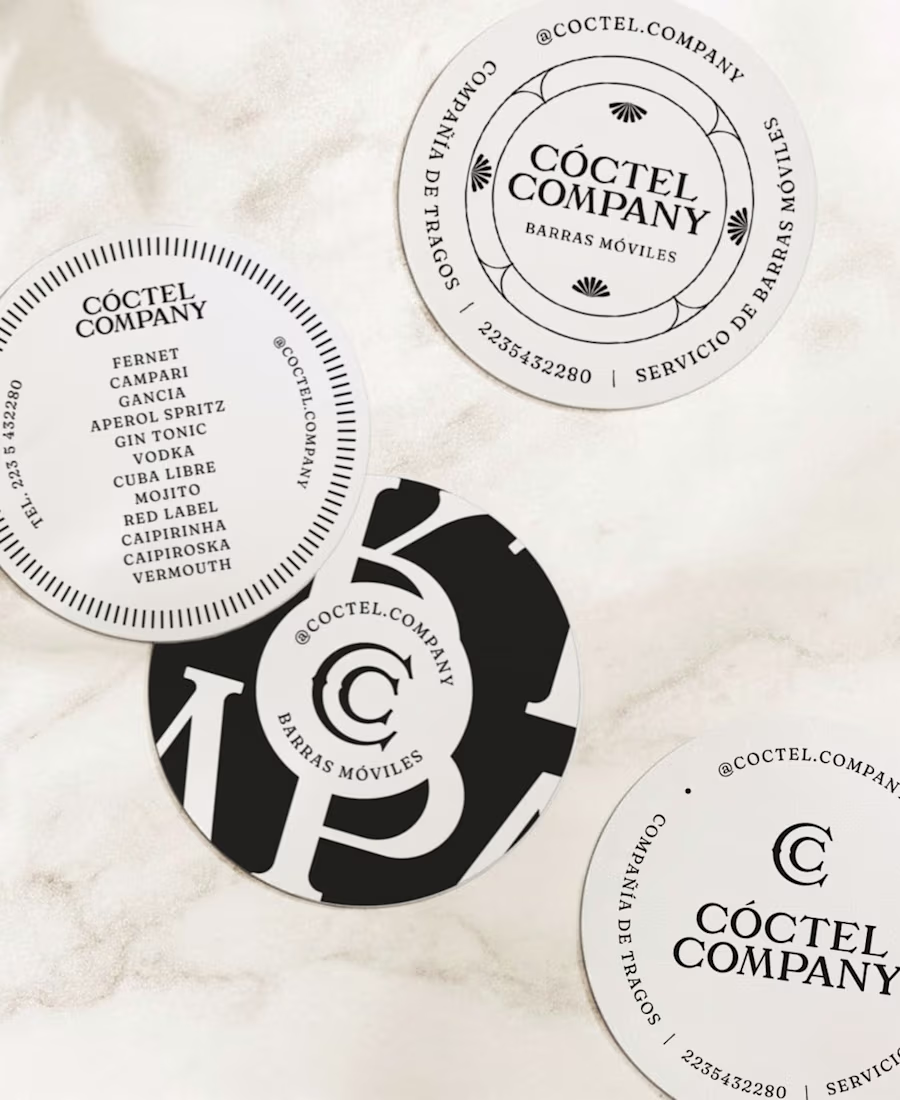
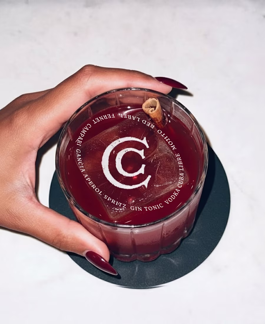
In a world saturated with color, black and white is a declaration of intent.
For the Coctel Company identity, B&W wasn't an aesthetic choice, it was a strategic decision to immediately position them in a superior category. The monochrome palette communicates seriousness,...