Roongtiwa Wongjina
Project manager
Profile in progress
Roongtiwa is building their profile!
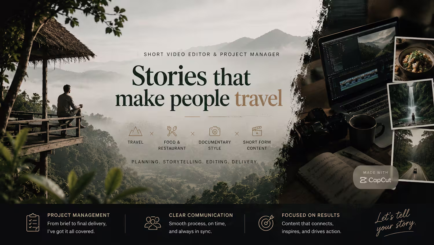
Project Title: CapCut Lost Story Agency
Direction: CapCut as a Persona
Project Description
CapCut Lost Story Agency is a fictional café where people gather not only to enjoy coffee but also to share the stories that shaped their lives.
In this world, memories are treated as valuable treasures. Every customer who walks through the café doors brings a story — a childhood memory, a forgotten dream, a life lesson, or a moment that deserves to be remembered. The agency listens, preserves, and transforms these stories into cinematic experiences so they can be passed on to future generations.
The project reimagines CapCut as a friendly storytelling companion whose mission is to protect human memories from being forgotten. Rather than simply editing videos, CapCut becomes a guardian of stories.
I created the visual concepts, story world, character design, and video assets using CapCut Design Studio, then edited and assembled the final video in CapCut.
As a creator, I am passionate about storytelling. This project is also inspired by my upcoming AI-powered storytelling channel, where I plan to share historical stories, legends, and folktales through cinematic video experiences.
Through CapCut Lost Story Agency, I wanted to explore how technology can help preserve human stories and connect generations through creativity and visual storytelling.
Tagline: "Every Story Deserves a Frame."
0
3
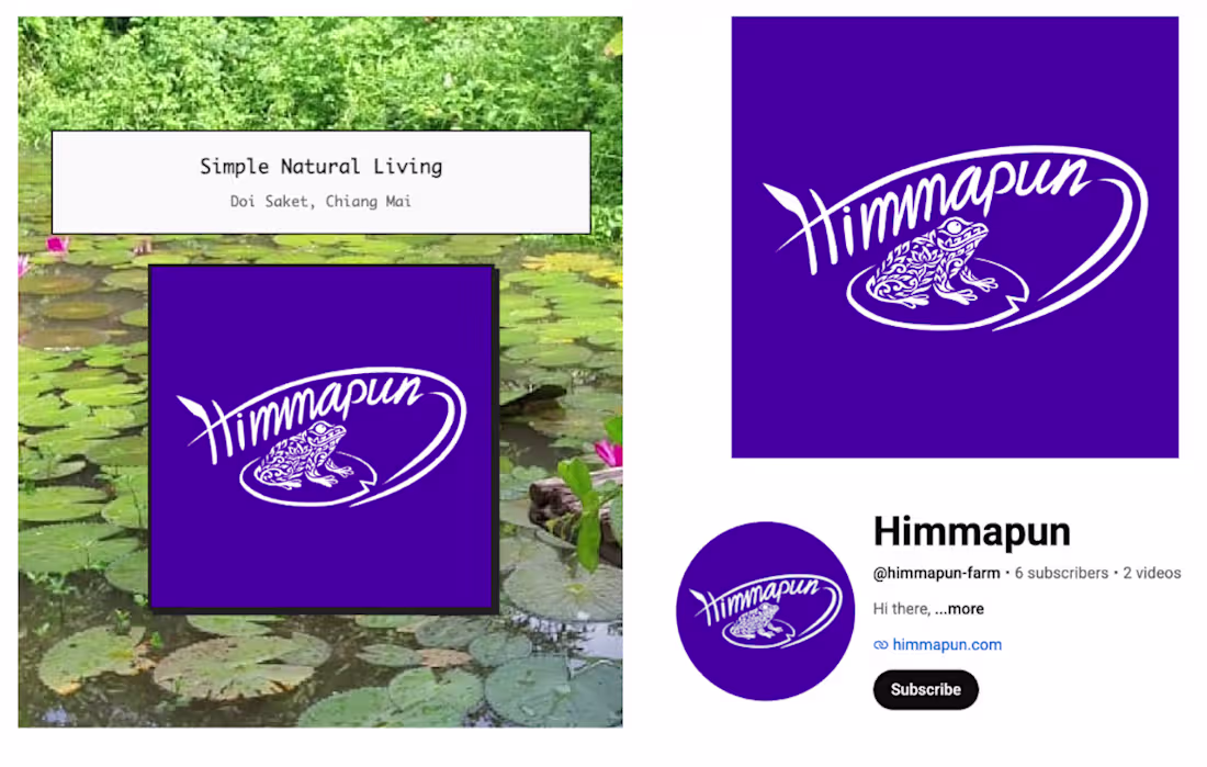
Himmapun — Brand Identity Design for Natural Living Farm
Himmapun is a natural living and lifestyle brand located in Doi Saket, Chiang Mai.
The goal of this project was to create a visual identity that feels:
- organic
- approachable
- artistic
- locally rooted
- memorable for digital audiences
The brand needed a logo system that could work across:
YouTube, social media, profile icons, promotional graphics, future packaging and merchandise
Design Direction
- The visual concept combines:
- handwritten typography to create a human and personal feeling
- a frog illustration inspired by nature and local biodiversity
- bold purple branding to make the identity recognizable online
- minimal composition for flexibility across platforms
- The circular motion in the logo was designed to create movement and energy while keeping the identity playful and organic.
0
23