
Jimoh Kazeem
Squarespace Designer | Websites that convert.
New to Contra
Jimoh is ready for their next project!

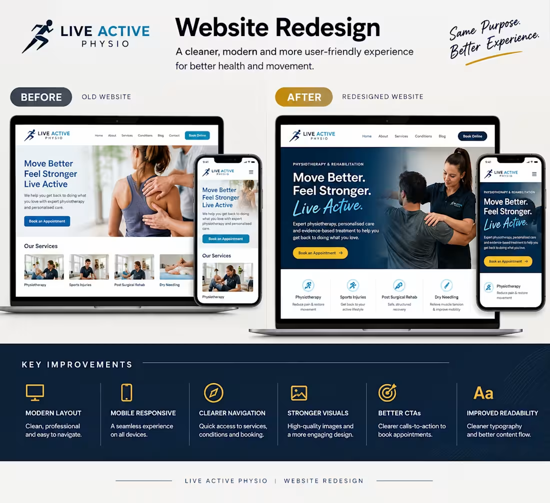
A website redesign isn’t just about making a website look better — it’s about making it work better.
Here’s a Before & After concept for Live Active Physio, focused on creating a cleaner and more user-friendly experience.
✨ What I improved:
Cleaner, more modern layout
Better mobile responsiveness
Clearer navigation
Stronger visual hierarchy
More engaging service presentation
Clearer booking CTA
Improved readability and content flow
The goal: help visitors understand the services quickly and make it easier to take the next step.
Which version would you choose — Before or After? 👀
1
38
Website Redesign — Before & After
Website: desioakley.com (http://desioakley.com)
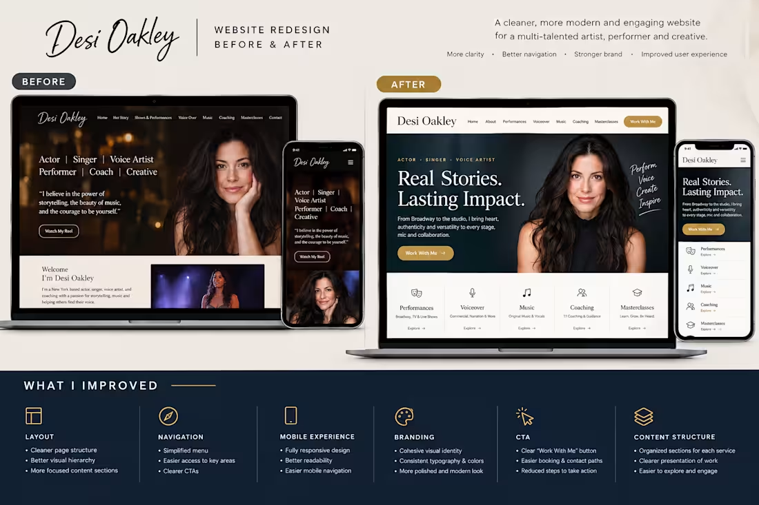
Before — Original Website
The original Desi Oakley website presents her work across Broadway, television, voiceover, music, coaching, masterclasses, and performances. It uses a personal, artistic style with sections such as Her Story, Shows & Performances, Voice Over, Work With Me, and Contact.
After — Redesigned Version
The redesigned concept gives the website a more structured and modern portfolio experience, making Desi's different services and creative work easier to discover.
What I Improved
1. Layout
•Created a cleaner page structure •Improved spacing and visual hierarchy •Made key information easier to scan •Created stronger sections for her different areas of work
2. Navigation
•Simplified the navigation structure
•Made major areas of the website easier to reach
•Created clearer paths for visitors interested in performances, voiceover, coaching, and collaborations
3. Mobile Experience
•Designed responsive layouts for smaller screens
•Improved readability and spacing
•Made buttons and navigation easier to use on mobile
4. Branding
•Created a more cohesive visual identity
•Strengthened typography and imagery
•Used a consistent design system across the pages
•Made the personal brand feel more polished while retaining its artistic character
5. CTA — Calls to Action
•Made important actions more visible
•Added clearer Work With Me, Book, and Contact pathways
•Reduced the number of steps required to find ways to work with Design
6. Content Structure
•Organized her Broadway, screen, voiceover, music, coaching, and masterclass offerings into clearer categories.
Portfolio Description
A complete website redesign concept for Desi Oakley, focused on creating a cleaner layout, stronger navigation, improved mobile experience, cohesive personal branding, and clearer calls to action. The redesign organizes her performance, voiceover, coaching, music, and professional work into a more intuitive experience while maintaining the personality of her creative brand.
1
28
Project Title
PDQ Chicken — Restaurant Website Redesign
Short Description
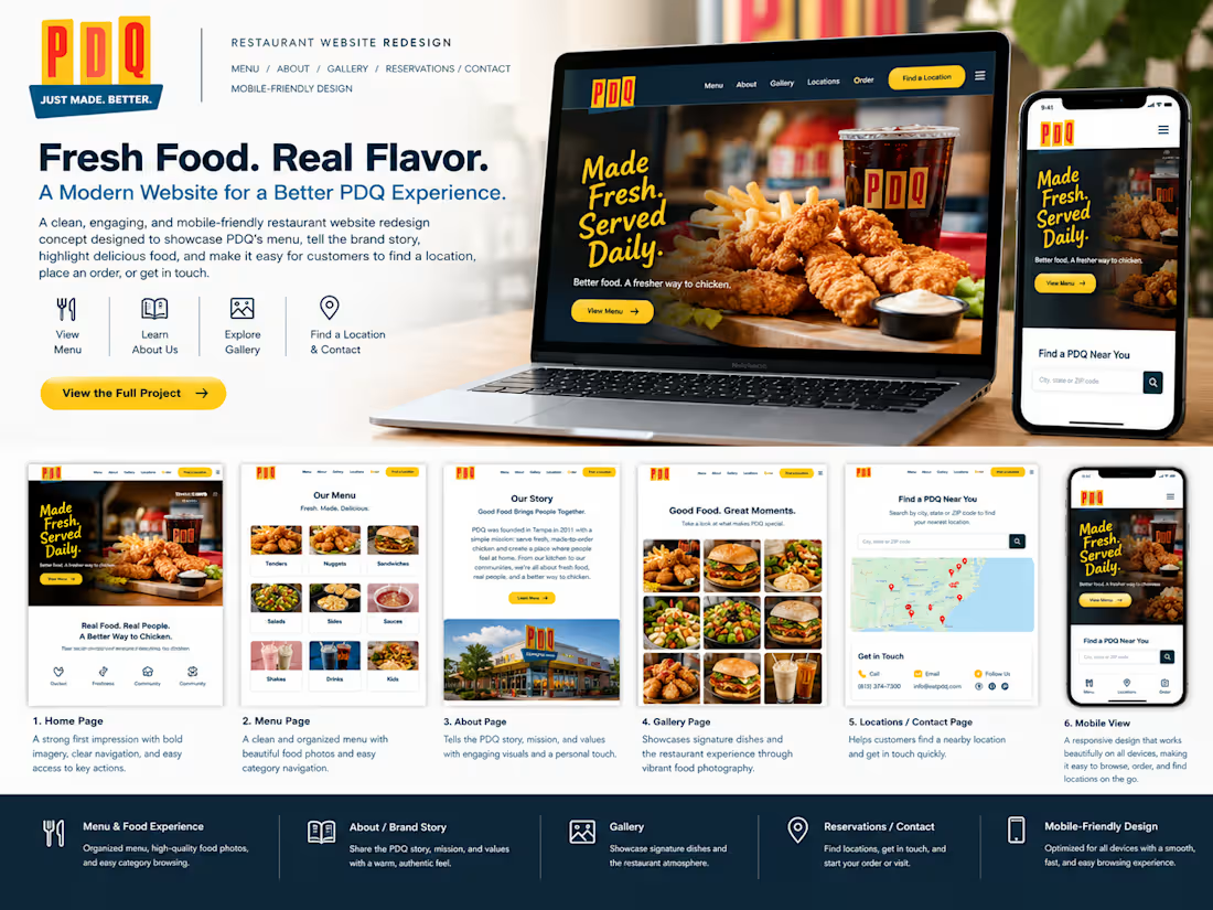
A modern, mobile-friendly restaurant website concept designed to showcase the menu, communicate the brand story, highlight food visually, and make it easy for customers to take action.
Project Overview
A restaurant website redesign concept for PDQ Chicken, focused on creating an engaging digital experience for customers looking to explore the menu, learn about the brand, find a location, and place an order.
The design emphasizes strong food imagery, simple navigation, clear menu organization, and prominent calls to action. PDQ currently operates locations across states including Florida, North Carolina, and New Jersey.
What I Did
-Designed the overall restaurant website structure
-Created a modern food-focused visual direction
-Organized the menu into easy-to-browse categories
-Designed an engaging About/Brand -Story section
-Created a food gallery section
-Added location and contact pathways
-Designed clear ordering/reservation-style CTAs
-Improved website navigation
-Created responsive layouts for mobile and desktop
-Focused on visual hierarchy and user experience
-Designed prominent conversion-focused buttons
Services / Skills Used
Squarespace Website Design
Restaurant Website Design
Website Redesign
Responsive Web Design
UI/UX Design
Squarespace Development
Mobile-Friendly Design
Conversion-Focused Design
Content Structure
Landing Page Design
The Problem
Restaurant customers typically want to find important information quickly—especially the menu, food options, location, ordering information, and contact details.
The challenge was to create a website experience that makes this information easy to discover while using strong food imagery and clear navigation to keep visitors engaged.
The Solution
I created a clean, image-led restaurant website structure that puts the customer's most important actions first.
The redesigned experience organizes the menu into clear categories, introduces the restaurant's story, uses food photography to create visual interest, and places strong calls to action throughout the website.
The design is also responsive so customers can browse the menu and interact with the website comfortably from their phones.
Main Features
🍗 Menu
A structured menu experience showcasing categories such as chicken tenders, nuggets, sandwiches, salads, sides, sauces, shakes, and drinks. �
PDQ Chicken
📖 About
A dedicated section explaining the PDQ story, brand values, and restaurant experience. PDQ says it was founded in Tampa in 2011 and focuses on fresh, made-to-order food and community involvement.
📸 Gallery
A visually engaging food gallery designed to showcase signature dishes and create a stronger appetite appeal.
📍 Reservations / Contact
Clear contact and location pathways that help visitors find a nearby restaurant and take the next step. PDQ's current location finder lets users search by city, ZIP code, or address.
📱 Mobile-Friendly Design
A responsive layout optimized for customers browsing on smartphones, making the menu, location information, and CTAs easy to access.
Professional Project Description
PDQ Chicken — Restaurant Website Redesign
A modern restaurant website redesign concept created to deliver a more engaging and user-friendly digital experience for customers.
The project focused on making the menu easier to explore, strengthening the restaurant's visual identity, presenting the brand story clearly, and creating intuitive paths toward ordering, finding a location, and getting in touch.
I focused on website structure, responsive design, menu presentation, visual hierarchy, UI/UX, mobile experience, and conversion-focused calls to action.
The result is a clean, image-driven restaurant experience designed to help visitors discover the food, understand the brand, and quickly take action.
1
30
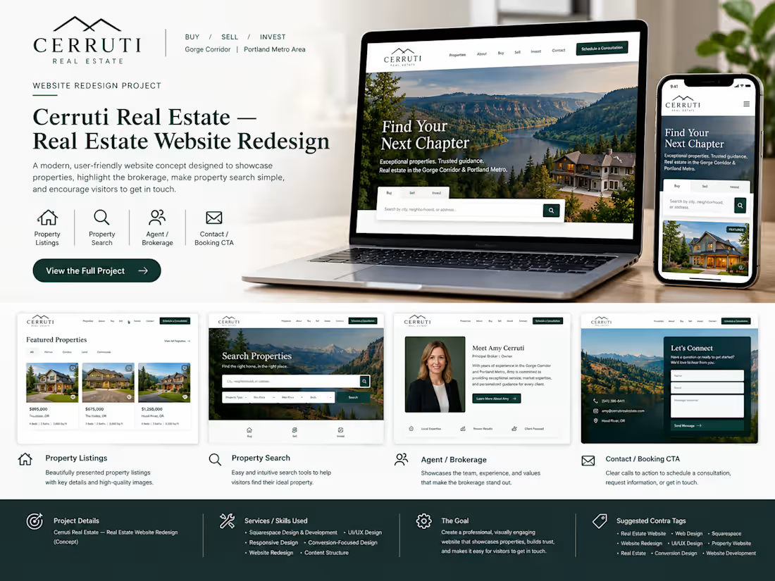
Project Title
Cerruti Real Estate — Real Estate Website Redesign
Short Description
A modern real estate website concept designed to showcase properties, build trust in the brokerage, simplify property discovery, and encourage potential buyers and sellers to get in touch.
Project Overview
A professional real estate website redesign concept for Cerruti Real Estate, a Pacific Northwest brokerage serving the Gorge Corridor and Portland Metro Area. The project focuses on presenting properties and services clearly while creating a personalized experience for buyers, sellers, and investors.
What I Did
-Designed the overall website structure
-Created a modern real estate visual experience
-Structured property listing sections
-Designed property search/discovery areas
-Organized buying and selling services
-Created an agent/brokerage presentation section
-Added trust-building content and testimonials
-Designed clear contact and consultation CTAs
-Improved content hierarchy and navigation
-Designed responsive desktop and mobile layouts
-Focused on a simple customer journey
Services / Skills
Squarespace Website Design
Web Design
Website Redesign
Real Estate Website Design
Responsive Web Design
UI/UX Design
Conversion-Focused Design
Squarespace Development
Landing Page Design
Content Structure
The Problem
Real estate websites need to communicate a lot of information without overwhelming potential buyers and sellers. Property information, services, agent expertise, buying/selling processes, testimonials, and contact options all need to work together. The challenge was to create a structure where visitors could explore properties, understand the brokerage, learn about the buying/selling process, and quickly take the next step.
The Solution
I created a clean, property-focused website structure that puts the user's real estate journey first. The design organizes property discovery, brokerage information, buying and selling services, social proof, and contact opportunities into clear sections. Strong calls to action encourage visitors to start a conversation or request more information. The design also emphasizes responsive layouts so potential clients can browse the website comfortably across desktop and mobile devices.
Professional Project Description
Cerruti Real Estate — Real Estate Website Redesign A modern real estate website redesign concept created to provide a more structured and engaging digital experience for buyers, sellers, and property investors. The project focused on presenting property opportunities clearly while strengthening the brokerage's online presence through professional service sections, agent information, testimonials, and strategically placed calls to action. I focused on website architecture, responsive design, user experience, property presentation, visual hierarchy, and conversion-focused interactions. The goal was to create an experience that allows visitors to move naturally from discovering properties and learning about the brokerage to taking the next step and starting a conversation.
1
36