
pro
Jesus Da Costa Gomez
Visual identity designer for game changing brands
Ready for work
Jesus is ready for their next project!
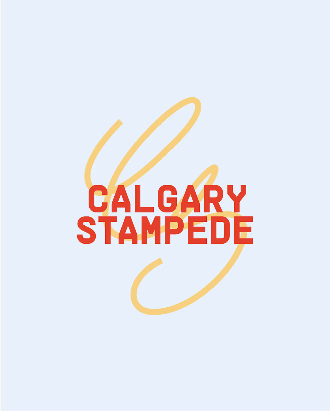
The Stampede is the biggest thing here in Calgary
Rides, rodeo, weird food, all kinds of music events, tents and beer (lots of it), cowboy vibes and much more.
Everyone here's had their fun at the grounds and it’s the biggest event of the year, the city literally lights up for it, everyone’s in their best mood and for 10 days we are all in on the cowboy aestheticsss
So, as a designer I could not help it but to cook up a fresh visual identity for the whole thing, to see what the Calgary Stampede could look like with a more expressive, unique, and intentional branding
0
9
PRT2
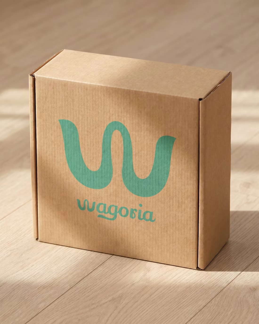
I was tasked to design a logo symbol and a logotype for Wagoria.
Besides the spirit and the vision we developed during the strategy process, the main inspiration for the logos were dogs “waging” their tail (honestly speaking).
But we also wanted to focus on five main descriptors: imagination, friendliness, empowerment, evolution, and trust.
Wagorias goal: To Harness intelligence tech to elevate pet care, enhance safety, and redefine the modern day pet parenting experience.
With the quiet power of intelligent technology, the app weaves together real-time health tracking, behavior insights, and personalized wellness tools.
Below here is the full breakdown. Fun project for a great cause 🐕🦺
2
40
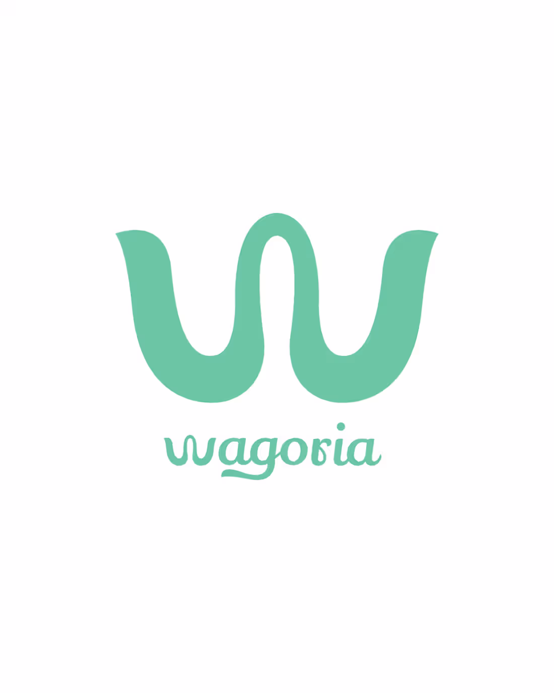
Wagoria Logo design (Part 1)
I was tasked to design a logo symbol and a logotype for Wagoria.
Besides the spirit and the vision we developed during the strategy process, the main inspiration for the logos were dogs “waging” their tail (honestly speaking).
But we also wanted to focus on five main descriptors: imagination, friendliness, empowerment, evolution, and trust.
Wagorias goal: To Harness intelligence tech to elevate pet care, enhance safety, and redefine the modern day pet parenting experience.
With the quiet power of intelligent technology, the app weaves together real-time health tracking, behavior insights, and personalized wellness tools.
Below here is the full breakdown. Fun project for a great cause 🐕🦺
0
25
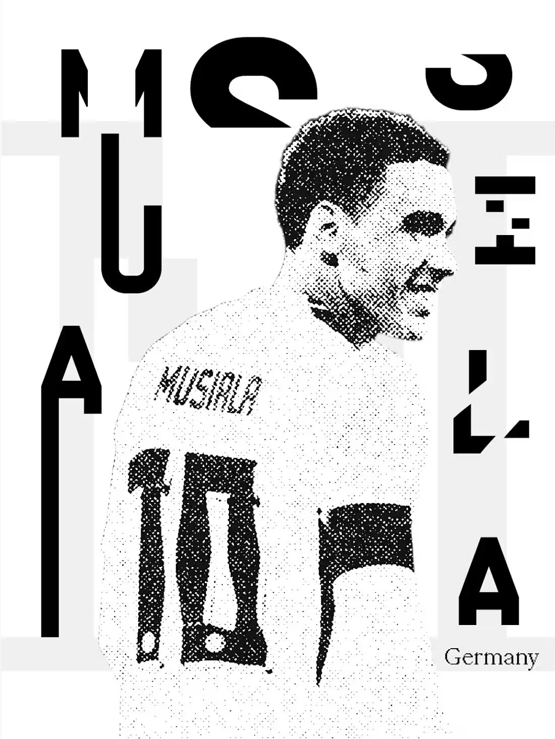
Design exploration for Germany, World Cup fever is among us. Exploring Image treatment and Typography
2
22
Logos For MAXXIN
MAXXIN is a conceptual eyewear brand for those aiming to get the MAXX out of life.
Inspired by rave culture and brutalist aesthetic
2
2
20
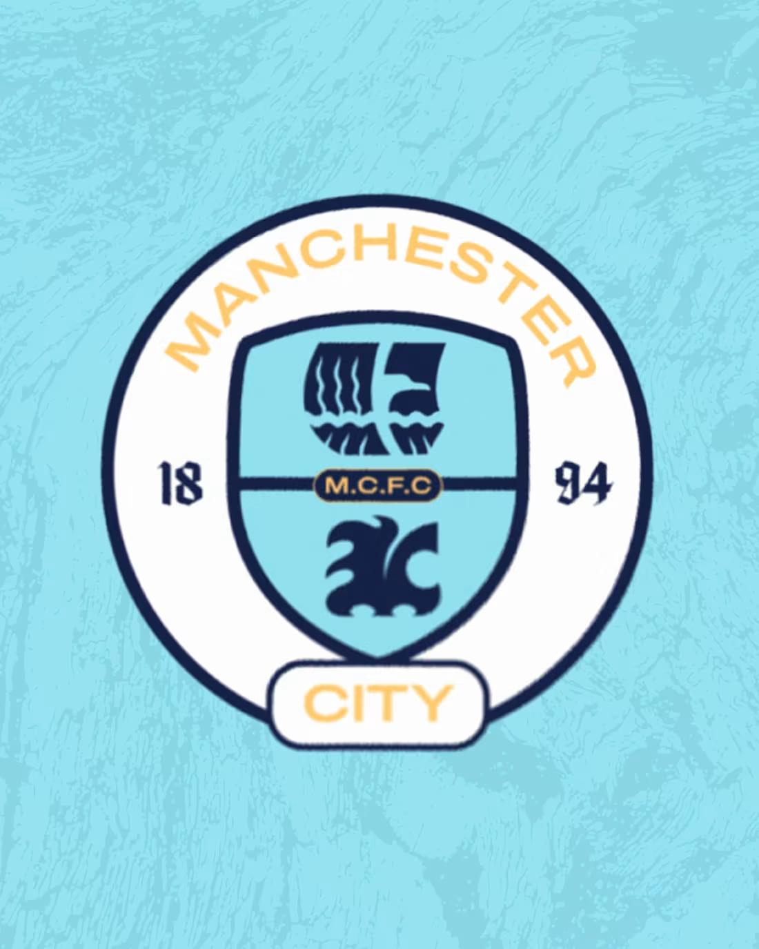
Manchester City Re Up completed!
A conceptual project re branding Man City Football Club
Next stop is to design Case Study and put it up🙌
20
116
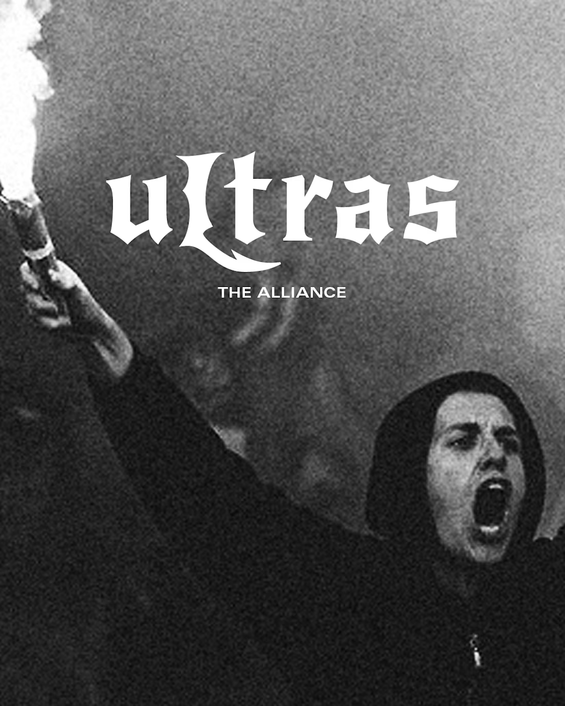
No one shows more passion for the game than the Ultras.
The chanting, the Toffys, the fights, the trolling, the heart breaks, the celebrations.
UItras are not regular fans, they are the heart and lungs of their football teams.
I was inspired to design a brand that pays tribute to the hinchada, the barras bravas, the true die hard fans of the game
I thought The name “Ultras” was very self explanatory, short and memorable.
This brand needs character, it needs passion and that rebel like attitude ultras have.
For the logo, I took inspo from the huge fences they built inside the stadiums in South America to keep fans from entering the field.
For the word mark, I went for this aggressive type face and customized it to give it extra character.
The imagery for this brand had to be grungy, greedy, chaotic.
15
92
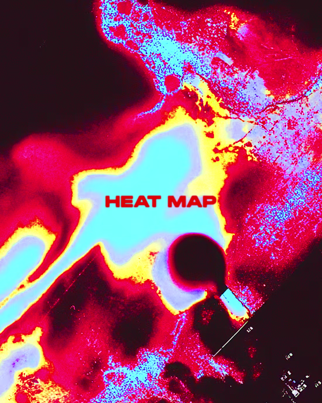
HEAT MAP is a sportswear brand focused on providing Hyrox athletes with the gear they need to perform at the highest level.
This concept brand was inspired by the high intensity of Hyrox competitions, where athletes test their limits to the max, enduring various high intensity exercises that combine power, strength and stamina.
Bringing in a visual identity that is full of energy, grit, and heat 🔥
1
26
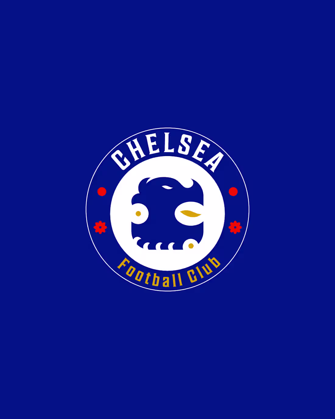
Chelsea logo re up ⛓️
This was an exercise to explore ways to simplify Chelseas iconic lion logo without losing its essence, and paying homage to the OG badge.
Simplification without compromising character.
I think Chelsea’s current lion logo is great in its own way btw but I’m ready to come off the bench and hit it 🎨🏟️⚽️
2
20
127
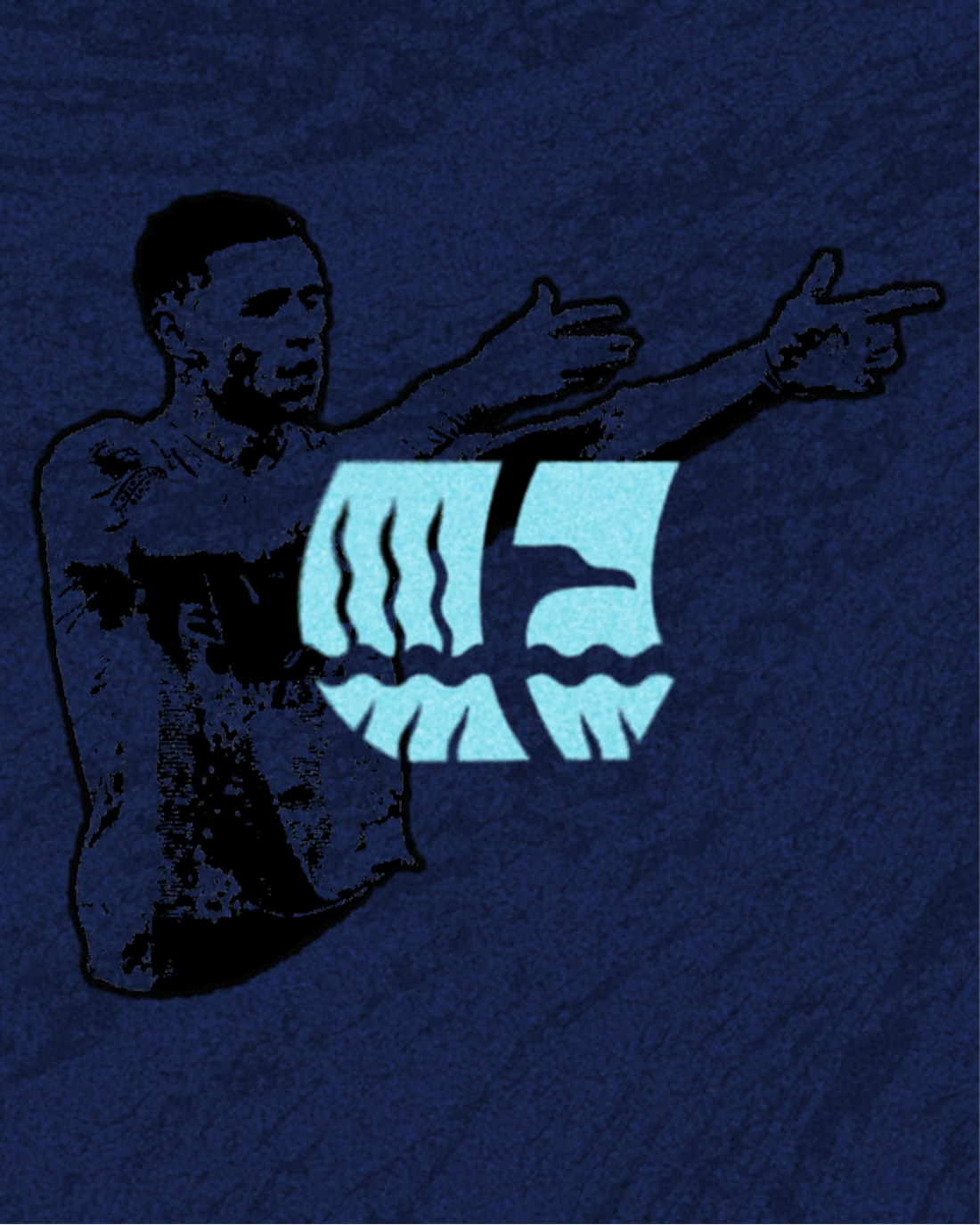
Logo re design for Manchester City
I got very inspired by looking at their badges through out history and grabbed symbolism from my favourites to combine and reinterpret those my way.
The eagle silhouette represents strength and tenacity. The boat like shape represents the city of Manchester is a reference to Manchesters Ship Canal, opened in 1894.
In the negative space of the logo we can also find a reference to the England flag.
For the typography I wanted to experiment with very expressive type, adding a bit of a classic/heritage vibe.
Overall I'm happy with the outcome.
I will always find an excuse to merge football and design to create projects like these.
15
106
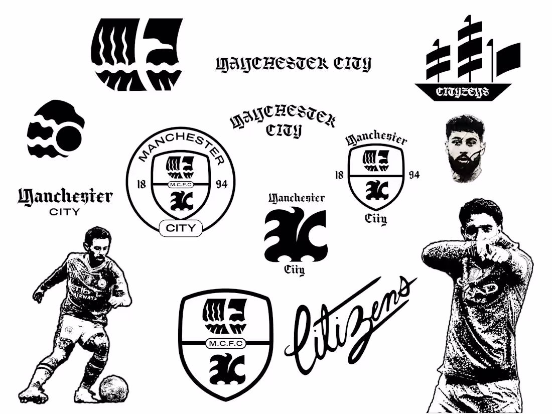
Sometimes I like to rebrand football clubs as personal projects.
It allows me to try different design styles, express my taste, and push the limits of creativity without having to worry about all the business side of things.
And I usually go all out. Brand strategy, logo suit and variants, typography treatment, art direction, illustrations, etc.
This is what keeps things fun for me, and the goal is always to then be able to work with people and brands that are into the personal projects I share. It's like a full circle moment every time.
Anyways, the recent personal project has been re branding Manchester City. Here is some of the assets I've come up with. The next step is applying brand colours and bringing all to life in a case study.
Sharing more very soon.
13
88