
max
Jeremie Lasnier
Branding, Product & Web Design that convert
- $100k+
- Earned
- 11x
- Hired
- 5.00
- Rating
- 1.5K
- Followers
Just crossed $100,000 in revenue on Contra.
Grateful to every founder and team who trusted PROHODOS with their brand, website, and product.
One of the biggest lessons?
Great design isn’t about making things look better.
It’s about helping companies communicate clearly, build...
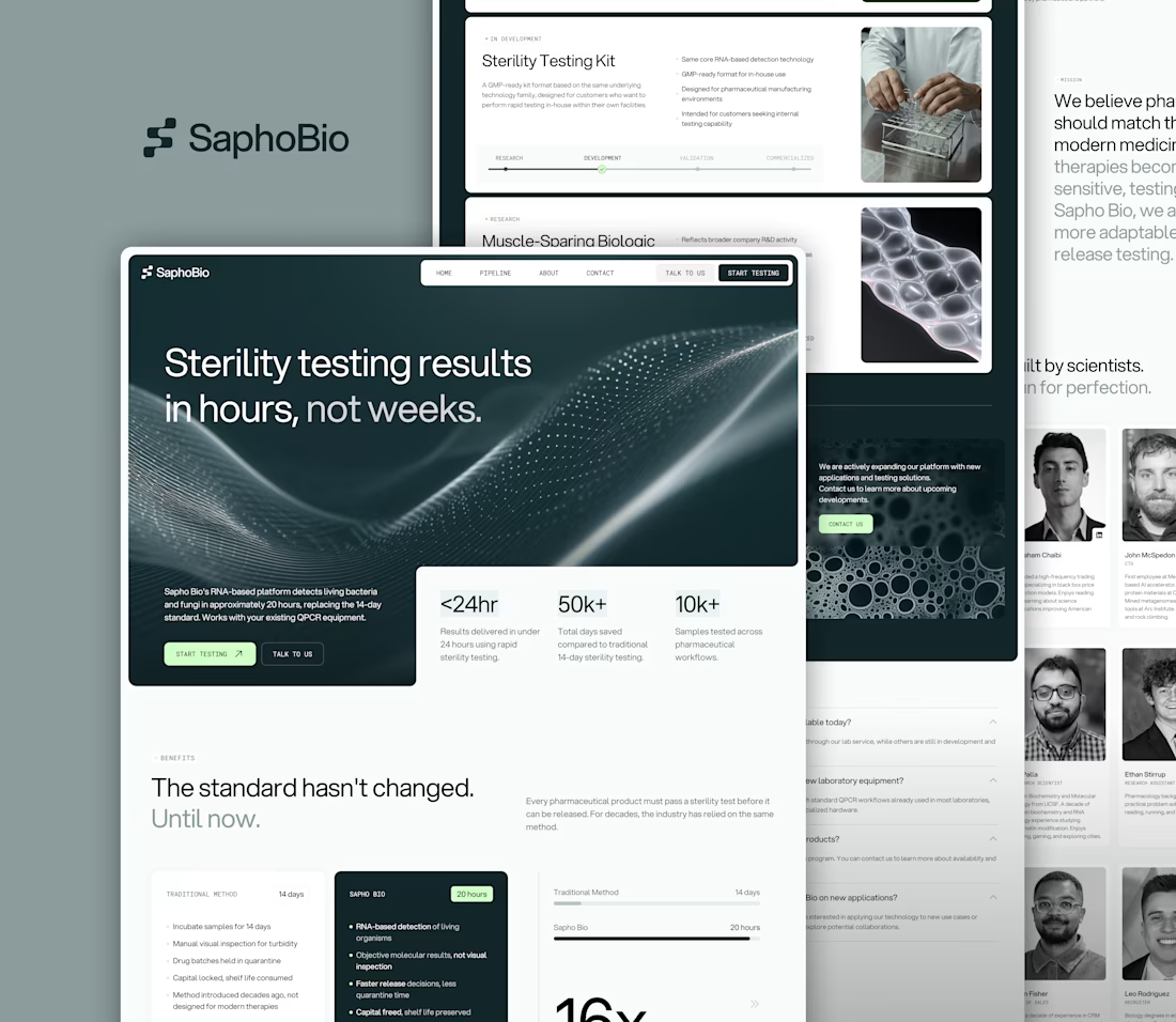
Partnered with SaphoBio, a San Francisco based biotech company developing next-generation microbiological testing, to design their branding, logo, and website.
The goal: translate complex science into a clear, credible, investor- and client-ready experience, enabling stronger...
Partnered with SaphoBio, a San Francisco based biotech company developing next-generation microbiological testing, to design their branding, logo, and website.
The goal: translate complex science into a clear, credible, investor- and client-ready experience, enabling stronger...
We designed the brand and website for SymphonIQ, an enterprise AI platform focused on control, ownership, and institutional intelligence.
We created a structured visual system and clear hierarchy to communicate trust, governance, and long term value.
See it live → symphoniq.ai