
pro
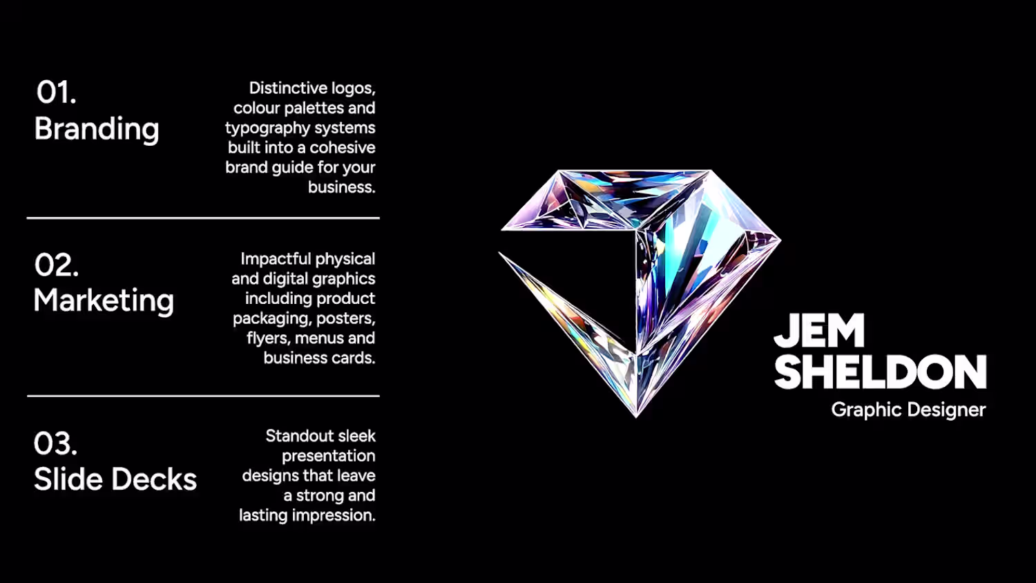
Jem Sheldon
Focused graphic design that brings your ideas to life.
Ready for work
Jem is ready for their next project!
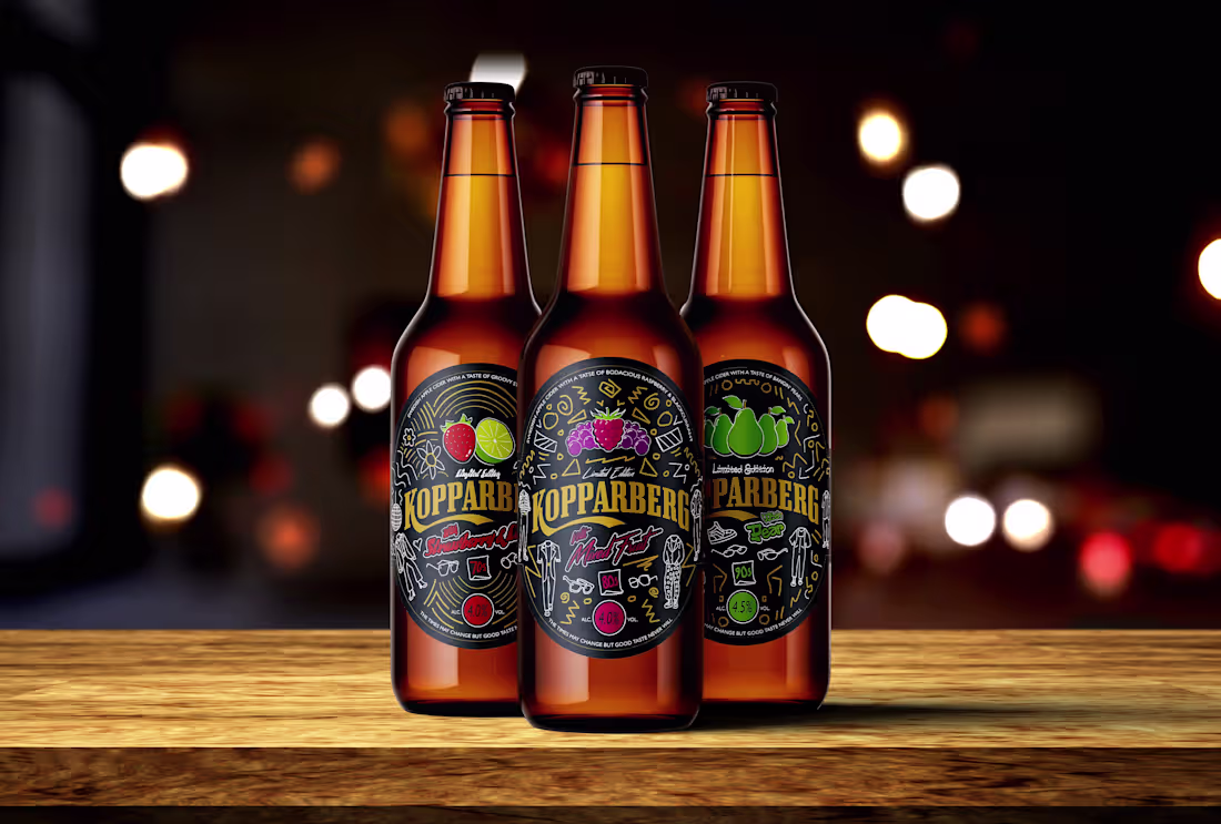
In 2021, I created some limited edition labels for Kopparberg's "To Firsts That Last". The concept targeted young creatives by using vintage fashion to celebrate freedom and self-expression. Each design captures a defining era: Strawberry & Lime (70s), Mixed Fruit (80s), and Pear (90s), creating a visual timeline that connects personal fashion style with personal taste. United under my original tagline, "The times may change but good taste never will," this work links Kopparberg to lasting cultural moments and a sense of liberation!
0
248
Hi everyone! I am very excited to share my first project on Contra. It is a true fusion of my love for local heritage and modern, strategic design. This café celebrates the historic Norwich Market and the city I am proud to call home.
The Canopy: A Fine Café
The vision was to create a brand identity that honours the market's 900-year heritage while feeling completely fresh and modern. The iconic striped canopies were the perfect starting point.
The entire visual system transforms this historic symbol into a contemporary design language. This positions the café as "A Fine Café", a fun nod to the city's quasi motto.
2
20
463

In a world growing more divided, connection has never been more important.
Uncommon Ground is an app concept I developed for the D&AD New Blood Awards 2023, designed to break barriers and group people together through unique shared interests and hobbies.
Because no matter how different we seem, we have more in common than we think even in the uncommon.
2
297
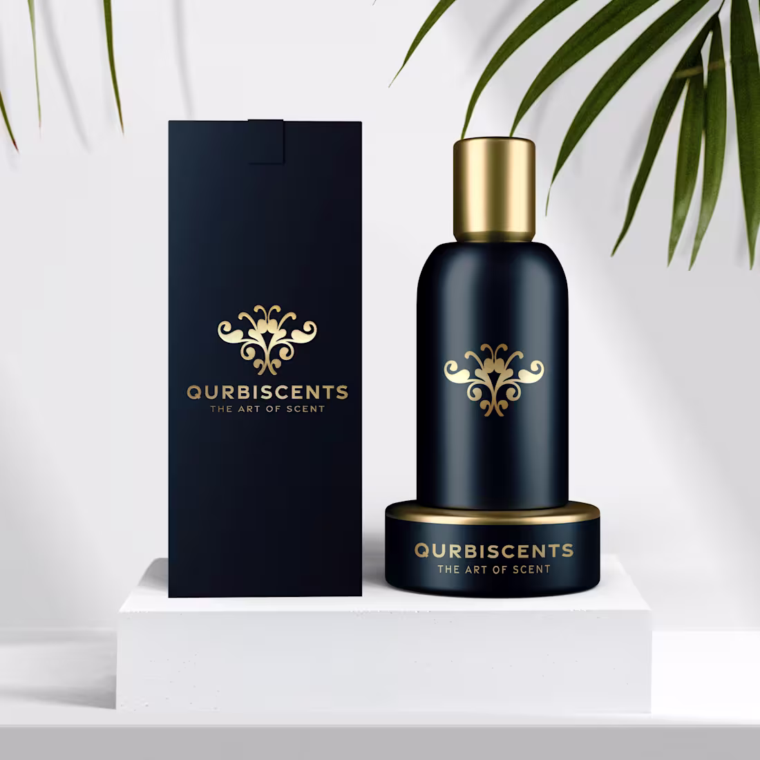
I recently developed a brand identity for a high-end perfume. The goal was to create something that embodied sophistication, timeless appeal and modern elegance for a discerning clientele.
The result is a refined combination mark, pairing a custom emblem with an elegant wordmark.
The colour palette chosen was to evoke an immediate sense of luxury and premium quality across all applications from packaging to digital presence.
3
23
432