
JENIS JE
Creative Product & Visual Design, creative image


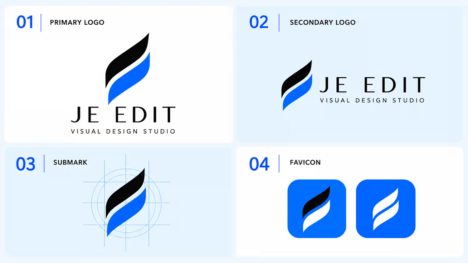
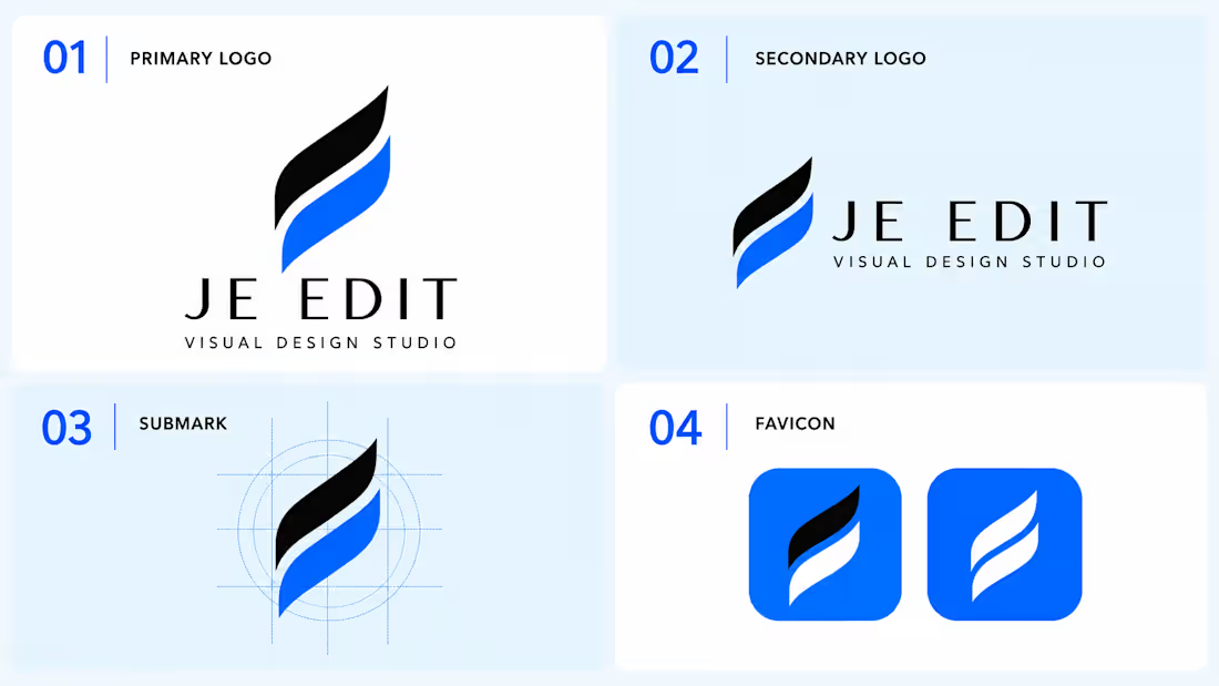
JE EDIT is an independent visual design studio focused on creating refined, purposeful visual identities and digital brand assets. This project represents the development of the studio’s own identity system—from the core symbol and typography to secondary logo applications, submark, and favicon—built for consistency across digital platforms
Recommended Work entry
JE EDIT — Visual Design Studio
Role: Brand Identity Designer
Project Type: Logo & Visual Identity
Industry: Creative / Visual Design
Project description:
Developed a complete visual identity system for JE EDIT, including the primary logo, secondary logo, submark, and favicon. The identity uses a refined black-and-blue palette with a distinctive flowing symbol designed to communicate creativity, precision, and visual movement. The system was structured for consistent use across digital platforms, social media, and brand applications.
Deliverables
Primary Logo
Secondary Logo
Submark
Favicon
Logo construction system
Digital brand applications
If the platform asks for “Work Experience”
Don't list it as employment at another company if it was your own project. Use:
JE EDIT — Founder / Visual Designer
2026 – Present
Independent Creative Studio
0
24

Thumbnail Design — High-Impact Visuals
A curated set of four thumbnail concepts designed to make content instantly recognizable and visually compelling.
Each thumbnail uses a different creative direction, with careful attention to composition, subject focus, typography, contrast, color balance, image treatment, and visual hierarchy. The goal is to communicate the core idea within seconds while creating a strong reason to click.
Focus
High-impact visual composition
Clear subject and message hierarchy
Professional photo manipulation & retouching
Strong typography and readability
Attention-grabbing color and contrast
Platform-ready visual presentation
Every design is built around the specific content rather than following one repeated template—giving each thumbnail its own visual identity while maintaining a polished, professional finish.
1
2
208
Nike Footwear Creative Campaign & Product Advertisin
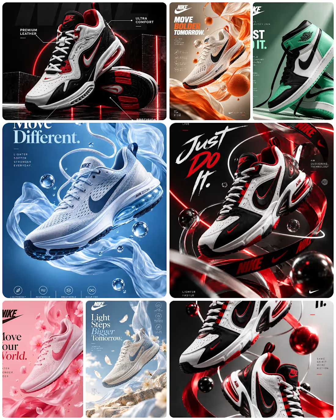
A multi-concept footwear advertising campaign created to present sneakers through high-impact commercial art direction, product-focused composition, and premium visual storytelling.
The project explores several distinct creative directions—from high-contrast athletic energy and bold typography to soft lifestyle compositions, fluid motion, seasonal color stories, and futuristic product environments.
Each visual was designed around the footwear as the primary subject, with carefully considered lighting, perspective, material detail, depth, typography, color balance, and composition to create campaign-ready advertising visuals.
Creative Focus
Product advertising & campaign design
Footwear visual direction
Commercial composition
Art direction
Typography & layout
Lighting and depth
Lifestyle/product storytelling
Social media & promotional creatives
1
3
175
VÆRON
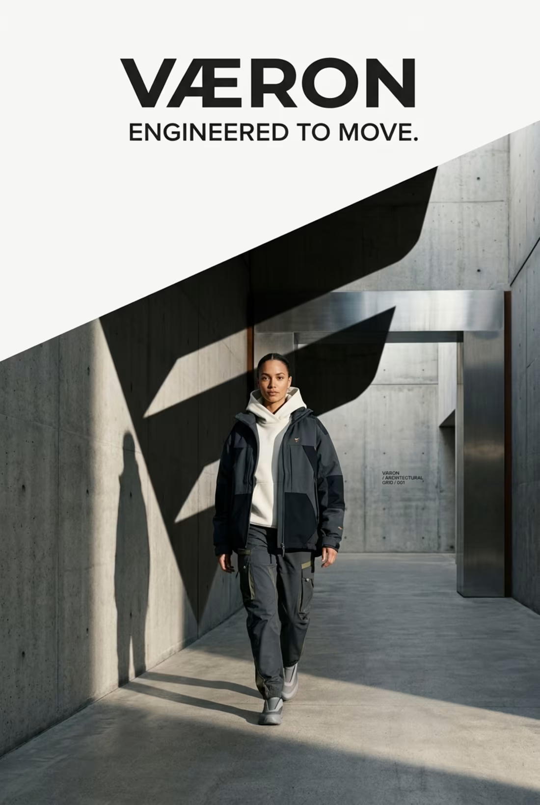
A complete visual identity exploration built around one central idea: FORWARD FORM — a design language where fashion, architecture, engineering and movement converge.
Rather than designing a logo in isolation, I developed VÆRON as a connected brand system, where every decision has a purpose.
From the Æ construction and typography to the geometric language, material direction, color architecture, garment design, hardware, packaging, digital experience and campaign world — every layer was developed to function as part of one recognizable visual universe.
The creative direction balances contemporary streetwear with quiet luxury, using engineered silhouettes, tactile materials, architectural forms and controlled color to create a distinctive identity with both character and restraint.
The goal was simple: build a brand that remains recognizable even when the logo is removed.
Concept → Identity → Graphic System → Material → Garment → Packaging → Digital → Campaign
This project represents my approach to brand identity, creative direction, AI-assisted visual development, image editing, fashion visualisation, art direction and detail-driven design.
VÆRON
ENGINEERED TO MOVE.
Want to see the thinking behind the visuals?
Explore the full case study in my portfolio — from the initial concept and identity system to the final brand world.
Open to creative collaborations, freelance projects and brand identity opportunities.
5
17
1.5K