
pro
Jayson Clarit
I design your brand and launch it live using Framer.
Ready for work
Jayson is ready for their next project!
Adding a shader to my portfolio makes it look so premium, even with a simple layout!
This is the power of Framer—it's such an intuitive tool. As a designer with limited knowledge of coding, it’s a total game-changer for building professional sites fast.
Check it out: jaysonclarit.com (http://jaysonclarit.com)
3
5
107
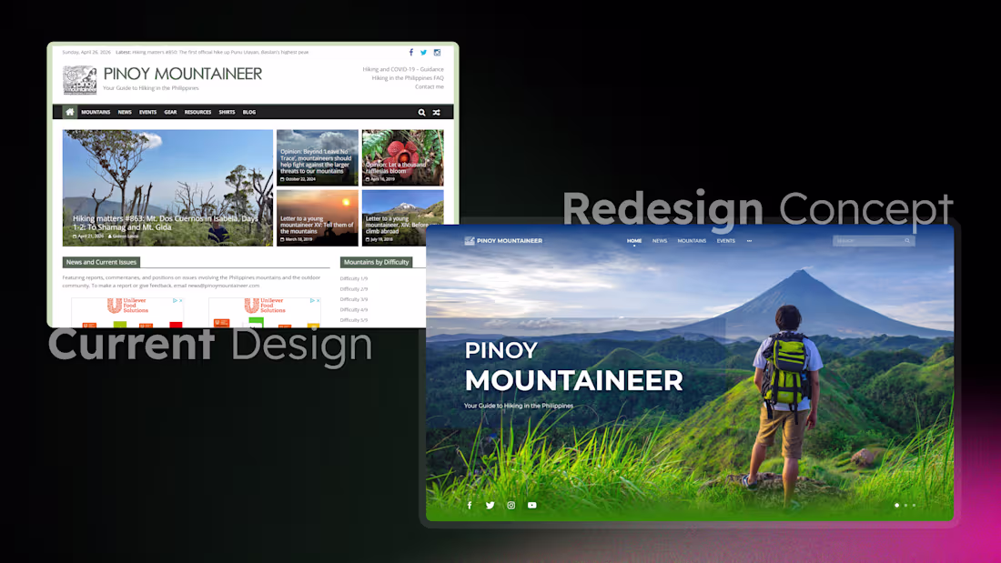
Sharing this Pinoy Mountaineer Landing Page Redesign Concept.
Current Site Design: https://www.pinoymountaineer.com/
Feedbacks and suggestions are highly appreciated.
3
2
224
Sharing this landing page concept I designed last 2024 for a coffee shop.
My focus was on creating a digital experience that isn't just visually appealing, but also solves the problem of connecting a physical cozy vibe with a functional online presence.
Take a look at the live prototype and let me know your thoughts!
https://fig.page/themanorcafe
2
194
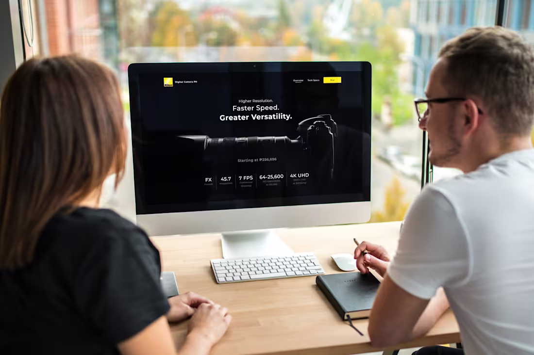
Sharing a landing page concept I created, aiming to capture the power and precision of Nikon's professional cameras with a clean, dark-mode aesthetic that lets the tech shine.
I focused on intuitive user flows and highlighting key specs, all designed to convert curiosity into a click.
I'd love to hear your feedback on the layout and user experience! Any suggestions to push this design further?
1
194
ML Prycegas Center Logo
I designed a professional visual identity for ML Prycegas Center, a local retailer here in the Philippines specializing in LPG (liquid petroleum gas) and high-quality gas stoves.
The Challenge
The client needed a logo that looked trustworthy and safe, while still standing out in a competitive utility market.
The Solution
I designed a dynamic combination mark that pairs bold, modern typography with a stylized flame emblem.
Color Strategy:
I utilized a vibrant orange-to-red gradient to represent heat and energy.
Symbolism:
The "flame" icon was crafted to feel fluid and energetic, symbolizing consistent performance.
Versatility:
The final design was delivered in two formats to ensure the brand remains crisp and recognizable whether it's printed on an LPG tank or featured on a digital storefront.
The result is a strong, industrial-modern brand that establishes ML Prycegas Center as a top-tier provider in their community.
1
206
Caferajan Logo
I designed the visual identity for Caferajan, a local coffee shop here in the Philippines looking to establish a cozy yet professional brand presence.
The goal was to create a logo that felt welcoming and artisanal. Since they wanted a combination mark, the challenge was blending the brand name with a coffee-inspired icon without it feeling generic. I focused on a circular emblem design that features a steaming cup of coffee, using a rich, warm color palette that reflects the premium quality of their brews.
1
182
K&K Frozen Food Trading Logo
I was approached to design the brand identity for K&K Frozen Food Trading, a distributor and dealer for major brands like Mekeni, Purefoods, and various imported meats.
The goal was to create a logo that felt established and trustworthy, especially since they work with such well-known names in the food industry. The challenge was making the brand stand out as a reliable distributor while keeping the design simple and recognizable. I focused on a clever geometric approach, combining two "K" letters into a single, unified mark that represents partnership and seamless distribution.
1
194
In 2025, a colleague reached out to me to help him create a logo for his new platform, Budolist.com (http://Budolist.com)
Problem:
Creators and influencers often share their favorite finds through messy, unorganized lists. They lacked a professional "gallery-style" platform that could make their curated collections look as premium as the items they were recommending.
Solution:
I designed a sophisticated visual identity centered around a clean, modular monogram that feels both high-end and functional.
Challenge:
The goal was to make the logo feel like a "luxury container"—distinct enough to be recognized, but neutral enough to never clash with the diverse content (from fashion to tech) that curators share on the platform.
Summary:
The final logo gives Budolist.com (http://Budolist.com) a credible, "editorial" aesthetic. It transforms a simple list-making tool into a professional curation platform where users feel proud to showcase their world.
2
243
FaustINNOTECH IT Solution Logo
Back in 2020, a colleague reached out needing a logo for his IT firm, FaustINNOTECH.
Since they handle everything from software to hardware, the trick was creating a single, clean mark that represented all those different services without looking cluttered. I presented three different design directions to make sure we found the perfect fit that felt both innovative and trustworthy.
We ended up with a modern look that really gives the brand a professional edge.
If you're ready to turn your own business vision into a high-impact reality, I’d love to help you build a brand that stands out!
2
231