
Jamie de Rooij
Multidisciplinary designer, aiming for bold design solutions
New to Contra
Jamie is ready for their next project!
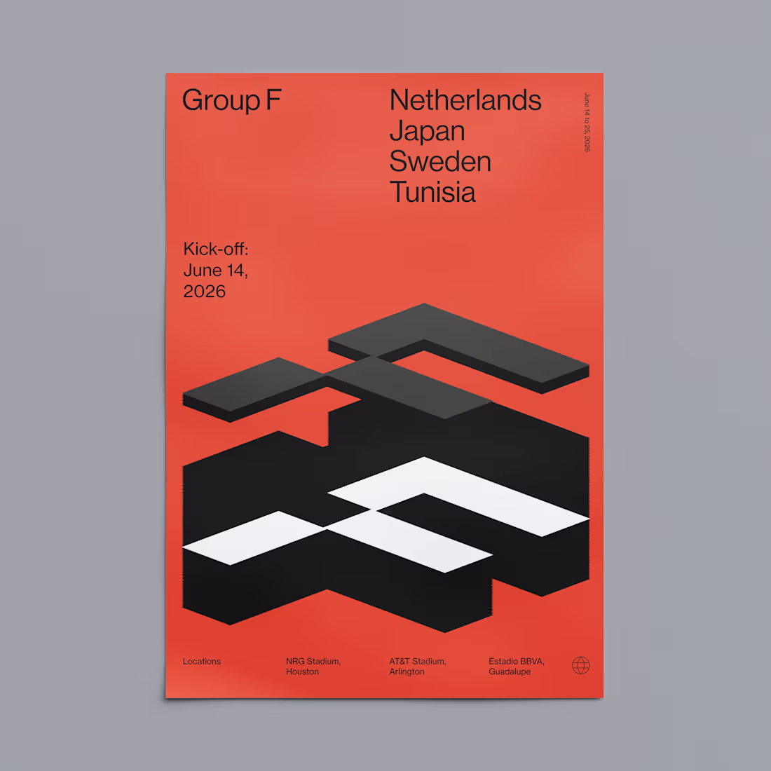
I promised myself I'd share more of my work on Contra, and with the World Cup around the corner, it felt like the perfect excuse to start.
Over the years, I've always enjoyed creating alternative matchday posters for Ajax. For this tournament, I'll be continuing that tradition with a series of World Cup-inspired designs.
This is the first one of the series, and I had a lot of fun bringing my idea to life. More posters to come throughout the tournament.
1
1
47
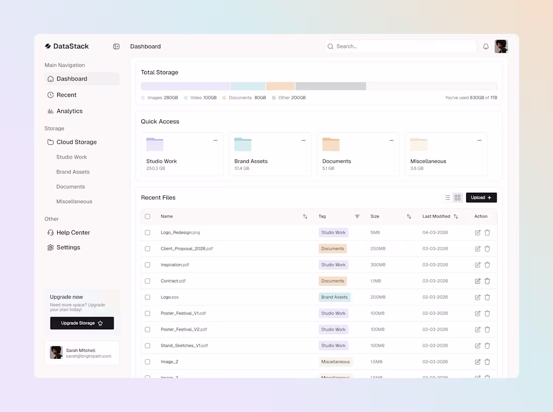
I had fun designing my first dashboard. It will be used for case study I am making.
6
7
122
A month ago I launched my new website. As a creative it can be challenging to build your own portfolio. There's always something that could be refined or improved. It's easy to forget that a portfolio isn't meant to be perfect from day one, but to evolve and grow over time.
✅ It should represent what defines me as a designer. That's why I created a poster wall, because that is what makes me stand out as a designer.
✅ It should show that I am a multidisciplinary designer.
✅ It should be a visual archive that is easy to scroll through.
✅ It needs to be fun 😀
www.jamiederooij.com
13
20
227
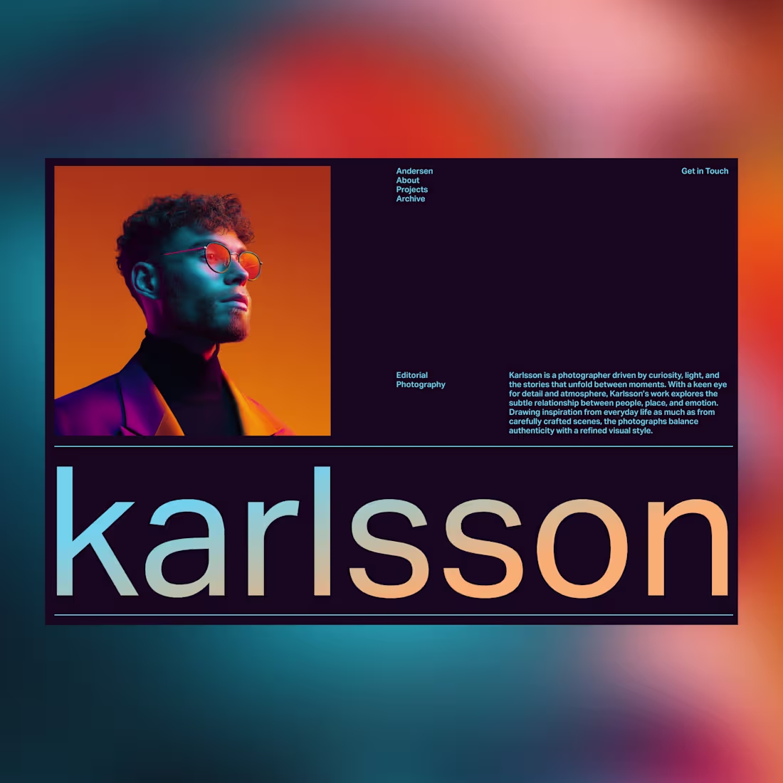
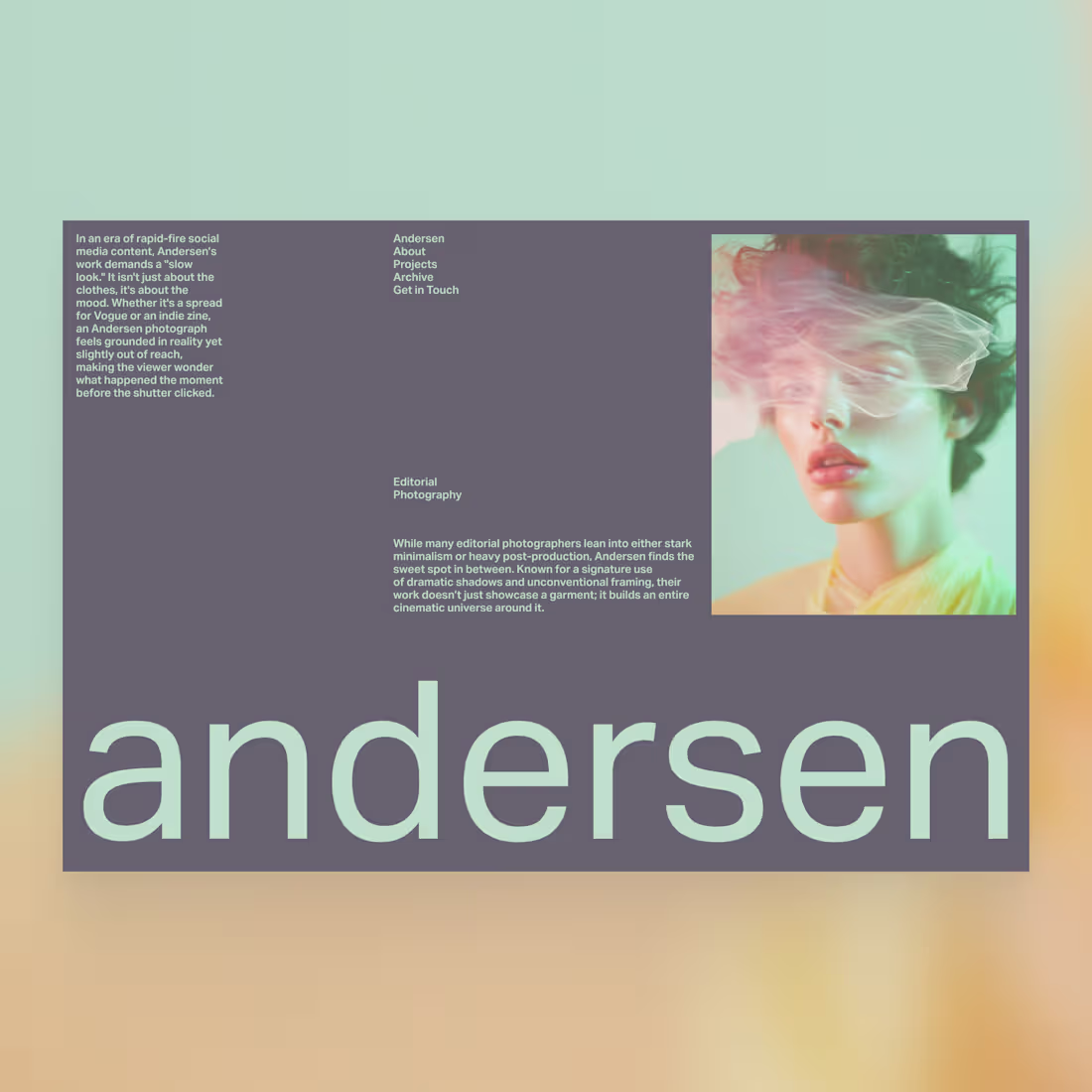
Nothing better than starting the week with an editorial layout.
Picture @lummipics (https://x.com/lummipics)
Ava Thiery
2
2
59
In my work I always try to experiment. For this testimonial exploration I tried out a bold way of showcasing the testimonials.
2
3
79
Hello all!
I finally joined this platform, and I am looking forward to what it will bring me. To introduce myself, and my work, I created a little video.
Open for work!
3
3
82
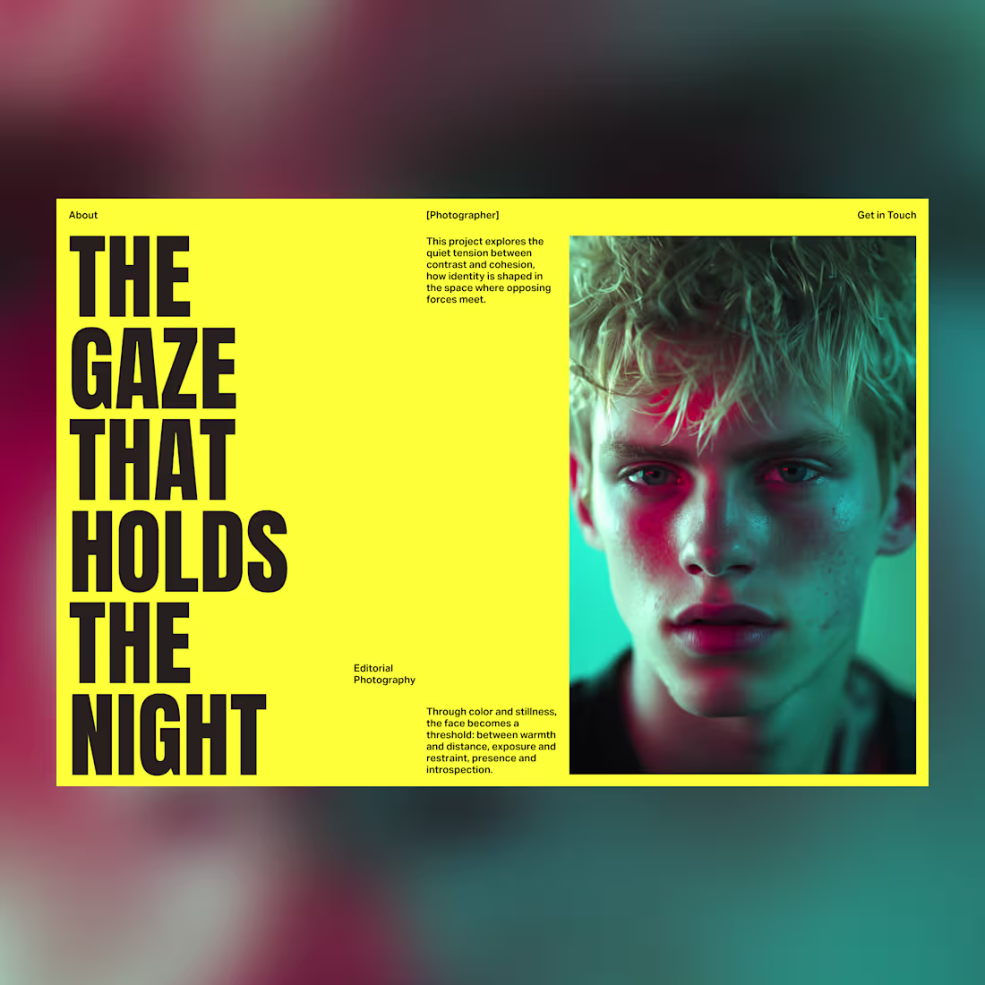
Editorial Layout
A refined editorial layout where imagery takes center stage. I’ve balanced bold, expansive photography with purposeful negative space.
2
11
157
Editorial Layout
A refined editorial layout where imagery takes center stage. I’ve balanced bold, expansive photography with purposeful negative space.
1
67
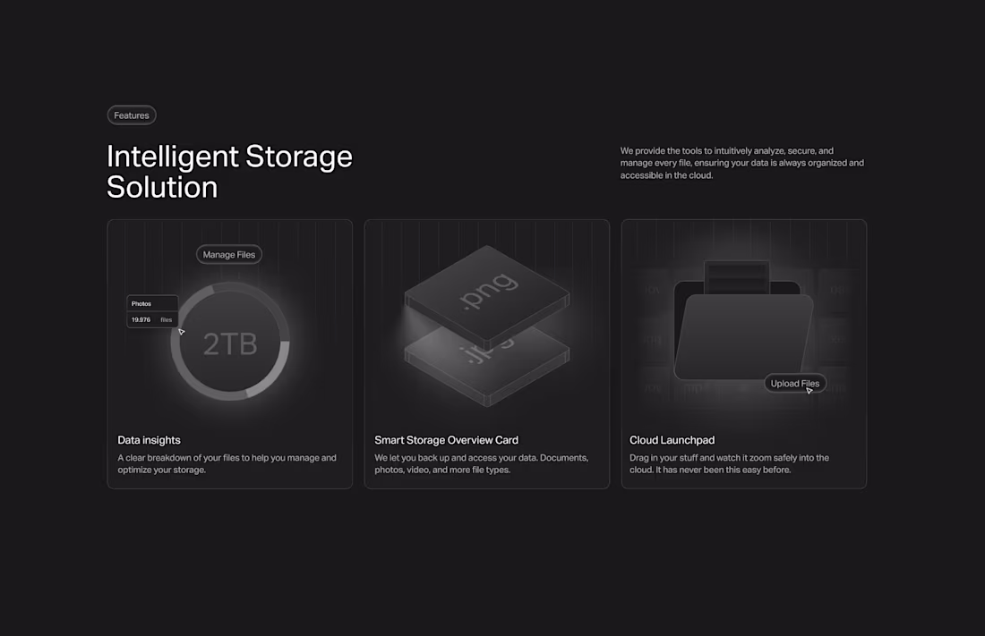
Intelligent Storage Solution
To simplify complex services, I utilized a "Bento Grid" layout. By pairing structured hierarchy with custom illustrations, I transformed technical information into a clear, digestible, and visually satisfying narrative.
21
29
460
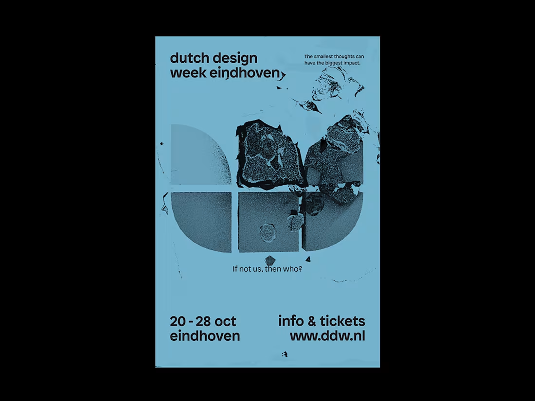
Dutch Design Week, Campaign, 2018
I was asked to design one of the 5 campaign posters for the Dutch Design Week 2018. The theme of this edition was: If not us, then who? I looked at the butterfly effect. I developed a campaign concept centered on the "stone in the water" metaphor, the idea that one small act creates an infinite ripple. Using a raw, stencil-machine aesthetic, I gave the message the urgency and weight it deserved.
1
66