
pro
James Klahn
I build brands that match the quality of your product.
Ready for work
James is ready for their next project!
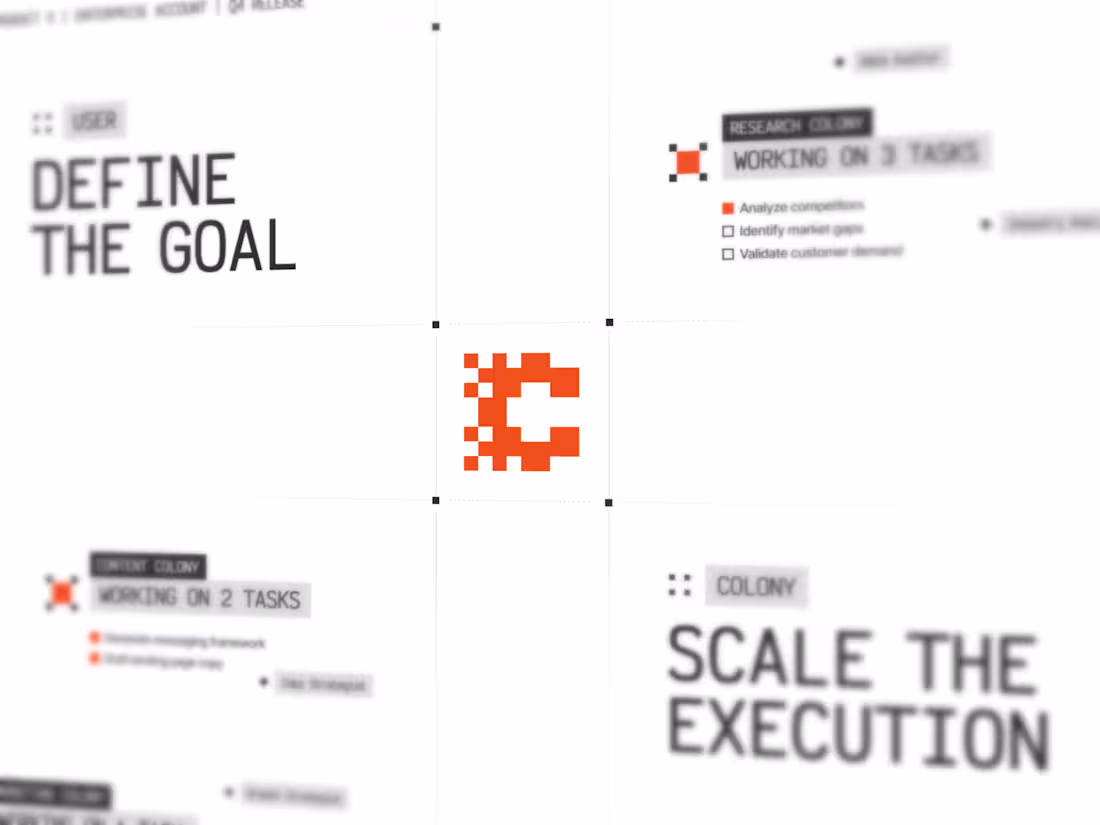
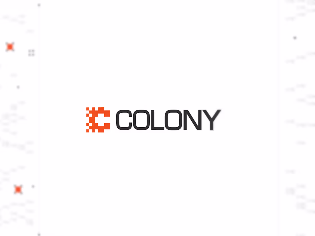
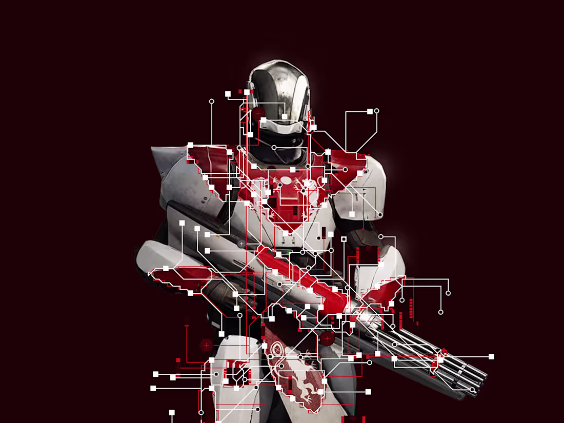
Colony is a conceptual platform for multi-agent collaboration.
The part I enjoyed most about this project was visualizing the relationship between agents. Rather than treating AI as a single intelligent system, the brand explores how specialized agents can work together, share context, and contribute toward a common goal.
The identity draws from ideas of coordination, collective intelligence, and interconnected systems, translating a complex technical concept into a simple, memorable visual language.
Check out the full project: https://www.jamesklahn.com
6
152
Here's another sneak peek! Excited to bring this one together.
Case study should be live soon!
0
83
Working on something new...
Building out the case study now. Hoping to have it ready to share by this weekend. This one's worth waiting for :)
2
2
158
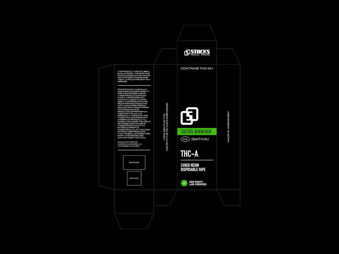
One of my favorite ways to sharpen my branding skills is by studying growing local companies and exploring how their identity systems could evolve alongside the business.
For this concept, I looked at a Wisconsin-based brand and explored what a more cohesive visual system might look like across products, packaging, and future customer touchpoints. Rather than focusing on a single package design, the goal was to think about how the brand could scale consistently as new products, marketing materials, and experiences are introduced.
This isn't a finished solution or recommendation; more of an exercise in translating a strong product and business into a more unified brand system. I always find these explorations valuable because they force me to think beyond individual assets and focus on the larger story a brand is trying to tell.
A few early concepts ↓
2
129
Getting into the details
0
11
I've been working on a new brand direction for Priority—a productivity tool that focuses on your core identity rather than the repetitive tasks that you complete to get there.
Just shared some V1 brand concepts with the team. Overall, happy with the ideas, going to refine the direction a bit further.
Should have in-depth updates soon!
2
74
Here's todays warmup. Trying a few different things to see what sticks.
1
1
81
cooking up something new
1
2
91
Took some time today to try out Geist Pixel. I'm really liking the general style of it and can imagine that it will become popular quickly.
1
1
75
Decided to try out Node Machine for photoshop and I'm having a blast.
Excited to incorporate this into my current workflow (lots of potential for unique brand elements with this tool).
What do you think?
2
62

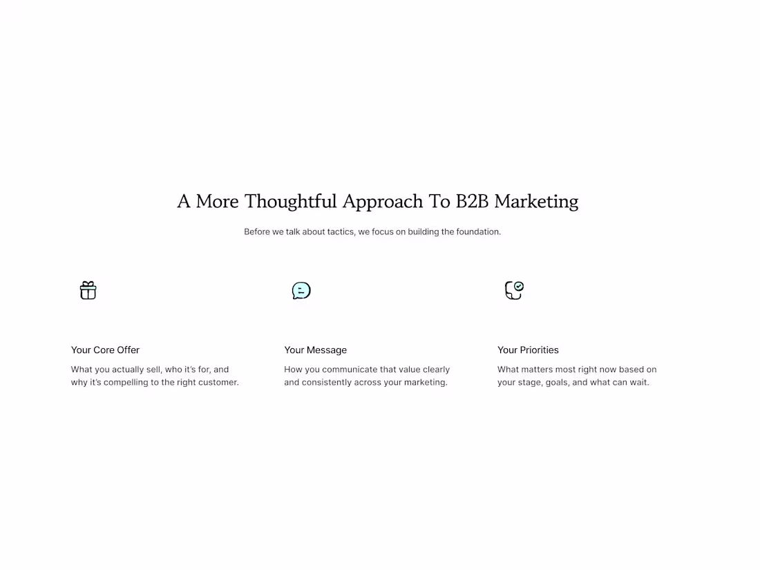
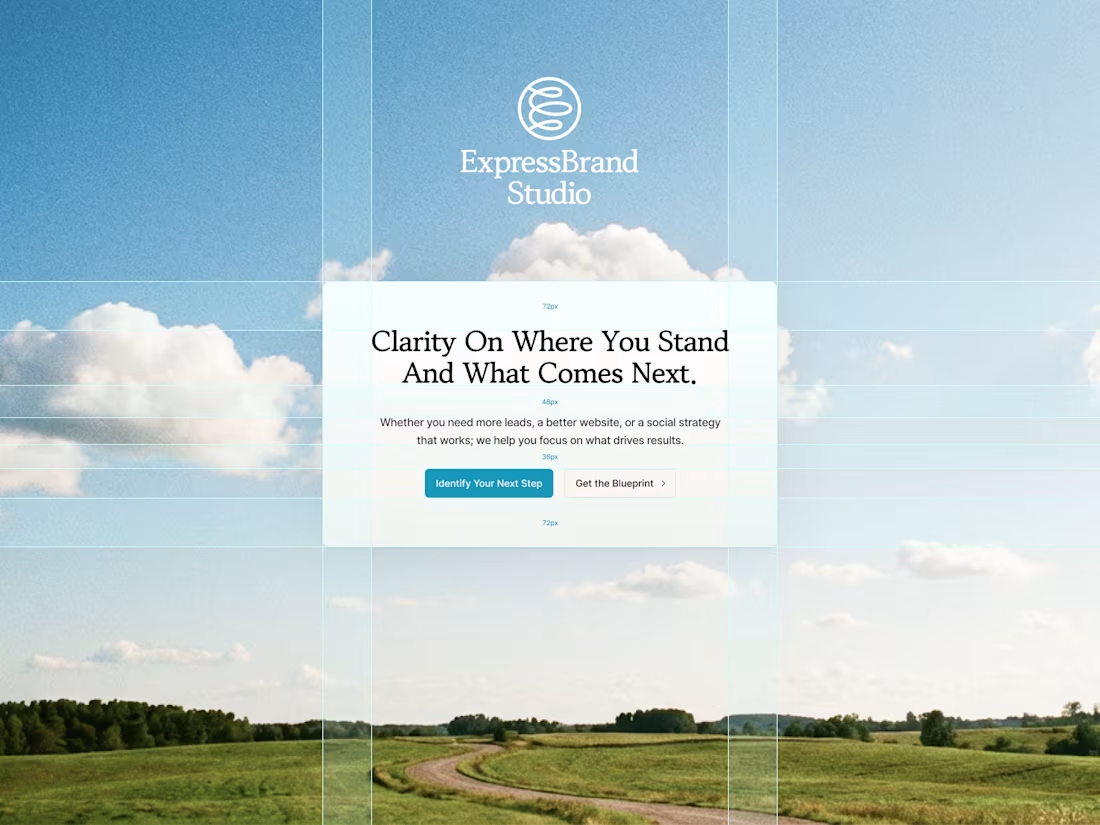
Wanted to share one of the variations of the ExpressBrand Studio hero section.
EBS is all about finding clarity in your brand's messaging and positioning. This direction followed that motto.
Let me know what you think!
2
69
{redacted} isn't another productivity tool. It's who you are becoming, and the system to get there.
Excited to bring this brand together. Here are some snapshots of the visual directions so far...
2
4
69
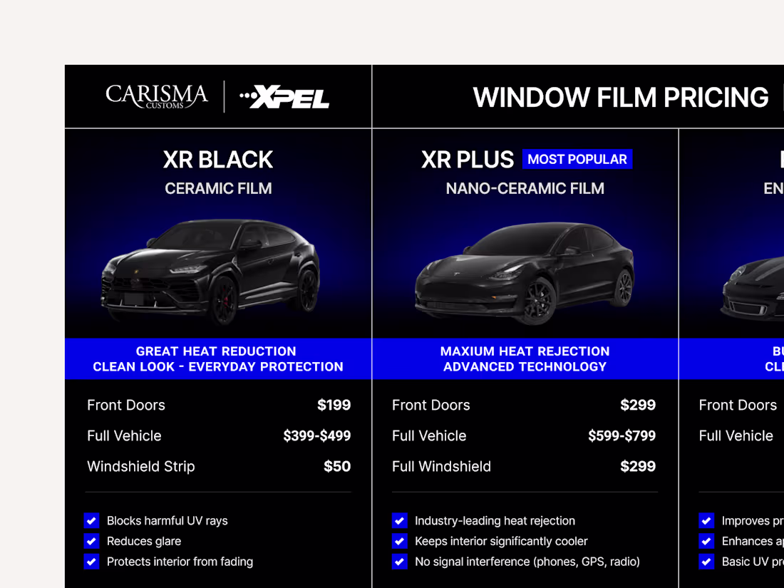
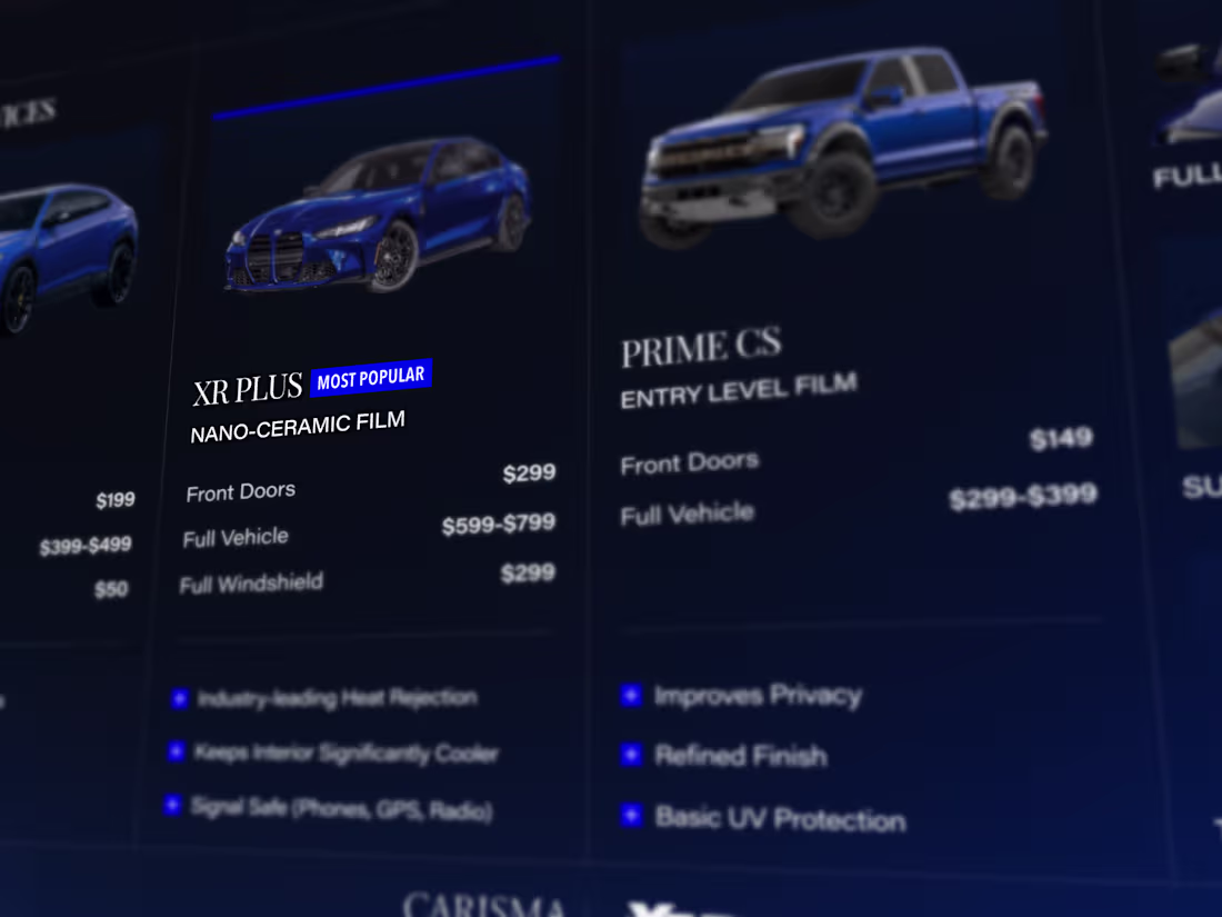
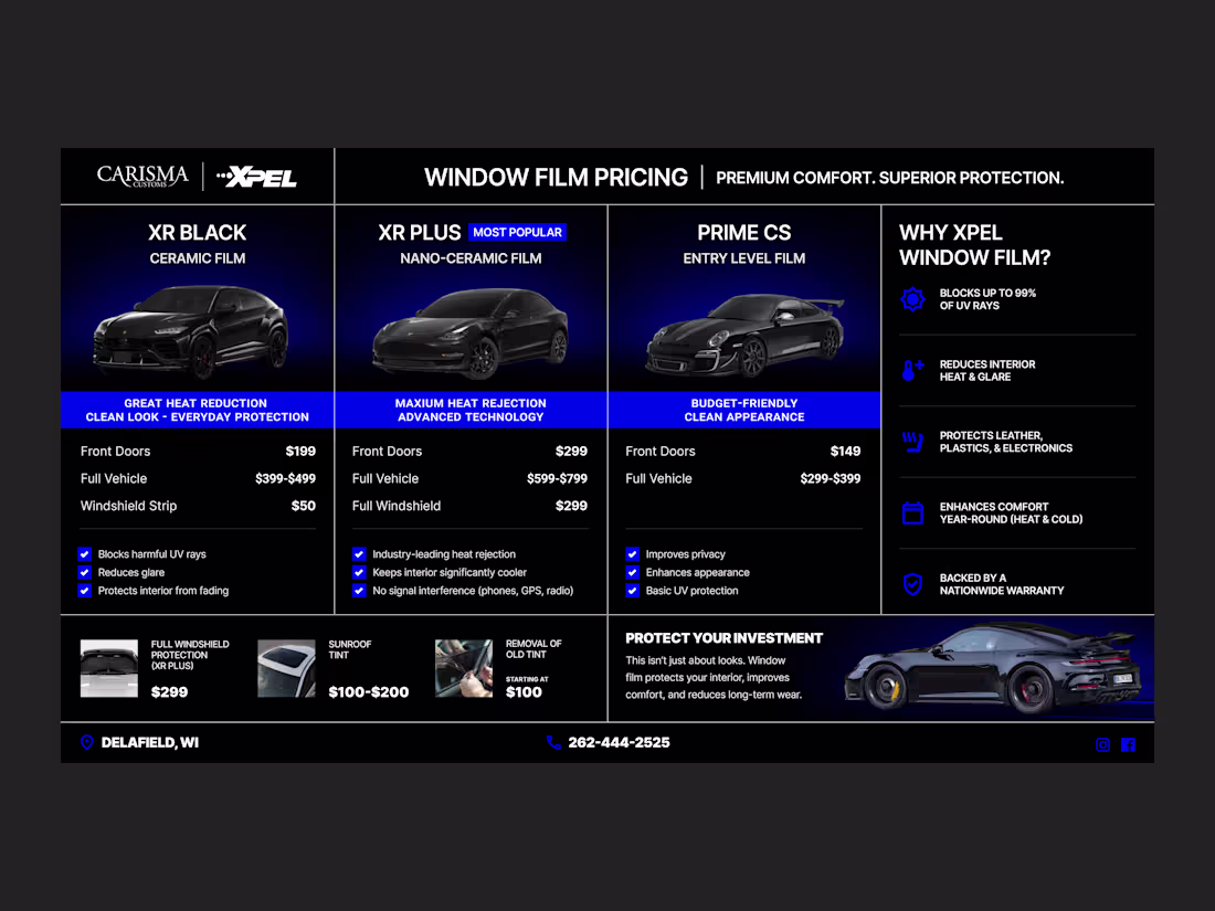
Working on a custom tint spec sheet for a premium auto spa in the area...
The plan is to also update the brand to better reflect their target audience.
Stay tuned!
1
53
Working on some interactive digital screens for a premium car spa.
1
45

Here's a quick glance into a energy drink packaging that I did (this was actually the v1 for Goblin Serum)
This packaging, identity, and art direction was updated as Goblin Serum pre-workout!
Let me know what you think.
1
3
96
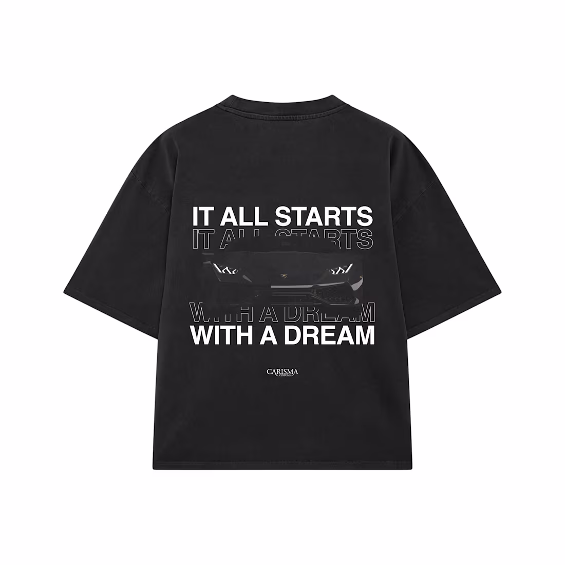
Working on some t-shirt designs for a local car spa...
What do you think?
0
55
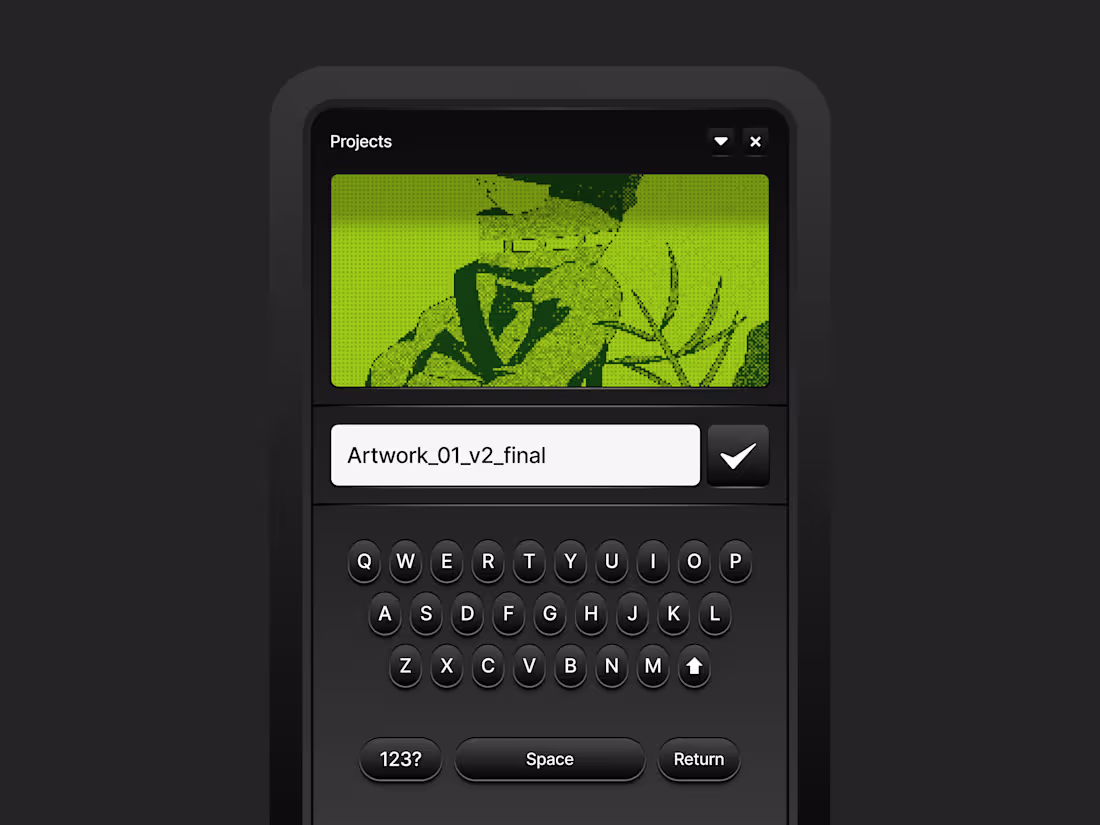
Taking some time to play around with https://www.ascii-magic.com/
Let me know what you think!
0
52
Heres a close up some of the visual updates to Markit - a mobile app that gives you gift cards for simply showing up.
Detailed project breakdown soon...
2
1
102
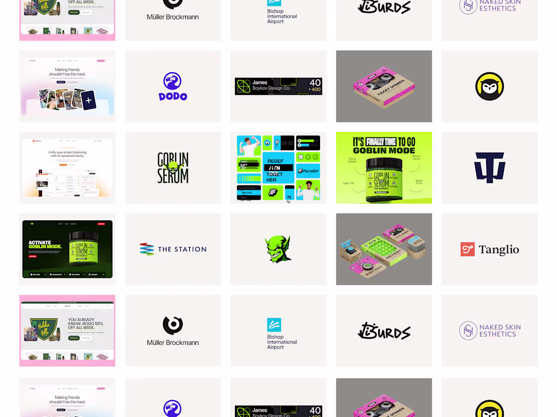
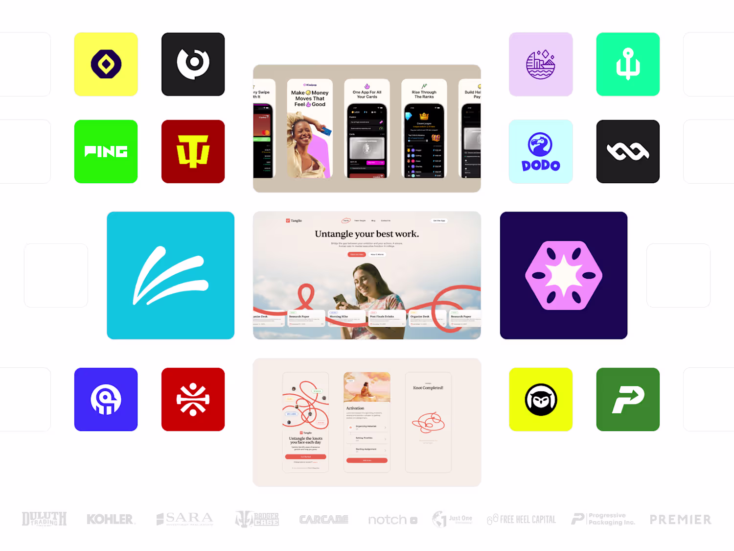
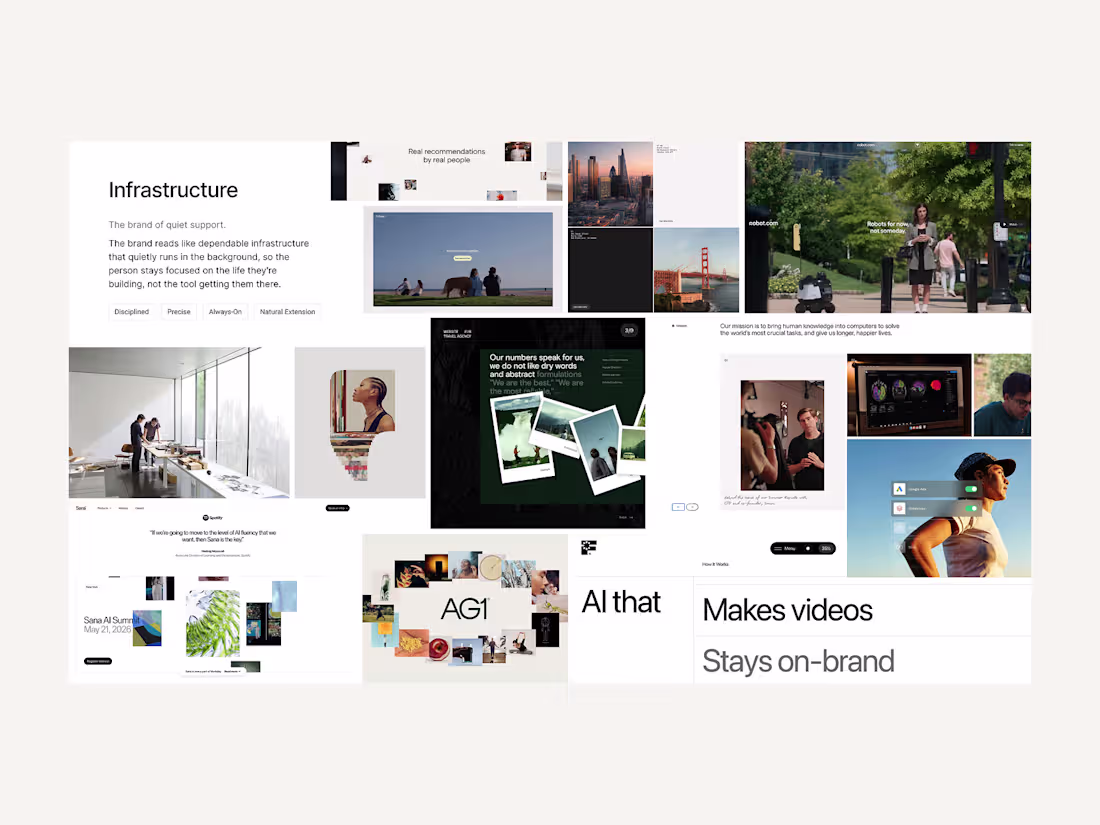
Pulling together some of my favorite work for the new site. More coming soon!
6
17
315
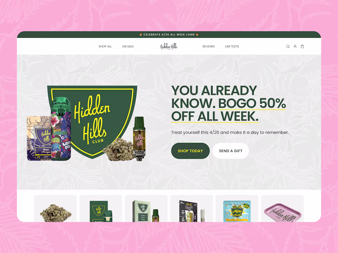
Redesigned the hero section for Hidden Hills Club's 4/20 campaign. The brief was simple, premium brand, week long BOGO promo, needs to hook immediately.
Focused on keeping it clean and letting the offer do the work rather than overdoing it.
What do you think?
2
4
107
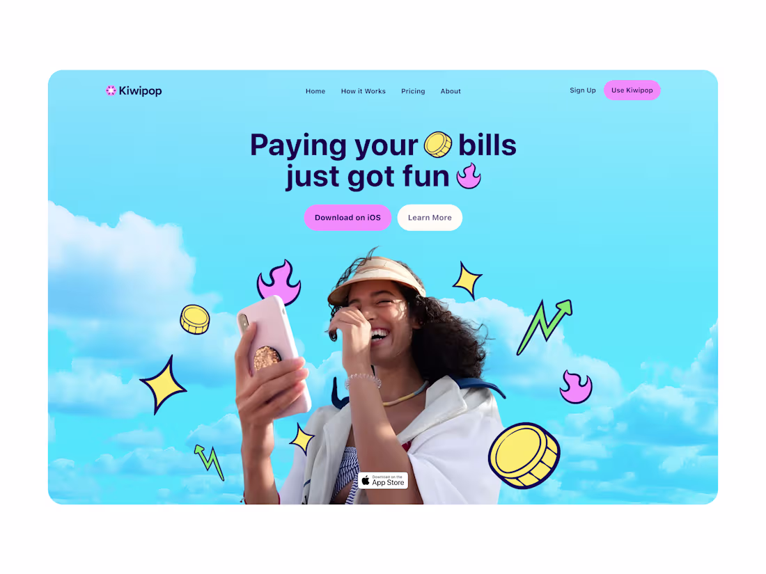
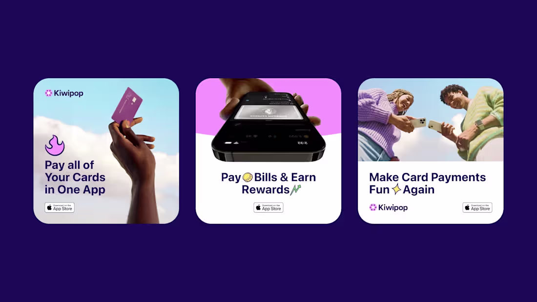
Here is a hero section design for Kiwipop.
Kiwipop is a fintech app that helps young adults tackle credit card debt without the stress. Thinking about debt is hard enough. Kiwipop makes the process feel rewarding, turning repayment into a gamified experience while teaching users about interest, payment options, and building healthier financial habits.
The brand needed to feel energetic and approachable without dismissing the real problem users are trying to solve.
2
3
129
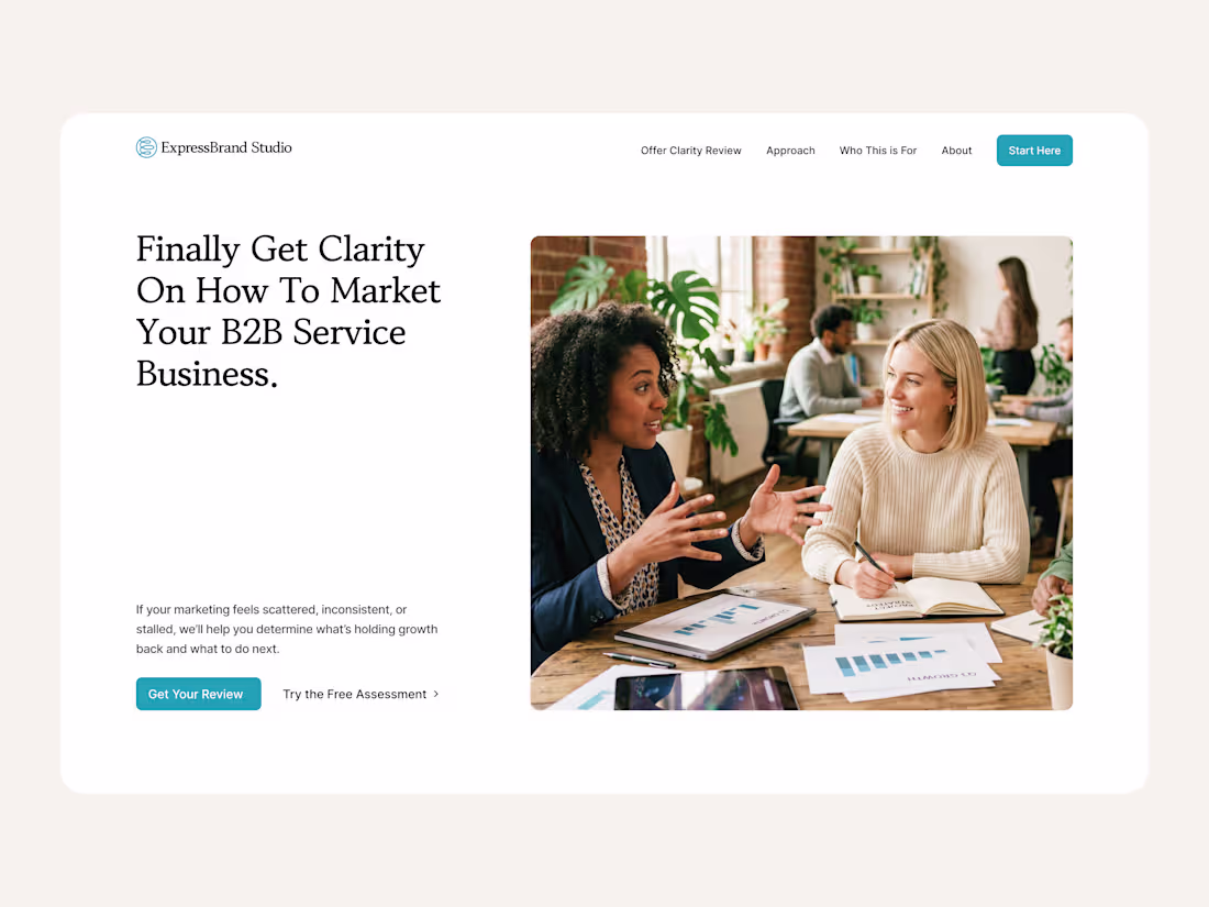
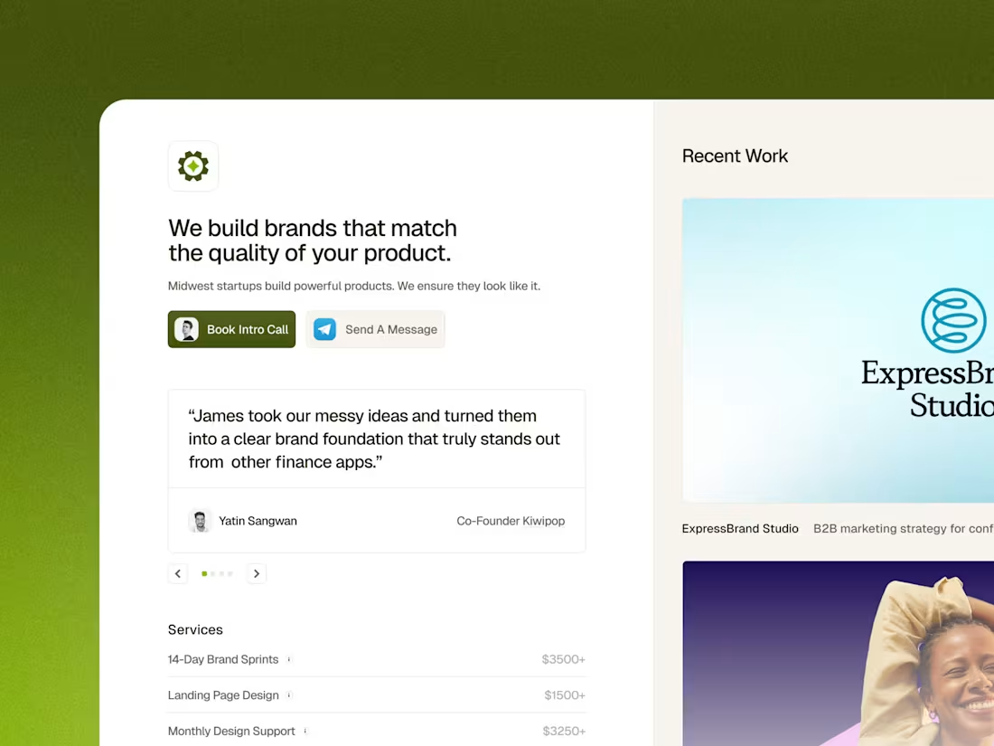
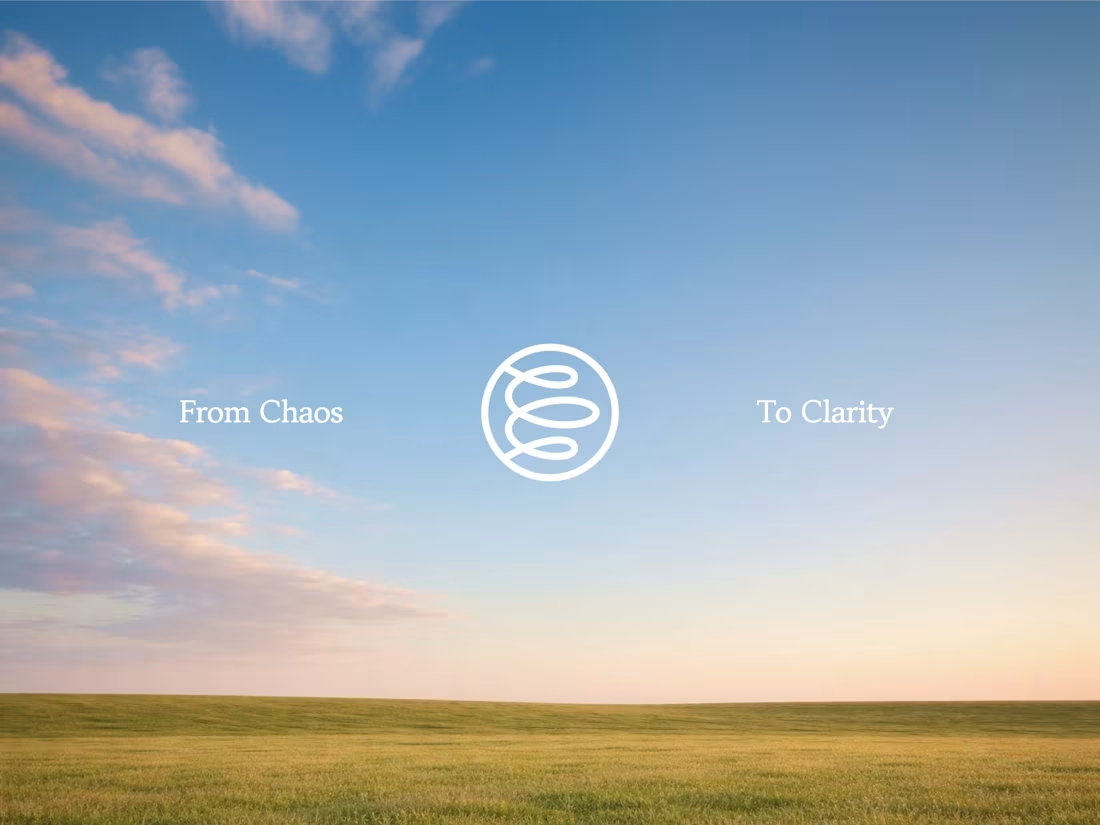
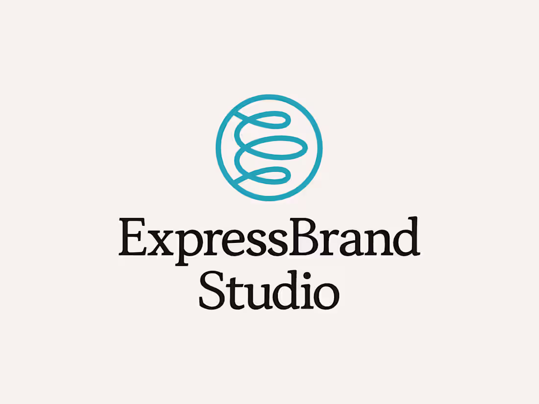
New work: ExpressBrand Studio.
What started as a rebrand turned into a full brand and landing page. A B2B marketing consultancy needed an identity that matched their methodology. Clean layout, intentional type, and a color system built around clarity.
Going live soon.
1
115
Some quick snapshots of some sections for a recent landing page project... looking forward to sharing the full thing once it's live!
1
115
Wanted to share some various icons styles I've had the pleasure to work on.
My record is nearly 1,000 custom icons for Mead & Hunt.
1
2
117
A knee injury while playing rugby in middle school changed the entire direction of my life.
I spent the first three days recovering by playing Destiny nonstop. But after a while, I realized gaming all day was not going to be enough. I needed to do something. I kept thinking about how cool the emblems were and wondering who had made them.
That is when I found an old copy of Photoshop on my dad's home computer. After countless YouTube tutorials, I picked up Photoshop and Illustrator. Creating something out of nothing felt incredible.
I started making logos and stream packages for Destiny streamers on Twitch and YouTube, combining a new skill with a community I actually cared about.
By the end of my first month, I was charging $5 for logos and $25 for stream packages. My proof of concept that design could be a career.
1
2
125
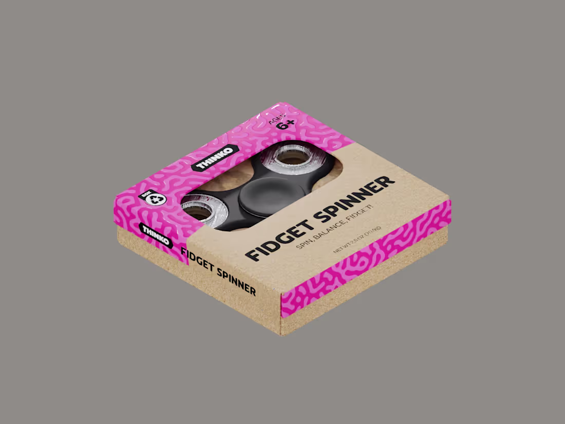
Here is an old packaging project for Thinko. The packaging was created in Adobe Illustrator and brought to life within Blender.
2
110
Before you scale, you have to be aligned. Currently in the process of tightening my studio's positioning, offering, and foundation before bringing on new clients & design partners.
New site dropping soon...
5
3
140
Something about grids...
0
137
ExpressBrand Studio refined its key selling point in just a few words.
0
144
Here is a quick snapshot of the brand guidelines for my recent brand project for ExpressBrand Studio... more to come!
2
142
Here are a few snapshots from a recent branding project I have been working on. Full case study & exploration will be out soon! The goal was to help this founder communicate their uvp through every touch point: Reducing the noise and providing clarity.
The brand mark symbolizes the ideas of taking large amount of information (often tangled up in a mess) and reducing it into the most valuable output. It also creates an abstract E monogram that relates to the brand name.
Would love to hear your thoughts on this human-led approach!
2
3
135
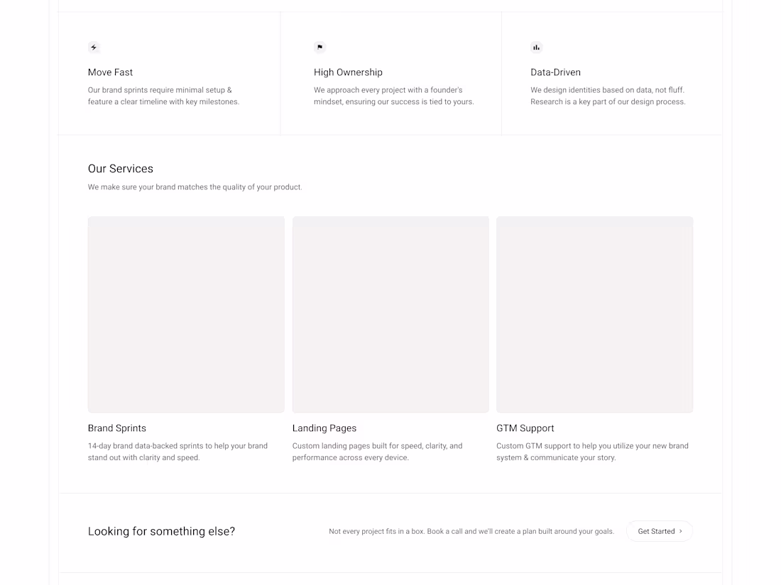
Working on the V2 for my personal site... This section focuses on my key services. Would love to hear everyones thoughts on the layout.
I am currently working on identifying what minimal card illustrations / animations would work best to showcase each offering. Leaning towards showcasing actual assets for each (brand guidelines, landing pages, GTM assets) or something more abstract like a brand bento grind, a landing page that changes widths to represent multiple devices, and some sort of simplified GTM roadmap for the final card.
Would love to hear your thoughts!
22
286
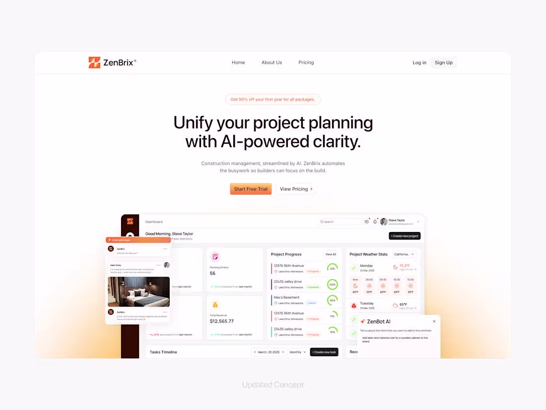
Based in Minnesota, ZenBrix is bringing AI clarity to the chaotic world of construction management.
When selling sophisticated software to builders, trust is everything. The goal of this design was to elevate the hero section to match the quality of the actual product. By introducing better visual hierarchy, depth, and a clearer value proposition, I aligned the external brand signals with the internal product value.
4
16
283
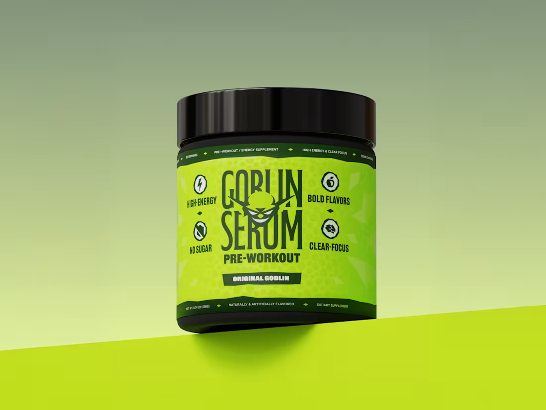
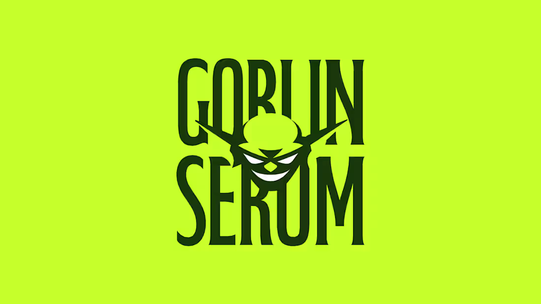
Wanted to share a few snapshots from a supplement brand I worked on building called Goblin Serum.
Bold energy, bold results.
1
170
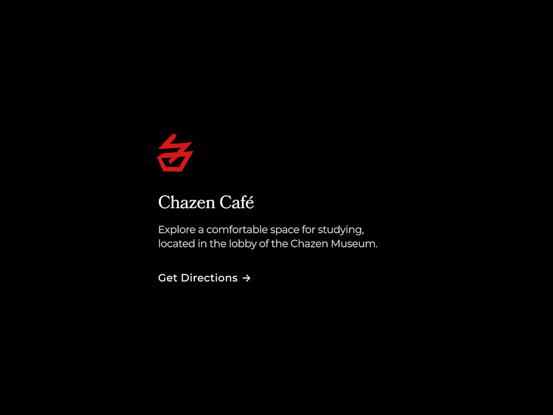
I spent some time this morning refreshing the Chazen Museum of Art landing page. When designing for cultural institutions, the challenge is balancing utility (tickets/hours) with inspiration (art/history).
Here is a breakdown of the visual system:
Icon Set: Custom abstract glyphs that reference primitive etchings to bridge the gap between the ancient collection and the modern web.
Typography: A high-contrast serif pairing that prioritizes readability without losing sophistication.
Visual Rhythm: An immersive hero loop that sets a slow, deliberate pace for the user.
20
293
Decided to update the landing page for the Chazen Museum of Art as my warm-up today.
My goal was to modernize the landing page and make it feel a bit more premium while still having some historic elements. I did switch the side to dark mode to really have the featured exhibitions & work stand out.
Let me know what you think!
0
153
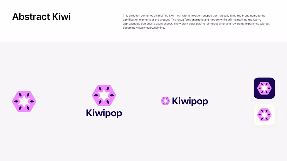
Wanted to share the 3 final directions for Kiwipop! Gotta love refining hundreds of ideas into just a few final options. 🍀
(We did land on the abstract kiwi concept as the final)
3
179
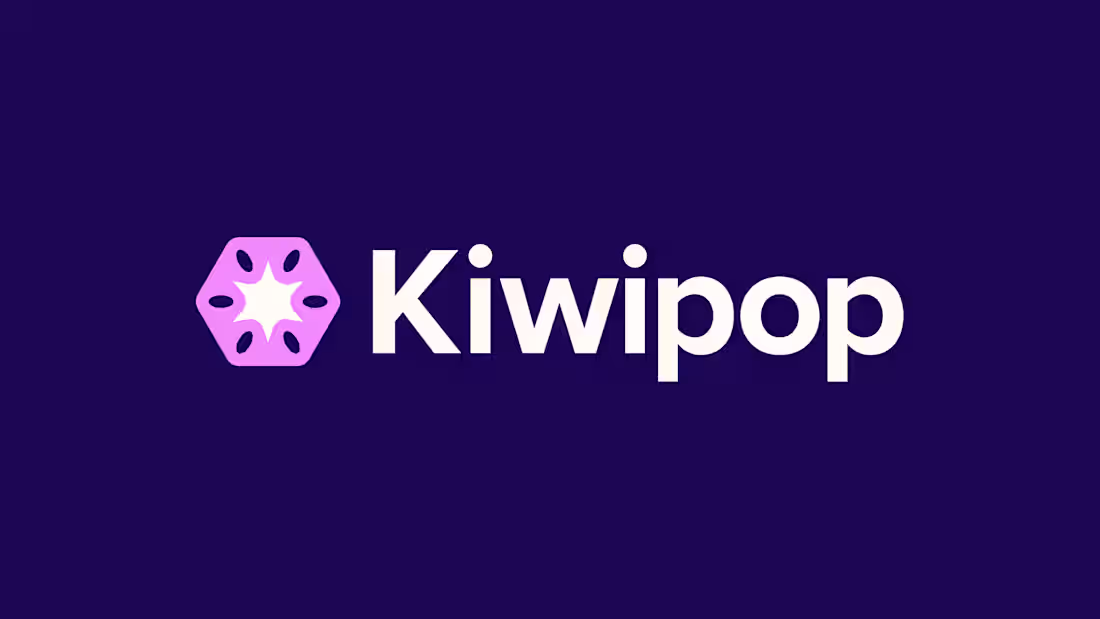
Quick snapshot of a recent brand update for Kiwipop!
Think: Duolingo meets credit card debt. Kiwipop helps consolidate credit card debt while helping provide basic education to users.
One of my favorite projects to date! 🙌
6
28
280
Some tiles from a recent app project I worked on!
2
171
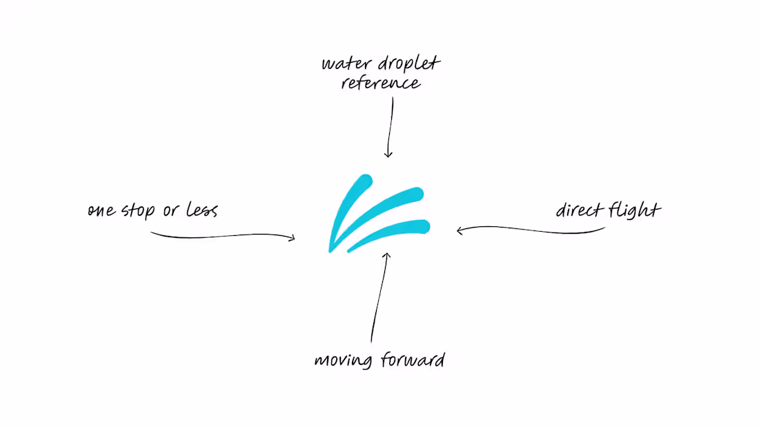
Thoughts on this logo direction for Flint Bishop International Airport? My goal was to incorporate water/water drop with their main offer: any destination in one stop or less.
0
167
FNT Airport
1
1
Bringing a bit of life to a static mark. What do you think?
1
155
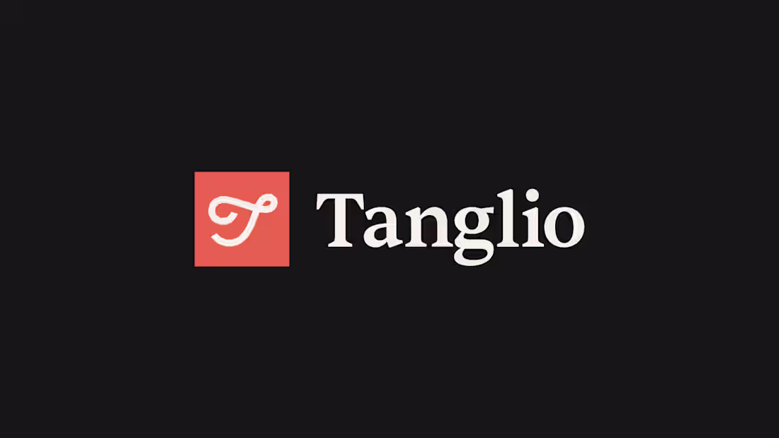
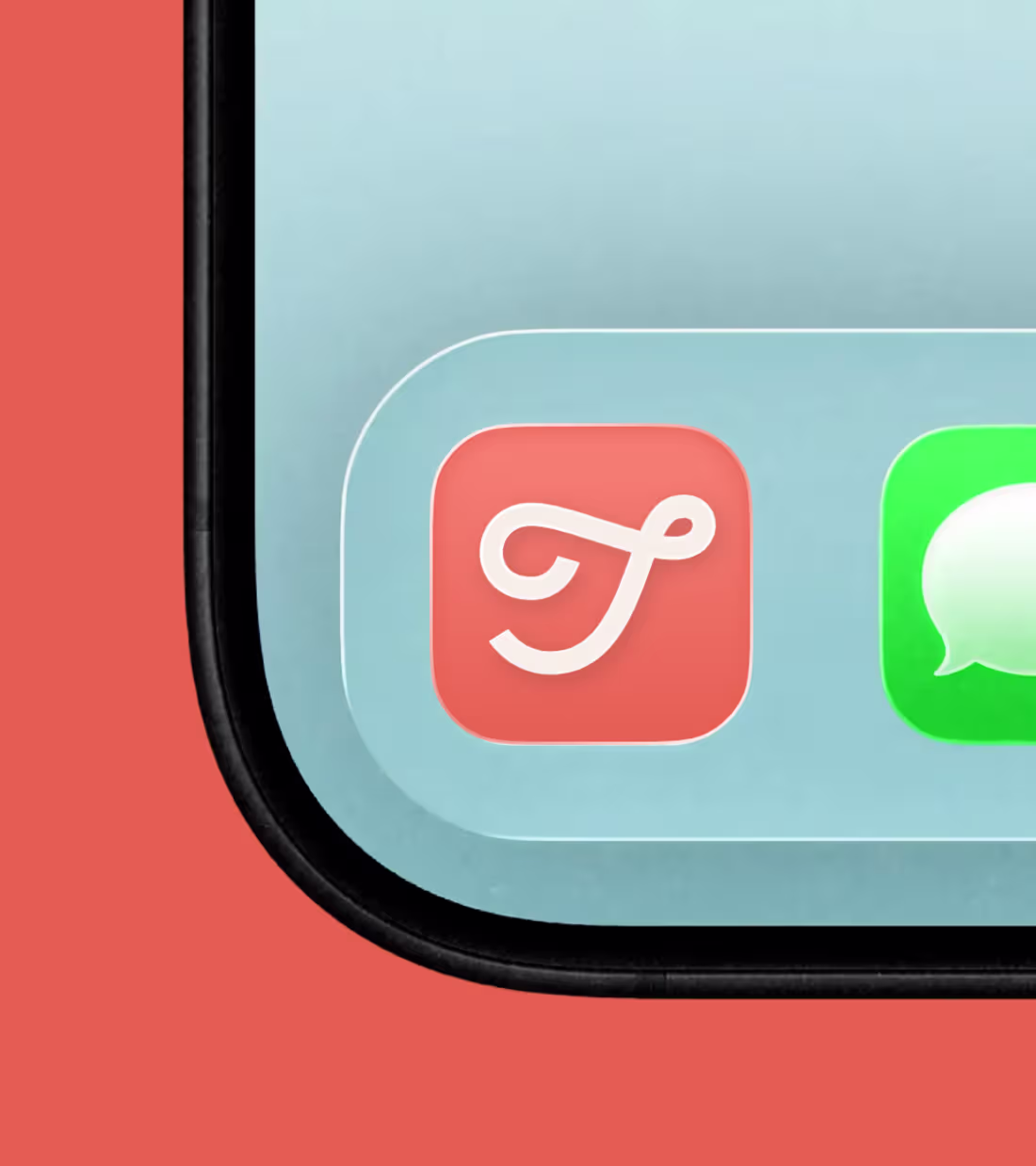
Logo mark designed for Tanglio, a new app focused on helping students manage their e-functions more clearly and efficiently.
17
47
266

Kiwipop - Branding Project
1
6
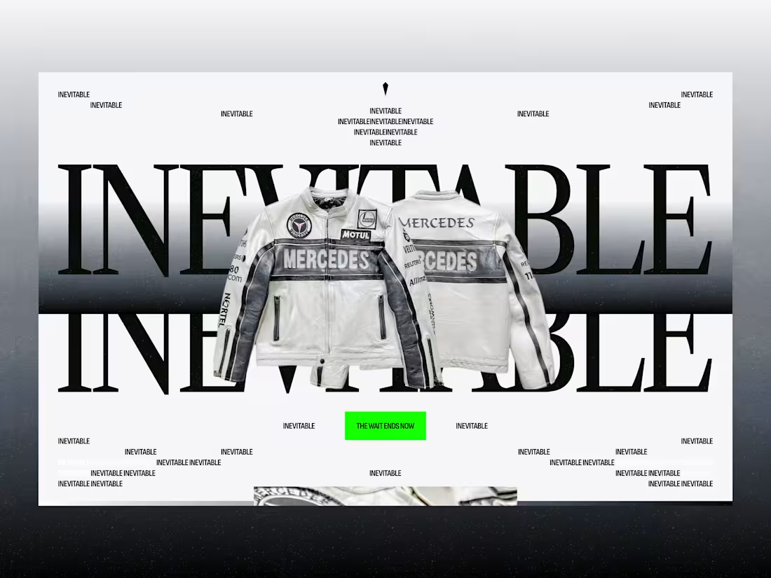
Goblin Serum
0
3
Nothing better than a clean and simple app icon
0
132

Tanglio - Branding Project
0
1