
Jacob Beck
Graphic designer. Pixel pusher. Color curator.
Profile in progress
Jacob is building their profile!
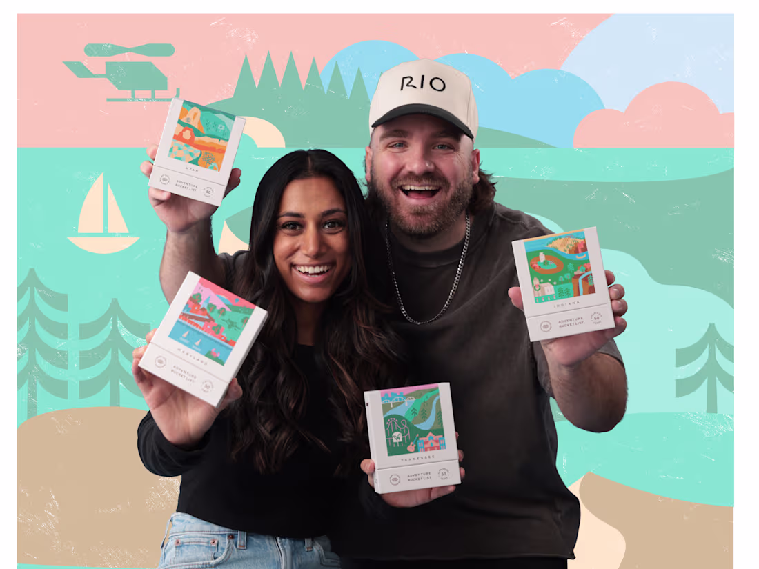
Adventure is what I live for! And that's what made designing for Reach International Outfitters (https://reachinternationaloutfitters.com/)all the more meaningful.
RIO is the company behind the viral Scratch Off Adventure Bucket Lists.
I had the privilege of using thoughtful email design to put their product in front of more eyes, enabling more people to get outside and explore their state, uncovering hidden gems and creating beautiful memories.
This project involved creating email templates, badges, gifs, and custom graphics to tell their story the right way.
Designed in Figma.
6
69
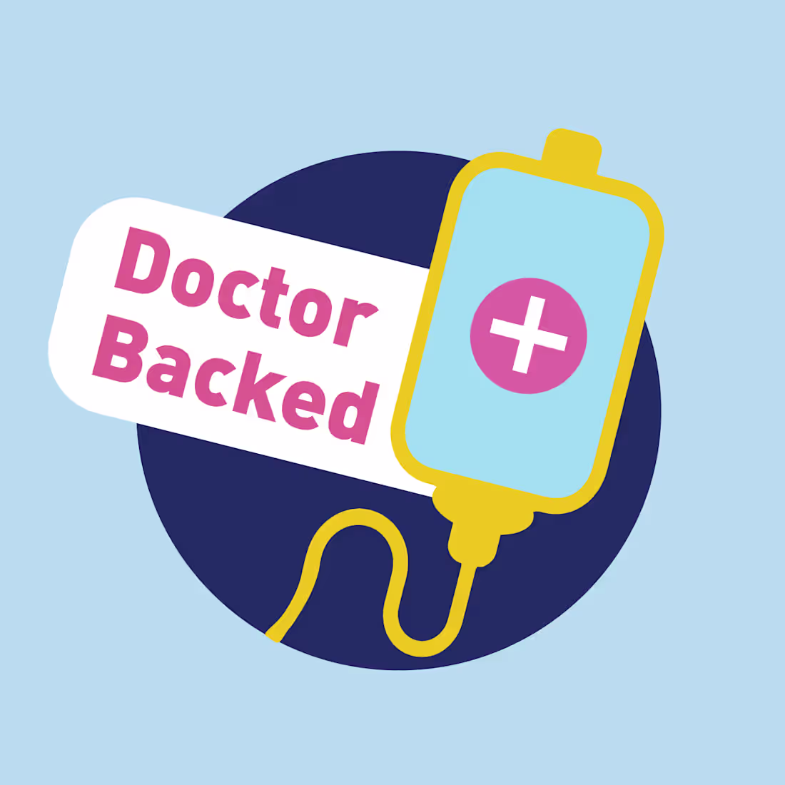
Water sucks... Biolyte is better?
I had the pleasure of working with Biolyte to elevate their digital presence through design forward email design. My approach leveraged badges, gifs, and bright colors to reach viewers with the wonderful doctor backed beverage brand.
What I love most about this brand is their story (https://drinkbiolyte.com/pages/our-story): Biolyte was started by a man who's wife struggled to stay hydrated during chemo therapy, he went on to create a physician backed hydration formula to help others in desperate need of hydration.
What an inspiration.
8
83
Everyone loves small businesses—the data doesn't lie.
For Truly Engaging I created a robust campaign focusing on the great good of small businesses.
Starting with thorough research, we found so many data points that demonstrate the unique value small businesses bring to
the world.
This campaign involved creating a free printable infographic to spread the word and help others rally around small business.
Additionally, motion was added to select portions, as well as the campaign logo, to create short form animation.
This project was an absolute blast to create and I loved
every second. Lot's more to this campaign, but this is all I'll share here:)
I love every opportunity to use my design skill to bring light to the important things in life.
6
81
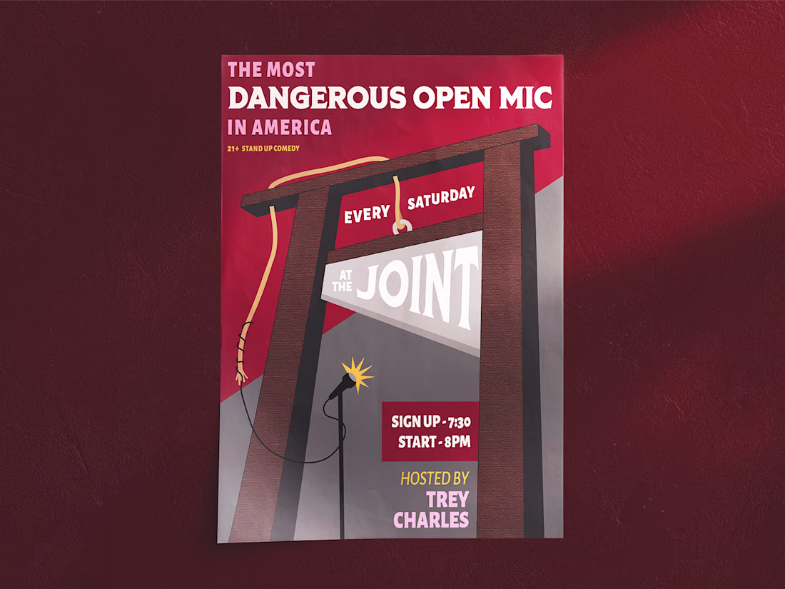
The Most Dangerous Show In America!
Did I catch your attention? I hope so...
For this project, I used typographical arrangements, original illustrations, and textures to create an eye-catching poster for a stand-up comedy event that takes place weekly at the Joint Bar in Minneapolis.
My process involved heavy ideation around live performances and traditional symbols of death. Weaving together a grim color palette, frightening fonts, and a perilous illustration, I created a design to powerfully communicate the event's central theme.
What do you think?
13
116