


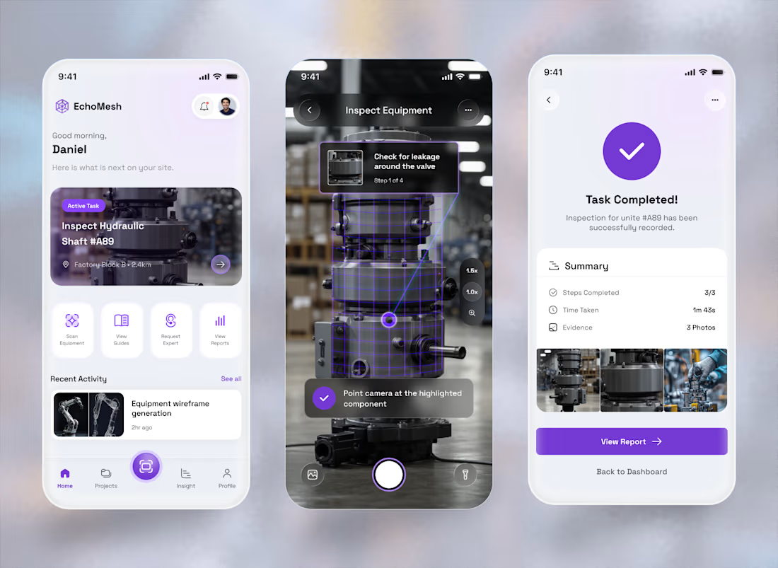
A technician shouldn't have to interpret a 40-page manual while standing in front of a complex machine.
What if the instructions came to the machine instead?
That's the idea behind ECHOMESH, a spatial-computing platform that connects physical equipment with contextual AR guidance...
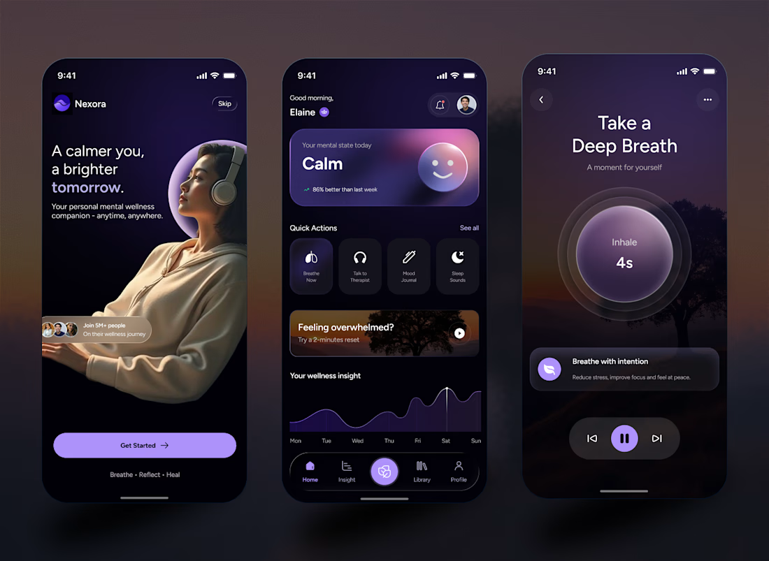
The UX rule I set for this app context is, the more stressed the user is, the fewer things on the screen. So the home screen has a "Feeling overwhelmed? Try a 2-minute reset" card which is one tap away, and it navigate to the breathing screen has just one orb and one number.


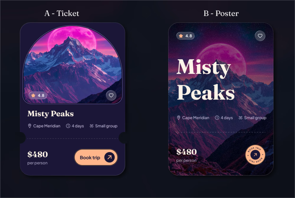
Same music player, two moods. Which one wins for you?
0 voted
1%
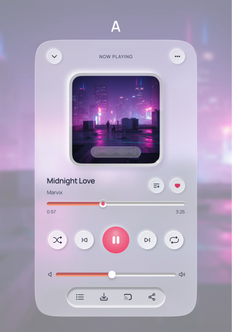
0 voted
1%
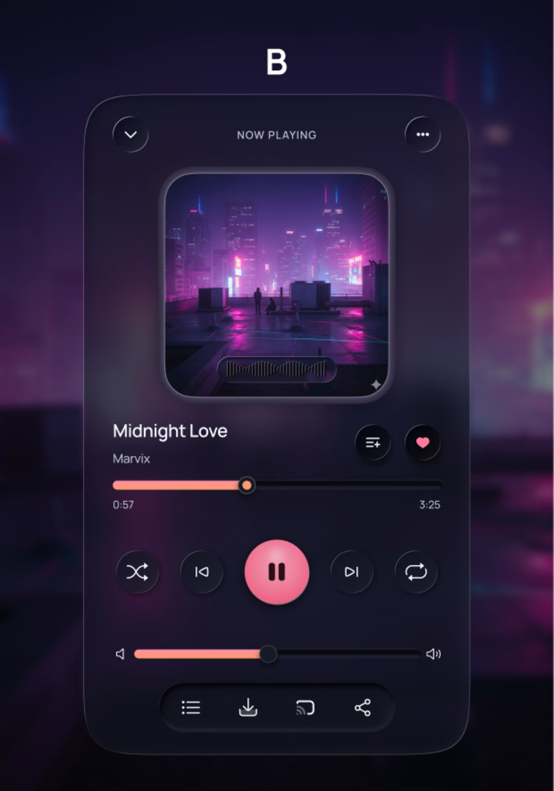
0 votes
Closed