Lawrence Singh
"AI Brand Commercial Creator"
Ready for work
Lawrence is ready for their next project!
Every great day starts with something pure.
That's why we created Neutromo — a milk brand built on freshness, quality, and goodness in every sip.
Check out our first ever animated commercial and let us know what you think!
What if your brand could have a professional animated commercial without a big production cost?
I used AI tools to bring Neutromo Milk to life with a full cartoon commercial — and I'm now open to helping other brands do the same.
Here's why animated AI commercials work for brands:
They grab attention instantly
They perform great on social media
They cost a fraction of traditional video production
They can be made fast
2
59
Every moment, quietly connected.
This smartwatch ad tells the story of one complete day — from the first quiet moment in the morning to the final peaceful moment at night. The film focuses on simplicity, wellness, and everyday connection without using loud messaging or forced product selling.
The watch becomes a silent companion throughout the day: helping her wake up, track her health, stay focused, manage stress, receive important updates, and end the day with a sense of completion. Each scene is soft, cinematic, and natural, showing how the smartwatch fits into real life without interrupting it.
The visual style is premium and minimal, using warm morning light, calm bedroom moments, outdoor movement, and a peaceful night ending. The final scene, where she removes the watch, places it on charge, and goes to sleep, gives the ad a complete emotional circle: the day is finished, the user rests, and the watch prepares for tomorrow.
The overall feeling of the ad is calm, modern, personal, and human — showing that technology can support life quietly, beautifully, and effortlessly.
1
1
151
Link between the nature and the maths
quite interesting Made this shot using veo 3
1
75
Made a simple spec 10sec commercial for Noise watch
1
1
98
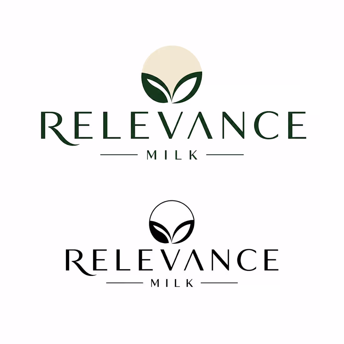
RELEVANCE — Brand Identity & Packaging Design
Case Study | AI-Assisted Design Process
👋 About Me & My Approach
I am a brand identity designer who uses AI as a core creative tool — not to replace design thinking, but to accelerate it. My process combines strategic human direction with the speed and breadth of AI-generated exploration, resulting in distinctive brand systems delivered faster and at higher quality than traditional methods alone.
What this means for you as a client:
Faster turnaround — full brand systems in 1–2 weeks instead of 4–6
More creative directions to choose from — AI lets us explore 10x more concepts
Lower cost without sacrificing quality
Full transparency — you always know exactly how the work was made
📋 Project Overview
Brand Name: RELEVANCE
Product: Natural Milk / Dairy
Target Audience: Everyone — families, young adults, health-conscious consumers
Brand Mood: Natural, clean, wholesome, modern, trustworthy
Deliverables: Logo, Icon, Packaging, Colour Strategy, Typography, Guidelines
Timeline: 7–10 working days
⚙️ My Design Process (AI-Assisted)
Here is exactly how I would approach the RELEVANCE brand identity — with full transparency on where AI is used and where human judgment takes over.
PHASE 1 — Discovery & Strategy
Brief analysis using Claude AI to define brand personality, tone, and positioning
Competitor research (Innocent, Oatly, Arla, local premium dairy brands)
Creative brief writing — target audience, brand values, visual direction
Mood board creation using Midjourney + Pinterest
PHASE 2 — Visual Exploration
20–30 logo concept variations generated via Midjourney with custom prompts
3 distinct creative directions shortlisted and presented to client
Symbol / icon mark exploration — abstract forms combining milk + nature
Colour palette strategy built using Adobe Color + Coolors AI
PHASE 3 — Refinement (Human Design Work)
Winning concepts redrawn as clean vectors in Adobe Illustrator
Typography system selected and paired (Playfair Display + DM Sans)
Packaging design built in Figma with realistic product mockups
All assets exported in correct professional formats (SVG, PNG, PDF, AI)
PHASE 4 — Brand Guidelines
Full brand guidelines document — logo usage, colours, typography, do's & don'ts
Packaging system rules — label hierarchy, size variations, material guidance
Final delivery in both editable source files and print-ready formats
🤖 AI Tools Used — Full Transparency
I believe in being completely open about AI usage. Here is every tool used and exactly what role it played:
Midjourney
Used for: Logo concepts, icon exploration, packaging visuals, lifestyle imagery
My contribution: Selecting, directing, refining, and vectorising all outputs
Claude AI
Used for: Creative brief, brand strategy, colour psychology, guidelines writing
My contribution: All strategic decisions, client communication, final judgment
Adobe Color
Used for: Colour palette generation and harmony analysis
My contribution: Final palette selection based on brand strategy
Fontjoy
Used for: Typography pairing suggestions
My contribution: Final font selection and spacing decisions
Smartmockups
Used for: Realistic packaging and product mockup photography
My contribution: Composition, selection, and presentation design
Figma
Used for: Final layout, packaging design, brand guidelines document
My contribution: All layout, spacing, and design execution work
🎨 RELEVANCE — Brand Identity System
Colour Strategy
The RELEVANCE colour palette is built around nature, trust, and freshness — communicating purity without being clinical.
Forest Green #2D5016 — Primary, trust
Cream White #F5F0E8 — Background, pure
Warm Beige #C8A96E — Accent, warmth
Charcoal #1A1A1A — Text, strong
Typography System
Heading: Playfair Display — Elegant serif, premium feel
Subheading: DM Sans Bold — Clean geometric, modern
Body: DM Sans Regular — Humanist, highly readable
📦 What You Will Receive
Design Files
Primary logo (SVG, PNG, PDF, AI)
Logo variations (dark, light, icon only)
Symbol / icon mark
Packaging design files (Figma)
Colour palette swatches
Brand Documents
Brand guidelines PDF (20–30 pages)
Typography guide
Colour usage rules
Packaging system guide
2 rounds of revisions included
💡 Why AI-Assisted Design Is an Advantage
Traditional Design Only vs AI-Assisted Design:
3–5 logo concepts explored → 20–30 concepts explored
4–6 week timeline → 7–10 day timeline
Higher cost for same output → Better value, same quality
Limited visual exploration speed → Rapid iteration and refinement
🤝 Let's Work Together
I am excited about the opportunity to build the RELEVANCE brand identity. This is exactly the kind of project where AI-assisted design delivers outstanding results — a consumer product brand that needs to be both commercially strong and visually distinctive.
I bring to this project:
Full transparency — you will always know every tool used and every decision made
Strategic thinking — AI generates, but I direct, curate, and refine everything
Professional delivery — all files in industry-standard formats, ready to use
Open communication — regular updates, fast responses, and revision rounds included
1
80
Most perfume ads sell beauty.
This one visualizes perception.
Instead of flowers, models, or cinematic landscapes, the fragrance is represented as a network of memories, emotions, and sensory signals. The central eye becomes the observer, while each surrounding world represents a different layer of human perception.
The idea is simple:
We don't experience scent through the nose alone.
We experience it through the mind.
That's what makes this concept different.
It turns fragrance into psychology.
#LuxuryCampaign #CreativeConcept #VisualStorytelling #PerfumeAdvertising #ArtDirection #DesignThinking
1
92
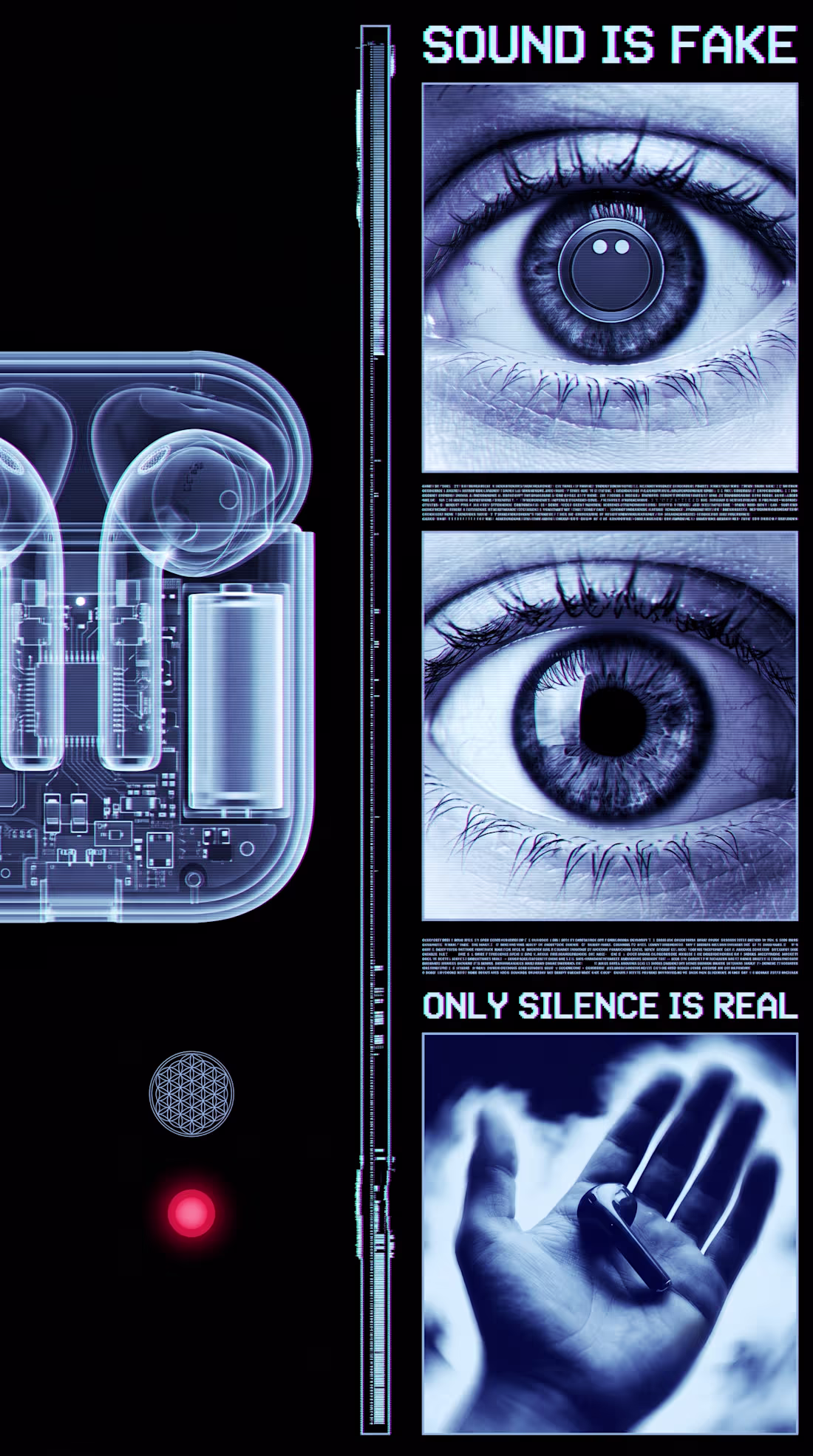
The eye itself is the anchor of the whole piece. Eyes are one of the few images the human brain is hardwired to fixate on instantly, infants track eyes within days of birth, so opening on one guarantees attention before any concept lands. But this isn't just an eye, it's an eye in monochrome cyan with scanlines crossing it, which reads as a "broken sensor" rather than a living organ. That's an important distinction psychologically: a closed eye suggests sleep or death, a crying eye suggests pain, but a glitching eye suggests something stranger, that the very apparatus of seeing has been compromised. It puts the viewer in the position of distrusting their own perception, which is a deeply uncomfortable, almost vertiginous feeling.
The chromatic aberration and scanlines aren't just texture, they're borrowed directly from broken transmission, old televisions losing signal, damaged VHS tape, dying CRT monitors. Visually this maps onto a very specific cultural memory of "something is wrong with the feed" and the brain reads that as urgency even without conscious recognition. It's the same instinct that makes static on a baby monitor unsettling, the noise itself implies a connection that's failing.
The sacred geometry, the flower of life, the circular mandala-like patterns, functions almost as a counterweight to the digital decay. These shapes carry thousands of years of association with order, cosmic structure, and meaning-making. Placing them inside a corrupted, glitching frame creates a quiet tension between the eternal and the failing, like ancient wisdom trying to transmit itself through a dying machine. That contrast is what gives the piece its cult or ritual undertone rather than just feeling like generic tech-glitch art.
The text fragments work almost like intrusive thoughts. Short, declarative, ungrounded statements like "reality is false" mimic the kind of thought spirals people experience during anxiety or derealization episodes, where the mind starts questioning the basic premise of experience itself. Presented in a flickering, semi-corrupted font, the text doesn't feel authoritative, it feels like something glitching its way into consciousness rather than a calm statement of fact, which makes it feel more like a symptom than a slogan.
The hand, when it enters in the product version, is the emotional pivot point. After several seconds of synthetic, ocular, mechanical imagery, a hand is the most embodied, human, tactile thing you can introduce. Psychologically it signals safety and agency, hands are how humans manipulate and trust the physical world, so the moment it appears the entire emotional register shifts from disorientation toward groundedness. That's why placing the product literally into an open palm lands as resolution rather than just product placement, it's mimicking the felt sense of coming back into your body after a dissociative moment.
And the product itself, glowing, transparent, suspended in light, benefits from all of that buildup by contrast. Because everything preceding it has felt corrupted or untrustworthy, the object that finally appears clean, intentional, and stable reads as desirable almost by relief alone. It's less "look how cool this is" and more "finally, something solid," which is a much stickier emotional hook than straightforward aspirational advertising usually achieves.
1
115
How these are different from normal shoots?
In normal shoots we don't have so much creative freedom but in these types of shoots we have infinite creative freedom what we need is just a creative and directive person where I came in
2
2
154
Instead of just showing the product, they create a sense of awe.
Think giant products placed in real environments, cinematic lighting, dramatic camera movement, and minimal text. The goal is to make people stop scrolling before they even realize why.
A simple formula that keeps working:
Epic scale → grabs attention
Product reveal → builds curiosity
Beauty shot → creates desire
Brand moment → leaves an impression
The psychology is pretty straightforward:
Bigger scale = higher perceived value
Motion = captures attention
Premium lighting = signals quality
Less copy = stronger recall
Most high-performing commercials don't try to explain everything. They focus on creating a feeling first and letting the product do the talking.
It's a fun reminder that great advertising is often less about information and more about perception.
#AICommercial #CGI #ProductFilm #CreativeDirection #AIVideo #Advertising #BrandMarketing #ProductLaunch #VisualStorytelling #TechMarketing
1
134
Inspired by Huawei ,, What do you think ? is this capable to land a project?
1
134
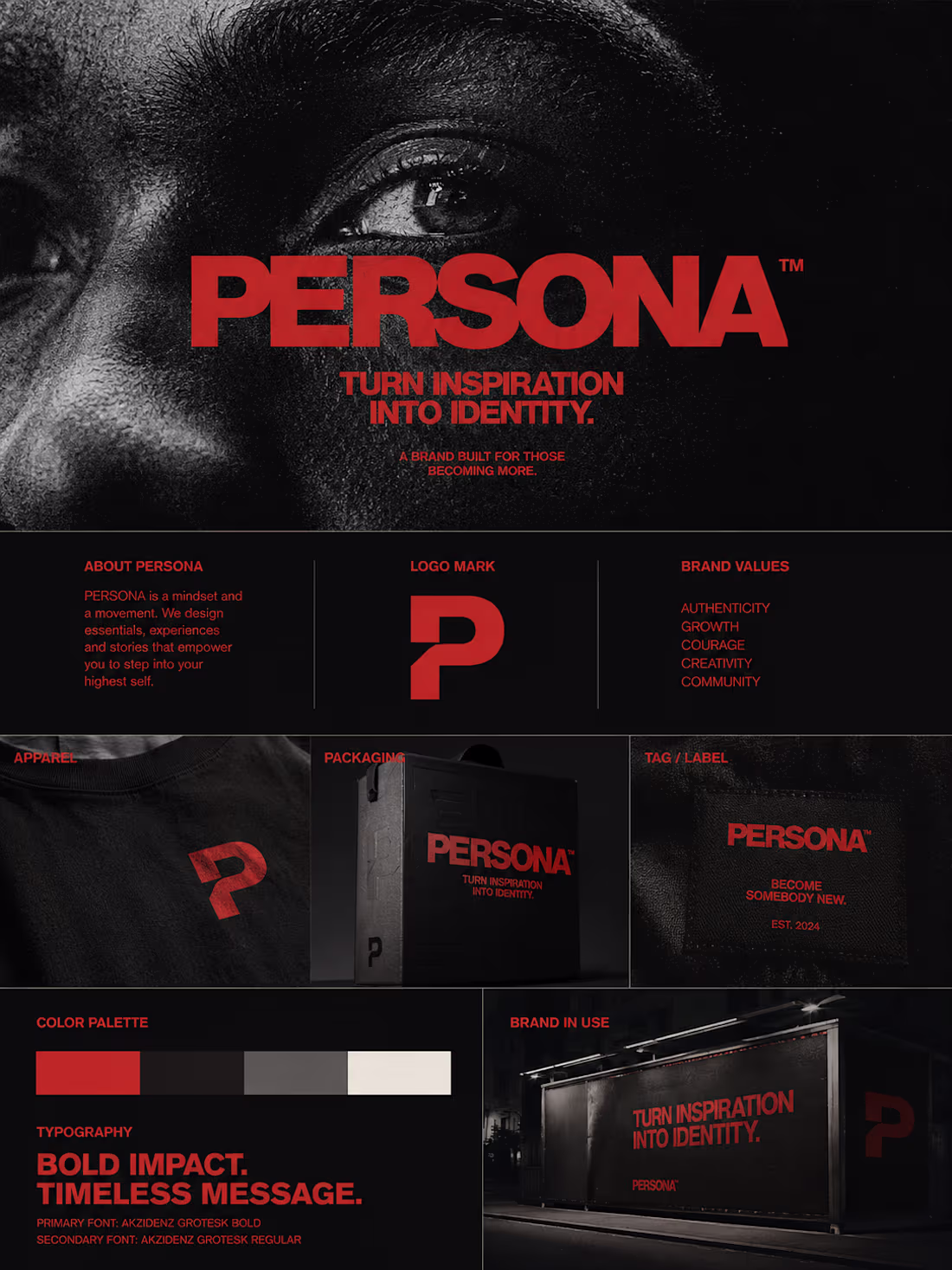
This is a hypothetical brand Persona Poster, Review these in comments
How are these ??
4
6
201
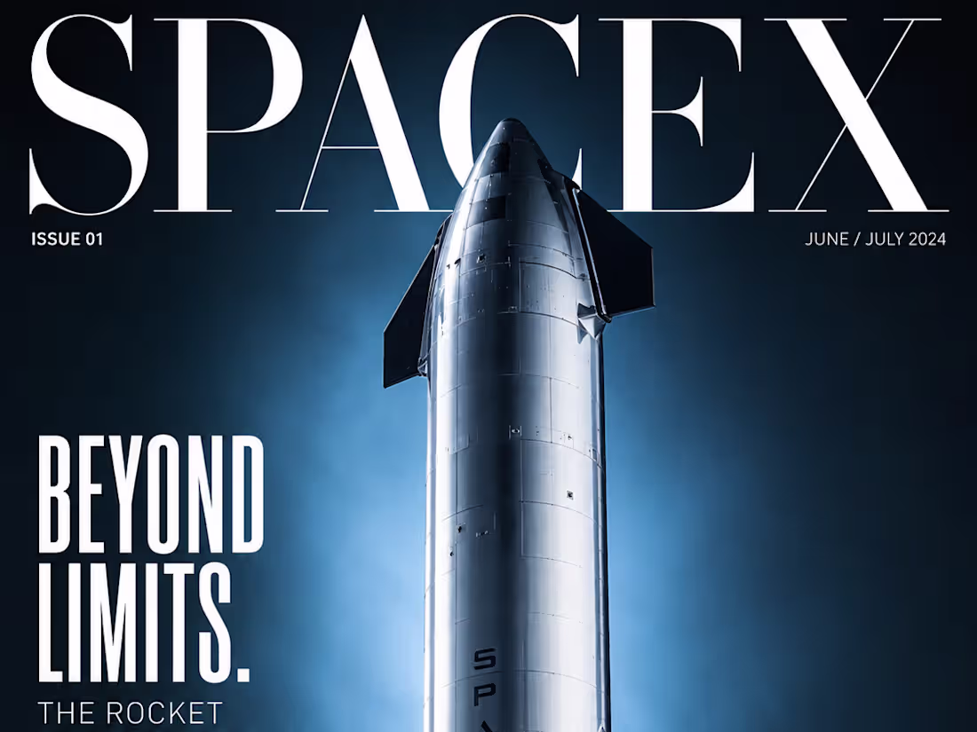
SpaceX documentary (spec)
1
3
Every frame is designed to trigger a specific feeling:
→ Darkness at the start = anticipation (brain hates emptiness)
→ Single light pulse = curiosity (what is that?)
→ Slow rise = premium status (fast = cheap, slow = luxury)
→ Orbit reveal = ownership fantasy (you're inspecting it)
→ Macro Home button pulse = dopamine hit (the payoff)
→ Hero hold = desire (brain lingers on what it wants)
This is how Apple, Sony and Nintendo make you want things you don't need.
2
5
249
CASE STUDY: Creating a Cinematic Brand Ad with Limited AI Resources
Overview
This project started with a simple challenge to myself : create a visually compelling advertisement by combining existing footage, static posters, AI-generated visuals, and professional post-production techniques into a cohesive brand story.
While my initial vision was to create a fully AI-generated commercial, budget and credit limitations made that approach impossible. Instead of compromising on quality, I shifted the focus toward creative editing, storytelling, colour grading, and sound design to achieve the desired impact.
The result was a cinematic advertisement built from multiple visual sources, unified through careful research, creative direction, and post-production.
The Challenge
The primary challenge was creating a premium-looking advertisement without access to the amount of AI generation credits required for a complete video production.
The available assets included:
Two existing video clips
Two promotional posters
AI-generated panther footage
Additional visual references and research material
The objective was to transform these disconnected assets into a single narrative that felt intentional, immersive, and professionally produced.
Creative Direction
The concept centered around performance, adventure, and perspective.
One of the strongest visual ideas was introducing a panther as a symbolic character representing focus, agility, confidence, and instinct.
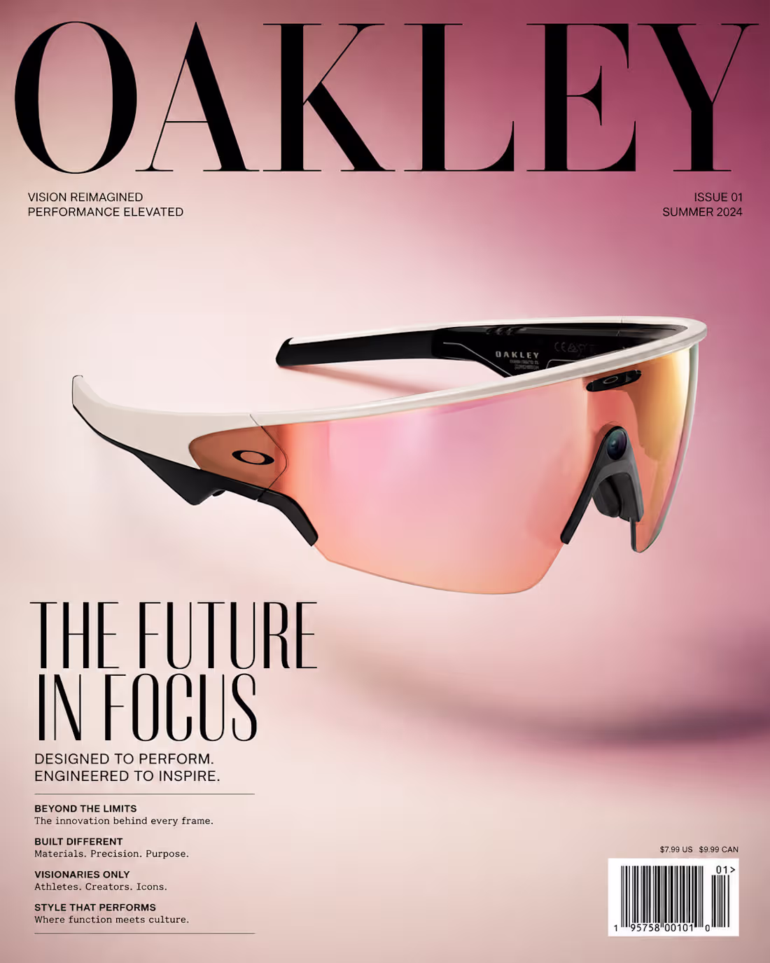
To make the sequence feel more believable and immersive, I developed the idea that the panther footage was being captured through Oakley Meta smart glasses worn by a cyclist.
This perspective-driven approach helped create a sense of realism while connecting the AI-generated visual with the rest of the footage.
Research & Storyboarding
Before opening the editing software, I spent time researching:
Brand advertising styles
Action sports cinematography
POV camera storytelling
Colour palettes used in premium lifestyle campaigns
Visual transitions that could connect unrelated footage
Based on this research, I created a storyboard outlining:
Introduction of the visual atmosphere
Establishment of movement and energy
Panther POV sequence
Product and brand integration
Final emotional payoff
This planning stage became crucial because the footage originated from different sources and required a strong narrative structure to feel connected.
Post-Production Process
Editing
The edit focused heavily on rhythm and pacing.
Since the footage was not originally created as part of a single production, every cut had to be carefully chosen to maintain continuity and emotional momentum.
Key editing goals included:
Maintaining viewer attention
Creating smooth transitions between assets
Building tension and release
Supporting the narrative through visual progression
Colour Grading
One of the most important aspects of the project was colour grading.
The source materials varied significantly in terms of:
Exposure
Contrast
Saturation
Overall visual tone
To solve this, I developed a unified cinematic look that helped all footage feel like it belonged in the same world.
The grading process focused on:
Matching shots from different sources
Enhancing mood and atmosphere
Increasing visual consistency
Supporting the premium feel of the advertisement
The final grade played a major role in making the project appear as a single production rather than a collection of separate assets.
AI Integration
AI was used strategically rather than excessively.
Instead of relying on AI to generate the entire commercial, I used AI-generated visuals where they could create the most impact.
The panther sequence became a narrative device that added personality, symbolism, and visual intrigue to the advertisement.
This approach demonstrated how AI can enhance storytelling when combined with strong creative direction and traditional editing skills.
Sound Design
To strengthen the emotional impact, I designed the audio experience around movement, energy, and immersion.
The sound design included:
Environmental layers
Motion-based effects
Transition accents
Atmospheric textures
Each sound element was selected to support the visuals and increase viewer engagement.
The goal was not simply to add audio, but to create a cinematic experience that elevated every cut and transition.
Constraints & Problem Solving
One of the most valuable aspects of this project was working within limitations.
Rather than seeing limited AI credits as a setback, I treated them as a creative constraint.
This led to a stronger emphasis on:
Storytelling
Visual consistency
Editing craftsmanship
Colour grading
Sound design
The final result proves that compelling advertisements are not created solely through expensive tools or unlimited AI generation. They are created through creative thinking, problem-solving, and strong execution.
Key Contributions
Creative Direction
Concept development
Visual storytelling
Storyboarding
Research
Advertising references
Visual style exploration
Narrative structure planning
Post-Production
Video editing
Colour grading
Asset integration
Visual consistency
AI Production
AI visual integration
Concept enhancement
Audio
Sound design
Atmosphere creation
Impact enhancement
Final Takeaway
This project became an exercise in creative adaptability.
What began as a vision for a fully AI-generated advertisement evolved into a hybrid production that relied on editing, colour grading, storytelling, sound design, and strategic AI integration.
The experience reinforced an important lesson:
Great advertising is not defined by the tools available—it is defined by how effectively those tools are used to tell a compelling story.
3
217
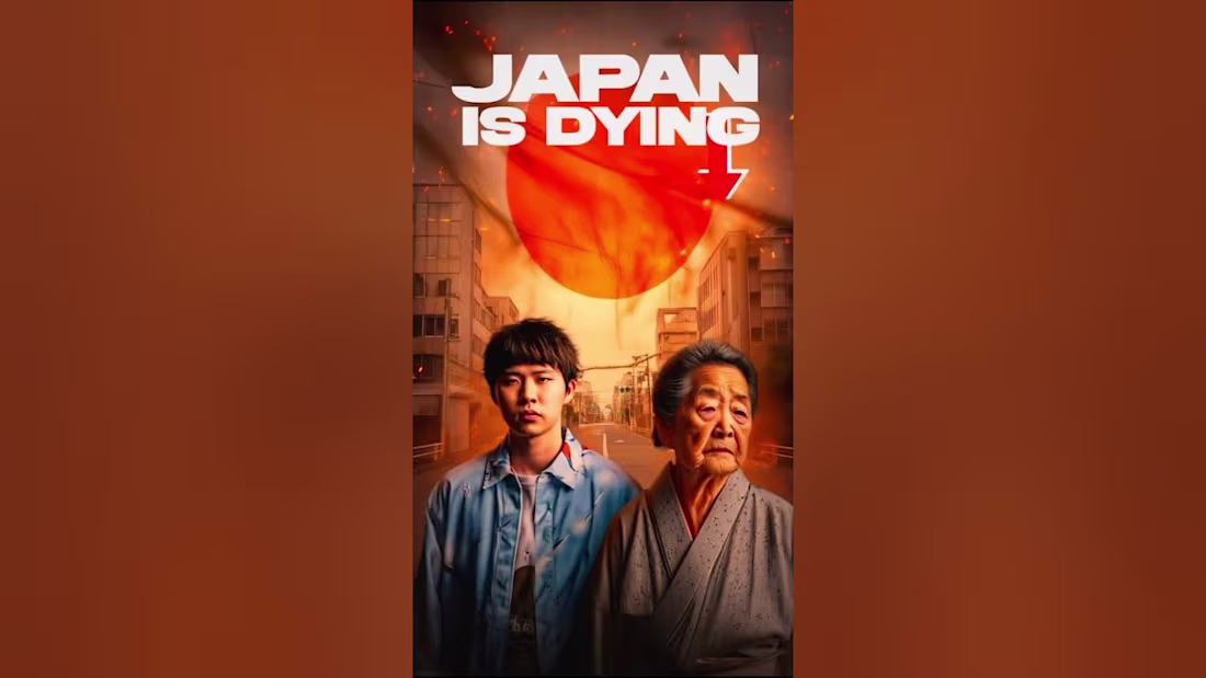
Editing of (Why child rate decreasing in Japan..)
0
4
Motion
1
135
This project I experimented for my skills , I found a long form content of creator https://youtu.be/Bl3wAPimGq4?si=TD4R2VRl1o5S3CLL
I transform this long form into a short form video .
Psychology behind the edit is that short form should deliver the exact the main long form into 60 sec and should not leave the original idea of the content , I think I delivered it well
0
136
My work was make the creator's provided script and dialogues into a visual documentary style video ;
The result
0
134
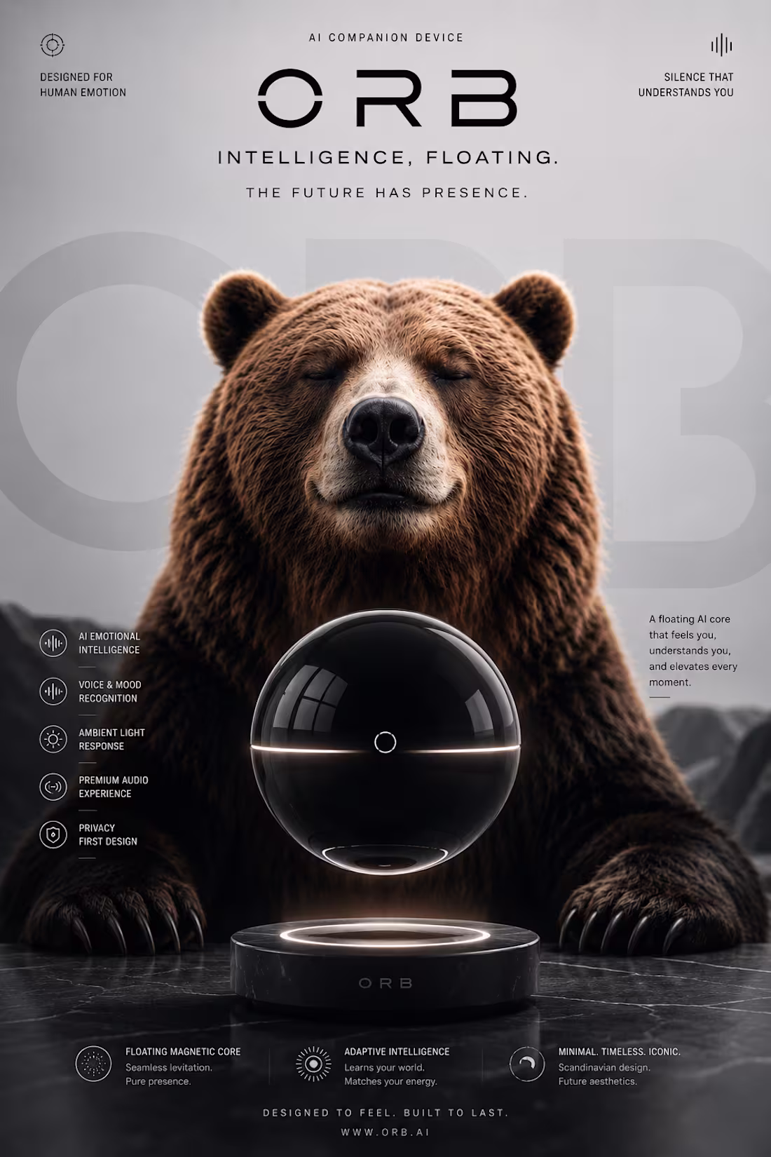
“How do brands make things feel this expensive?”
So I started breaking it down.
The lighting.
The typography.
The shadows.
The camera movement.
The psychology behind luxury design.
Then I started experimenting with AI tools.
Using only free AI access, I designed a fictional futuristic brand called ORB — an AI companion device inspired by minimalist tech aesthetics.
I created:
• the product concept
• the brand identity
• cinematic product posters
• a luxury-style intro commercial
• premium visual direction
Everything was generated, refined, and art-directed by me with AI.
What fascinated me most wasn’t the tool itself —
it was learning how design creates emotion.
How shadows create mystery.
How minimalism feels expensive.
How motion creates trust.
How lighting can make fictional products feel real.
This honestly feels like the beginning of a completely new creative era.
From just an idea → to a full luxury tech campaign.
Built with curiosity, taste, and free AI tools.
ORB.
“The Future Has Presence.”
2
5
266
I made this using veo 3 ,
Things i found to using that it creates result not exactly like you given the prompt but works very well for new brands to create a advertisement in low cost .
share you experience.
3
239