Isaac Oyelese
"UI/UX that guides, converts, and delights every user."
- 35
- Followers


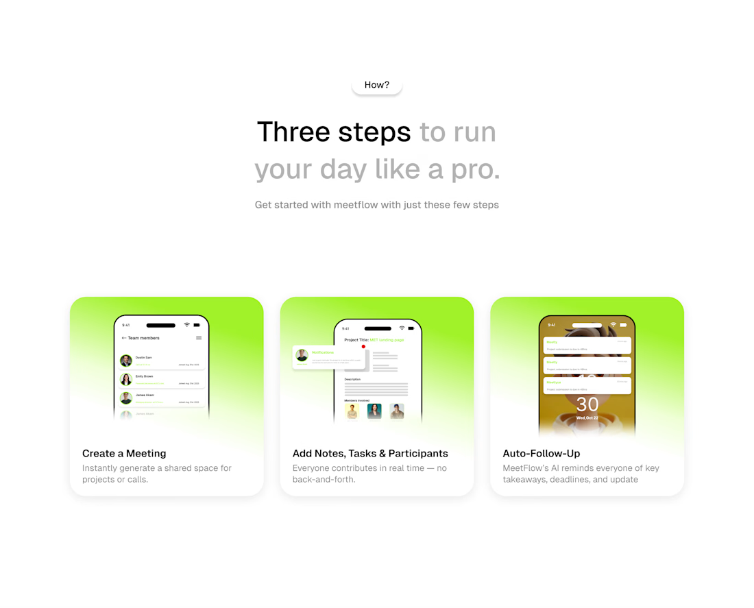
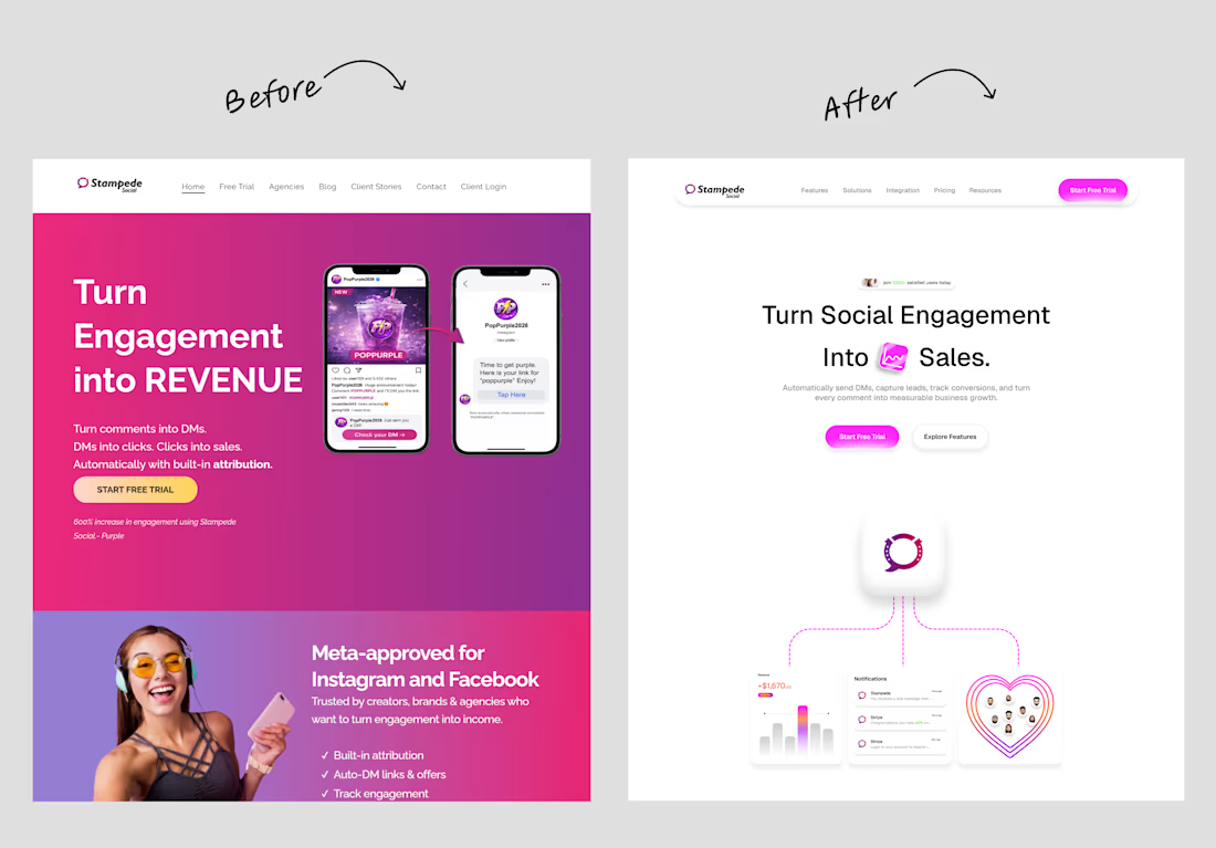
Had fun bringing this design to life! 🎨✨
From the illustrations to the overall layout, I enjoyed seeing all the elements come together into one cohesive design.
Always love the process of turning an idea into something visual. 🙂
#UIUXDesign #WebDesign #ProductDesign #VisualDesign #DesignProcess #Figma #Contra

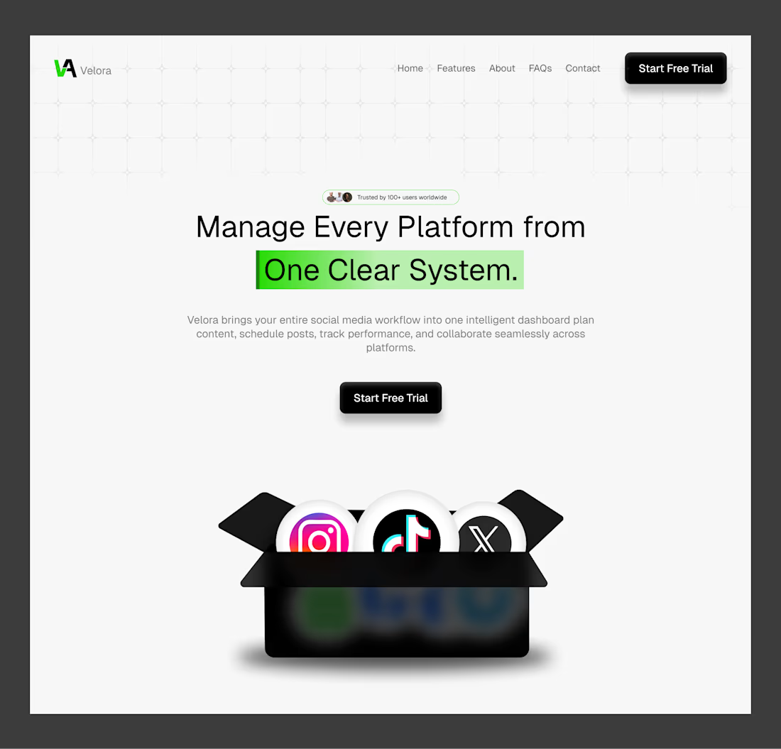
FORGED — You Don’t Find Strength. You Forge It. ⚔️
A hero section concept built around discipline, mental toughness, and personal growth.
Dark cinematic visuals, bold typography, and rugged details come together to create a powerful first impression that reflects the mindset...

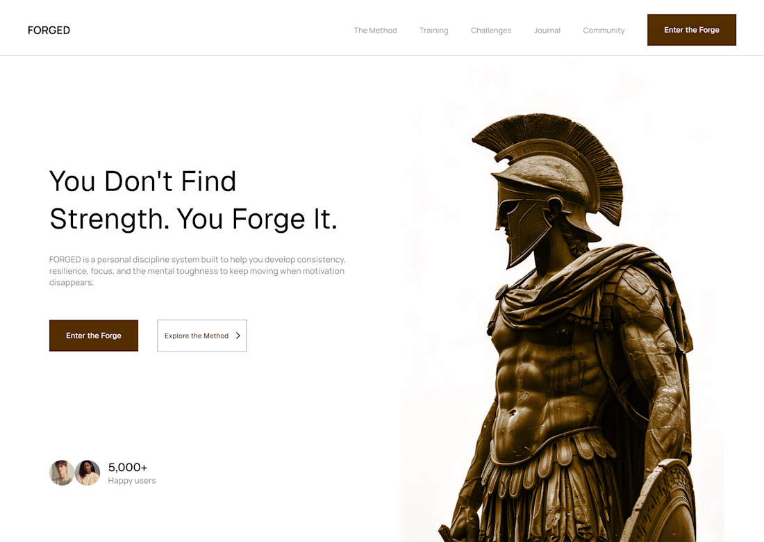
A finance hero section concept 💸
Clean visuals, bold typography, and a clear message designed to make managing money feel simpler and smarter.
#UIUXDesign #WebDesign #LandingPageDesign #Fintech
A little collection of bento cards I designed ✳️
Playing around with layouts, colors, and details to make simple UI elements feel more engaging.
Which one’s your favorite? 👀
#UIUXDesign #UIDesign