Irem Sengöz
Communication Designer creating modular & adaptable systems.
New to Contra
Irem is building their profile!
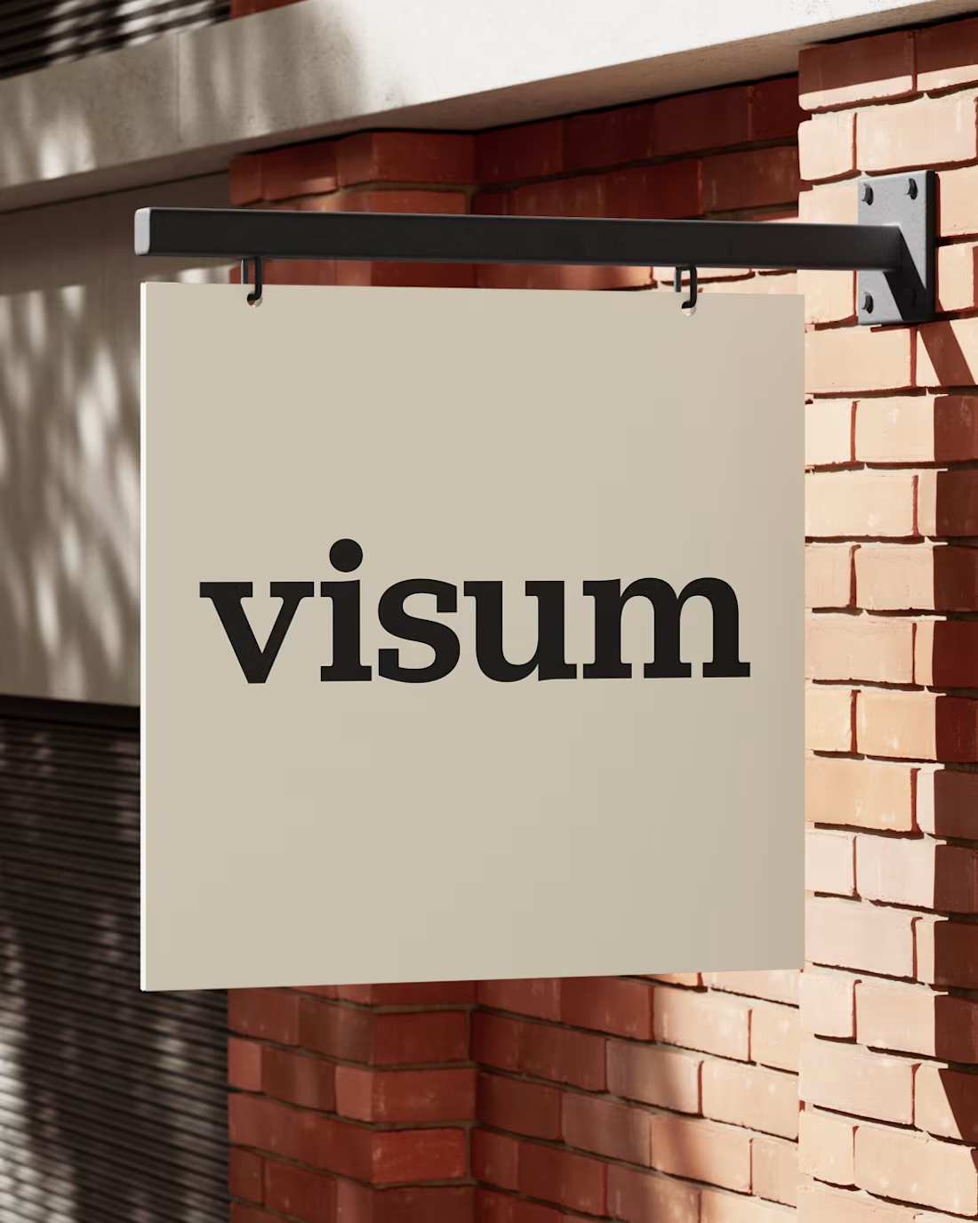
At a time when AI-generated images are increasingly calling into question the authenticity of visual media, credibility and trust in photography are becoming ever more important. For photo agencies such as Visum, it is therefore crucial not only to showcase the photographs themselves, but also to highlight the stories and contexts behind them in order to preserve their authenticity and value.
The ‘Visum Viewpoint’ concept explores the Visum image agency from two perspectives: the photographs themselves and the stories behind them. The corporate design deliberately draws on the character of a newspaper – a symbol of trust and journalistic reliability. Through exhibition spaces, animations and publications, viewers are encouraged to shift their perspective and explore the world of images from different angles. They can choose whether to engage with the photographic aspect or the stories behind the images, thereby developing a deeper understanding of the photographers, their work and the agency.
1
49
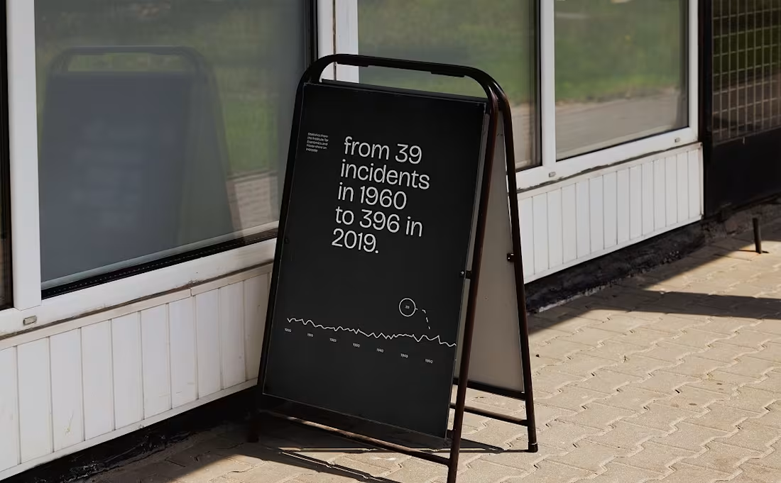
Cities are growing, glaciers are melting, biodiversity is changing and the population is growing. These changes are visible, measurable and undeniable. Yet behind these macro-level processes lie personal stories of loss, resilience, adaptation and hope that often go unnoticed.
This project explores how design can serve as a tool to translate complex changes into accessible and meaningful visual narratives. It addresses twelve different forms of change. For each theme, measurable facts are visualised in a book through infographics, whilst the website showcases personal stories of how people experience these changes. By combining data and storytelling, the duality of change is highlighted: its measurable impacts and its emotional resonance. Like black and white, change is both dark and light, constant and fleeting, exciting and overwhelming – defined by contrasts.
2
1
45
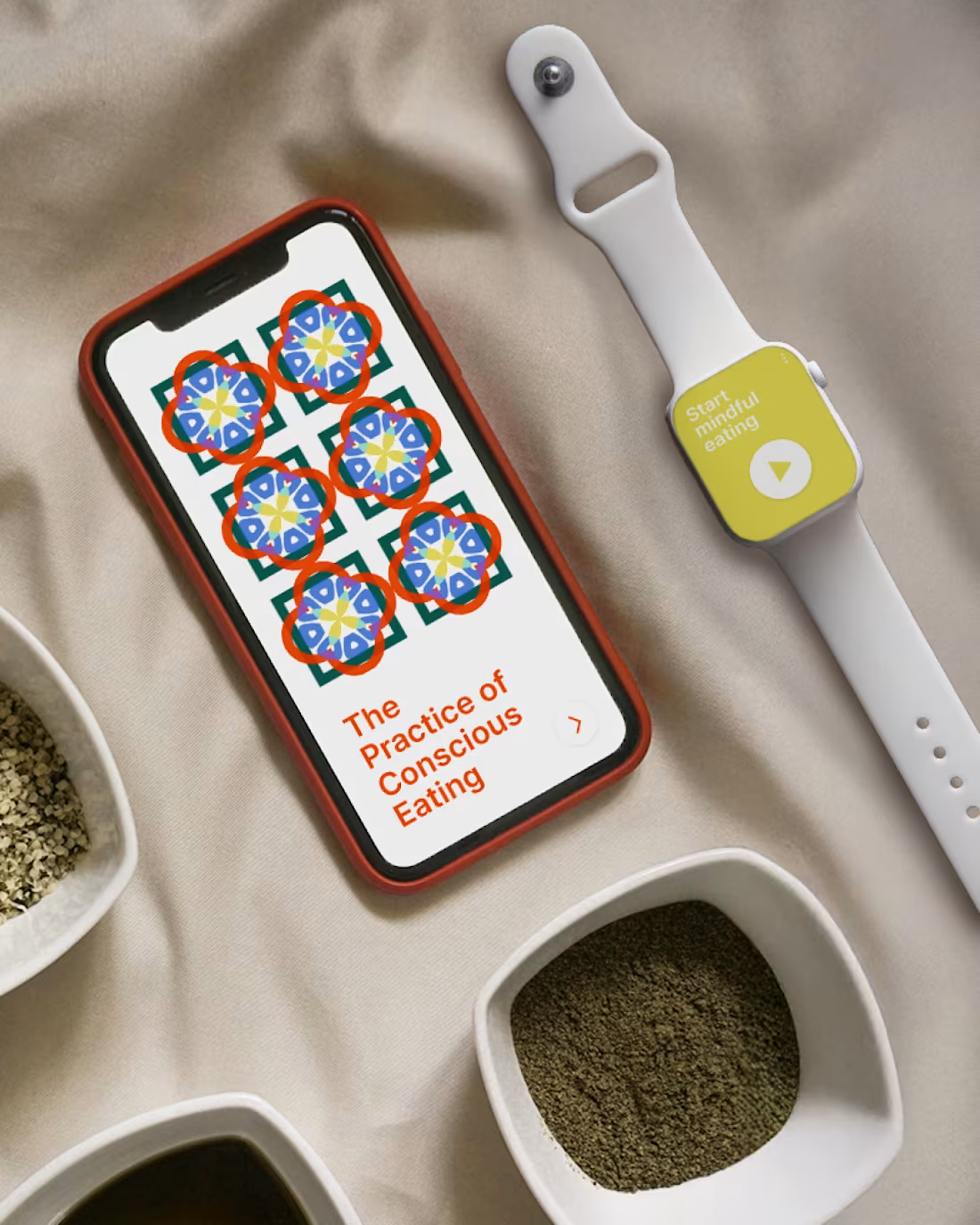
In everyday life, eating is often dictated by habits and time constraints. As a result, aspects such as mindfulness, awareness and reflection when dealing with food tend to take a back seat.
This project explores the practice of mindful eating, inspired by Zen Buddhism. The design is based on the visual language of mandalas, which symbolise concentration and mindfulness. The app allows users to choose from various categories and, based on these choices, generate a unique symbol. Each symbol is linked to a piece of information, a reflection task or a question that encourages users to engage with the principles of mindful eating and apply them in their daily lives. The resulting symbol combinations have been documented in a book, in which attentive readers can discover subtle differences between the individual pages.
2
1
27
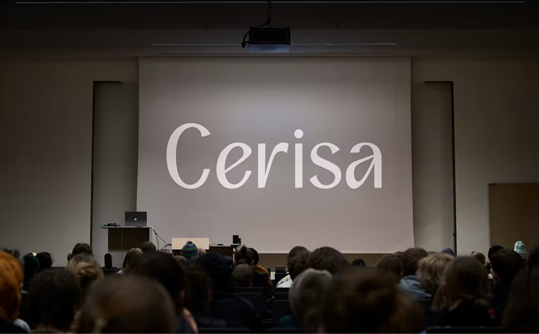
The Cerisa typeface takes its name from ‘cerise’, meaning cherry or cherry red. Its defining feature is the curved strokes that converge at a single point, much like cherry stems. Cerisa is a humanist typeface that has its roots in writing with a pointed nib and emphasises a natural look, whilst retaining an elegant and confident character.
1
27