
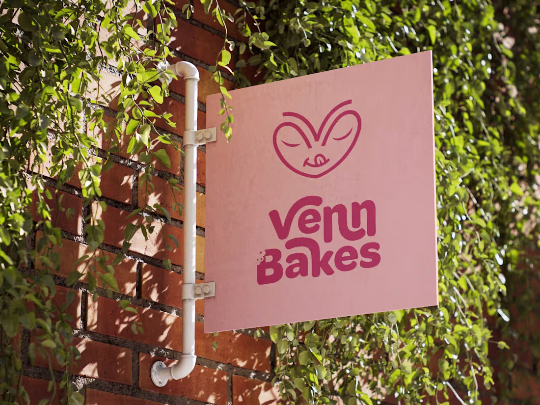
Venn Bakes – Brand Identity & Packaging:
The Goal: Build a modern bakery brand for young professionals in Nigeria. The client specifically requested to avoid industry clichés like whisks or chef hats.
The Solution: I created a "fun and playful" visual identity that feels authentic.
Logo: A custom icon merging a heart with a satisfied expression to visualize "tasty".
Style: A soft pastel palette paired with bold, rounded typography.
Deliverables: Logo, Social Media Kit, and Packaging Design.
Full Project (https://www.behance.net/gallery/242505065/Venn-Bakes-Playful-Modern-Visual-Identity) For More (https://www.instagram.com/debraj.designs/) Client (https://www.instagram.com/venn.bakes/)
3
61
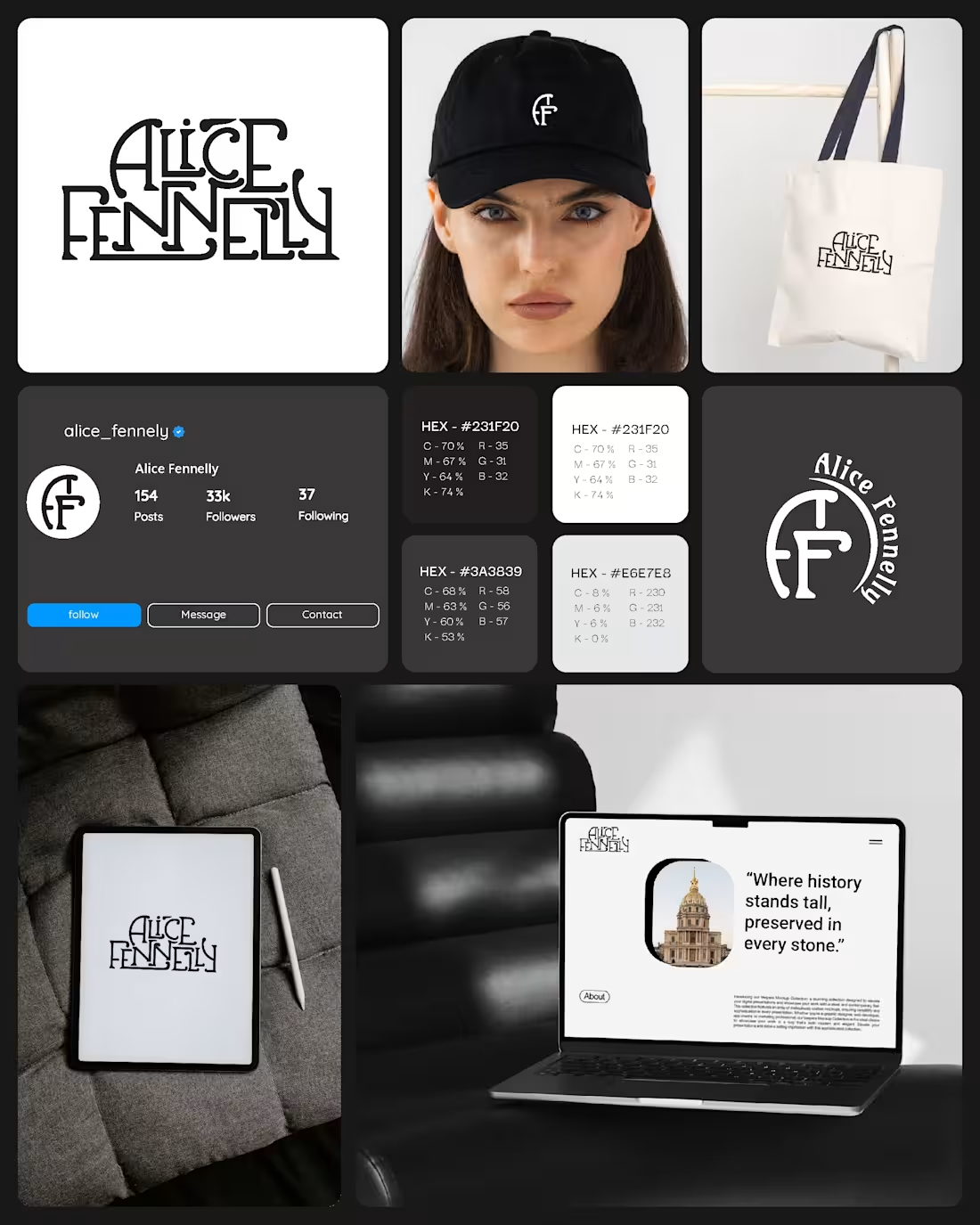
Just wrapped up a personal brand identity project inspired by historic French architectural typography.
The goal was to capture elegance, culture, and timeless craftsmanship — blending the charm of heritage buildings with a modern brand presence.
Excited to share this one. ✨
4
4
90
Showing less can actually build more trust.
For years, I used to flood clients with sketches, unfinished concepts, and raw ideas — thinking they’d appreciate “the process.” Some did. But honestly? It often worked against them.
This time, I built 90% of the deck around one bold direction. It was strong, it was confident… but it still wasn’t the right fit. That’s the reality of design — sometimes you swing and miss.
Here’s what I’ve learned:
✨ Clients don’t need to see the messy middle.
✨ They need to see ideas that are tested, refined, and ready to stand on their own.
✨ Fewer, stronger concepts > dozens of half-finished ones.
Excited to share more of this project soon.
💭 Do you prefer showing clients the journey (sketches, explorations) or just the destination (refined concepts)?
2
76
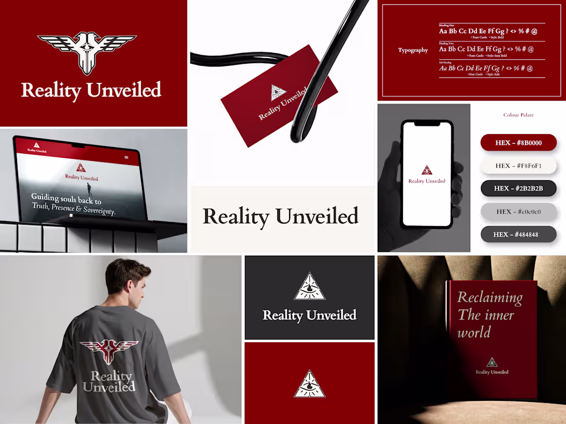
Reality Unveiled – Visual Identity Design
Website: realityunveiled.com (http://realityunveiled.com):
A timeless, symbolic identity for Reality Unveiled — a philosophy and self-actualization platform guiding seekers toward truth, presence, and sovereignty. The challenge was to express deep, esoteric ideas through minimal design. Inspired by alchemy, hermetic seals, and sacred geometry, I created a phoenix glyph that feels carved and eternal. The monochrome palette with deep red accents and classic serif typography embody rebirth, truth, and discipline. The result: a brand that feels discovered, not designed — sacred, modern, and mythic.
🔥 “Alchemy begins in ashes.”
— Debraj | Brand & Identity Designer
1
90
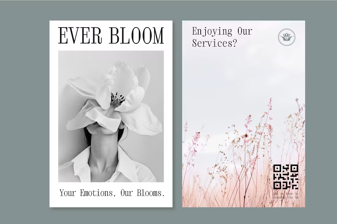
Ever Bloom - Brand & Logo Design
3
7
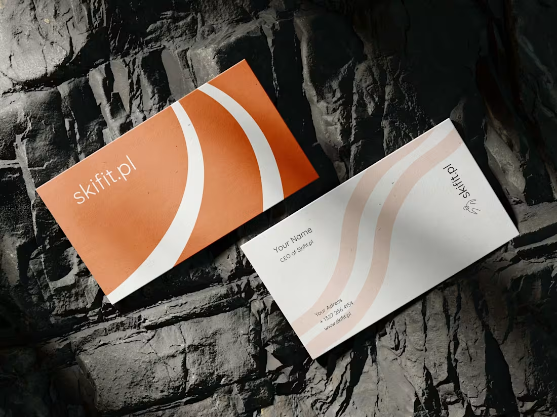
Skifit.pl Brand Identity
2
8
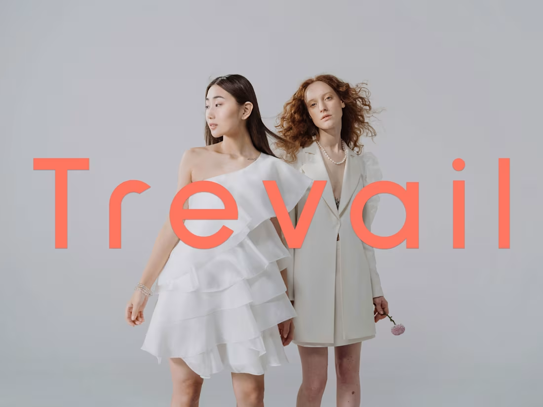
Trevail Logo and Brand Identity Design
2
8
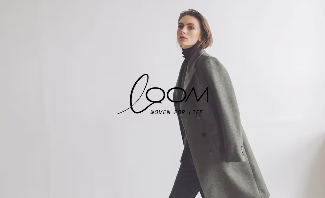
Sustainable Modern Fashion & Apparel Brand Identity
0
4
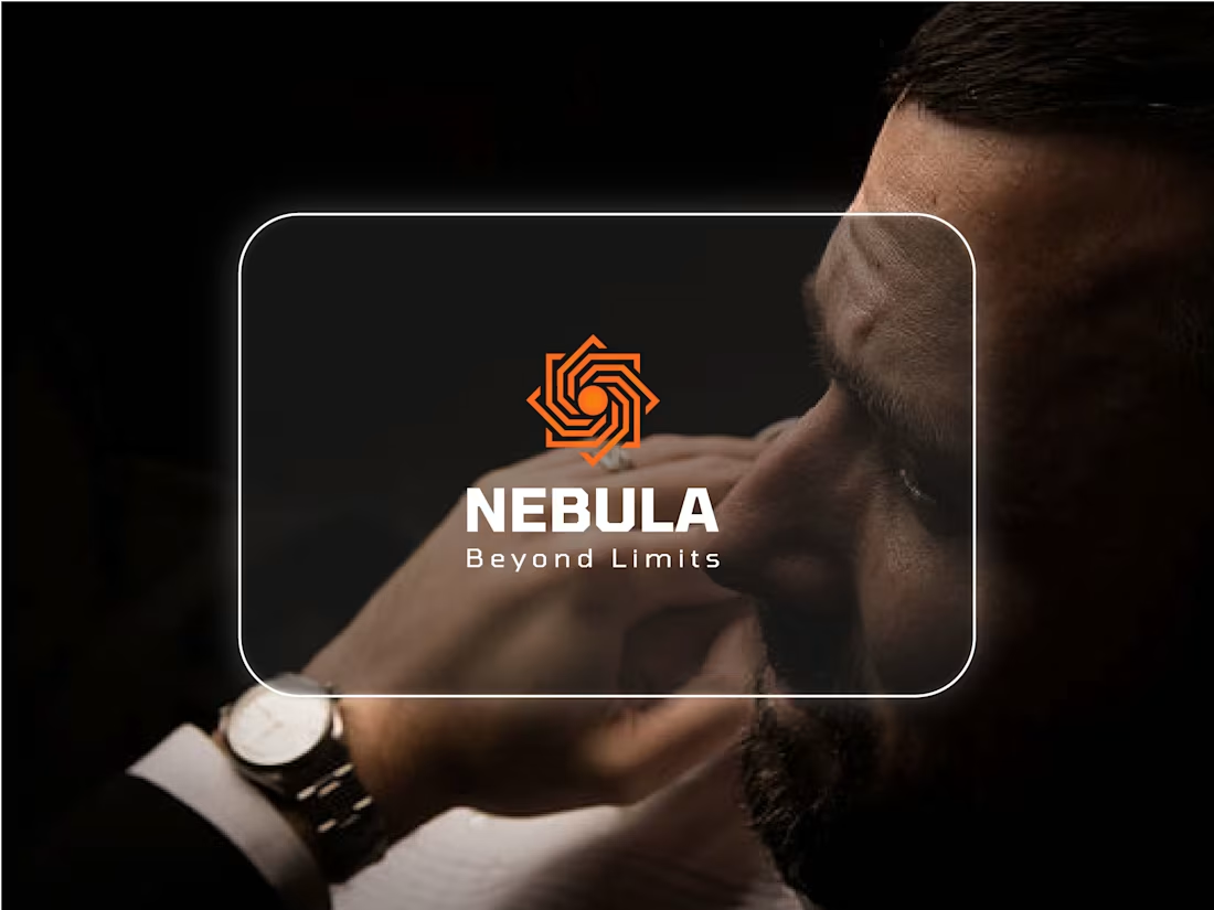
Nebula Logo Brand guidelines design
1
3
Minimalist logo design :: Behance
0
7
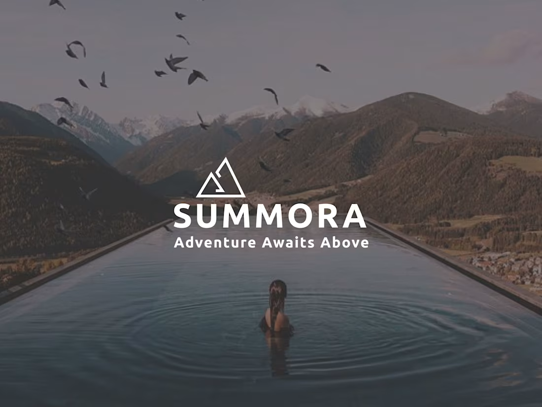
Luxury hotel SUMMORA logo and brand guidelines :: Behance
0
3
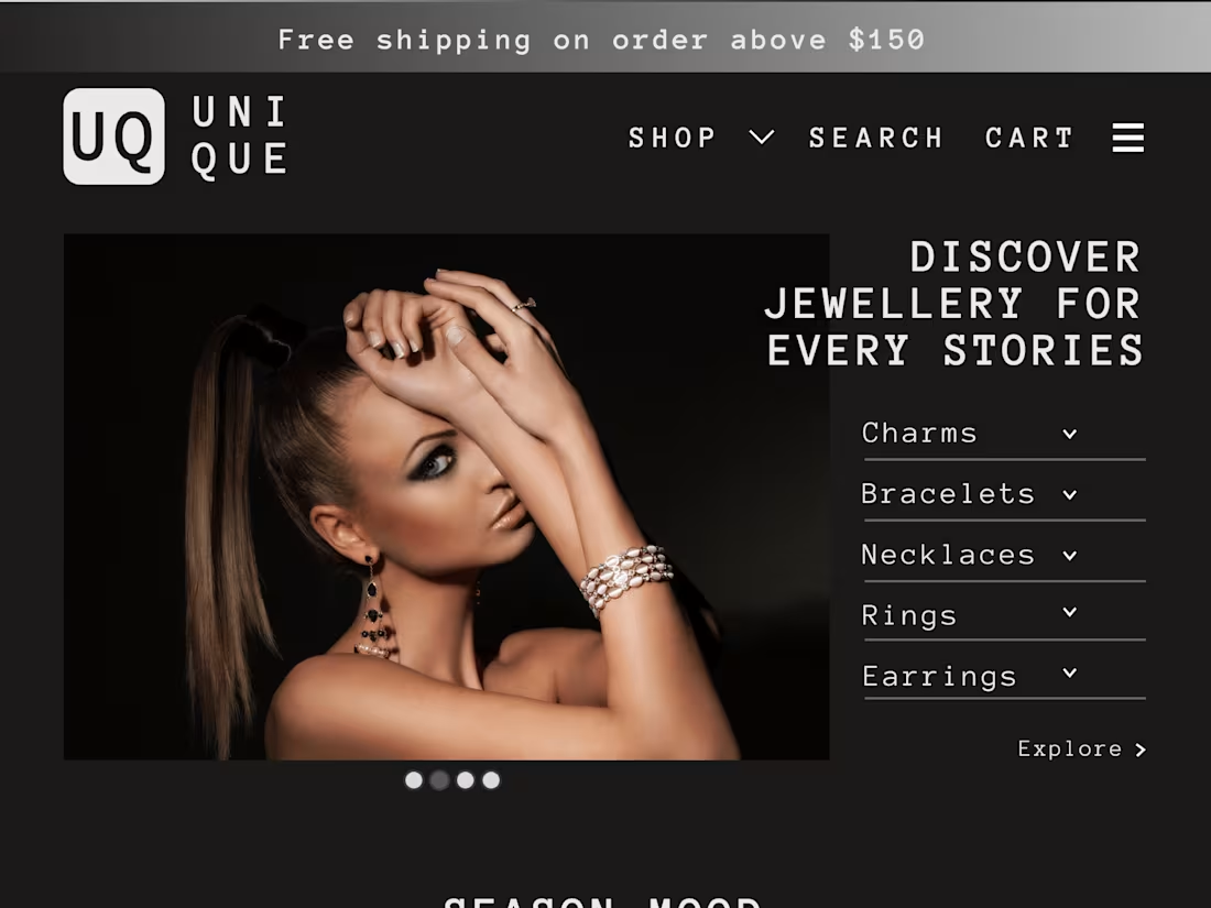
Introducing UNIQUE
0
7
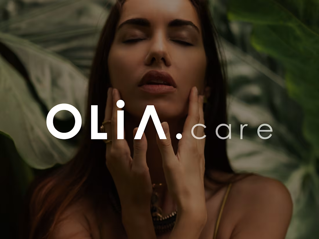
OLIA.care Cosmetics brand BRANDING & LABEL DESIGN
0
3
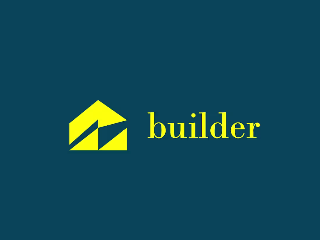
Logo Design and Branding for builder a real estate company
0
4
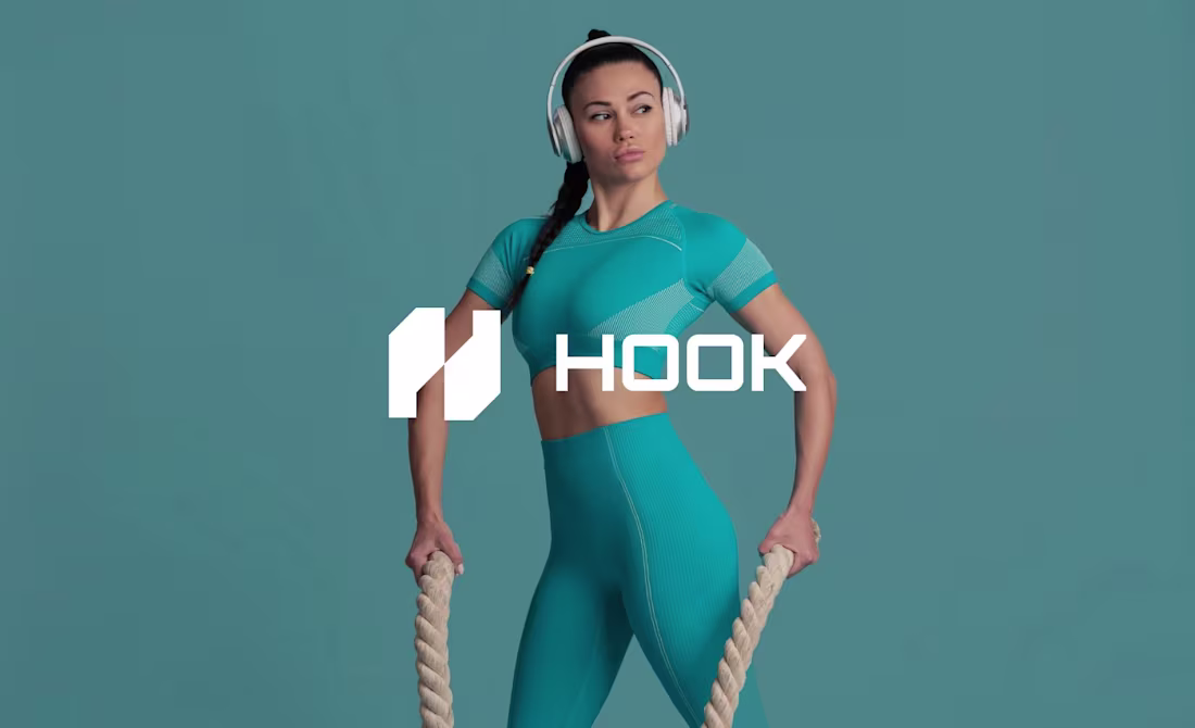
SportsWear Brand Guidelines and Logo
0
10

Car Towing Services Brand Design.
0
2