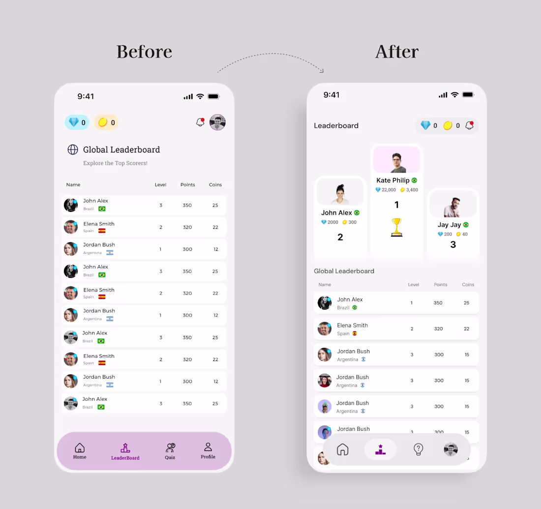
I revisited one of my old leaderboard designs and decided to give it a fresh look. Seeing the old and new screens side by side really shows how much I’ve grown as a designer.
The previous version did its job, but the new one feels more intentional. Better hierarchy, cleaner spacing, more personality, and a clearer focus on what users care about most. I wanted the top three winners to feel more celebrated and the entire experience to feel lighter and more engaging.
It’s always interesting going back to older work. You can literally see your own progress. I’m grateful for the journey and excited to keep improving.
I’m a Product Designer who loves creating meaningful experiences for users, and I’m always open to collaborating on great products.
1
24
Soccer game app I designed a few years ago.
#Design #SoftSkills #UXDesign #ProductDesign #Communication #Redesign #Growth #Mindset
1
63
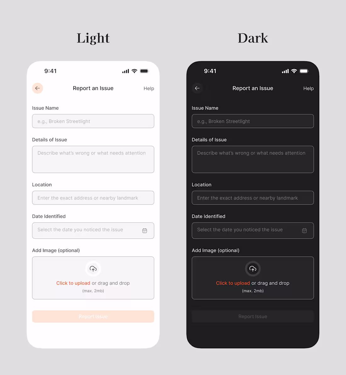
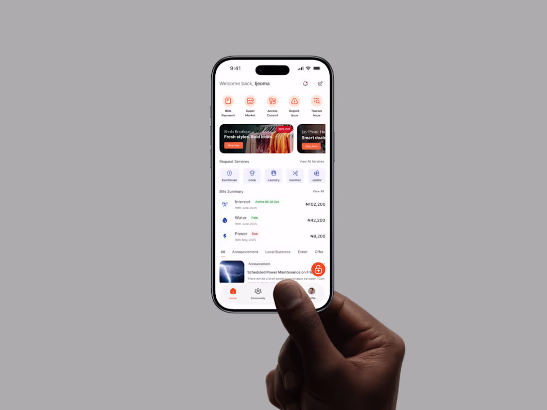
I recently redesigned a “𝐑𝐞𝐩𝐨𝐫𝐭 𝐚𝐧 𝐈𝐬𝐬𝐮𝐞” form and what started as a plain layout turned into something much more intentional.
Which version feels more natural to you: the “Before” or the “After”?
3
67
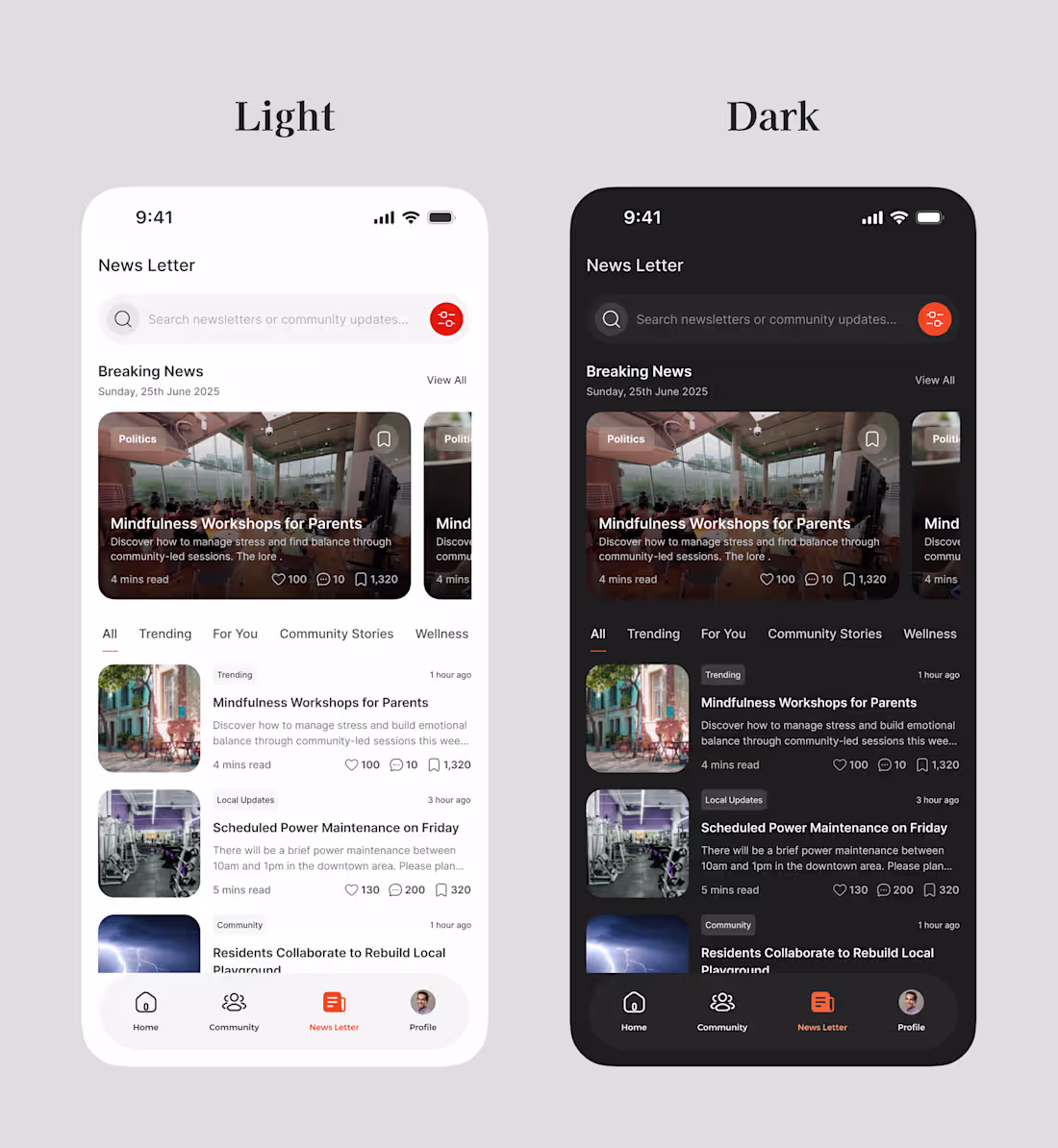
Designing for Clarity and Comfort — Every Interaction Matters.
As part of refining the community app’s newsletter experience, I explored two key areas:
1️⃣ Dark and Light Modes — ensuring visual comfort across different user preferences and environments.
2️⃣ Search Interaction Flow — designing a smooth, intuitive experience from the moment users start typing to when results appear.
My goal was to create a design that feels natural, accessible, and emotionally balanced — where every state transition, shadow, and layout choice contributes to a seamless reading and discovery experience.
This iteration focuses on bridging usability and emotion, making sure users feel guided, not overwhelmed.
#UXDesign #ProductDesign #UIUX #DesignThinking
2
73
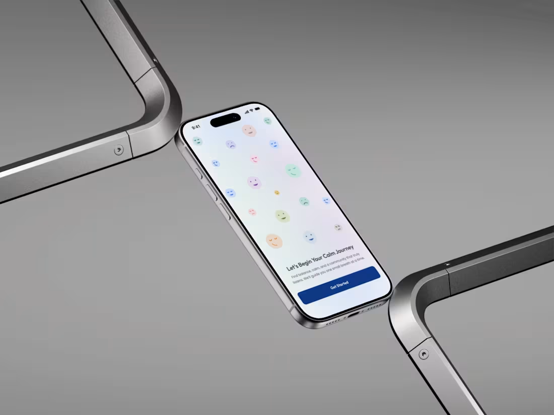
Still on the onboarding flow
Good UX isn’t just about flow — it’s about empathy in motion.
🎨 Tools: Figma
💡 Focus: Emotional design, micro-interactions, and accessibility
I’m currently open to collaborating with teams or startups that value thoughtful, human-centered design.
Let’s build something that feels good to use — not just looks good.
#UIDesign #UXDesign #ProductDesign #MentalHealth #DesignThinking #OpenToWork
4
67
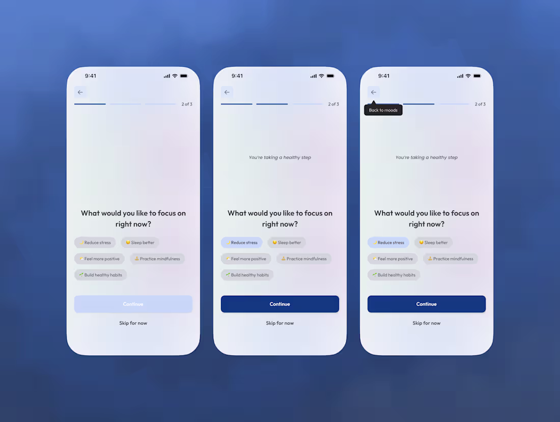
𝗜 𝗯𝗿𝗼𝗸𝗲 𝘁𝗵𝗲 𝗿𝘂𝗹𝗲𝘀 𝗼𝗳 𝗼𝗻𝗯𝗼𝗮𝗿𝗱𝗶𝗻𝗴 — 𝗮𝗻𝗱 𝗶𝘁 𝘄𝗼𝗿𝗸𝗲𝗱.
I got tired of the same onboarding pattern: bright colors, happy slogans, and a “next” button that means nothing.
So I tried something different.
I built an onboarding flow that starts with emotion, not action.
Each step responds to how users feel anxious, hopeful, unsure and adjusts tone accordingly.
The goal?
Not to convert. To connect.
Because sometimes, design should listen before it speaks.
#ProductDesign #UXResearch #DesignThinking #Onboarding #HumanCenteredDesign
2
4
77
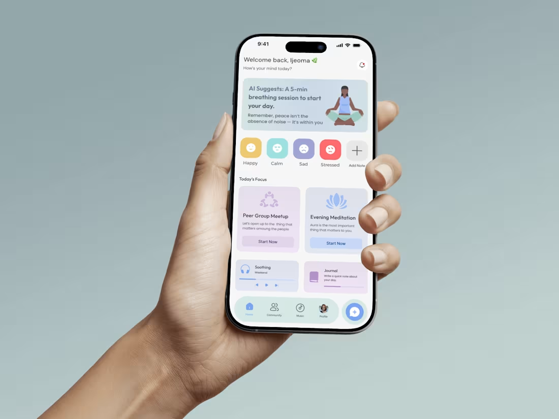
𝗥𝗲𝗱𝗲𝘀𝗶𝗴𝗻𝗶𝗻𝗴 𝗠𝘆 𝗢𝗹𝗱 𝗠𝗲𝗻𝘁𝗮𝗹 𝗛𝗲𝗮𝗹𝘁𝗵 𝗔𝗽𝗽 — 𝟮 𝗬𝗲𝗮𝗿𝘀 𝗟𝗮𝘁𝗲𝗿
I stumbled on a design I created over two years ago, a mental health app concept.
Looking at it now, I realized how much I’ve grown not just in skill, but in how I think about design.
So I decided to give it a new life.
This time, I focused on simplicity, emotion, and purpose.
𝗜 𝗮𝗹𝘀𝗼 𝗶𝗻𝘁𝗿𝗼𝗱𝘂𝗰𝗲𝗱 𝗔𝗜 𝘁𝗼 𝗺𝗮𝗸𝗲 𝗶𝘁 𝗺𝗼𝗿𝗲 𝗽𝗲𝗿𝘀𝗼𝗻𝗮𝗹 𝗵𝗲𝗹𝗽𝗶𝗻𝗴 𝘂𝘀𝗲𝗿𝘀 𝗿𝗲𝗳𝗹𝗲𝗰𝘁, 𝗵𝗲𝗮𝗹, 𝗮𝗻𝗱 𝗴𝗿𝗼𝘄 𝗶𝗻 𝘁𝗵𝗲𝗶𝗿 𝗼𝘄𝗻 𝗿𝗵𝘆𝘁𝗵𝗺.
The process reminded me that design isn’t just about pixels it’s about people, progress, and perspective.
𝗦𝘄𝗶𝗽𝗲 𝘁𝗼 𝘀𝗲𝗲 𝘁𝗵𝗲 𝘁𝗿𝗮𝗻𝘀𝗳𝗼𝗿𝗺𝗮𝘁𝗶𝗼𝗻 𝗼𝗹𝗱 𝘃𝘀 𝗻𝗲𝘄.
#UIDesign #ProductDesign #Redesign #MentalHealthApp #AIinDesign #Contra #shareyourwork
5
90
Redesigned one of my old projects from two years ago — and honestly, it felt like a full-circle moment.
I remember how much I struggled with the layout back then. This time, it flowed naturally from spacing to color balance and even the dark mode version.
It’s wild how much growth happens when you just keep creating.
Sometimes, you don’t notice it until you revisit your old work and realize how far you’ve come.
Swipe to see the before & after 👀
#DesignJourney #Framer #UIDesign #UXDesign #Shareyourwork
2
3
106
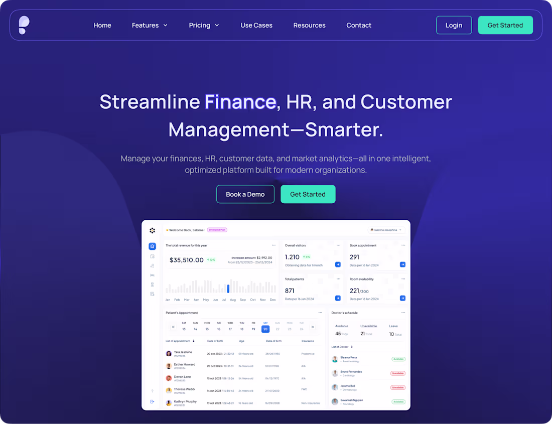
Design that feels effortless even when the system isn’t.
Built this clean, minimal SaaS dashboard concept focused on clarity, structure, and flow. From Finance to HR, every detail was designed to make complex data feel simple and intuitive.
Luxury meets logic and I’m just getting started.
#wip #shareyourwork #UI
2
6
124
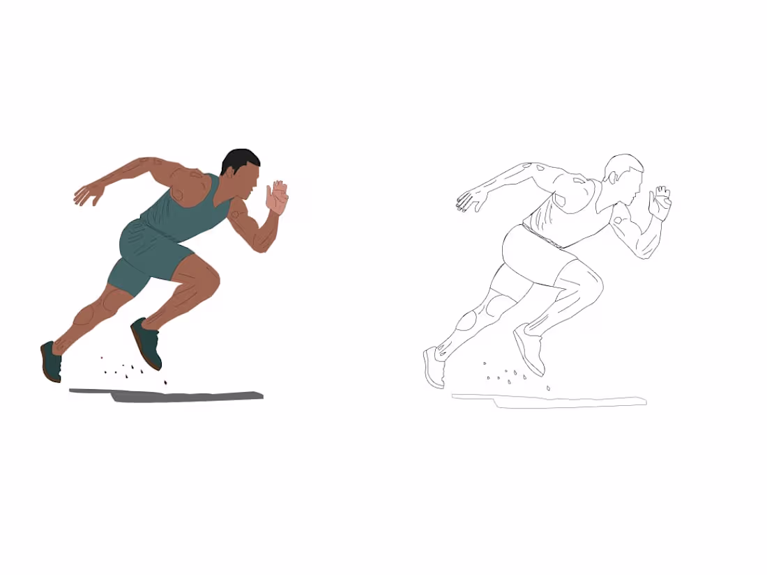
Been experimenting with motion through stills lately so I drew a man who refuses to walk 😅
Every line, every curve, had to feel fast.
It’s crazy how much storytelling can live inside a single frame.
#shareyourwork #contra #illustrator
23
295
1
4
37
359
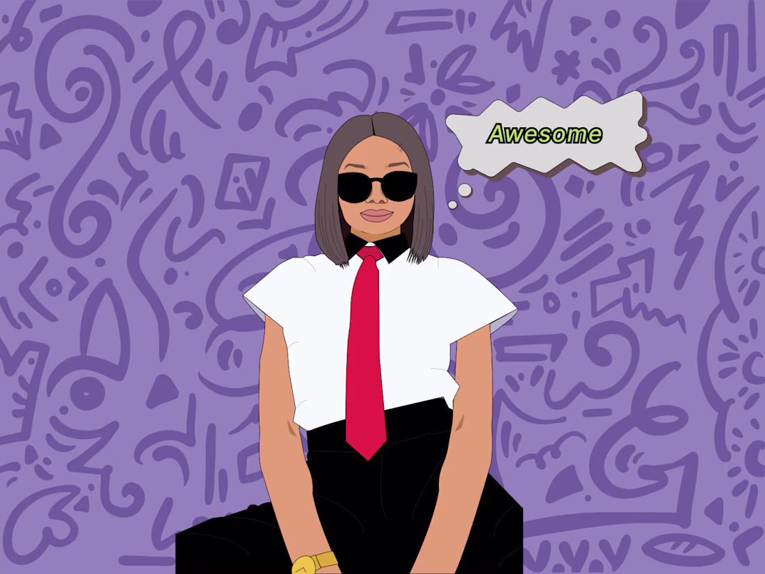
Started as a plain sketch, no colors, no background, just vibes.
Then I thought, why not let her own the scene?
Added doodles, a tie, and that “Awesome” energy and suddenly it all clicked.
Funny how a blank start can turn into something full of attitude 😎
What do you think, should I do a whole series like this?
2
27
302
Hey everyone 👋
I’m Candy — an illustrator and UI/UX designer with a frontend background.
I love creating things that not only look good but work seamlessly too. Lately, I’ve been diving into motion design and exploring how far I can stretch creativity across different mediums.
Open to gigs, collabs, and learning from other amazing creatives here. Let’s build something cool together
2
37
351
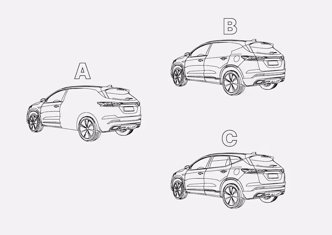
🚗 From a rough sketch to a refined ride.
This started as a simple car sketch I illustrated on Adobe Illustrator, then fine-tuned and brought to life on Figma.
It’s one of those projects that reminded me how design isn’t always about speed — it’s about patience, tweaking the little things, and watching an idea evolve.
After my LinkedIn post on Framer blew up, I wanted to share something more personal — a piece that shows the art side of what I do.
Excited to share more of my illustrations here on Contra, connect with other creatives, and keep building stories one frame at a time.
23
322
Okay… now I get why Framer designers call themselves developers 😅
I used to see "Framer Developer" in people’s bios and think, "come on, it’s design, not code."
But after actually building with Framer, I completely understand.
It has serious frontend energy — logic, variables, dynamic layouts — all built right in.
Coming from a frontend background, I’m honestly amazed by how much it can do.
Animations? Check.
Interactions? Check.
Fully responsive without breaking a sweat? Double check.
And the best part?
You can include preview images just like in frontend builds. That was the moment I realized Framer isn’t just another design tool.
It’s design and development living in one beautiful space.
I’m genuinely thrilled.
Just wrapped up my first build on Framer, check it out 👇
https://discreet-plans-171032.framer.app/
2
31
331
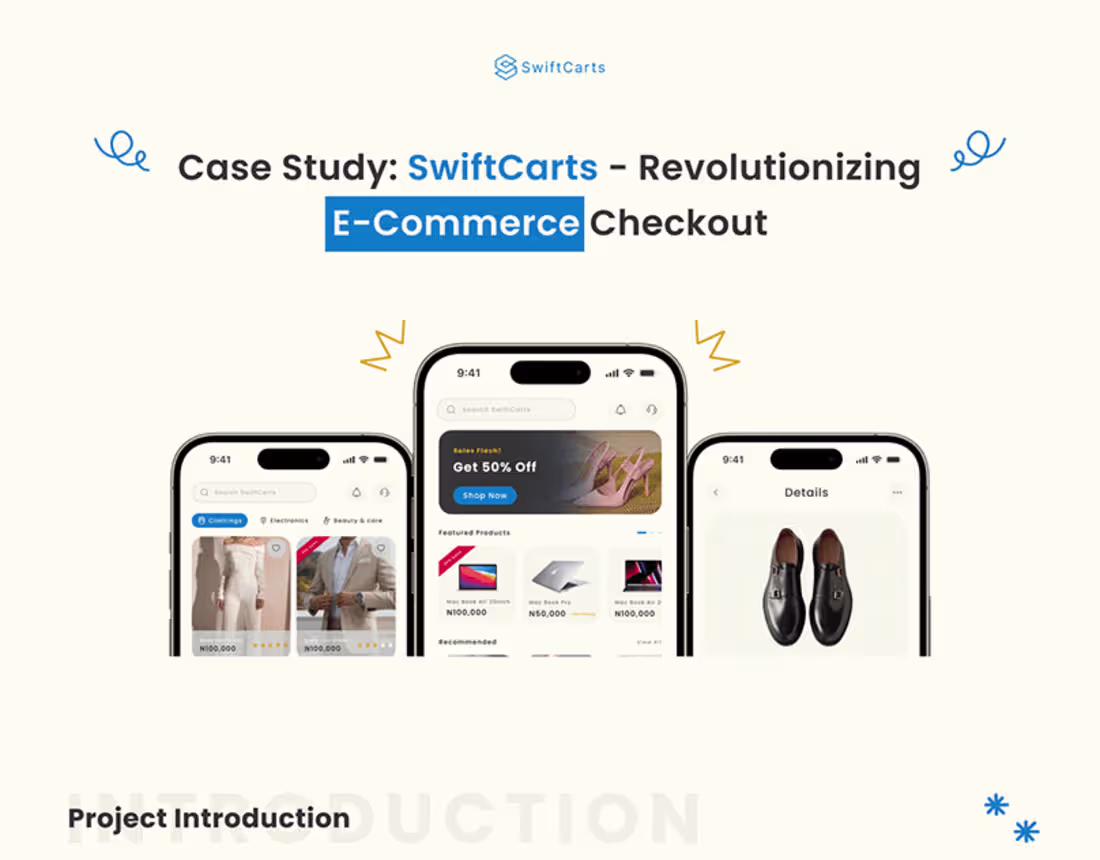
A Case Study in Streamlined Shopping Experiences (1) | Images :…
0
4
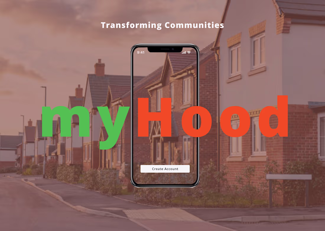
myHood Connect: Digital Community Reinvented :: Behance
0
3
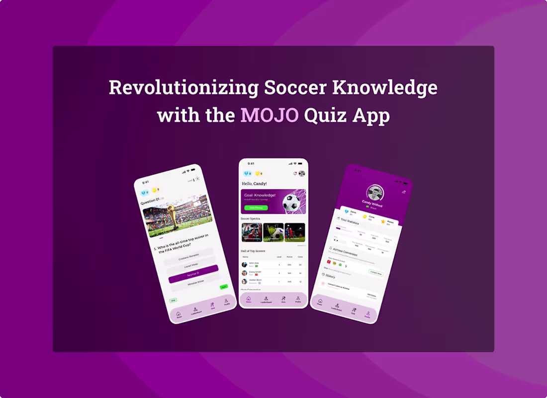
Mojo Soccer Quiz App :: Behance
1
6
1
1
5