
Igor Dinuzzi
Senior Communication Designer
Ready for work
Igor is ready for their next project!
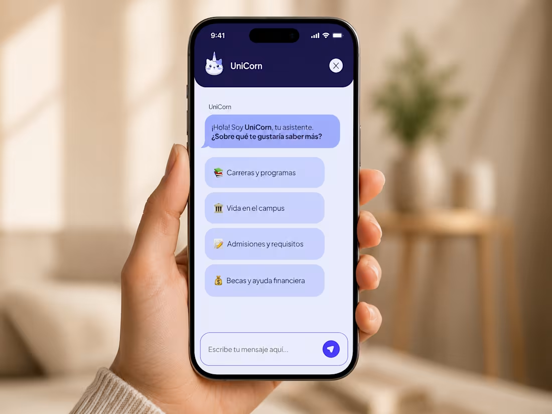
UniCorn is an AI-powered conversational experience designed to simplify how prospective students discover academic programmes, admissions requirements, and campus resources.
As Lead Designer, I was responsible for the end-to-end product experience, including UX strategy, conversational design, visual identity, logo creation, interface design, and design system development. The project explored how conversational AI could replace complex navigation structures with guided interactions that help users quickly access relevant information while reducing cognitive overload.
The solution included onboarding flows, conversational user journeys, quick-reply interactions, chat states, educational content modules, and a scalable component-based design system built in Figma. Particular attention was given to accessibility, readability, mobile-first behaviour, and creating a human-centred interaction model that balanced efficiency with engagement.
Through user-flow design, interaction architecture, and conversational UX principles, the platform transformed university discovery into a more approachable and personalised experience. The project demonstrates how AI-assisted guidance can improve information discovery, increase engagement, and support scalable digital experiences within the higher education sector.
0
13
Savvi Financial required a modern brand identity capable of communicating trust, expertise, and accessibility within a highly competitive financial services market. The objective was to reposition the brand with a visual system that felt intelligent and credible while remaining approachable to a broad audience.
As Creative Director and Lead Designer, I led the rebranding initiative from research and stakeholder interviews through visual identity development and implementation. The project included logo design, typography systems, iconography, co-branding frameworks, illustration direction, and digital brand assets. Market analysis and stakeholder feedback helped identify opportunities to differentiate the brand while aligning with user expectations within the fintech sector.
The resulting design system combined a flexible visual language, structured colour palette, editorial typography, and an extensive icon library covering key financial topics. Particular attention was given to consistency across digital touchpoints, co-branded experiences, and future scalability.
Deliverables included brand guidelines, logo systems, typography frameworks, iconography libraries, illustration assets, marketing materials, and digital design components. The rebrand established a stronger market presence and created a scalable foundation capable of supporting future growth across multiple channels and customer touchpoints.
0
17
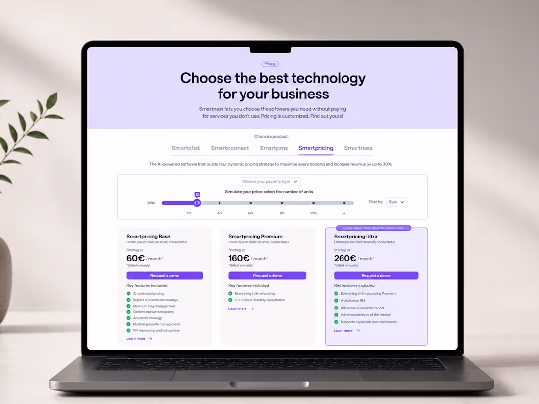
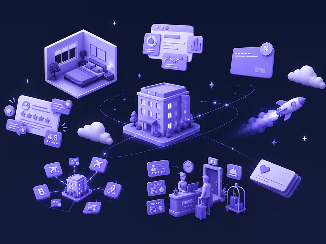
This project focused on designing a scalable pricing framework for a hospitality SaaS ecosystem, supporting multiple products, pricing models, property types, currencies, and responsive user experiences. The challenge was to simplify complex pricing structures while maintaining clarity, flexibility, and consistency across a growing portfolio of digital products.
As Lead Designer, I was responsible for pricing architecture, UX/UI design, interaction design, responsive behaviour, and component system development. The objective was to help users compare plans, understand value propositions, and make informed decisions without being overwhelmed by the complexity often associated with SaaS pricing.
The solution introduced a modular pricing system built around reusable components, progressive disclosure patterns, comparison tables, interactive controls, and responsive layouts. Special attention was given to mobile experiences, where pricing comparisons and feature matrices were restructured into simplified interaction models that preserved usability across smaller screens.
Deliverables included pricing flows, comparison frameworks, responsive components, interaction patterns, design system specifications, and reusable CMS-driven modules. The resulting architecture created a scalable foundation capable of supporting future products, campaigns, and pricing updates while improving clarity and decision-making throughout the customer journey.
0
21
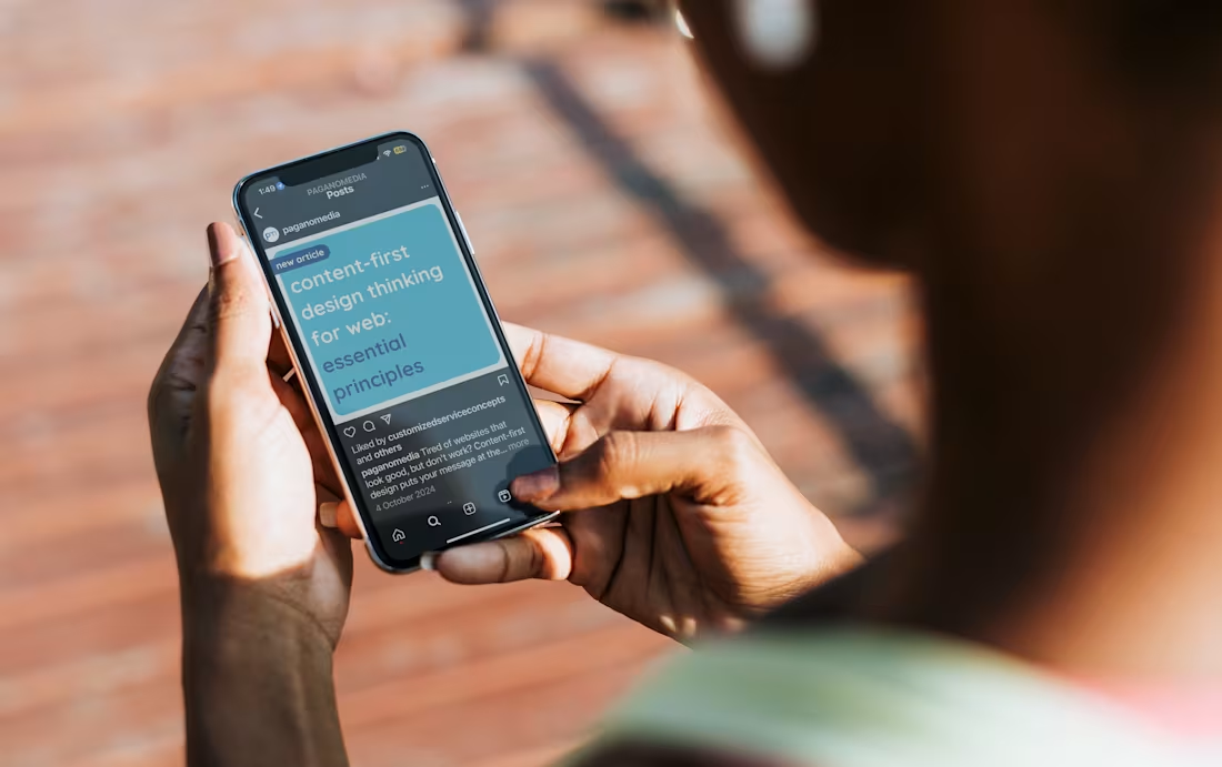
Pagano Media required a scalable communication framework capable of supporting social media, email marketing, recruitment campaigns, thought leadership content, and client communications while maintaining a consistent brand experience across channels.
As Creative Director and Senior Communication Designer, I developed a modular content design system that enabled non-designers to create and publish assets while preserving visual consistency and brand integrity. The system included reusable social templates, newsletter components, content hierarchies, typography standards, and flexible layout structures designed for operational efficiency.
The solution focused on scalability, governance, and ease of adoption, ensuring teams could create content quickly without sacrificing quality. By establishing clear visual rules and reusable components, the framework improved consistency across marketing touchpoints and strengthened brand recognition throughout the customer journey.
Notice how that reads like a systems project rather than a social media project.
0
25
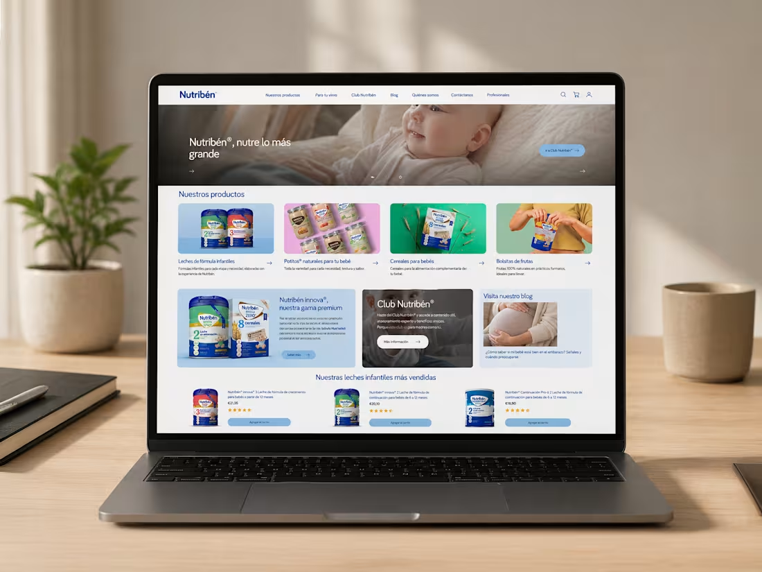
Nutribén is one of Spain's leading infant nutrition brands, supporting families through pregnancy, early childhood, and key parenting milestones. The project focused on redesigning the digital experience to better connect products, educational resources, loyalty programmes, and parenting content within a unified platform.
As Lead UX/UI Designer, I was responsible for information architecture, user experience strategy, interface design, responsive layouts, and the development of a scalable design system. The challenge was to accommodate multiple user goals, from product discovery and nutritional guidance to community engagement and loyalty programme participation, while maintaining a clear and intuitive experience.
The solution introduced a simplified navigation structure, improved content hierarchy, and modular design components that supported consistency across the platform. Product catalogues, educational resources, blog content, promotional campaigns, and membership experiences were reorganised into a cohesive ecosystem designed to improve discoverability and reduce friction throughout the customer journey.
Deliverables included user personas, user flows, responsive interfaces, design system components, product listing experiences, shopping journeys, and content frameworks. The result was a more scalable and user-centred platform that strengthened the connection between e-commerce, education, and brand engagement while improving usability across desktop and mobile devices.
0
21
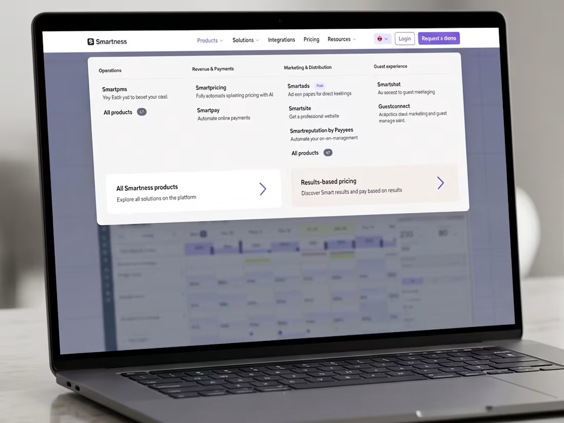
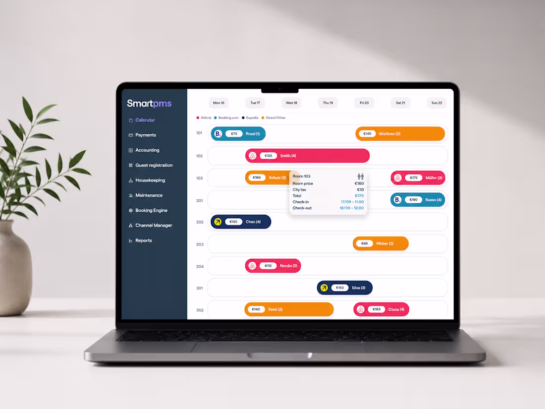
This project focused on redesigning the navigation experience for a growing hospitality technology platform that connects revenue management, guest communication, operations, marketing, and payments within a unified SaaS ecosystem. As the platform expanded, the existing navigation structure became increasingly difficult to scale, making product discovery more challenging and creating inconsistencies across the user experience.
As UX/UI Designer, I led the redesign of the navigation ecosystem across desktop and mobile experiences. The project began with a comprehensive UX audit to identify usability issues, information architecture challenges, navigation bottlenecks, and scalability concerns. Insights from the audit informed a new navigation strategy designed to support a growing product portfolio while improving clarity and discoverability.
The solution introduced a modular mega menu architecture organised around business goals, product categories, and user needs. Responsive navigation patterns were developed for mobile devices using progressive disclosure techniques, expandable navigation layers, and streamlined interaction flows to reduce cognitive load.
Deliverables included information architecture frameworks, navigation flows, interactive prototypes, responsive behaviours, component specifications, and a scalable design system approach. The result was a more intuitive navigation experience that improved product discovery, strengthened platform cohesion, and established a foundation for future growth across the Smartness ecosystem.
0
21
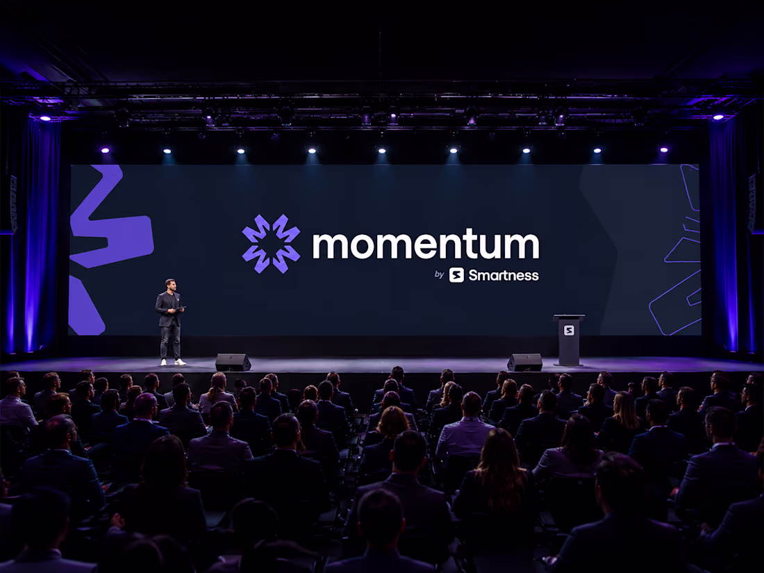
Momentum is a hospitality industry event designed to bring together technology leaders, hospitality professionals, and innovators through a unified digital and physical brand experience.
As Creative Director and Lead Designer, I was responsible for the end-to-end design of the event ecosystem, including brand identity, website design, user interface design, social campaigns, keynote templates, attendee materials, environmental graphics, and supporting event assets. The challenge was to create a distinctive event identity capable of standing independently while remaining connected to the broader Smartness brand ecosystem.
The visual system was built around themes of movement, acceleration, and connection. A scalable identity framework was developed to support multiple touchpoints, including digital experiences, event communications, printed materials, signage, badges, merchandise, and presentation assets. Particular attention was given to consistency, hierarchy, modularity, and adaptability across both digital and physical environments.
Deliverables included logo systems, visual guidelines, website interfaces, social media assets, presentation templates, attendee experiences, environmental graphics, and reusable brand components. The result was a cohesive event platform capable of supporting future editions while strengthening recognition and engagement across the entire event journey.
0
21
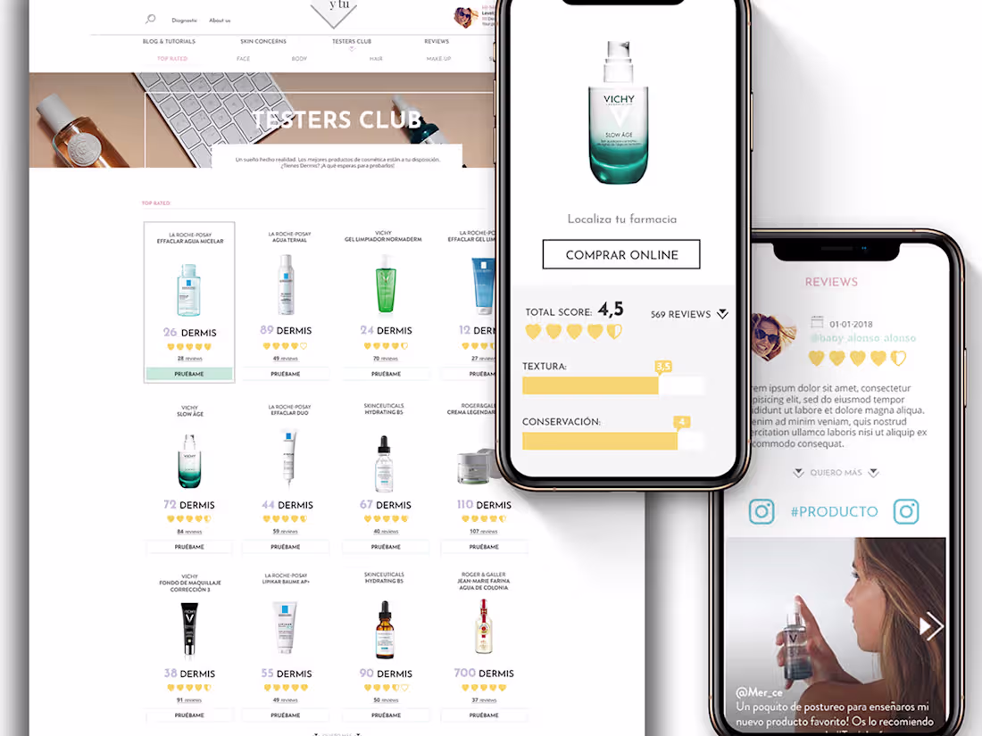
Tu Piel y Tú was created as a digital skincare platform designed to help users navigate skincare education, routines, recommendations, and personalised content through a calm and intuitive experience. The challenge was to create a platform that felt supportive and trustworthy while avoiding the complexity and promotional focus commonly found in beauty and e-commerce experiences.
As UX/UI Designer and UI Brand Designer, I led the design of the user experience, interface systems, content architecture, and visual language across the platform. The project focused on organising educational resources, guided recommendations, skincare routines, and interactive content into a cohesive ecosystem that encouraged exploration without overwhelming users.
The solution introduced modular page structures, simplified navigation patterns, responsive layouts, and a visual system inspired by editorial design principles. Particular attention was given to readability, content hierarchy, accessibility, and helping users quickly find relevant information based on their needs and skincare goals.
Deliverables included user flows, interface systems, responsive page designs, content frameworks, and visual design guidelines. The result was a more approachable and user-centred platform that strengthened L'Oréal's position as a trusted source of skincare guidance while creating a consistent experience across devices.
0
27
As digital products grow, maintaining consistency across marketing, educational content, product storytelling, and customer communications becomes increasingly complex. This project focused on designing a scalable illustration system that could support a wide range of marketing touchpoints while creating a cohesive visual language across the brand ecosystem.
I led the visual strategy, art direction, illustration system development, and design documentation process. The objective was to establish a flexible framework that marketing and content teams could use consistently across landing pages, feature launches, educational resources, customer success stories, and product communications.
The project explored multiple visual directions, including a premium soft-3D illustration approach and a more editorial style tailored to educational and content-driven experiences. Alongside the illustration work, I developed a category-based colour system that helped distinguish content themes while maintaining brand consistency and improving content discoverability.
Deliverables included visual language guidelines, illustration principles, colour taxonomy, reusable asset frameworks, creative direction recommendations, and scalable design documentation. The result was a structured visual system capable of supporting future growth while ensuring consistency across digital marketing and content experiences.
0
20
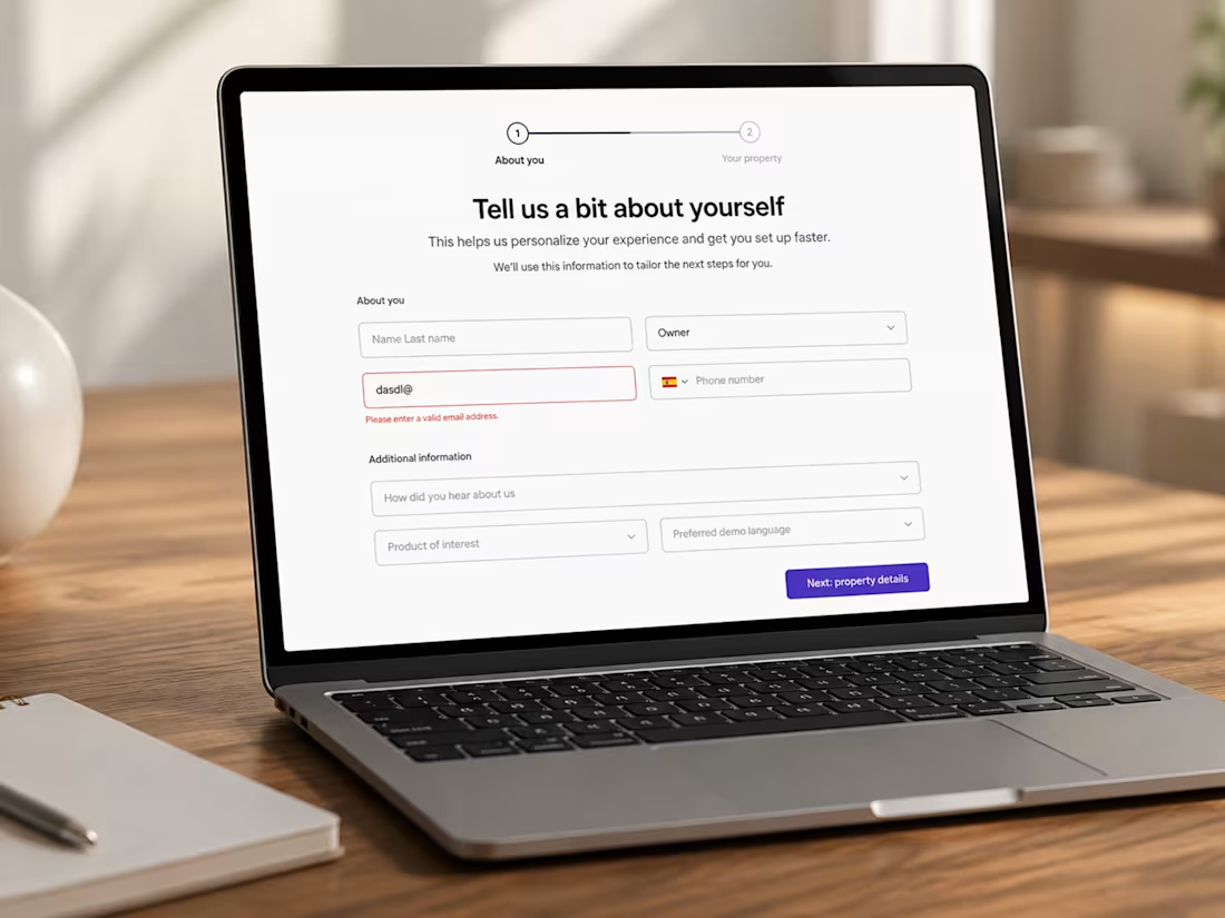
This project focused on redesigning a demo booking and onboarding experience for a hospitality SaaS platform serving hotels, vacation rentals, and hospitality operators. As the platform expanded, the booking experience needed to support multiple user types, qualification scenarios, and onboarding pathways while maintaining a simple and intuitive user experience.
As UX/UI Designer, I led the redesign of the end-to-end booking journey, focusing on conversion optimisation, information architecture, interaction design, and responsive user flows. The challenge was to reduce friction throughout the onboarding process while collecting the information required to qualify leads effectively.
The solution introduced a structured multi-step experience that separated user information, property details, and scheduling into progressive stages. This approach reduced cognitive load, improved form readability, and created a clearer path to completion. Validation patterns, interaction states, form hierarchy, and responsive behaviours were refined to improve usability across devices.
Deliverables included user flows, qualification logic mapping, interaction patterns, responsive layouts, component specifications, and interactive prototypes. The redesigned experience established a scalable framework capable of supporting future product growth while improving clarity, accessibility, and onboarding efficiency within the Smartness ecosystem.
0
20
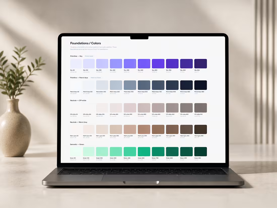
This project focused on designing a scalable design system foundation capable of supporting product interfaces, marketing experiences, and responsive digital platforms through a unified token-based architecture.
As Lead Designer, I was responsible for defining the system's foundational structure, including semantic tokens, responsive layout principles, visual governance, interaction patterns, and reusable UI foundations. The objective was to create a maintainable framework that could scale across multiple products while improving consistency, collaboration, and development efficiency.
The system was built around a layered architecture that separated primitive and semantic tokens, enabling greater flexibility and long-term adaptability. Foundations included colour systems, spacing scales, typography rules, grid structures, motion principles, elevation patterns, iconography guidelines, and responsive behaviours designed to support a wide range of interface requirements.
Particular attention was given to accessibility, component consistency, responsive design logic, and creating a shared language between design and development teams. The resulting framework established a scalable foundation capable of supporting future product growth while reducing fragmentation across digital experiences.
Deliverables included token architecture, design foundations, responsive frameworks, interaction guidelines, visual governance documentation, component specifications, and scalable UI principles for modern SaaS environments.
0
20
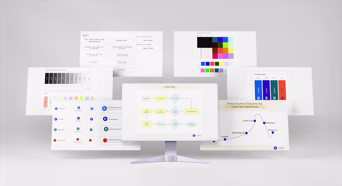
Designlab required a scalable design system capable of supporting multiple educational programs, learning experiences, marketing initiatives, and internal teams while maintaining a consistent and accessible brand experience.
As Senior Communication Designer and Creative Director, I led the evolution of the existing visual identity into a comprehensive design system framework. The project focused on creating a flexible foundation that could support growth across courses, educational content, templates, and digital learning materials without sacrificing consistency or usability.
The system included a structured colour architecture, reusable templates, iconography libraries, educational frameworks, infographic systems, and scalable visual guidelines built within Figma. Each educational track was assigned a distinct visual identity while remaining connected through a shared design language, enabling differentiation without fragmenting the overall brand experience.
Deliverables included design system documentation, colour taxonomy, icon libraries, template ecosystems, visual governance standards, and reusable educational assets. The result was a scalable framework that improved consistency across products, simplified content creation, and established a foundation for future growth across the Designlab platform.:
0
19
This project showcases a collection of product interfaces, operational dashboards, and marketing experiences designed for hospitality-focused SaaS platforms. The work spans property management, booking operations, payment systems, CRM tools, analytics dashboards, and supporting product marketing assets.
As Lead Designer, I was responsible for UI design, product systems, dashboard architecture, responsive layouts, interaction patterns, and visual communication across multiple hospitality products. The challenge was to create interfaces capable of supporting complex operational workflows while maintaining clarity, usability, and consistency across the broader platform ecosystem.
The design approach focused on scalable UI patterns, modular components, data visualisation frameworks, and intuitive navigation structures that improved readability and reduced complexity across information-dense environments. Particular attention was given to hierarchy, operational efficiency, responsive behaviour, and supporting decision-making through clear presentation of data and actions.
Alongside the product interfaces, I developed product marketing visuals and feature communication assets designed to help explain platform capabilities, workflows, and business value across landing pages and customer-facing experiences.
Deliverables included dashboard systems, user flows, component libraries, responsive interfaces, data visualisation patterns, product marketing assets, and interactive prototypes. The result was a cohesive product ecosystem that balanced operational complexity with usability, scalability, and visual consistency.
0
20
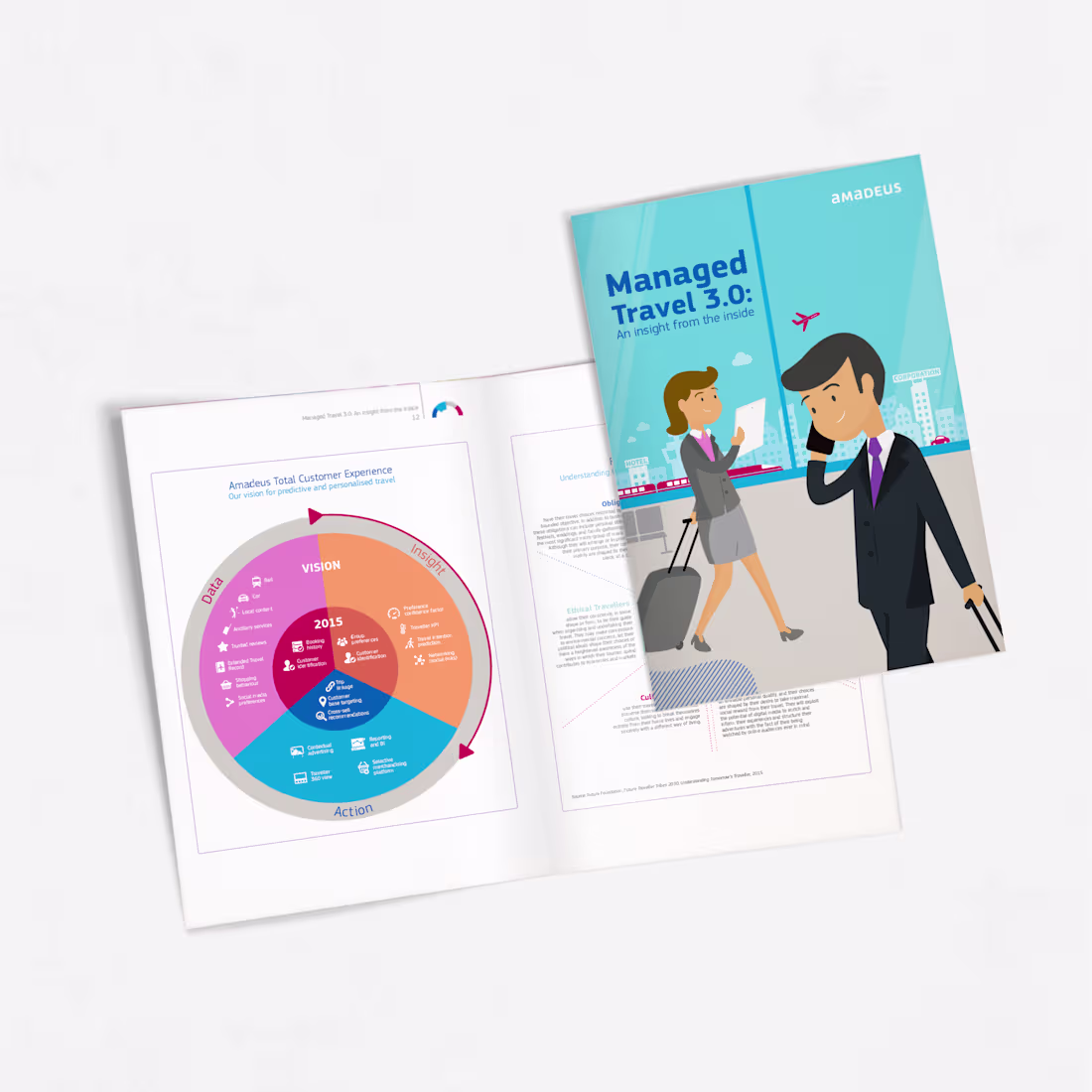
Amadeus, one of the world's leading travel technology companies, partnered with DMA Partners to communicate complex industry research through highly engaging editorial experiences. The challenge was to transform large volumes of travel, technology, and behavioural data into formats that were easier to navigate, understand, and retain.
As Art Director and Graphic Designer, I led the visual design, information hierarchy, editorial systems, infographic development, and motion graphics across two major publications: Managed Travel 3.0 and Future Traveller Tribes 2030. The work focused on translating research insights into accessible visual narratives while maintaining the depth and credibility of the underlying content.
The solution combined editorial design, infographic systems, illustration frameworks, motion graphics, and structured visual hierarchies to improve readability and user engagement. Particular attention was given to information architecture, content prioritisation, and simplifying complex concepts without oversimplifying the research itself.
Deliverables included publication design, infographic systems, editorial layouts, visual storytelling assets, motion graphics, and presentation materials. The result was a series of publications that improved content accessibility, strengthened audience engagement, and made future-focused travel research more approachable for industry stakeholders.
0
20
Pinterest
0
9
Genomelink
0
13

Amadeus IT Group
0
8