
Ibrahim Olashinde
Creative Book Covers, Editing & Formatting Expert
New to Contra
Ibrahim is building their profile!

Book Cover Design — The Way Back
I designed The Way Back as a warm, emotionally engaging children’s book cover centered around kindness, compassion, friendship, and finding your way home.
The cover uses a golden-hour setting to create a warm and hopeful atmosphere. The young girl walking alongside the dog immediately establishes the emotional heart of the story, while the rural pathway creates a strong visual metaphor for the journey she takes throughout the book.
The girl's protective embrace of the dog helps communicate trust, empathy, and companionship without needing the reader to know the full story. I also used the warm sunlight, natural landscape, and earthy tones to give the cover a nostalgic, comforting quality that appeals to both children and parents.
The large, classic title typography provides strong shelf visibility while maintaining the storybook feel. I carried the same illustration style and visual language onto the back cover, creating a cohesive full-wrap design with the book description and decorative elements.
Design focus:
🌅 Warm, emotional storytelling
🐕 Friendship & compassion
👧 Child-centered character design
🌿 Natural, storybook atmosphere
📖 Full-wrap cover consistency
✨ Clear, engaging typography
The goal: create a cover that immediately makes the reader feel the warmth of the story while visually communicating its central message—that one small act of kindness can change everything.
2
20

Book Cover Design — Kabbalah Yoga
I designed Kabbalah Yoga to communicate the book’s unique combination of yoga, spirituality, ancient wisdom, breathwork, and personal transformation through a sophisticated and symbolic visual style.
The front cover places the yoga practitioner at the center of the composition, creating an immediate connection between the physical practice of yoga and the book’s deeper spiritual message. The luminous sky and ocean setting create a sense of openness, meditation, and transcendence, while the surrounding Hebrew letters reinforce the connection to Kabbalistic teachings and the sacred language explored throughout the book.
I used deep blue and gold tones to create a premium, spiritual aesthetic. The gold typography gives the title a refined, timeless quality, while the subtitle clearly communicates the book's focus on the relationship between the body, breath, and soul.
The back cover was designed to continue the same visual identity, incorporating the book description, author information, author portrait, testimonial, and website details in an organized and readable layout.
Design focus:
🧘 Spirituality & wellness branding
✨ Premium typography and color direction
🔯 Kabbalistic symbolism
🌊 Serenity, meditation & transformation
📖 Professional full-wrap book design
🎨 Cohesive front, spine & back cover
The goal: create a cover that immediately communicates that Kabbalah Yoga is more than a traditional yoga book—it's an exploration of body, breath, spirituality, and ancient wisdom, presented through a visually premium and contemplative design.
1
18
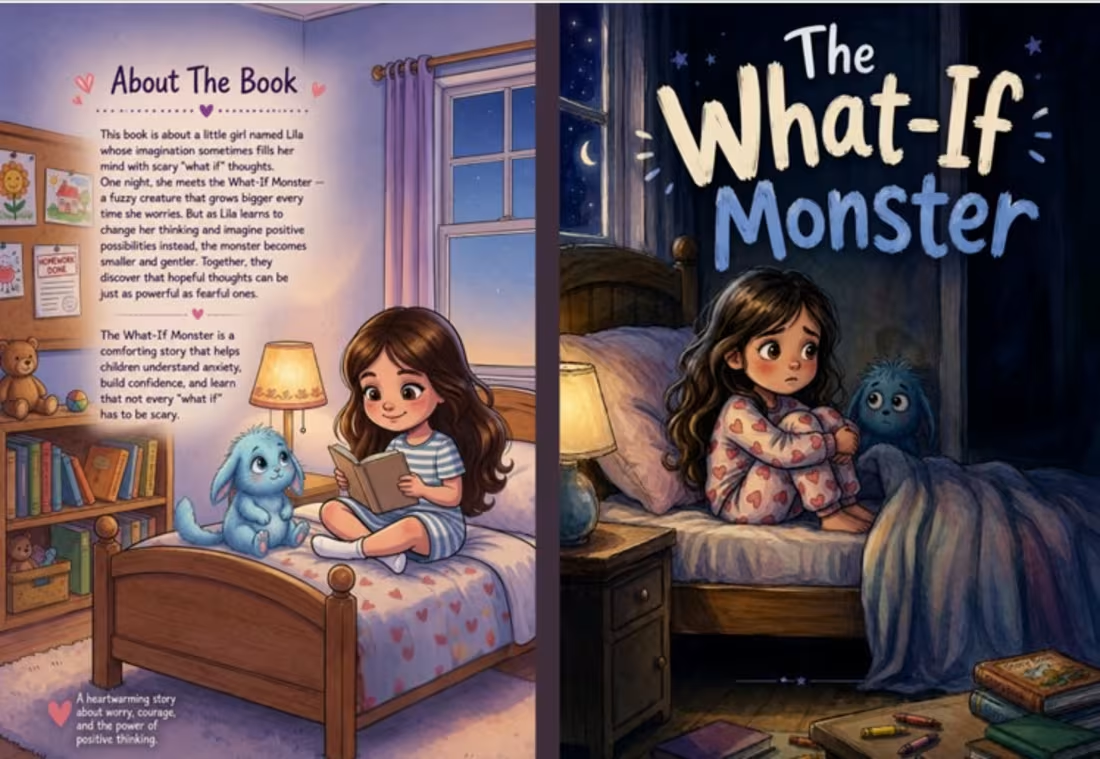
Book Cover Design — The What-If Monster
I designed The What-If Monster as a warm, imaginative children’s book cover that visually communicates the story’s themes of fear, imagination, courage, and emotional reassurance.
The cover centers on a young girl and her friendly “What-If Monster,” creating an immediate visual connection between the child’s worries and the comforting character who helps her face them. I used a dreamy nighttime setting, expressive characters, and warm bedroom lighting to create a sense of safety while maintaining the mystery and imagination that children naturally associate with monsters.
The hand-drawn title treatment gives the cover a playful, youthful personality, while the contrasting colors help the title stand out clearly. The character expressions and cozy bedroom environment were intentionally designed to make the book feel approachable rather than frightening.
I also created the accompanying “About the Book” interior page using the same illustration style, typography, and color direction to maintain a consistent visual identity throughout the book.
Design focus:
🎨 Children's book illustration & visual storytelling
👧 Emotional connection with young readers
👾 Friendly, imaginative character design
🌙 Cozy nighttime atmosphere
✏️ Playful, child-friendly typography
📖 Cohesive cover and interior design
The goal: turn an abstract childhood feeling—“What if something goes wrong?”—into a memorable character and a visual story that makes children feel understood, comforted, and brave.
1
23
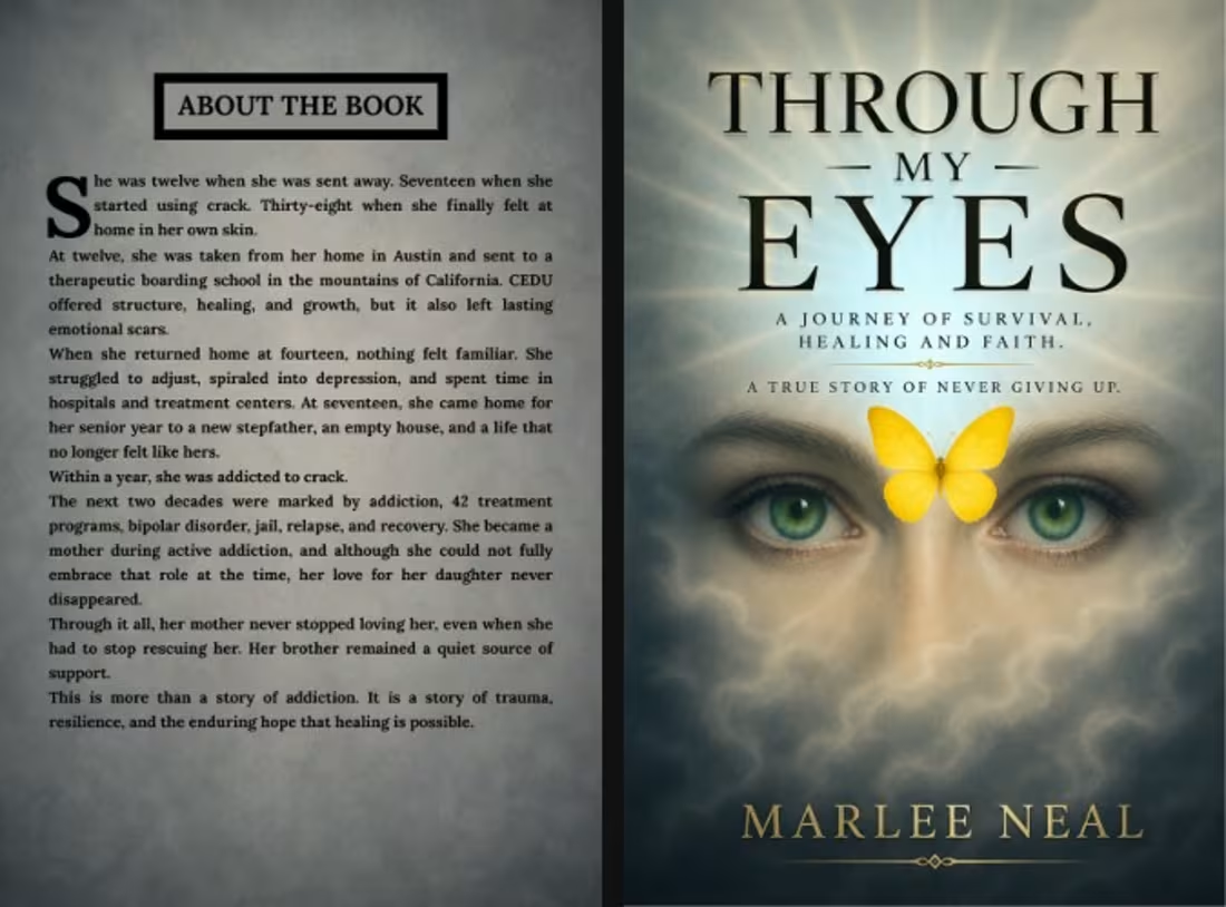
Book Cover Design — Through My Eyes
I designed the cover for Through My Eyes to visually capture the emotional journey of survival, trauma, healing, and faith at the heart of the story. The goal was to create something deeply emotional yet elegant, giving readers an immediate sense that this is a powerful and personal story.
The eyes serve as the central visual element, representing memory, pain, vulnerability, and the experience of seeing life through the author's perspective. The yellow butterfly adds a meaningful contrast, symbolizing transformation, hope, healing, and the possibility of a new beginning after difficult experiences.
I used a soft, atmospheric background to create a reflective and emotional mood, while the sophisticated typography gives the cover a professional memoir/true-story feel. The gold-toned title and author name add warmth and a subtle sense of premium quality.
I also designed the interior “About the Book” page to complement the cover, maintaining the same visual language and creating a cohesive reading experience.
Design focus:
🎨 Emotional storytelling
📖 Memoir & true-story aesthetics
🦋 Symbolism and visual storytelling
✨ Professional typography
📚 Cover + interior design consistency
My goal was simple: create a cover that doesn't just look beautiful—it makes the reader feel the story before they even open the book.
1
25