
Hridya Sharma
End-to-End Data Analyst: Raw Data to Business Decisions
- 1
- Followers

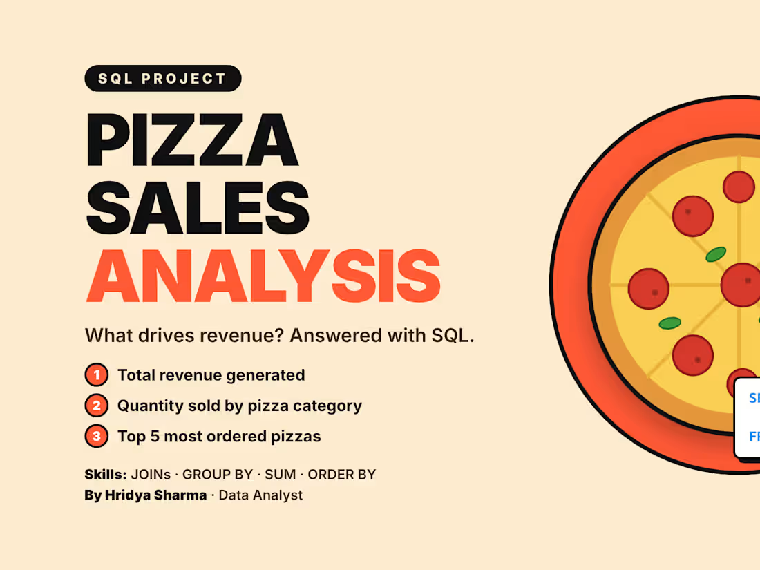
Pizza Sales Analysis with SQL
I analysed a pizza restaurant's sales database to find out what drives revenue and which products sell most.
What I did:
Joined 3 tables (pizza_types, pizzas, orders_details) to connect products, prices and orders
Calculated total revenue: 817,860.05
Ranked pizza categories by quantity ordered
Found the top 5 most ordered pizza types
Key findings:
Classic is the top category with 14,888 pizzas sold, about 30% of all pizzas ordered
Demand is evenly spread: the top 5 pizza types sold between 2,371 and 2,453 each, a gap of only about 3%
The top 5 pizza types together are about 24% of all pizzas sold
On average, each pizza sold brought in about 16.50 in revenue
Tools: SQL (MySQL), JOINs, GROUP BY, aggregate functions
Want your sales data turned into clear answers? Message me.😍
1
45
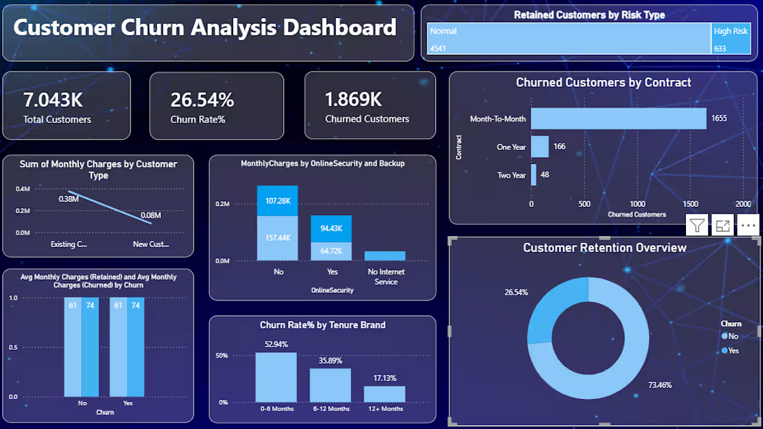
Customer Churn Analysis Dashboard | Data Analytics
Developed a customer churn analysis project to explore customer retention, identify potential churn patterns, and understand the factors that may influence customer attrition. The project focuses on transforming customer data into meaningful insights to support better business decisions.
Tools Used: Data Analysis, Data Visualization, Power BI / SQL / Excel (as applicable to the project)
Key Highlights:
Analyzed customer data to understand churn and retention patterns.
Examined customer characteristics and behavioral trends associated with churn.
Identified key performance indicators to evaluate customer retention.
Presented findings through clear visualizations and business-focused insights.
Project Objective: Help businesses better understand customer churn and identify opportunities to improve customer retention through data-driven analysis.🚀
0
25
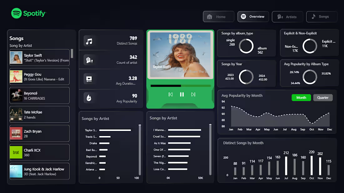
Spotify Data Analysis Dashboard | Power BI😊
Developed an interactive Spotify analytics dashboard using Power BI to explore music streaming trends and analyze track performance. The dashboard presents key metrics and visual insights to help understand music popularity, listening trends, and track characteristics.
Tools Used: Power BI, DAX, Data Visualization, Data Analysis
Key Highlights:
Analyzed Spotify track data to identify popular songs and music trends.
Designed interactive visualizations to compare track performance.
Used KPI cards, charts, and slicers to make data exploration easier.
Organized the dashboard to present music-related insights in a clear, visually engaging format.
Project Objective: Transform Spotify music data into meaningful insights through interactive visual analytics.
0
28
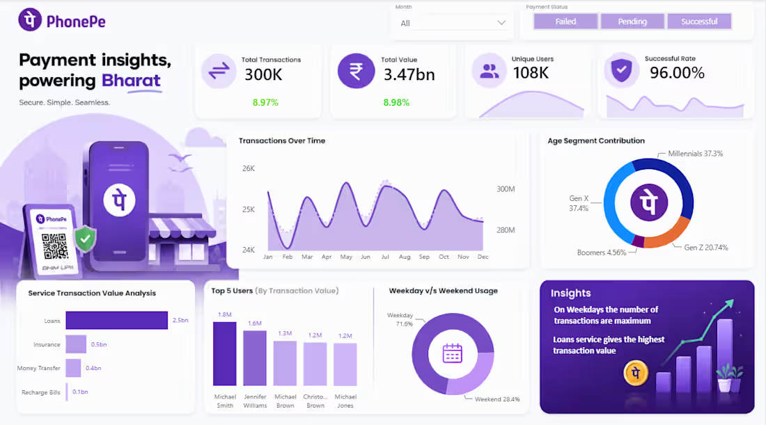
PhonePe Transaction Analysis Dashboard | Power BI
Developed an interactive Power BI dashboard to analyze PhonePe transaction data and present key business insights through data visualization. The dashboard highlights important performance indicators, transaction success rates, and transaction trends to support data-driven decision-making.
Tools Used: Power BI, Data Visualization, Data Analysis
Key Highlights:
Visualized transaction performance using interactive charts and KPIs.
Analyzed transaction success rates to understand payment performance.
Designed a clean, interactive dashboard for easy interpretation of data.
Used slicers to support dynamic filtering and exploration.
Project Objective: Transform transaction data into clear, actionable insights through an interactive dashboard.😍
2
102