Holladeco
Brand & Graphic Designer | Building Brands That Get Noticed
New to Contra
Holladeco is building their profile!
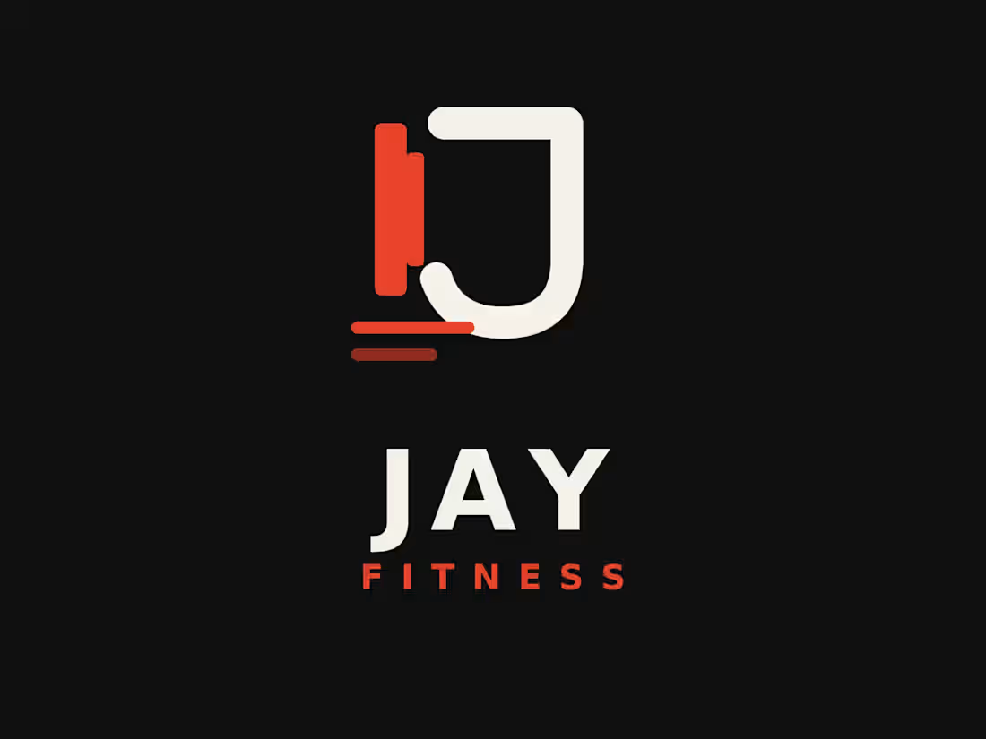
This is a logo concept for “Jay Fitness” with a monogram-style mark and wordmark.
Mark: A stylized “J” formed from two overlapping vertical bars — a solid red/orange rectangle (representing a dumbbell or weight plate) intersecting with a rounded cream-colored “J” shape that curves at the bottom, suggesting movement or a hook. Two short horizontal lines beneath it (red and dark maroon) act as a baseline/underline, reinforcing a sense of grounding or a barbell motif.
Wordmark: “JAY” in bold, condensed cream-white uppercase letters, with “FITNESS” beneath it in smaller, wide-tracked red letters for contrast and hierarchy.
Palette: Black background, warm off-white/cream, and a vibrant red-orange accent — a bold, energetic, modern combination common in fitness branding.
Style: Clean, geometric, minimal — flat design with rounded terminals, no gradients or shadows, giving it a confident, athletic feel suited for a personal training or gym brand.
Want me to write this up as formal brand-style copy (e.g., for a portfolio or client presentation), or help critique/refine the design itself?
1
2
17
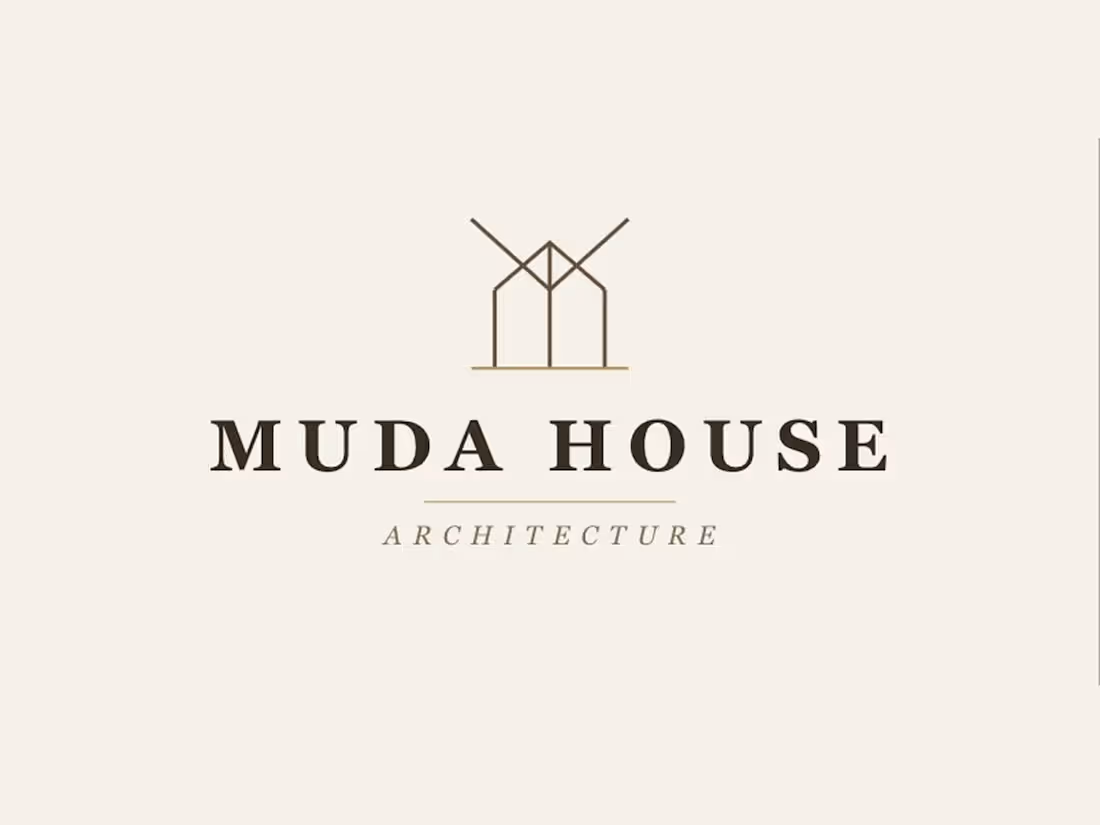
MUDA HOUSE ARCHITECTURE — Where structure meets story.
A refined architectural identity for Muda House Architecture, anchored by a minimalist line-art house mark that echoes the clean geometry of great design. Paired with a bold serif wordmark and warm earth-tone palette, the logo speaks to craftsmanship, permanence, and upscale design sensibility — ideal for a firm building spaces that last.
2
31
Ajik Stiches | Logo Design
An elegant, minimal wordmark for Ajik Stiches, featuring a subtle stitched-thread motif above the name — clean serif typography that reflects the craftsmanship of a fashion brand.
0
23
Royal Insurance company Of Nigeria | Logo & Brand Identity
A regal, trustworthy logo for Royal Insurance Company of Nigeria, built around a crowned shield emblem with a bold monogram “R” Symbolizing protection, authority, and reliability. Paired with a strong serif word mark in deep green and gold, the design conveys the stability and prestige expected of an insurance brand while staying clean enough to scale across print, digital, and signage.
1
29