
Luke Maitland
Brand Identity & Motion Designer


Planet Football Rebrand ⚽️
Planet Football is a celebration of everything the game has to offer beyond the scoreline. While traditional football media focuses on match reports and opinion-led coverage, Planet Football highlights the humour, nostalgia and culture of the sport, capturing the moments that make us love our beautiful game.
I led the rebrand and creative direction to help reposition Planet Football for a younger, more social-first audience. The goal was to rediscover the brand’s playful identity and evolve it into a more engaging and distinctive presence across digital platforms.
The identity needed to feel energetic, expressive and unmistakably football, while standing apart from more conventional news outlets. It had to support fast-moving social content while maintaining a clear and recognisable brand system across all touchpoints.
The final identity introduces a refreshed visual system, animation style and content direction designed for social-first storytelling. Supported by a new TikTok and Reels strategy and a redesigned website, the rebrand transforms Planet Football into a more dynamic and engaging brand built for modern football audiences.
24
32
1.2K
PlanetF1 Rebrand 🏁
PlanetF1 is one of the world’s leading independent Formula One media platforms, established in 1999 and part of the Planet Sport Group. Known for its global audience and trusted race coverage, it delivers breaking news, analysis and live weekend reporting to millions of F1 fans worldwide.
I led the rebrand and wider visual overhaul of the platform. Working closely with key stakeholders, I drove the research and discovery phase before designing and presenting a refreshed identity system built to position PlanetF1 as a modern, digital-first brand for Formula One audiences.
The identity needed to feel fast, precise and unmistakably connected to the sport, while elevating the platform’s presence within an increasingly competitive sports media landscape. It also needed to support high-frequency publishing across news, live coverage and social content.
The final identity introduces a new icon inspired by the Formula One “mini-map”, acting as a directional system to reflect speed, positioning and race tracking. Supported by updated brand guidelines and enhanced motion capabilities, the system creates a more dynamic and consistent visual language across digital and social platforms, strengthening PlanetF1’s presence as the sport moves “On the Grid”.
32
45
2K
Tool Finder Branding 🔎
Tool Finder helps users make informed buying decisions through honest software reviews, comparisons and educational content. I reimagined the brand across YouTube and the web, developing a cohesive identity that strengthens recognition, reflects its authority and creates a consistent presence across every digital touchpoint.
When Francesco first reached out, Tool Finder had never established a true brand identity. The goal was to create a scalable brand system that could evolve alongside the business as it continued to grow its YouTube channel, website and future ventures.
The identity needed to feel like a modern media brand rather than another software company. It had to balance playfulness and approachability with professionalism, while remaining distinctive in an increasingly competitive market.
The result is a flexible identity system centred around the new 'Finder' mascot. Designed to adapt across content, digital products and marketing, the brand gives Tool Finder the foundations to grow with confidence and establish itself as the go-to destination for discovering, comparing and exploring better software.
76
105
3.5K
Fair Game UK Rebrand ⚽️
Fair Game is a football governance organisation working to create a more equitable financial structure within the game. Focused on improving regulation and sustainability across the sport, they advocate for practical solutions that address the growing imbalance between divisions.
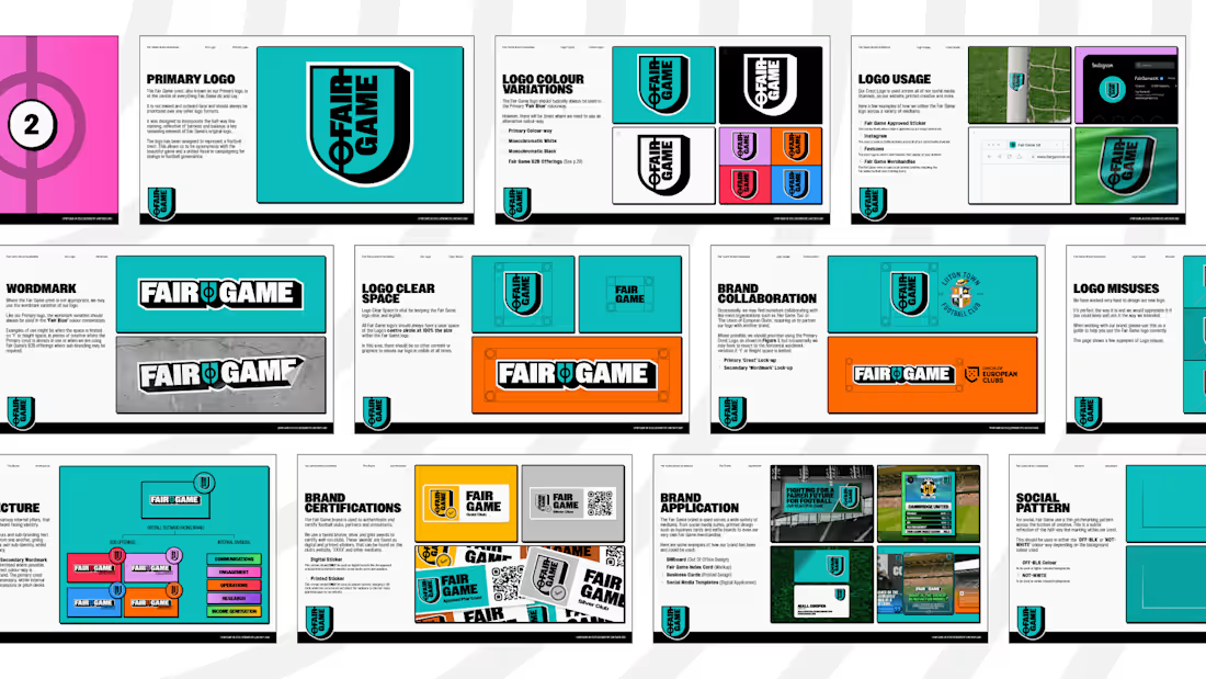
Since its launch in 2021, Fair Game had never developed a consistent or recognisable brand identity to reflect the importance of its mission. Working closely with key stakeholders, I redefined the brand from the ground up, creating a new visual identity system, logomark, brand guidelines and a full suite of social assets.
The final identity introduces a refined crest-inspired logomark, incorporating the halfway line as a central design element to symbolise fairness and equality. Built as a flexible system across digital and social platforms, the new brand gives Fair Game a stronger, more unified presence to support its ongoing work in reshaping the future of football.
4
5
465