
pro
Heidi Daiane
heidi-design.blogspot.com
- $5k+
- Earned
- 3
- Followers
Followed by David W, Jamie P, and patricia d


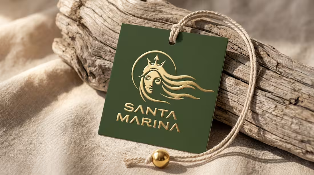
Logo design for Santa Marina, a Los Angeles swimwear brand with a Brazilian soul - freedom, nature, and environmental awareness built into every collection. The brief called for an identity as light as the sea and as firm as the purpose behind it. I designed a logo that conveys fluidity and strength, inspired by the energy of the ocean, extended into brand applications: product labels, shopping bags, and packaging. For a sustainable swimwear brand, color already tells part of the story - green entered the palette as nature, freshness, and connection to the ocean.
1
74
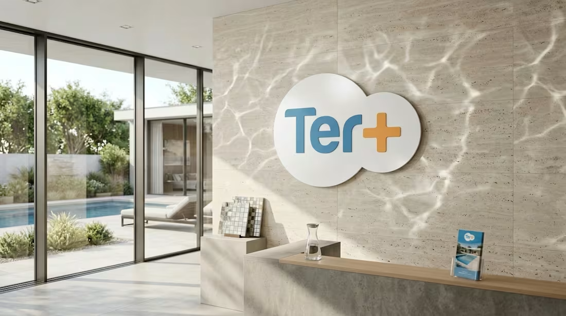
A pool construction company with great work and no brand to match it. The logo grew out of the contour of a pool itself - a simple, memorable symbol that ties the brand directly to its field. From there, I built a full visual system: water-inspired blues with orange accents, fluid shapes that extend across every touchpoint - business cards, stationery, uniforms, the company truck, and a website born in the same visual language. Identity and website designed together from the start, speaking the same language from start to finish.
1
75
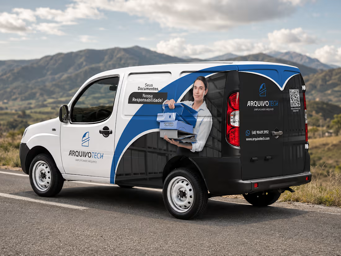
Vehicle wrap design to turn a company car into a moving brand communication piece. In vehicle wrap design, the message needs to land in a few seconds - the car passes, the eye catches it. I prioritized essential information, distributed across the most visible areas of the vehicle, with clear hierarchy and instant brand recognition. Final delivery includes production-ready technical files sized to the specific vehicle model, applied in realistic mockups for client approval before any printing.
0
73
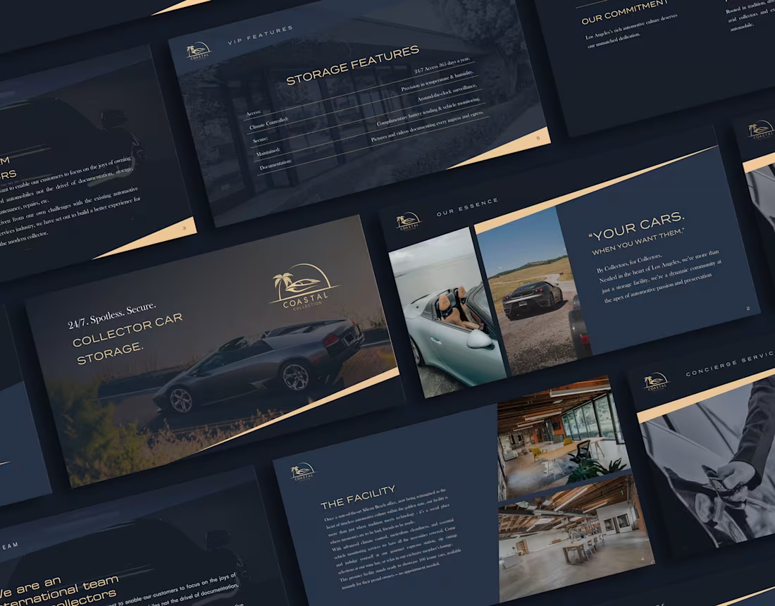
Business presentation for Coastal Collection Storage, a collector car storage and management company in Los Angeles. Founded by collectors, the company didn't need a deck that over-explains - it needed class. Clean layout, typography and palette aligned with the brand, and intentional diagonals that communicate movement and agility. The design doesn't compete with the cars; it leads to them.
0
113