
Hassan Designiey
Creative Brand Designer
New to Contra
Hassan is building their profile!
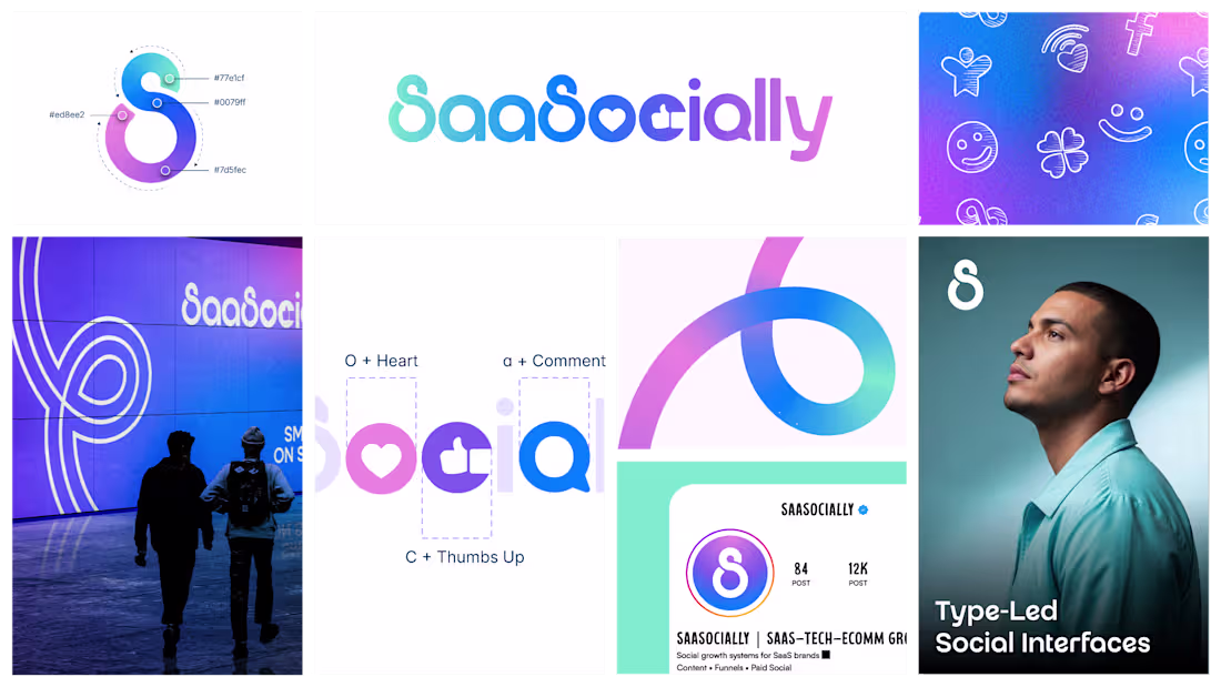
SaaSocially had a logo.
It just didn't have an identity.
The old mark was flat, generic blue, the kind of design that blends into every other SaaS brand on the internet.
They deserved better than blending in.
The brief was simple:
Clean and professional
Modern wordmark, nothing overcomplicated
A social touch that felt alive, not forced
Just a wordmark built on intention, where the "social" element lives inside the design itself, not bolted on top of it.
The result is a mark that feels premium without feeling cold.
Human without feeling casual.
Simple without feeling empty.
0
10