
Hafsa Tanveer
Creative Digital Designer & Landing Page Creator
- 6
- Followers


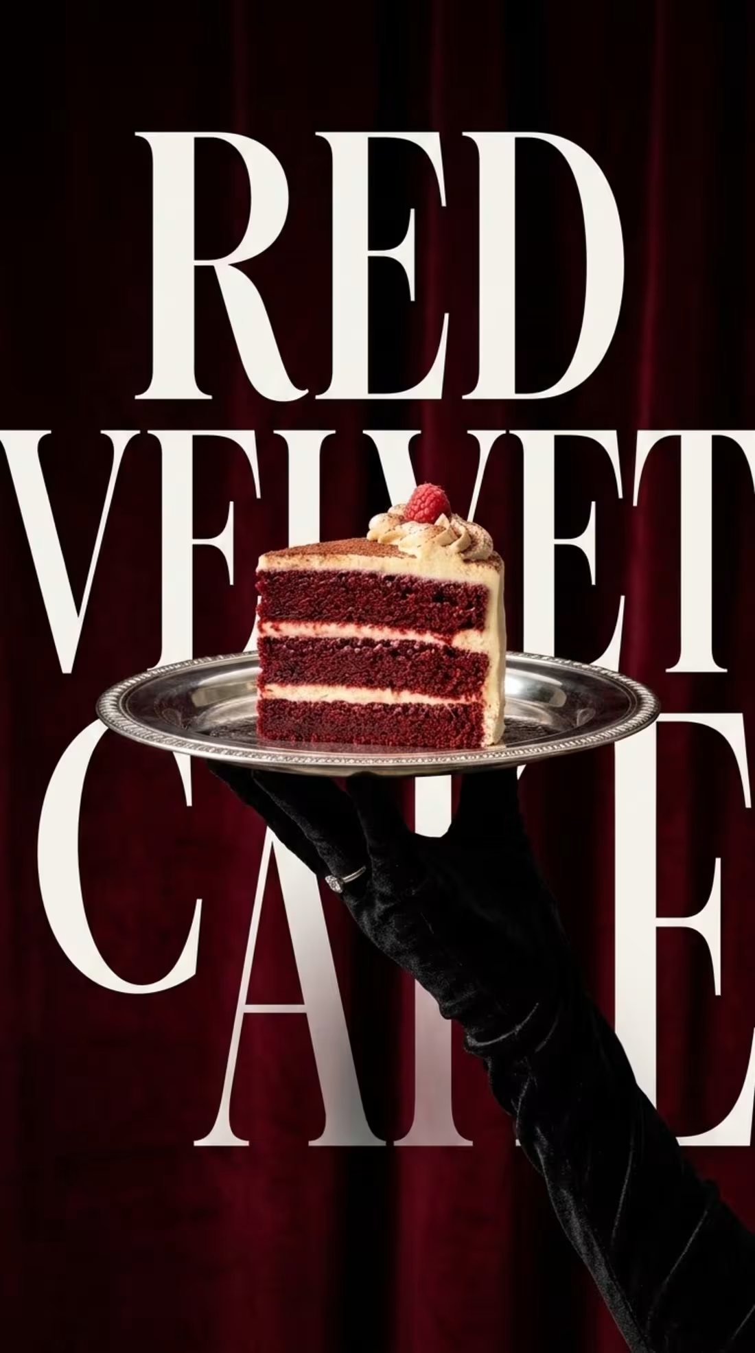
"Where typography meets taste. 🍰🍷
Conceptualizing a luxury dessert brand identity. The goal was to create something that feels rich, vintage, and elegant—using bold serif typography mixed with high-end editorial photography.
What do you think of this visual balance? Let me know below! 👇
1
1
24
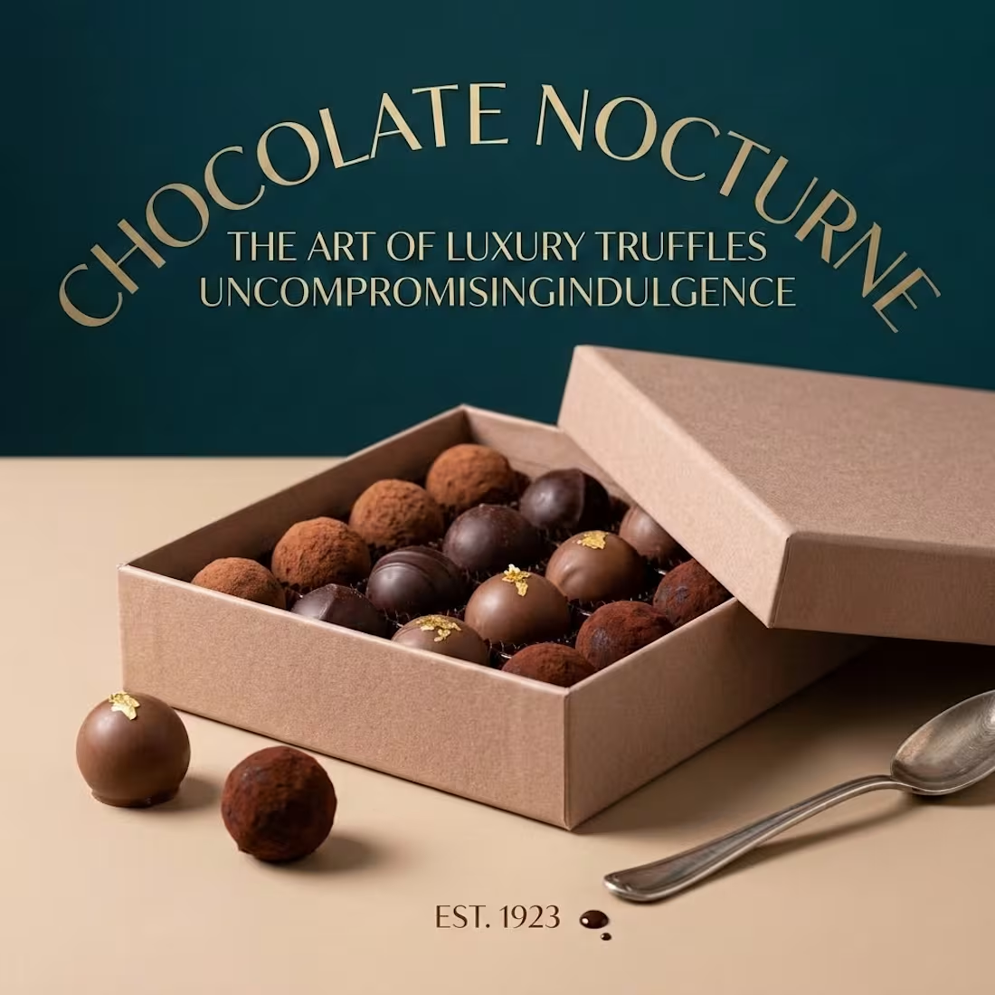
"Luxury is in the details. 🍫✨
Conceptualizing a premium chocolate brand doesn't just mean making the product look good—it's about the entire aesthetic. From the packaging design to the color palette, every detail matters.
1
23
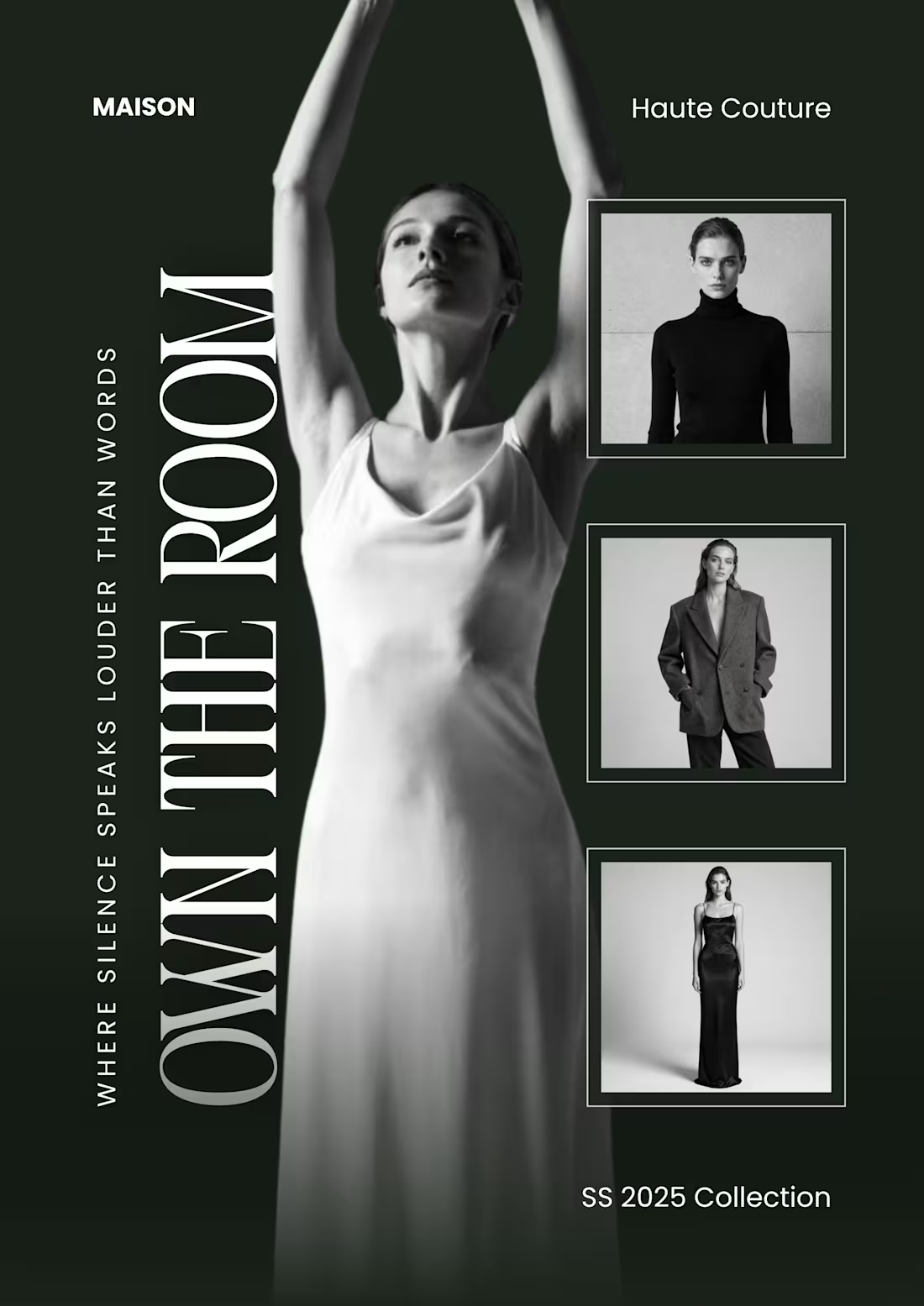
🖤 Black, White & Editorial Elegance: Redefining Luxury Fashion Design 🖤
Just wrapped up this high-end editorial layout for Maison Haute Couture (SS 2025 Collection). The vision was to create a bold, high-fashion visual statement that lets the typography and imagery speak volumes.
Design Breakdown:
Bold Editorial Typography: "OWN THE ROOM" paired with a subtle, powerful subline ("Where silence speaks louder than words") for a striking visual contrast.
Minimalist Grid Execution: A clean stacked column layout on the right side to highlight multiple looks without cluttering the canvas.
Timeless Monochrome Palette: A high-contrast black-and-white theme tailored specifically for the premium, high-fashion niche.
Sometimes, less truly is more when it comes to luxury branding. 🕶️✨
Niche: Luxury Fashion Branding / Editorial Design
Vibe: Avant-garde, clean, bold
Let me know your thoughts on this editorial layout! Would you pause your scroll for this? 👇
#GraphicDesign #FashionDesign #EditorialDesign #LuxuryBranding #Typography #Canva #ContraCommunity #HauteCouture
0
29
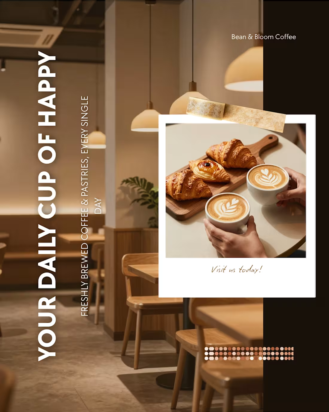
✨ Leveling up cafe branding with aesthetic design! ✨
I recently designed this premium social media post concept for Bean & Bloom Coffee using Canva. The goal was to capture that warm, cozy, and inviting cafe ambiance while keeping the design clean and modern.
Key Design Elements:
Sleek Vertical Typography: "YOUR DAILY CUP OF HAPPY" arranged to immediately catch the user's eye while scrolling.
Warm & Earthy Tones: A color palette that reflects artisanal coffee and fresh bakes.
Balanced Grid Layout: Blending minimalist product shots with cozy interior visuals.
Clean typography + strong visual hierarchy = Maximum engagement. ☕🥐
Tool used: Canva
Niche: Social Media Design / Brand Identity
Would love to hear your thoughts on this layout! 👇
#GraphicDesign #Canva #SocialMediaDesign #Branding #CafeDesign #Typography #UIUX #ContraCommunity
0
32