
pro
Varun Davera
Visual & Brand Designer crafting meaningful identities
- $1k+
- Earned
- 11x
- Hired
- 5.00
- Rating
- 29
- Followers
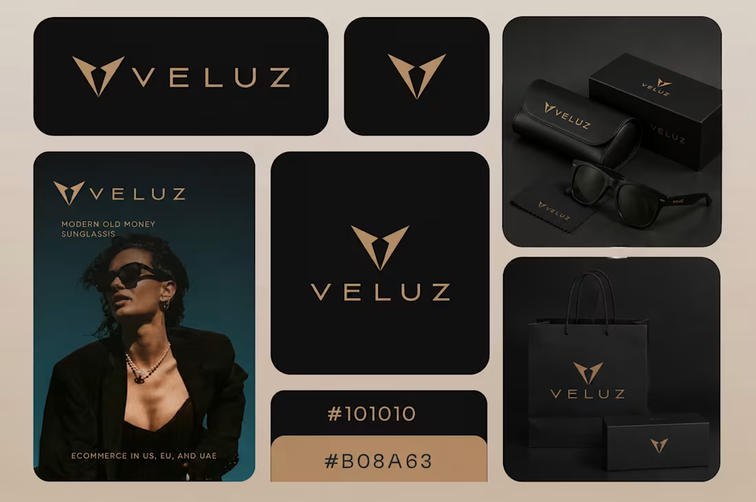
Proud to share the mini-guidelines for Veluz, a sunglasses brand targeting the US, EU, and UAE markets. The identity centers on a "Modern Old Money" aesthetic, a trend that demands sophistication without the noise.
Key Design Elements:
The Monogram: A sharp, "V" focused icon that doubles as a symbol of precision and luxury.
Typography: Clean, wide-kerning sans-serif to ensure legibility across digital storefronts and physical embossing.
The Palette: A high-contrast pairing designed to look stunning on both matte packaging and premium ad creative.
1
1
76
Motion Graphics
0
36
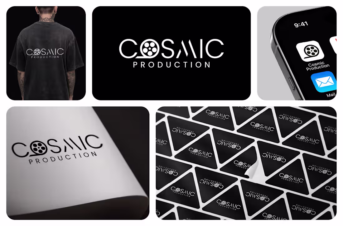
I designed this minimalist black‑and‑white identity for Cosmic Production, a film and content studio that wanted something clean, cinematic, and instantly recognizable. The logo is a simple wordmark where the “O” becomes a film reel, and the stylized “M” and “A” echo light beams or spotlights, hinting at motion and storytelling without adding extra clutter. The monochrome palette keeps the brand versatile and premium, working just as well on a T‑shirt, app icon, or sticker set as it does on screen credits and print collateral. Overall, the mark feels modern, confident, and built to live comfortably across all the touchpoints a production house needs.
0
262
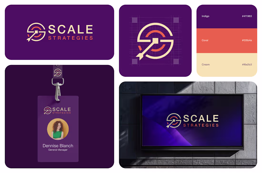
I created a bold, modern brand identity for Scale Strategies, a MarCom and organizational development consultancy that helps purpose‑driven organizations “scale what matters.” The logo is a clean wordmark paired with a geometric S‑shaped icon that combines a target, a rising path, and an arrow to hint at clarity, growth, and direction. The palette blends a deep indigo base with a vibrant coral accent and soft cream, giving the brand a professional, strategic feel with just enough warmth and energy for values‑driven clients. Clean, legible typography keeps everything easy to read across applications , from ID cards and presentation decks to a LinkedIn banner and large‑scale signage, so the brand feels consistent wherever it shows up.
6
5
411
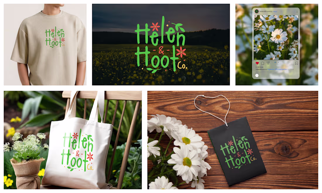
Helen & Hoot Co. is a warm, nature-inspired brand identity crafted to feel friendly, organic, and deeply connected to the outdoors. The visual style centers around hand-drawn typography paired with playful floral elements, giving the brand a wholesome, earthy personality. The design communicates creativity, simplicity, and a love for natural beauty perfect for lifestyle, eco-friendly, handmade, gardening, or wellness brands.
0
233
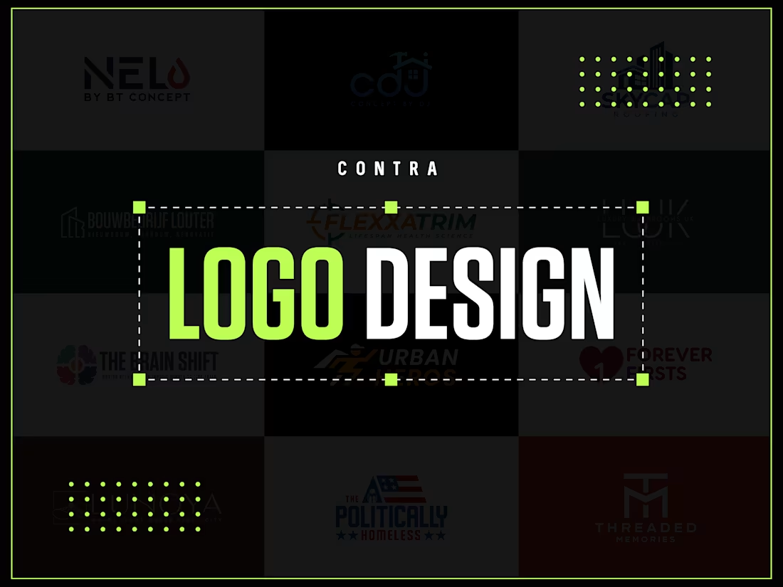
Logo Design
0
46
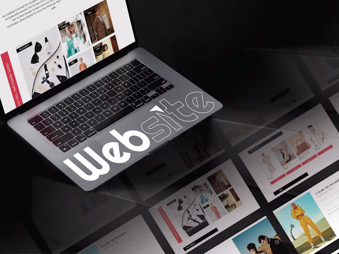
Website Design
0
52