Girrafix Design
Brand Identity, UI & WordPress Specialist
New to Contra
Girrafix is ready for their next project!
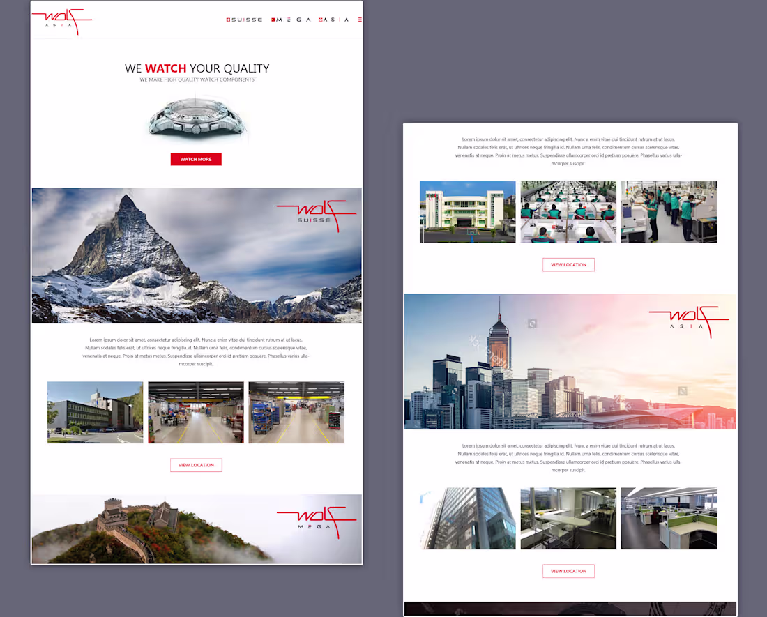
This website was created for a global watch components maker with operations in three places: Switzerland, China, and Hong Kong. The client asked for a very clean, minimalist design with clear sections and little visual clutter.
The homepage features large images, ample white space, and a structured content flow to highlight each location while keeping a consistent brand identity.
The main challenge was to showcase three different manufacturing facilities and business units in one cohesive experience that feels high-end, organized, and easy to navigate.
0
10
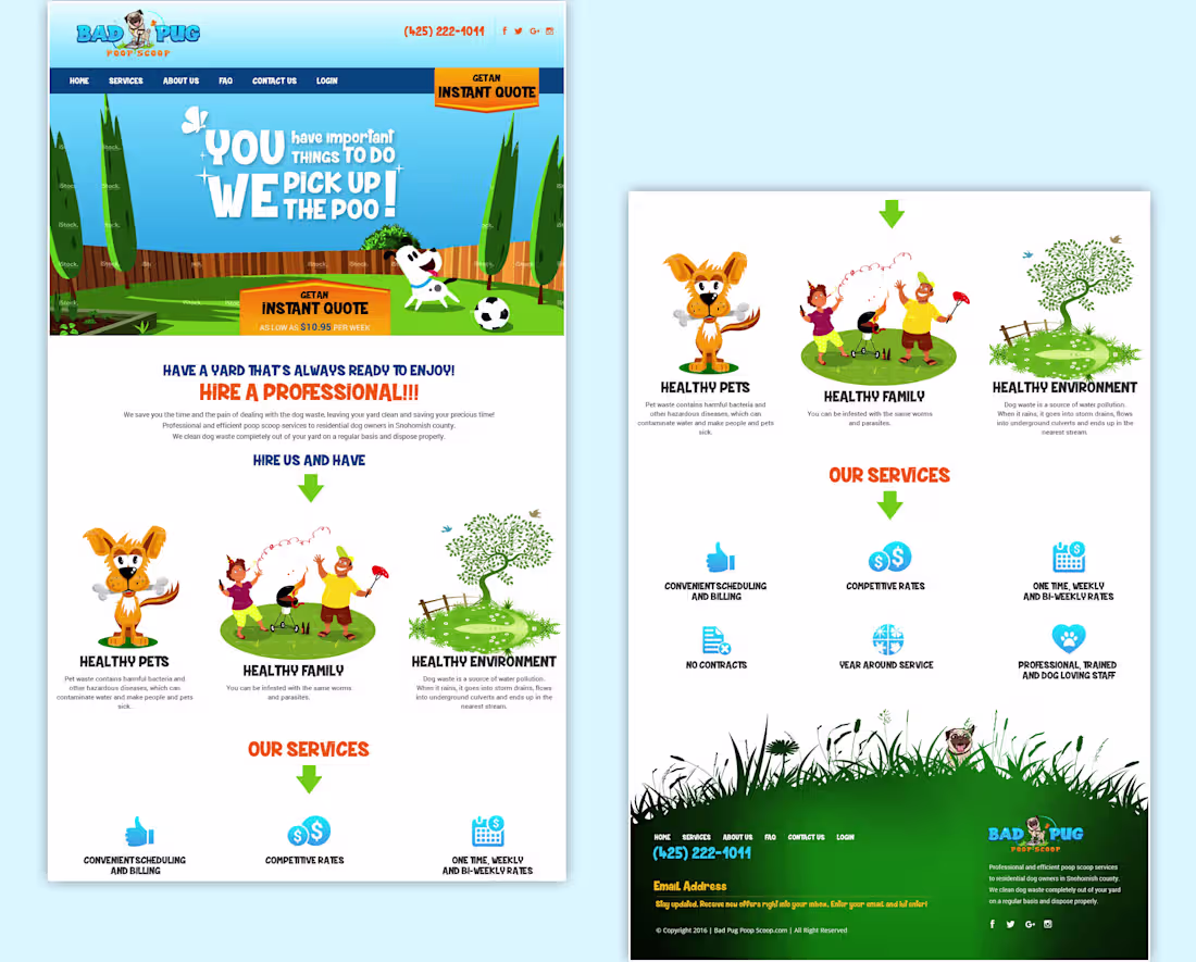
This website was designed for a professional pet waste removal service, using a fun and friendly visual style to make an otherwise unpleasant task feel approachable and trustworthy.
The homepage clearly communicates the benefits of the service, highlights key features, and encourages visitors to request an instant quote. The challenge was to balance playful illustrations and bold messaging while maintaining a clear user journey that builds trust, explains the service, and drives customer inquiries.
0
13
From the archives
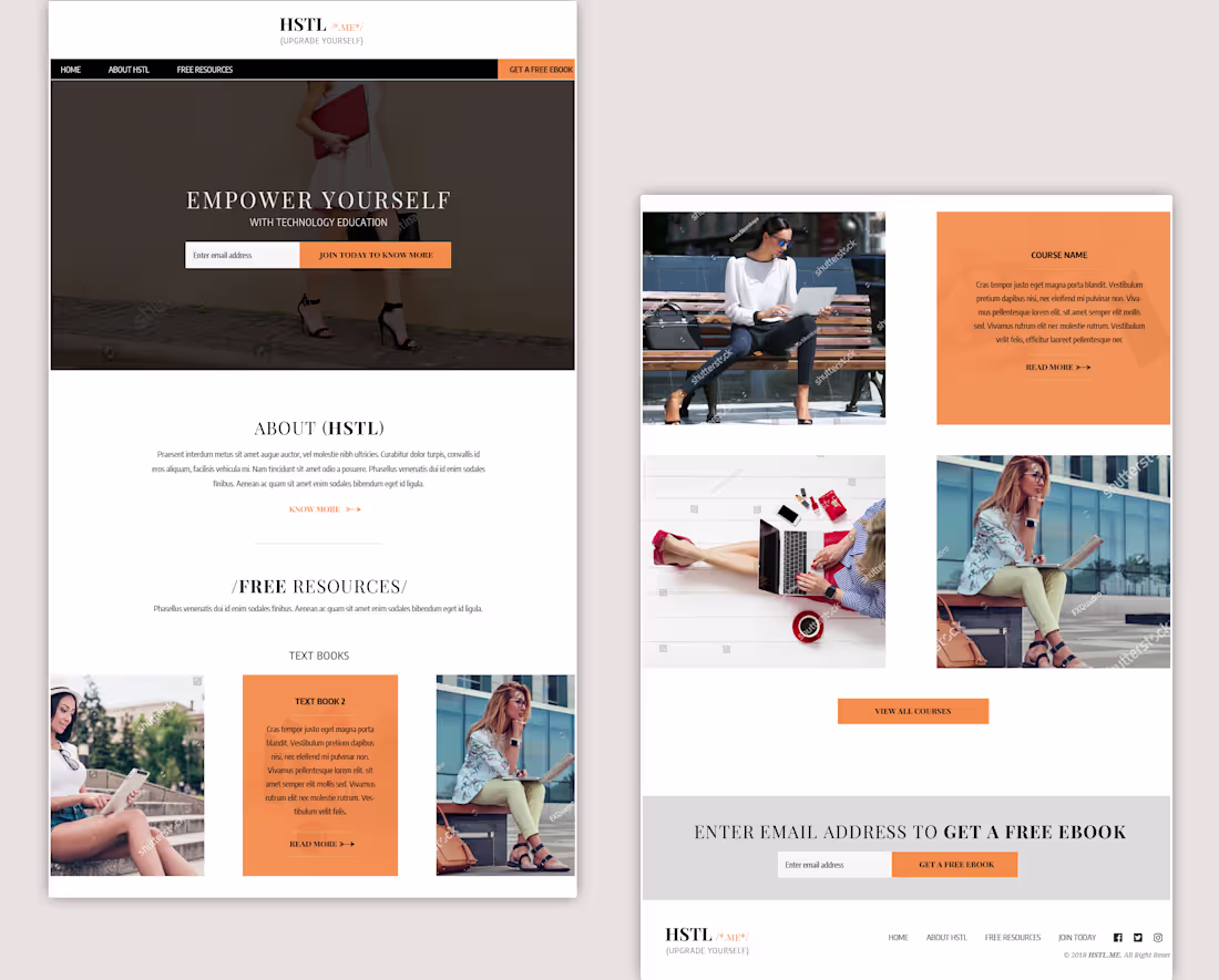
Designed this homepage a while ago. This website aims to promote technology education and self-improvement for young women, especially college students and working professionals interested in fashion and personal growth.
The homepage features eBooks, educational resources, and online courses in a clean layout inspired by magazines. The challenge was to arrange a lot of content into clear sections while creating a visually engaging experience that appeals to a fashion-conscious female audience and encourages email sign-ups and course enrollments.
0
18
From Archives...
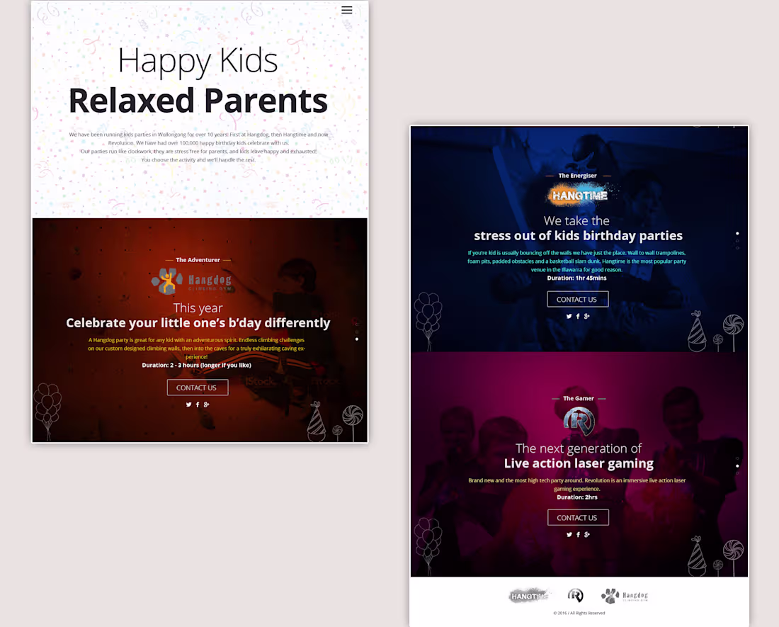
Happy Kids was created to promote three different children's entertainment businesses on one website. The challenge was to create a unified experience while allowing each brand to have its own identity with separate sections, colors, and logos. The result was a cohesive, easy-to-navigate website that felt like a single brand while effectively showcasing three unique businesses.
0
21
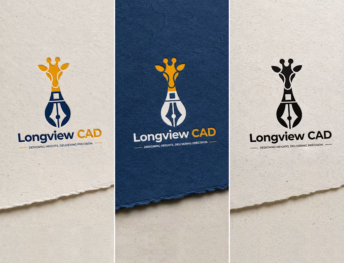
The Longview CAD logo combines a giraffe and a drafting pen nib to represent clear vision and precise design. The giraffe symbolizes looking ahead and seeing the bigger picture, while the pen nib reflects accuracy, creativity, and technical expertise. Together, they capture Longview CAD’s approach to delivering smart, detailed design solutions.
0
26
Redesigned this home page for a client earlier this year. The old design felt outdated, so I gave it a cleaner and more modern look with better spacing, typography, colors, and responsiveness across all devices.
The goal was to make the page feel more trustworthy, easier to use, and less overwhelming for users.
Would love to know what you think about the redesign and how you think it could be improved further.
0
50
Hello everyone!
I’m new here (little confused and overwhelmed) and currently exploring the platform, learning how things work, and discovering the amazing talent in this community. It’s inspiring to see so many skilled creatives in one place. Looking forward to learning, connecting, and growing here with all of you.
2
1
101
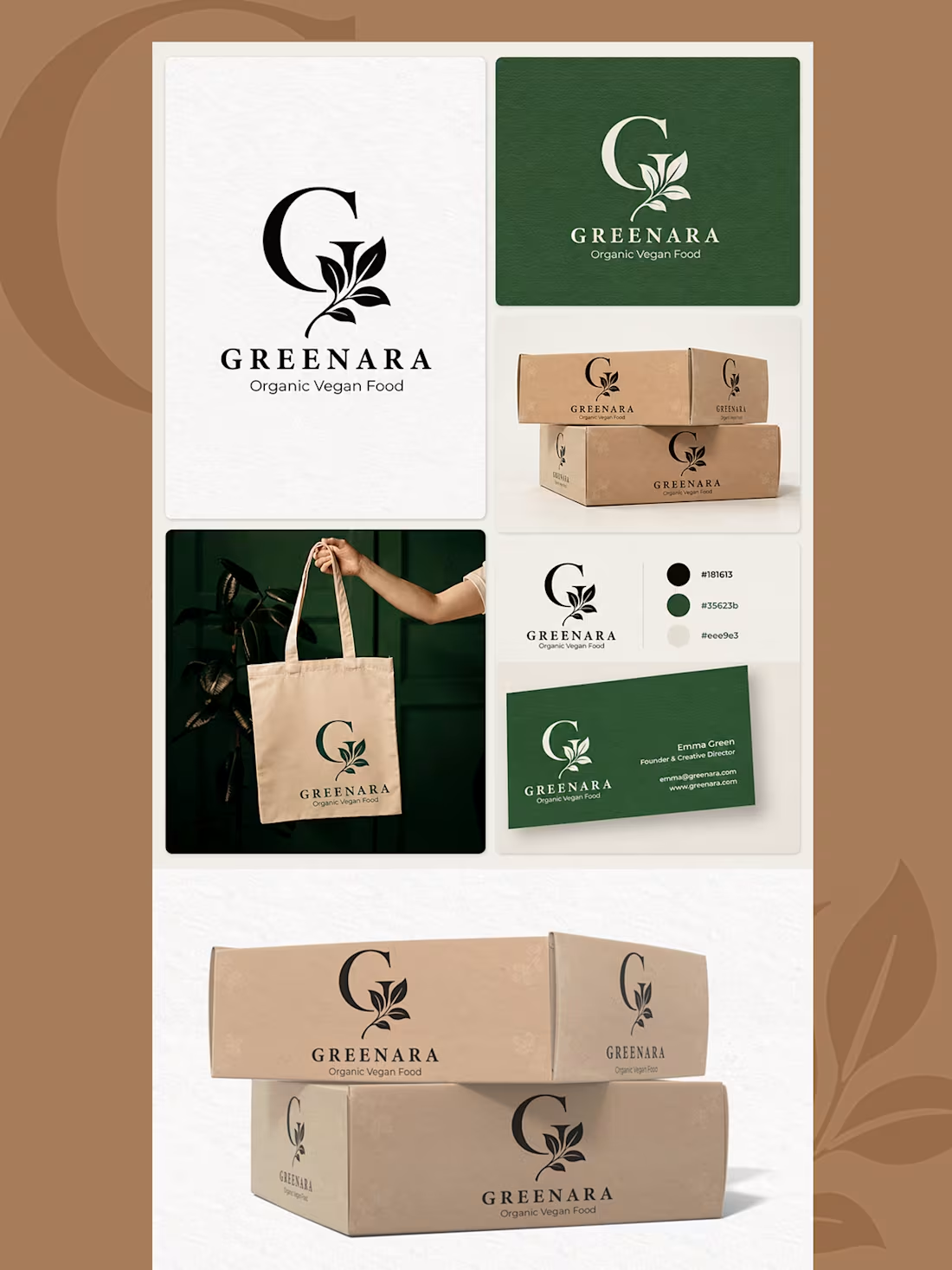
The Greenara logo and branding are designed to reflect nature, freshness, and organic living through an elegant leaf-inspired monogram and earthy color palette. The clean typography and minimal visuals create a premium yet natural brand identity that feels modern and trustworthy.
The branding extends beautifully across packaging, tote bags, and stationery, maintaining a consistent and sophisticated look. Together, the logo and brand applications create a calm, eco-friendly visual experience that perfectly represents an organic vegan food brand.
0
55
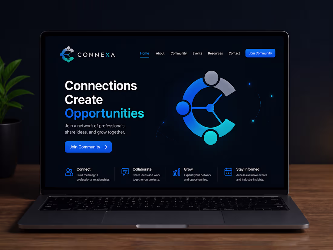
The Connexa logo is designed to represent connection, collaboration, and growth through a modern circular “C” monogram with connected nodes and vibrant blue gradients. The branding creates a clean, tech-driven identity that feels professional and trustworthy.
The landing page follows the same modern visual style with a sleek dark theme, bold typography, and minimal UI elements. Together, the logo and website design create a strong and engaging digital experience focused on networking and community building.
0
68
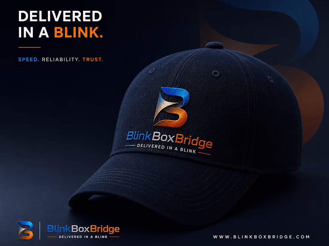
The BlinkBoxBridge logo is designed to represent speed, reliability, and modern delivery services through a bold and dynamic “B” monogram. The sharp curves and flowing form create a sense of motion, while the blue and orange color combination balances trust, energy, and confidence.
The branding follows a premium and cinematic visual style with dark backgrounds, strong typography, and realistic mockups that give the brand a professional and powerful presence. From digital platforms to merchandise applications, the identity maintains consistency and creates a strong, memorable impact.
0
68
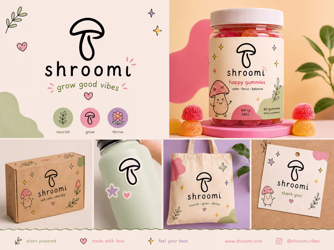
The Shroomi logo was created with a fun, friendly, and simple approach to reflect wellness, positivity, and self-care. The hand-drawn mushroom icon and soft colors give the brand a playful and calming feel.
The branding stays consistent across packaging and merchandise, creating a warm, cheerful, and easy-to-recognize identity that feels modern and approachable.
0
71
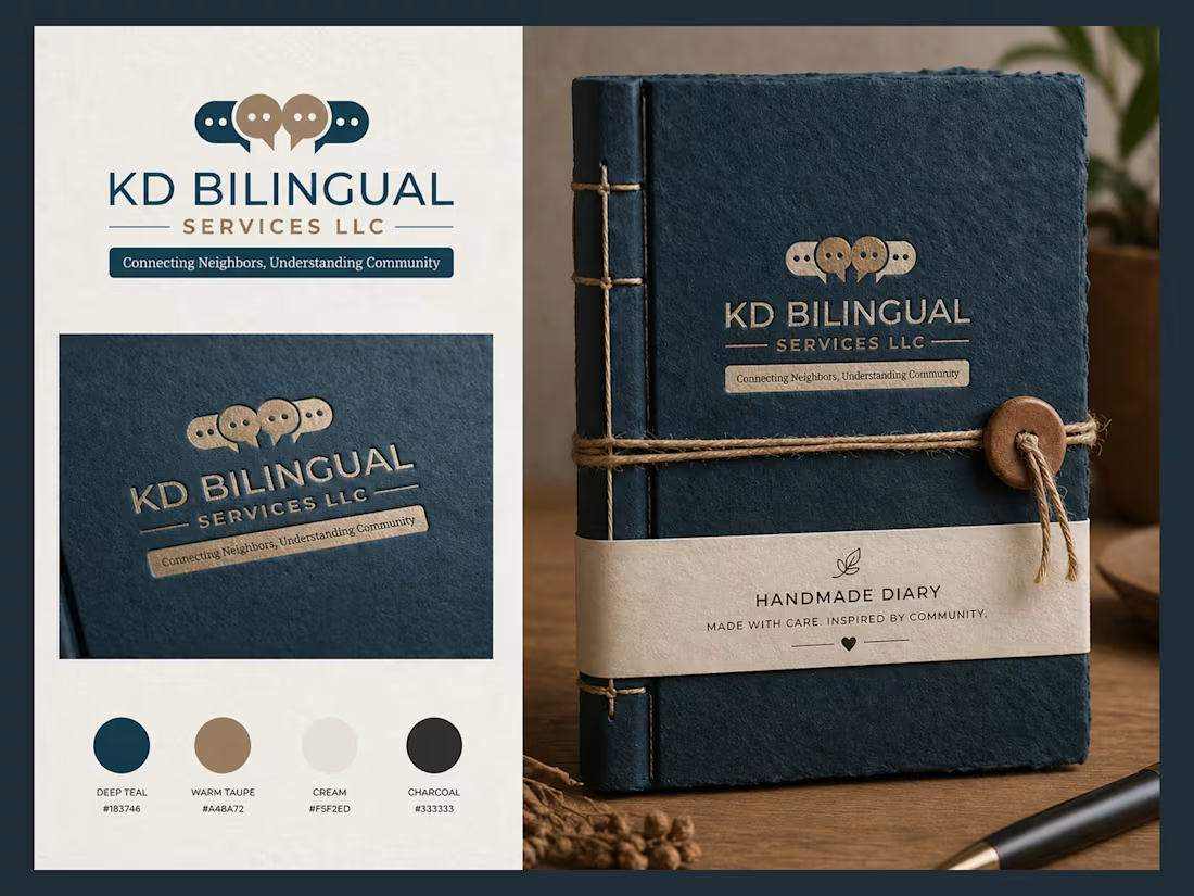
The KD Bilingual Services LLC logo and branding represent communication, connection, and community. The speech bubble icon symbolizes people understanding and connecting across languages and cultures, while the clean typography and balanced colors create a professional, warm, and trustworthy feel.
The branding carries this identity consistently across stationery and presentation materials, giving the company a polished, modern, and welcoming presence.
0
75