
Hani Design
Website, Shopify, mobile apps & branding



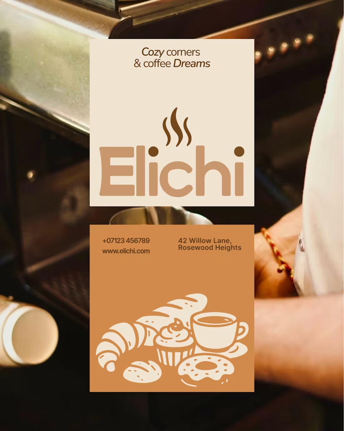
Case Study: Color Palette & Tagline Exploration for Elichi Cafe Branding
I recently developed a visual identity for Elichi, a proposed cafe brand specializing in cardamom-infused coffee and artisan baked goods. The project goals were to create a distinct, memorable logo and a cohesive system that reflects warmth and flavor.
This exercise was a direct comparison of two competing creative directions, testing how color palette shifts and tagline variations fundamentally alter brand perception for the same logo structure.
Concept 1 (Green Palette):
Focus: Organic heritage, botanical freshness, and high-energy mornings.
Palette: Deep Forest Green and Off-White/Light Cream.
Tagline: "Freshly brewed moments & warm bites" (More active, food-forward).
Designer's Note: The green directly references the botanical origin of cardamom (elichi). This approach feels health-conscious, fresh, and grounded, making it ideal for a brand emphasizing natural ingredients and a clean aesthetic.
Concept 2 (Rust Palette):
Focus: Deep warmth, comfort, coziness, and rich espresso flavor.
Palette: Rich Rust-Orange/Terracotta and Muted Taupe/Coffee Cream.
Tagline: "Cozy corners & coffee Dreams" (More aspiration, comfort-focused).
Designer's Note: The rust palette shifts the focus from the plant to the product—evoking roasted coffee, warmth, and a comforting environment. This direction is about the emotional experience of being in the cafe.
Design Feedback Requested:
As I finalize the brand guide, I would love the input of the design community:
Color Perception: Which color palette better captures the specific blend of cardamom and coffee without losing market clarity?
Versatility: Which concept do you see having more longevity across packaging and signage?
1
36

Odoscope
0
9
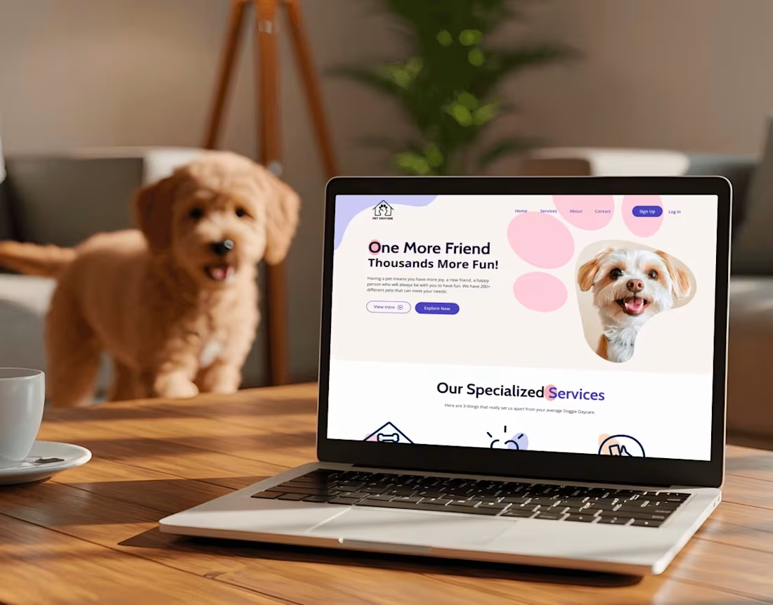
PetCation — Product UX/UI for pet-care booking & trust
0
5
Most ice cream brands use the same look: bright colors, cartoon drawings, and messy pictures. For Swirle, I wanted to do something completely different.
I gave Swirle a luxury, high-fashion look using clean fonts, a rich color palette (like deep black and warm earth tones), and sleek, minimal packaging. The goal was to turn an everyday snack into a modern lifestyle brand through smart design.
Role: Brand Designer
Deliverables: Brand Identity, Logo, Packaging Design
What do you think of this bold, luxury direction for an ice cream brand? I would love to hear your thoughts or feedback in the comments!
1
108