The network for creativity
Join 1.25M professional creatives like you
Connect with clients, get discovered, and run your business 100% commission-free
Creatives on Contra have earned over $150M and we are just getting started
Back to feedPost

Most ice cream brands use the same look: bright colors, cartoon drawings, and messy pictures. For Swirle, I wanted to do something completely different.
I gave Swirle a luxury, high-fashion look using clean fonts, a rich color palette (like deep black and warm earth tones), and sleek, minimal packaging. The goal was to turn an everyday snack into a modern lifestyle brand through smart design.
Role: Brand Designer
Deliverables: Brand Identity, Logo, Packaging Design
What do you think of this bold, luxury direction for an ice cream brand? I would love to hear your thoughts or feedback in the comments!

The network for creativity
Join 1.25M professional creatives like you
Connect with clients, get discovered, and run your business 100% commission-free
Creatives on Contra have earned over $150M and we are just getting started







Related posts





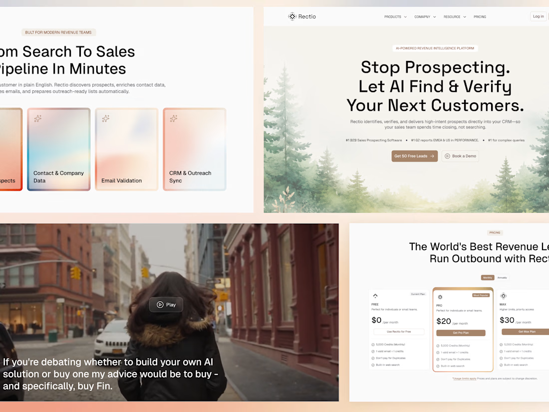
Now live in Framer 🚀 Designed & built in Framer.
If you're looking for a Framer designer/developer for a similar website or want to explore more of my work, feel free to connect with me or send me a message. 🤝





Impresive work


In home page instead of normal blur div, try to use svg filter blur with turbulence and displacement map.. it looks more natural and premium