
Xhesika Gasa
Visual identity systems for brands built to last.
New to Contra
Xhesika is ready for their next project!
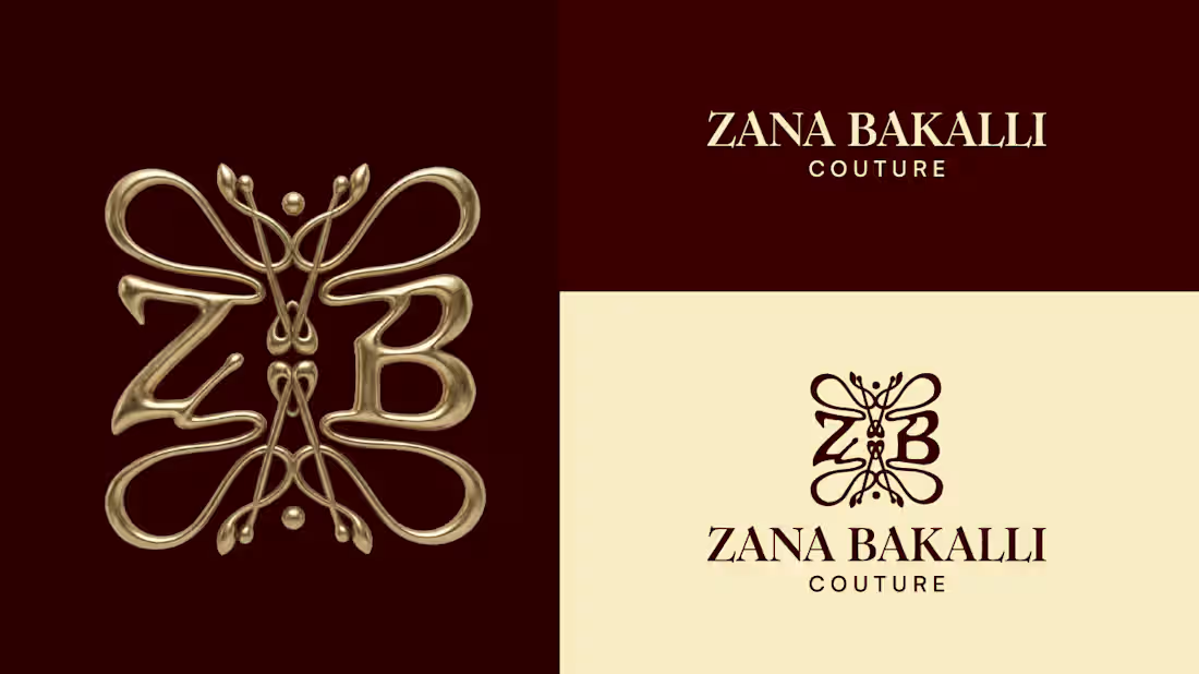
Zana Bakalli Couture — Visual Identity
A couture house from Prishtina, dressed in myth.
Zana Bakalli Couture is a couture atelier from Kosovo. I built the brand identity around the idea that fashion here isn't just clothing, it's meaning, passed down and worn.
The core of the identity is the ZB monogram, shaped like a butterfly. In Albanian folklore, a zana (fairy) is a guardian spirit — free, powerful, moving between worlds. The wings carry that same idea: transformation and protection. The two letters, Z and B, are woven together at the center like two figures in one gesture.
1
17
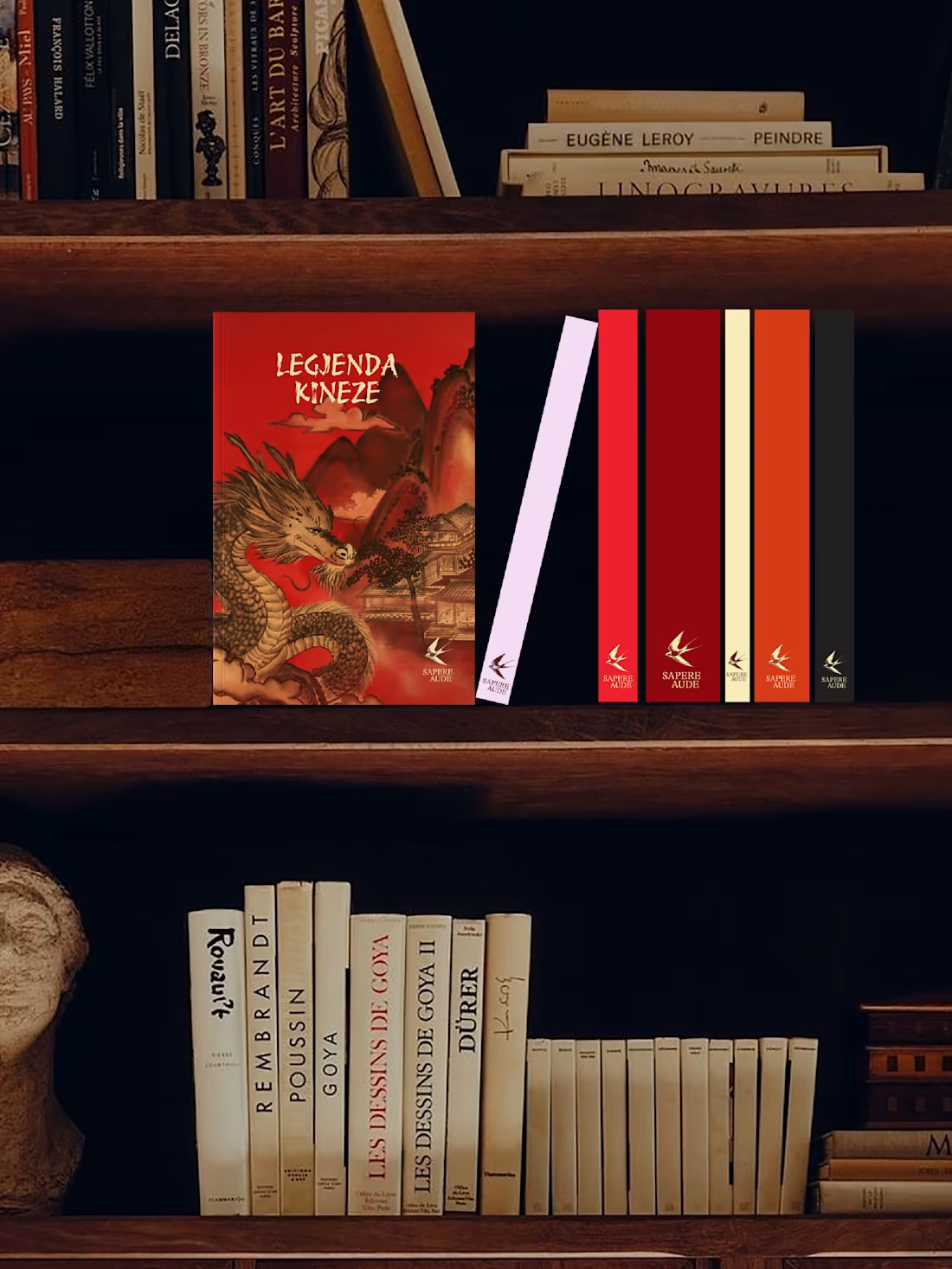
Sapere Aude
Brand identity for an independent publishing house
Sapere Aude — dare to know — is a brand identity for an independent publishing house in Tirana, founded on a simple conviction: knowledge isn't temporary. It's inheritance.
At its heart is the swallow — in Albanian folklore, the herald of spring and the keeper of the home, a symbol of faithful return. The right mark for a publisher whose mission is exactly that: to carry knowledge across borders and always return with what it has gathered.
Not a logo, but an architecture — classical typography, earthen tones, and the composure of a well-made book. An identity designed the way Sapere Aude publishes: not for the season, but for the shelf.
1
50
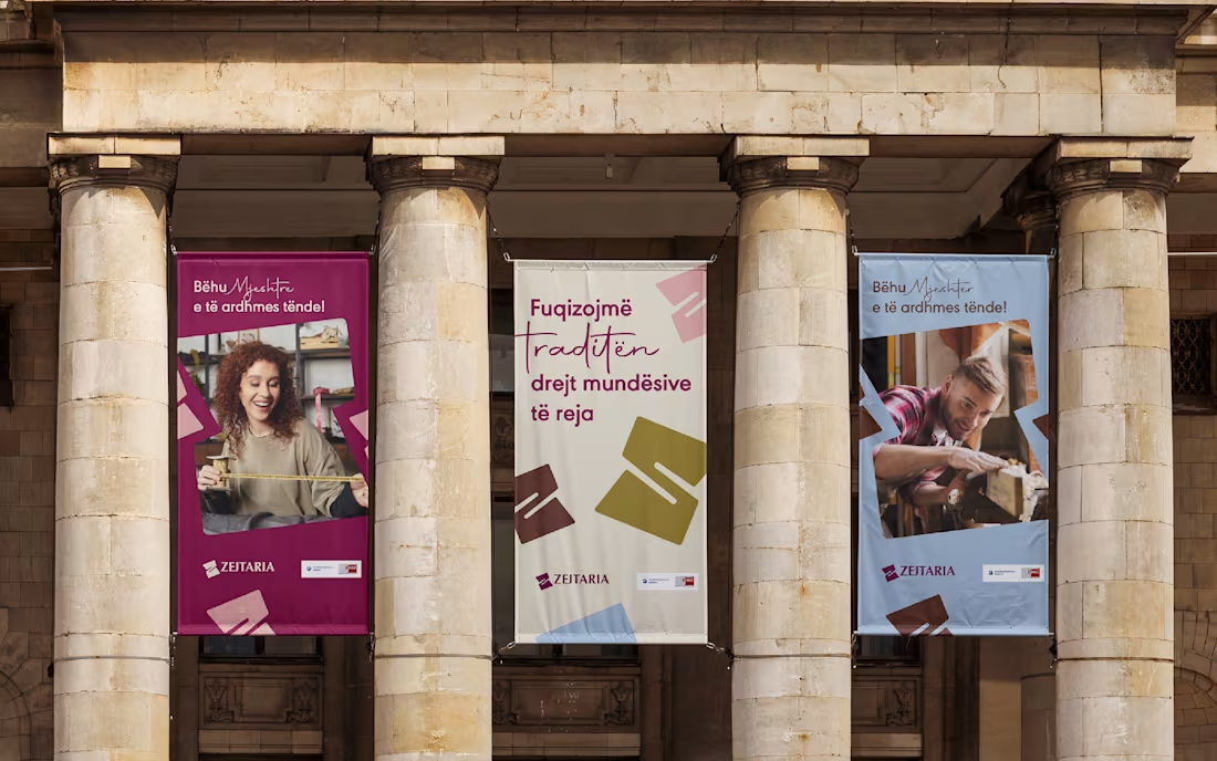
Zejtaria
Brand identity for the Albanian National Chamber of Crafts
Zejtaria was developed for the National Chamber of Crafts to reposition traditional trades as a serious, viable path — for a generation more inclined to doubt them than choose them.
The visual system centers on a single letterform — Z — folded until it opens into a window, a gesture that reads as both a turn of material and an opening.
Across posters, stationery, packaging, and outdoor applications, the identity holds a deep burgundy as its anchor, extending into terracotta, mustard, powder blue, and blush — with the same restraint carried through every touchpoint: no ornament standing in for meaning.
10
35
429
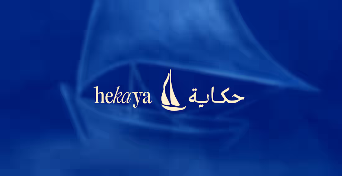
Hekaya Archive
Heritage Fragrance Identity
Hekaya — حكاية — means story. It's born from the sea, the smoke, and the memory of scents passed between generations: a fragrance house that doesn't sell a product so much as keep one.
The identity was built to be remembered rather than consumed. A bilingual wordmark lets Arabic and Latin share a single breath. Illustrated engravings, drawn from courtyard and coast, carry the hand of old print traditions. A palette of indigo and desert light holds the whole system in quiet composure — the tone of something made to last, not to pass with the season.
Across packaging, art direction, and applications, every mark and material was chosen to linger the way a scent does: long after the last drop, the story remains. Told twice. In one voice.
7
20
322
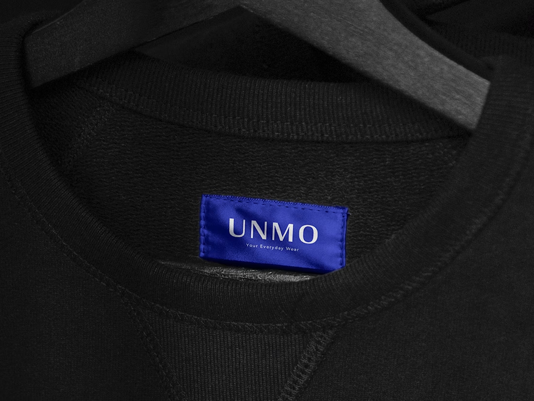
UNMO Brand Identity
0
1
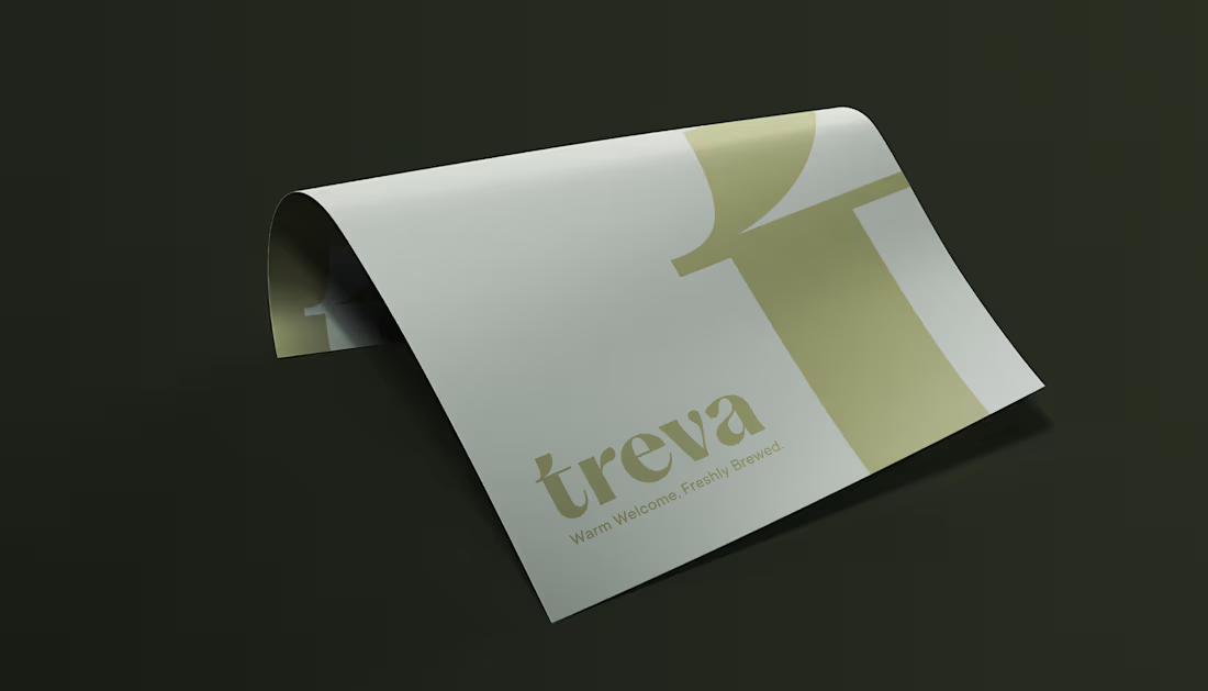
Treva Brunch n' Brew
0
0