Francis Favour
Product designer || web developer || Ai creator.
Ready for work
Francis is ready for their next project!
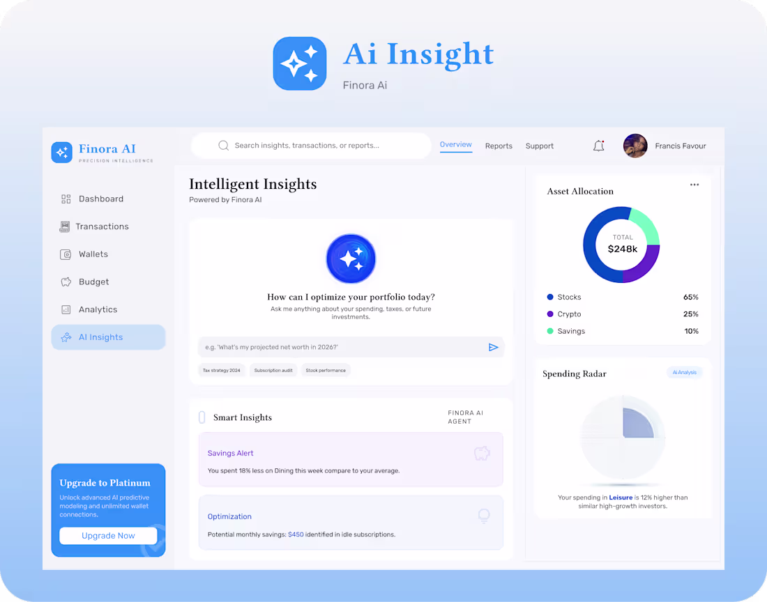
This is the continuation of Finora AI, a fintech dashboard I designed around one principle:
Help users make better financial decisions with less effort.
The dashboard provides an immediate financial overview.
The Transactions page makes thousands of records easy to search, filter, and understand.
The AI Insights page goes beyond reporting by surfacing personalized recommendations, identifying savings opportunities, and helping users take meaningful action.
Every design decision, " from layout and spacing to hierarchy" was made to reduce cognitive load and increase confidence.
Because in fintech, trust isn't built by showing users more data.
It's built by presenting the right information, at the right time, in the simplest way possible.
That's the kind of problem I enjoy solving as a UI/UX designer: turning complex systems into experiences people can navigate with confidence.
If you're building products where usability is just as important as functionality, let's connect.
I am Francis Favour, a Product Designer, and WordPress Developer based in Lagos, Nigeria. I help SaaS startups, fintech companies, healthcare businesses, agencies, coaches, and growing brands create user-centered products and high-converting websites. With 3+ years of experience, I have built 12+ websites, designed 10+ landing pages, helped 8 businesses launch online, improved conversion rates, increased user retention, and optimized user experiences using Figma, WordPress, Elementor, Framer, WooCommerce, and Custom Plugin Development. {francisfahvie}
Reach out to me Francisfavoureei@gmail.com (mailto:Francisfavoureei@gmail.com)
1
10
The best products don't force users to think.
They guide users naturally.
When users know exactly what to do next:
Engagement improves.
Retention improves.
Conversions improve.
That's the power of good UX.
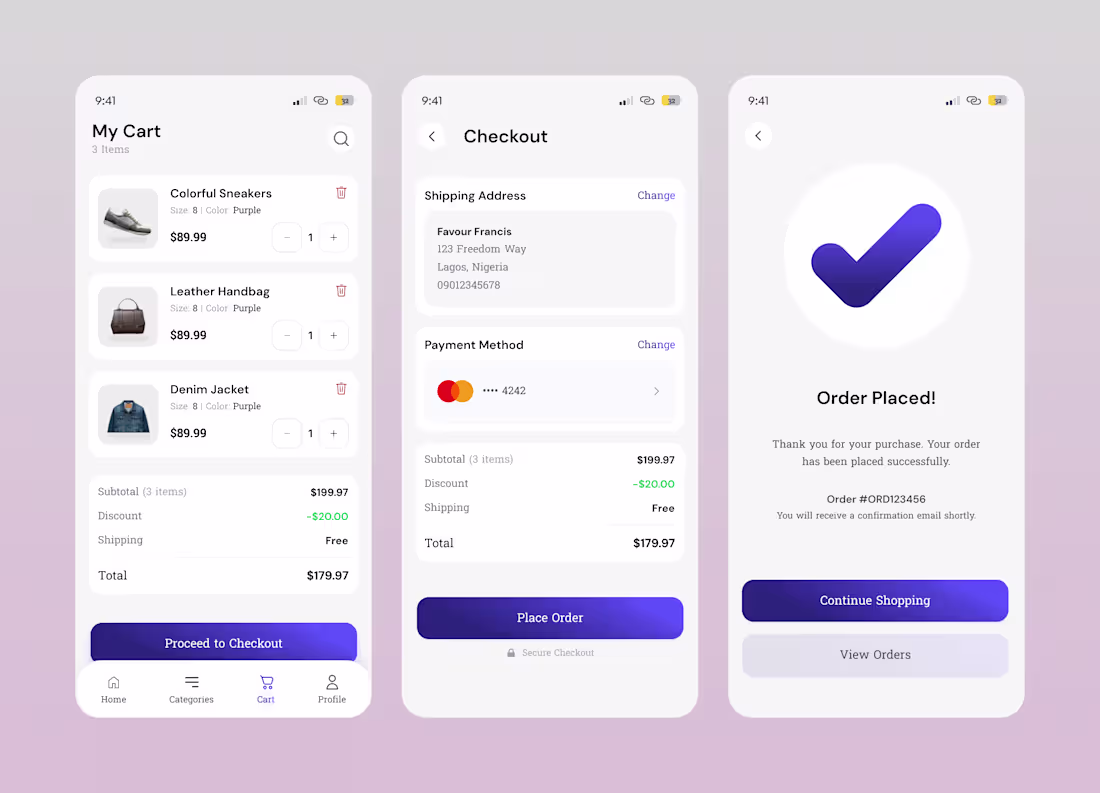
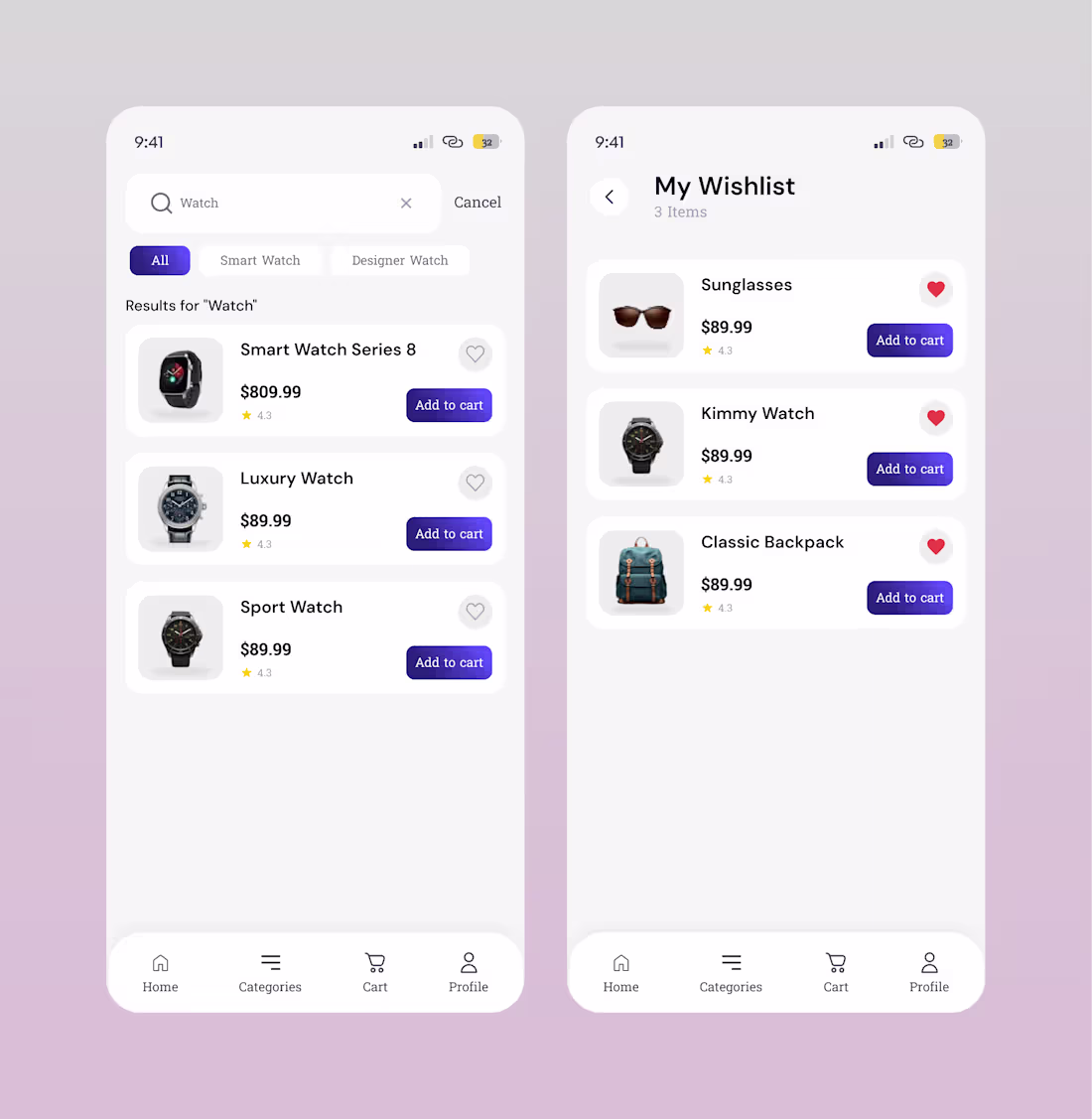
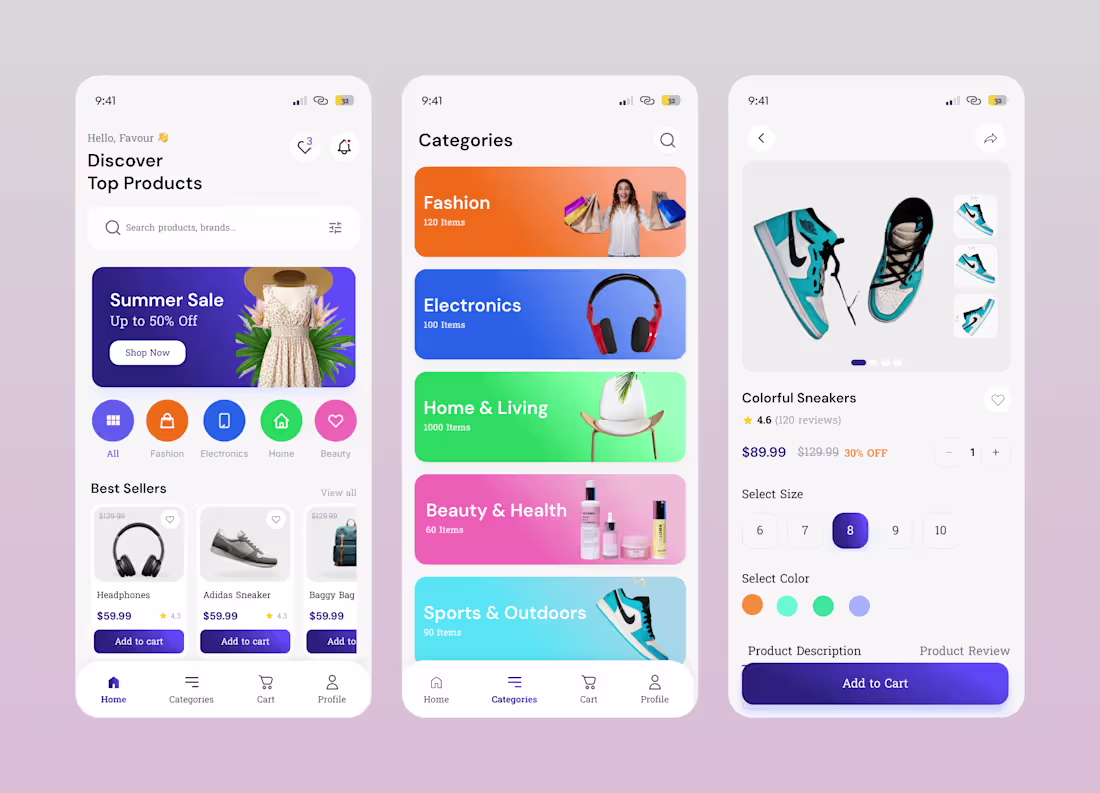
i'm sharing more screen on the E-commerce concept i'm working on
I am Francis Favour, a Product Designer, and WordPress Developer based in Lagos, Nigeria. I help SaaS startups, fintech companies, healthcare businesses, agencies, coaches, and growing brands create user-centered products and high-converting websites. With 3+ years of experience, I have built 12+ websites, designed 10+ landing pages, helped 8 businesses launch online, improved conversion rates, increased user retention, and optimized user experiences using Figma, WordPress, Elementor, Framer, WooCommerce, and Custom Plugin Development. {francisfahvie}
1
23
Recently I've been exploring vibe coding with tools like Lovable, Bolt, and AI-assisted workflows.
I vibe-coded an e-commerce website with Bolt Ai… and there was even payment gateway (tho not fully integrated)… But as a someone that build websites with CMS, Ai is amazing… ( I’ve been trying my hands on a couple of things with ai tools and this is one of them)… I wasn’t particular about the ui, I was leaning towards the functionality instead… overall it came out pretty good… I will attach the link in the comment section
Francis Favour is a Product Designer, and WordPress Developer based in Lagos, Nigeria. She helps SaaS startups, fintech companies, healthcare businesses, real estate brands, coaches, consultants, NGOs, agencies, and e-commerce businesses improve user experience, increase conversions, and build high-performing digital products. Skilled in Figma, WordPress, Elementor, WooCommerce, Framer, HTML/CSS, Adobe XD, and Custom Plugin Development. Built 12+ websites, designed 10+ landing pages, helped 8 businesses launch online, improved user retention, increased feature adoption by 29%, improved conversion rates by 24%, increased appointment efficiency by 32%, reduced user errors by 21%, and contributed to revenue growth through user-centered design.
Email: Francisfavoureei@gmail.com
(mailto:Francisfavoureei@gmail.com)WhatsApp: +2348143058856
2
56
The best products don't force users to think.
They guide users naturally.
When users know exactly what to do next:
Engagement improves.
Retention improves.
Conversions improve.
That's the power of good UX.
i'm sharing more screen on the E-commerce concept i'm working on
1
39
Francis Favou (https://x.com/francisfahvie)r
Showing up even on the difficult days, is what compounds over time.
Sometimes some of the best work doesn't happen because you're endlessly inspired.
It happens because you showed up yesterday, rested when you needed to, and came back ready to create today.
#Francisfavour (https://x.com/hashtag/Francisfavour?src=hashtag_click) #Francisfahvie
1
49
Want to increase your online shop's daily foot traffic?
Stop wearing all the hats in your business. You didn’t start a business to spend hours fighting with design tools, trying to build a website, or guessing how to run ads.
Let me handle the heavy lifting while you focus on what you do best.
From scroll-stopping visuals to high-converting websites, I’m your one-stop digital advertising machine.
Here is exactly what I build for your brand:
* Flyers that instantly grab attention
* AI Ads that stop the scroll
* Campaign Images that look premium
* Websites develoment to turn visitors into buyers
* Overall Digital Strategy to scale your sales Ready to look like the biggest brand in your industry? Let’s work. Send a DM right now
Tel: +2348143058856
Email: Francisfavoureei@gmail.com (mailto:Francisfavoureei@gmail.com)
1
69
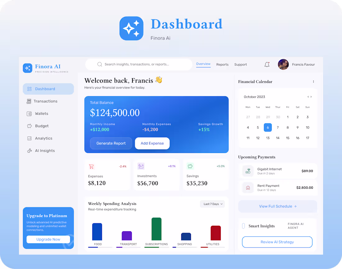
Good fintech design should answer the user's biggest questions before they even ask:
• How much do I have?
• Where is my money going?
• What's coming up next?
• What should I do today?
That's the thinking behind this dashboard.
Every card, chart, and interaction was designed to reduce cognitive load and replace complexity with clarity.
A finance platform doesn't succeed because it has more features.
It succeeds because users trust it.
Trust starts with design.
Clean layouts communicate professionalism.
Clear data visualization communicates transparency.
Predictive insights communicate value.
Every screen in this dashboard was designed around one idea:
Help users spend less time understanding their finances...
and more time improving them.
Because the best financial products don't just help people track money.
They help people make smarter financial decisions.
What stands out most is how the platform shifts from simply tracking money to helping users make better financial decisions. Predictive analytics, spending insights, automated reports, and an intelligent financial assistant work together to transform raw financial data into actionable guidance.The goal wasn't just to create another finance dashboard, it was to design a financial intelligence platform that empowers users to understand, plan, and grow their finances
I am Francis Favour, a Product Designer, and WordPress Developer based in Lagos, Nigeria. I help SaaS startups, fintech companies, healthcare businesses, agencies, coaches, and growing brands create user-centered products and high-converting websites. With 3+ years of experience, I have built 12+ websites, designed 10+ landing pages, helped 8 businesses launch online, improved conversion rates, increased user retention, and optimized user experiences using Figma, WordPress, Elementor, Framer, WooCommerce, and Custom Plugin Development. {francisfahvie}
1
56
I created this Ads to for @Vtablewater
Want to increase your online shop's daily foot traffic? Stop wearing all the hats in your business. You didn’t start a business to spend hours fighting with design tools, trying to build a website, or guessing how to run ads.
Let me handle the heavy lifting while you focus on what you do best. From scroll-stopping visuals to high-converting websites, I’m your one-stop digital advertising machine.
Here is exactly what I build for your brand:
* Flyers that instantly grab attention
* AI Ads that stop the scroll
* Campaign Images that look premium
* Websites develoment to turn visitors into buyers
* Overall Digital Strategy to scale your sales
Ready to look like the biggest brand in your industry? Let’s work. Send a DM right now
Tel: +2348143058856 Email:
Francisfavoureei@gmail.com (mailto:Francisfavoureei@gmail.com)
1
63
I rarely say this, but this project genuinely reminded me why I love design.
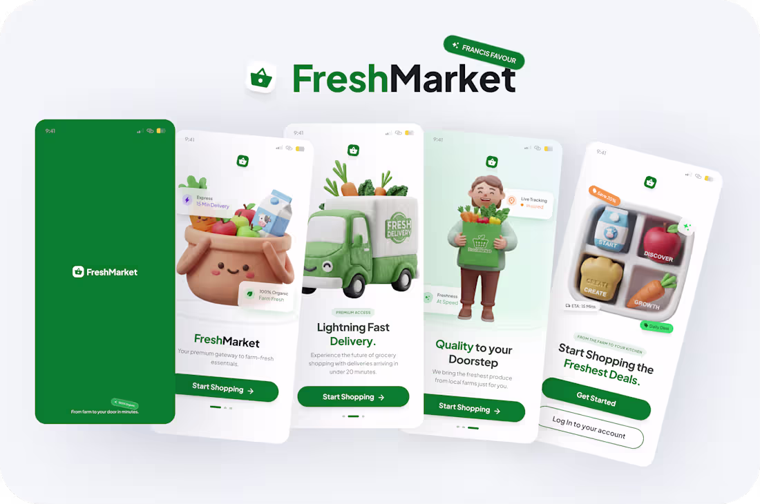
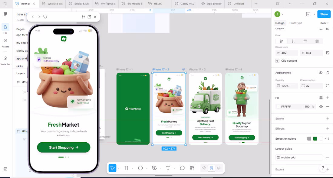
I am creating a concept for FreshMarket, and my approached is different this time.
Instead of jumping straight into screens, I asked myself:
How can this UI speak to the user and clearly express what this brand stands for?
I used custom illustrations from the ground up because I wanted visuals that didn’t just fill space, I wanted visuals that tell a story.
* A cheerful basket.
* A little delivery truck.
* A character holding groceries.
Each one designed to make the experience feel alive and human.
Then I layered the UX around clarity and instinct:
* Simple onboarding
* Clear CTAs
* Zero confusion
* Good storytelling visuals and clean hierarchy.
My goal was to balance playfulness + professionalism without losing the sense of trust that a grocery delivery/ E-commerce brand relies on.
This project wasn’t about showing skills, it was about showing intention.
About remembering that users aren’t just tapping screens; they’re feeling something with every interaction.
If you’ve ever designed something that made you smile before anyone else saw it, you know that feeling.
1
64
Want to increase your online shop's daily foot traffic?
Stop wearing all the hats in your business. You didn’t start a business to spend hours fighting with design tools, trying to build a website, or guessing how to run ads.
Let me handle the heavy lifting while you focus on what you do best. From scroll-stopping visuals to high-converting websites, I’m your one-stop digital advertising machine.
Here is exactly what I build for your brand:
* Flyers that instantly grab attention
* AI Ads that stop the scroll
* Campaign Images that look premium
* Websites develoment to turn visitors into buyers
* Overall Digital Strategy to scale your sales
Ready to look like the biggest brand in your industry? Let’s work. Send a DM right now
Tel: +2348143058856
Email: Francisfavoureei@gmail.com (mailto:Francisfavoureei@gmail.com)
2
108
I had a conversation with a fintech startup founder this week, and he asked me:
"Should I focus on design or functionality first?"
Here's what I told hm:
The best products combine both.
Users don't separate design from functionality.
If a feature works but is confusing, users leave.
If a design looks beautiful but doesn't solve a problem, users leave too.
Great products balance usability and business goals.
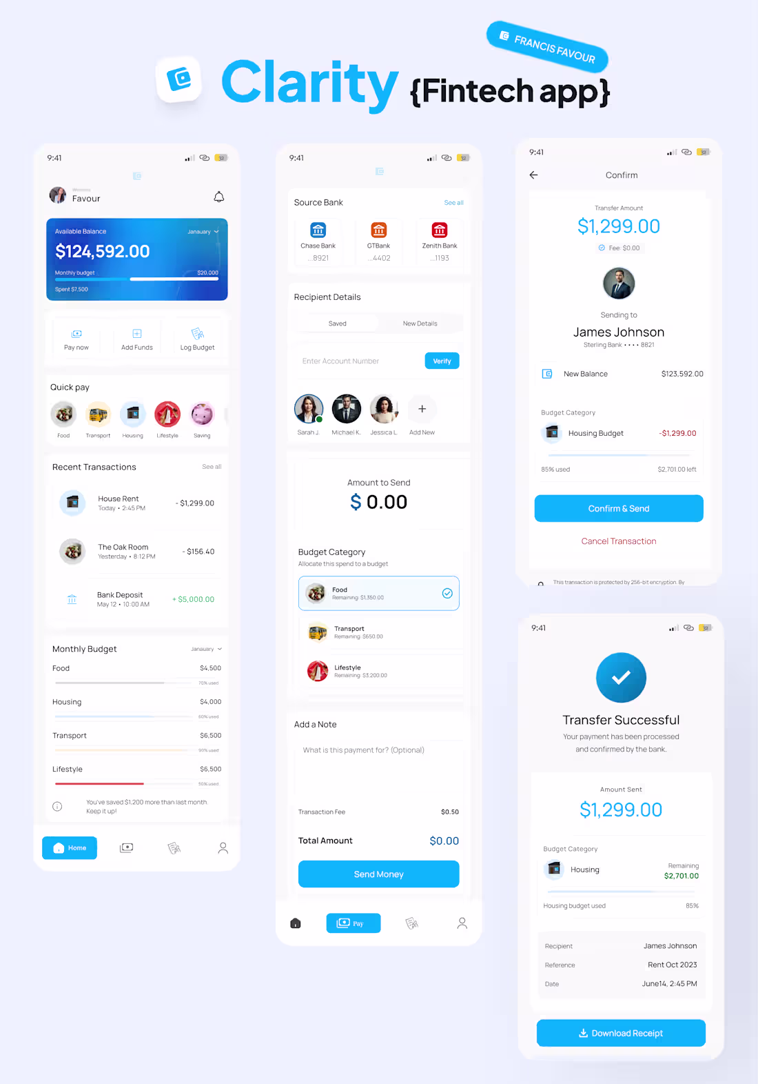
I’m sharing more screens from Clarity Budgeting Fintech App
After sharing the splash screen, here’s a closer look at the core experience.
Clarity is a fintech app designed to make managing money feel less overwhelming. Users can track budgets, send money, monitor spending, and stay in control of their finances, all from one clean dashboard.
Track your budget. Send money. Monitor spending. Done.
No clutter. No guesswork. Just clarity.
Probably my favorite thing about this project is how simple the flows feel despite handling important financial actions.
I am Francis Favour, a Product Designer, and WordPress Developer based in Lagos, Nigeria. I help SaaS startups, fintech companies, healthcare businesses, agencies, coaches, and growing brands create user-centered products and high-converting websites. With 3+ years of experience, I have built 12+ websites, designed 10+ landing pages, helped 8 businesses launch online, improved conversion rates, increased user retention, and optimized user experiences using Figma, WordPress, Elementor, Framer, WooCommerce, and Custom Plugin Development.
Tel: +2348143058856
Email: Francisfavoureei@gmail.com (mailto:Francisfavoureei@gmail.com)
1
1
88
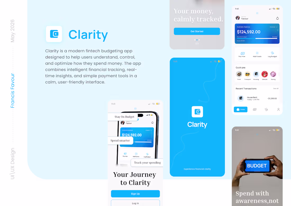
Over the past few days, I’ve been working on a project that reflects my passion for creating digital products that truly solve real problems, not just look beautiful. Today, I’m excited to share a glimpse of Clarity, a modern fintech budgeting app designed to help people control, and improve the way they spend money.
Why Clarity?
Money management is stressful for many users, not because they don’t earn enough, but because they don’t have the right tools to visualize their spending behavior. With Clarity, I set out to design not just an app, but an experience that provides clarity on the user's finance
My Design Approach
When I design, I think far beyond aesthetics. I focus on behavior, emotion, and problem-solving.
For Clarity, this meant: Building an interface that simplifies complex data into something friendly and digestible.
Crafting visual hierarchy that guides users naturally without overwhelming them.
Ensuring the app feels premium, modern, and trustworthy, because money is involve and users needs to feel safe depositing their money in the clarity app.
What the App Solves
Clarity helps users:
Track spending effortlessly
Set budgets that actually work
Pay quickly and intelligently
Build awareness around daily spending decisions
Develop healthier money habits.
1
75
i am working on a grocery shopping app focused on:
* Clean UX
* 3D illustrations
* Smooth onboarding
* Premium visual design
* Fast, intuitive shopping flow
Still a work in progress, but happy with the direction so far. More screens soon.
1
70
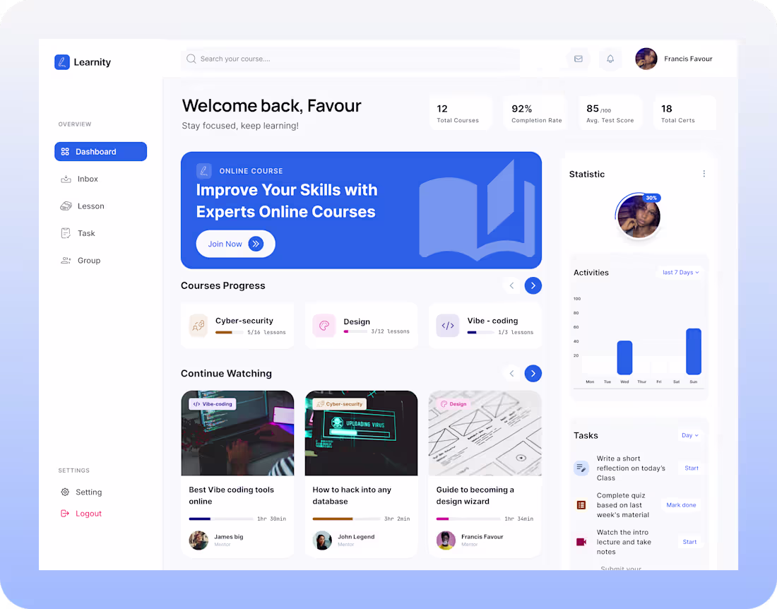
The goal was to create a clean learning experience where users can easily track progress, continue courses seamlessly, manage tasks, and stay motivated through a simple and organized interface.
Key focus areas:
• Clear navigation
• Smart course tracking
• Minimal and modern interface
• Better learning accessibility
• User-centered dashboard experience
Designed with simplicity, productivity, and learner engagement in mind.
1
74
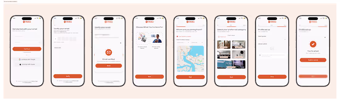
How I designed this signup flow with both the user and the business in mind
One thing I always prioritize in Ui/Ux design is making the first experience feel easy, safe, and intentional.
In this flow, I started by reducing friction, email, password, quick verification, no unnecessary steps, no confusion. Just enough to build trust and get users moving.
After authentication, I guide users straight into purpose:
This helps the product instantly personalize their experience while giving the business clean, high-quality user data for better targeting, recommendations, and monetization.
A mobile onboarding flow for the event booking & space discovery sector.
https://lnkd.in/eRTmqZ5y my portfolio, if you desire premium and user centered design that would help your business grow, then contact me to give you the best of the best.
1
84
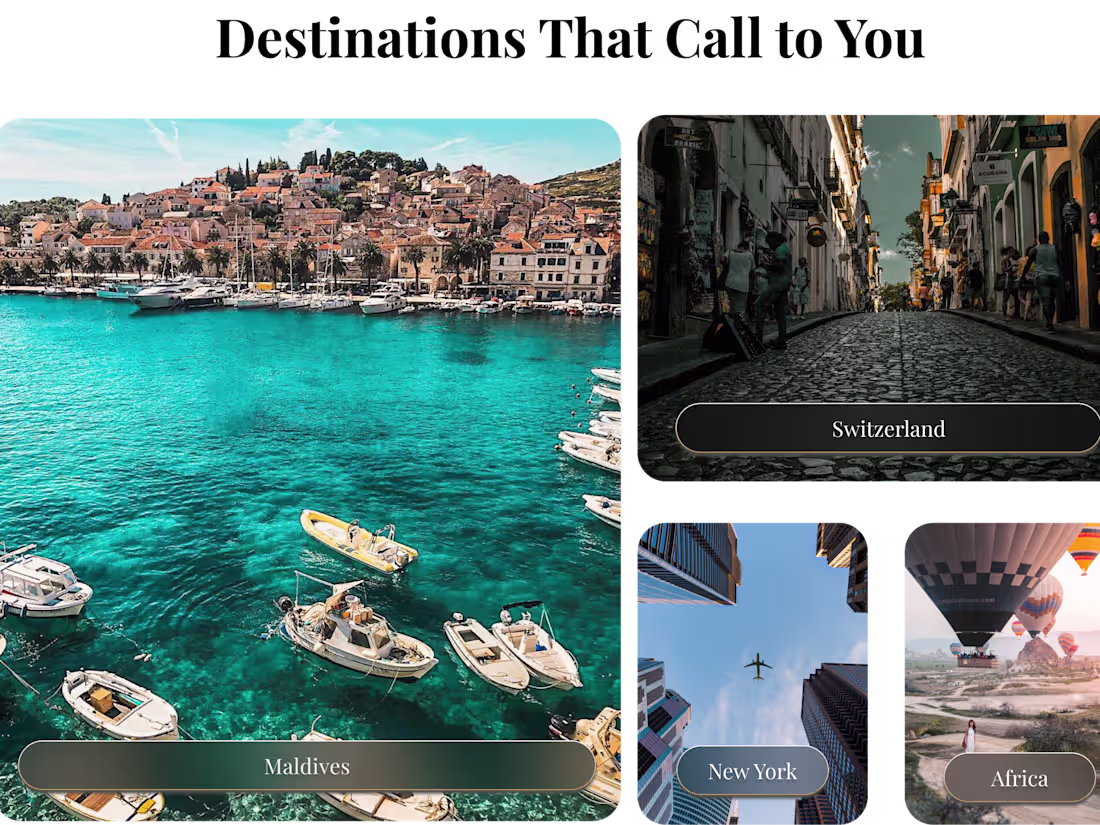
I designed a website for a travel and tour company, on this project i focused on a seamless user journey.
✅ Clean, card-based adventure selection.
✅ Strong iconography for "Why Travel With Us."
✅ High-contrast CTA buttons to drive conversions.
Do you have a design request? Let's talk about it.
I’m available for new projects! Drop me a line at “Francisfavour14@gmail.com (mailto:Francisfavour14@gmail.com)”
1
1
103
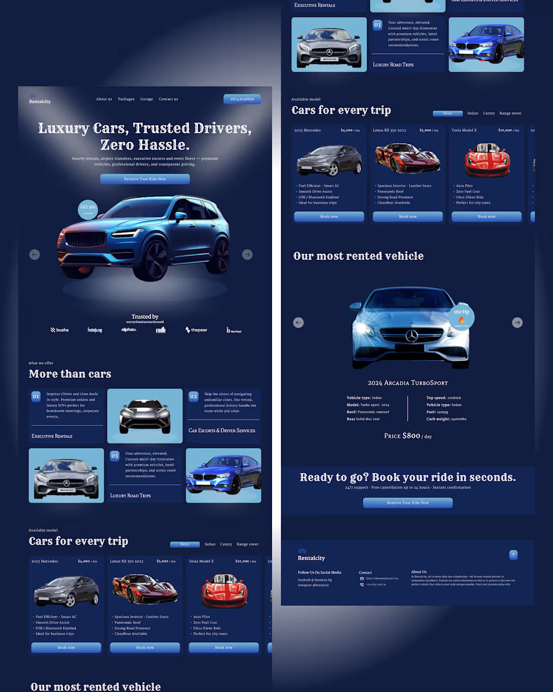
A car rental website
When the design is clean and the user journey is effortless, conversion rates climb. That's how we turned a design project into a business growth tool.
If you need a product designer for your project, I’m your best girl, allow me bring your idea to life
1
83
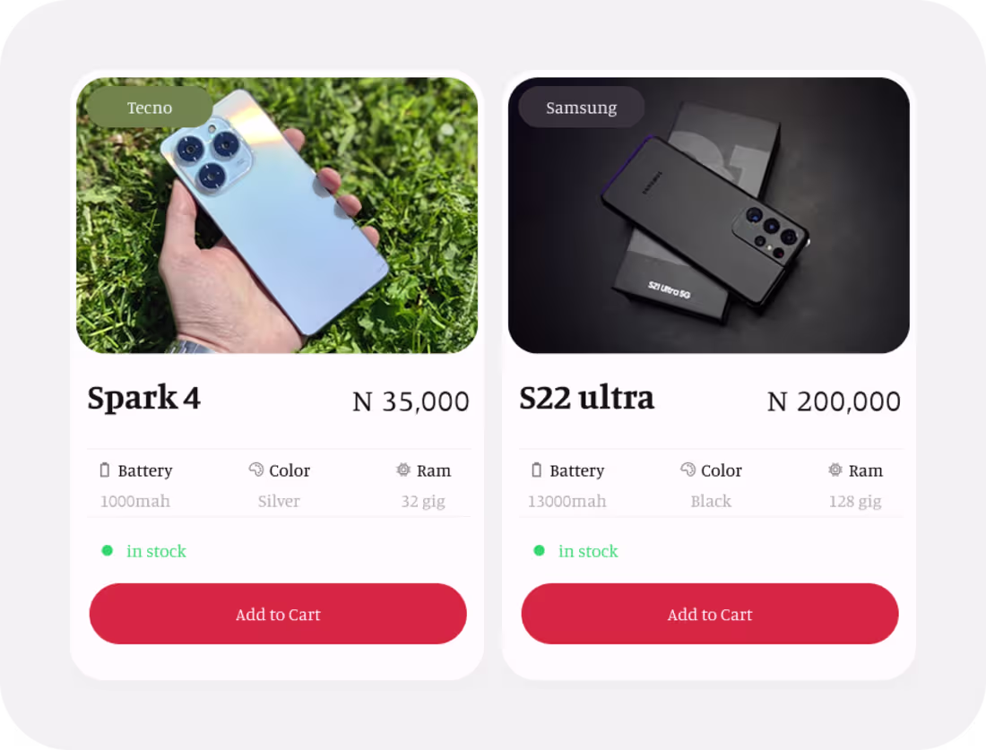
product card, for a gadget mobile app (e-commerce)
2
83
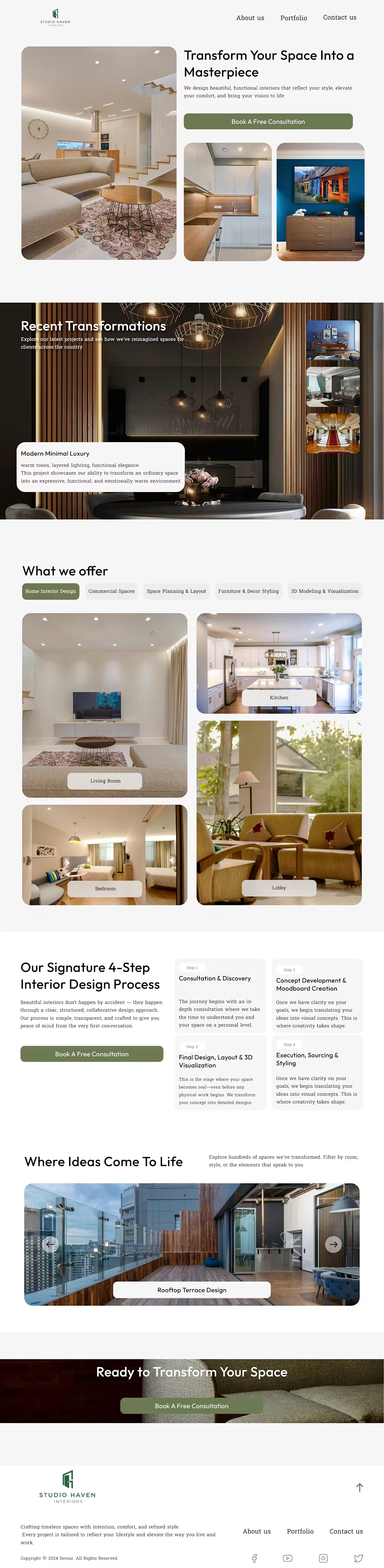
This is the interior design landing page I designed If you need a product designer and a framer dev for your project, I’m your best girl, allow me bring your idea to life
2
77