Florina Gafita
Senior Digital & Visual Designer | UI/UX
New to Contra
Florina is ready for their next project!

Portugal Direct Mail
Amazon.es/PT | Direct Mail Campaign
A little mail. A world of possibilities.
In 2021, Amazon introduced Portuguese as a secondary language on Amazon.es, followed by the launch of its Prime programme in Portugal. To support this expansion, a direct mail campaign was developed to introduce Portuguese customers to a more familiar, accessible and convenient shopping experience.
The Challenge
The objective was to build brand awareness in a growing market, attract new customers and communicate the benefits of shopping on Amazon.es in Portuguese.
The message needed to be simple, engaging and instantly recognizable, transforming an everyday piece of mail into an inviting introduction to the Amazon shopping experience.
The Creative Approach
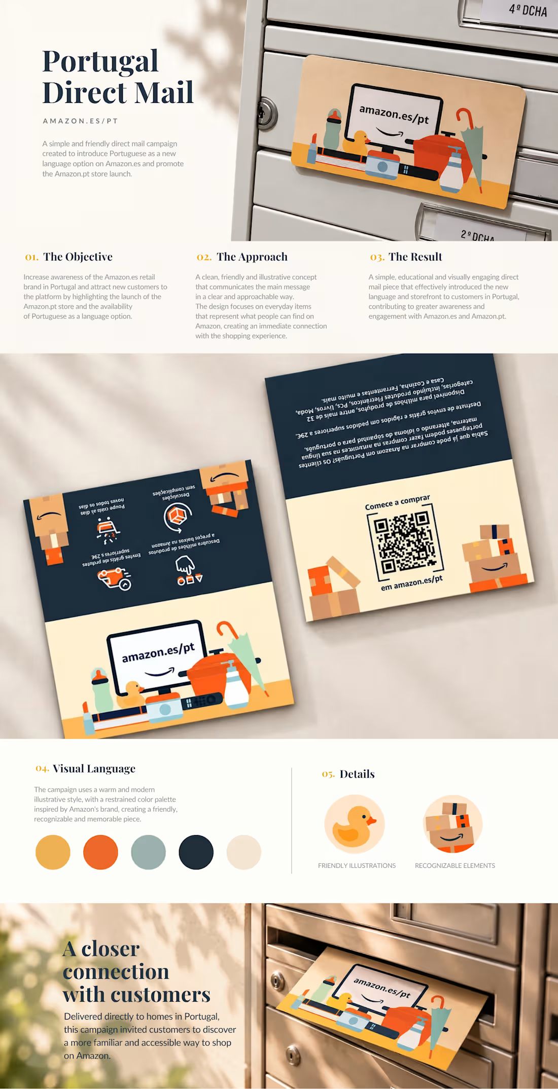
The concept revolves around the diversity of products available on Amazon, brought together through playful illustrations, simplified geometric shapes and a warm, approachable visual language.
Everyday objects, from household essentials to electronics, create a colourful composition that communicates variety and accessibility while maintaining Amazon's recognizable identity.
A contrasting navy and cream palette provides structure and clarity, allowing the vibrant illustrations and key messaging to stand out.
The Execution
Designed as a double-sided printed mailer, the piece combines an engaging illustrated composition with concise, educational messaging.
One side introduces the shopping experience through familiar product imagery and key benefits, while the other provides additional information and a QR code directing customers to Amazon.es/PT.
The result is a friendly, visually distinctive print piece that brings a digital shopping experience into a tangible, everyday format.
A Closer Connection with Customers
Delivered directly to mailboxes across Portugal, the campaign was designed to make Amazon feel more approachable, familiar and accessible to a new audience.
A simple piece of mail, connecting everyday needs with a world of possibilities.
Client: Amazon.es / Kindle Direct Publishing
Services: Art Direction · Creative Concept Development · Print Design · Illustration
1
15
Velvet Café — Menu Design
Where coffee meets conversation.
Velvet Café is a welcoming space built around good coffee, meaningful conversations, and the pleasure of slowing down.
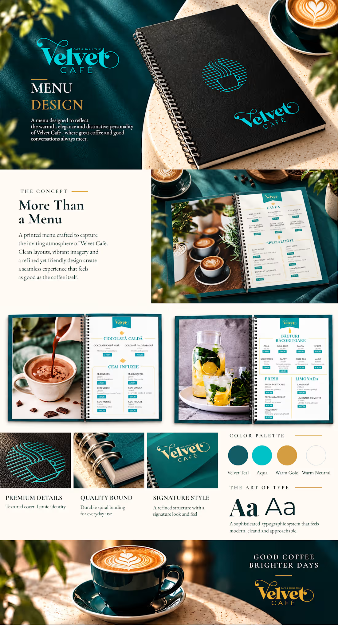
The menu was designed to translate that atmosphere into a cohesive visual experience, combining elegant typography, vibrant imagery, and a distinctive color palette.
The Concept
The design balances sophistication with approachability. Rich teal tones establish a recognizable visual identity, while warm golden accents, expressive headings, and carefully selected photography bring warmth and personality to every page.
Design & Functionality
The menu combines immersive, full-page photography with clear, structured product information. A thoughtful typographic hierarchy makes the different categories easy to explore, while subtle decorative elements reinforce the café's identity.
The spiral-bound format was chosen for its practicality, durability, and ease of use in a busy café environment.
The Art of Type
Two complementary typographic styles create a balance between character and functionality: an expressive serif for section headings and a clean sans-serif for product information and descriptions.
Together, they establish a visual rhythm that feels both refined and approachable.
The Result
A distinctive, practical menu that goes beyond presenting drinks and prices. Every detail contributes to a consistent brand experience, reflecting the welcoming character of Velvet Café.
Good coffee. Brighter days.
0
23
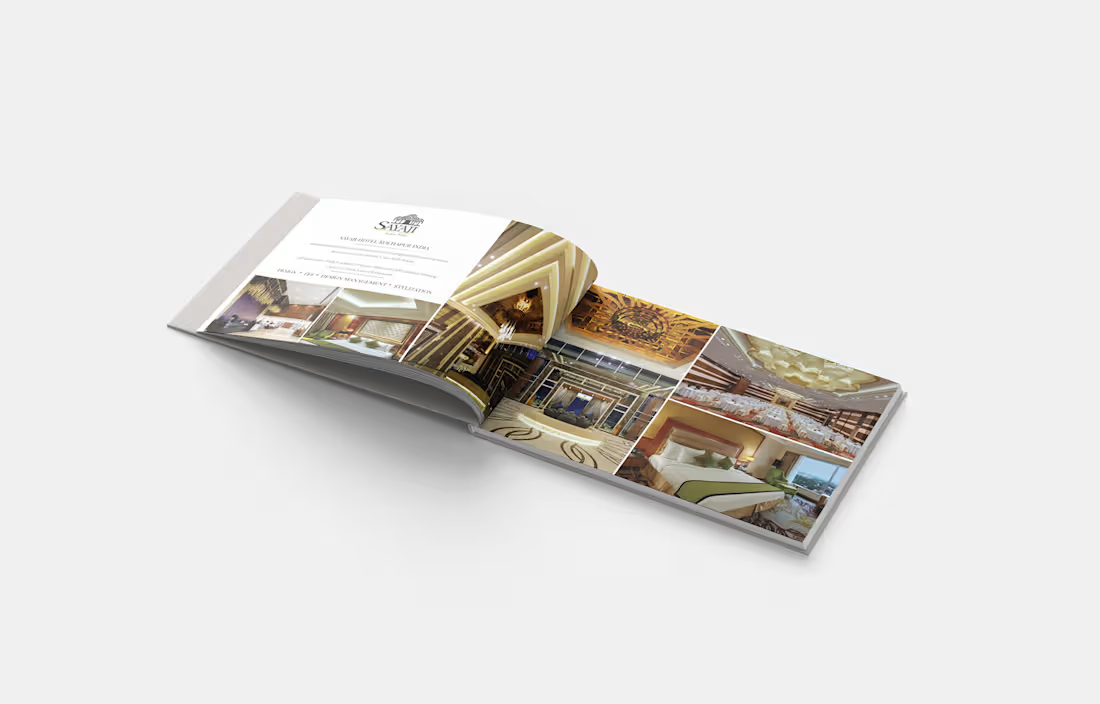
Coffee table book created for DBTA International, an interior design consultancy founded in 1995 by award-winning Japanese-Canadian designer David Tokiwa, with a strong focus on hospitality and leisure environments.
The book was designed as a curated showcase of the studio’s most distinctive projects, bringing together luxury interiors from across Asia and beyond. Featured work ranges from Maetomo, a refined restaurant located within Sheraton Towers Singapore, to Taj View Agra, a five-star hotel in India, alongside a selection of high-end residential and hospitality projects.
The editorial approach is intentionally clean and understated, allowing the interiors to remain the main focus. Large-scale photography, generous white space and a restrained typographic system create a sophisticated rhythm throughout the publication, while the changing page compositions give each project its own visual identity.
The result is a polished portfolio piece that presents DBTA International’s work in a way that feels timeless, elegant and aligned with the premium character of the spaces they design.
0
42
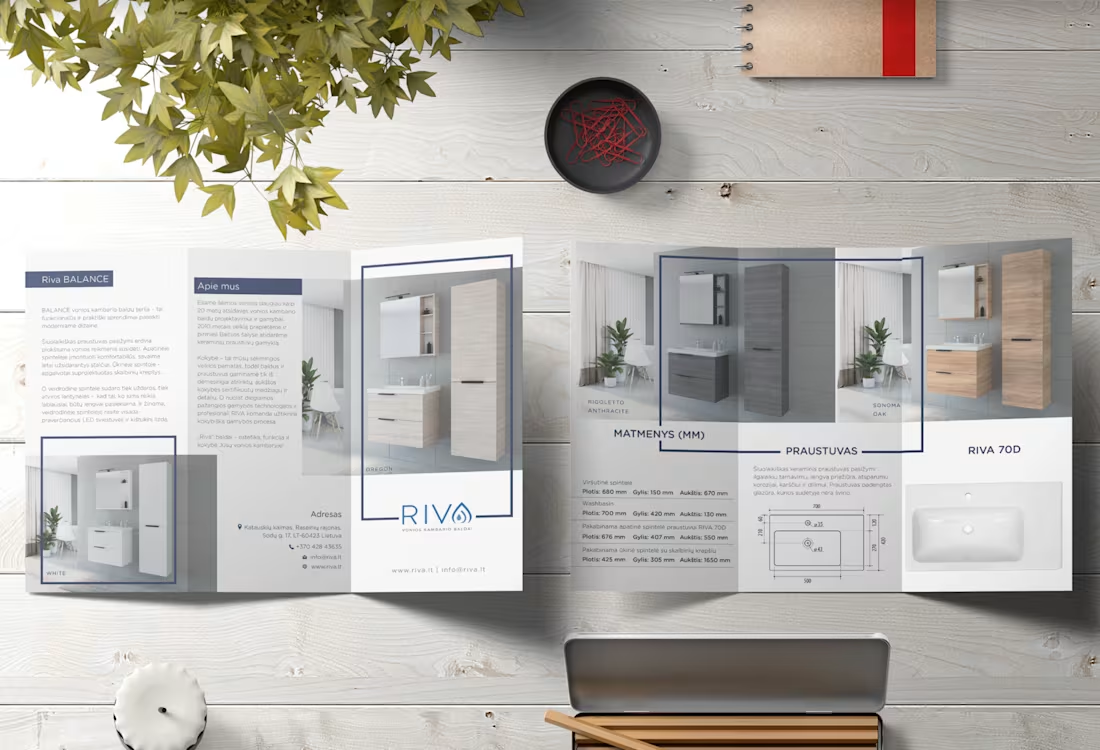
Riva is a family-run business with more than 20 years of experience in designing and manufacturing bathroom furniture. In 2010, the company expanded its expertise by becoming the first and only manufacturer of ceramic sanitary ware in the Baltic region.
For this trifold brochure, the goal was to create a clean and contemporary presentation that reflects Riva’s functional, modern approach to bathroom design. The layout combines product photography, technical specifications and essential brand information within a clear editorial structure, making the brochure easy to navigate while keeping the products at the centre of attention.
A restrained palette of soft greys and muted blue tones complements the minimalist interiors and reinforces the brand’s professional, architectural feel. Thin graphic frames, generous spacing and a structured grid bring consistency throughout the piece, balancing technical information with a more lifestyle-oriented presentation.
0
46