
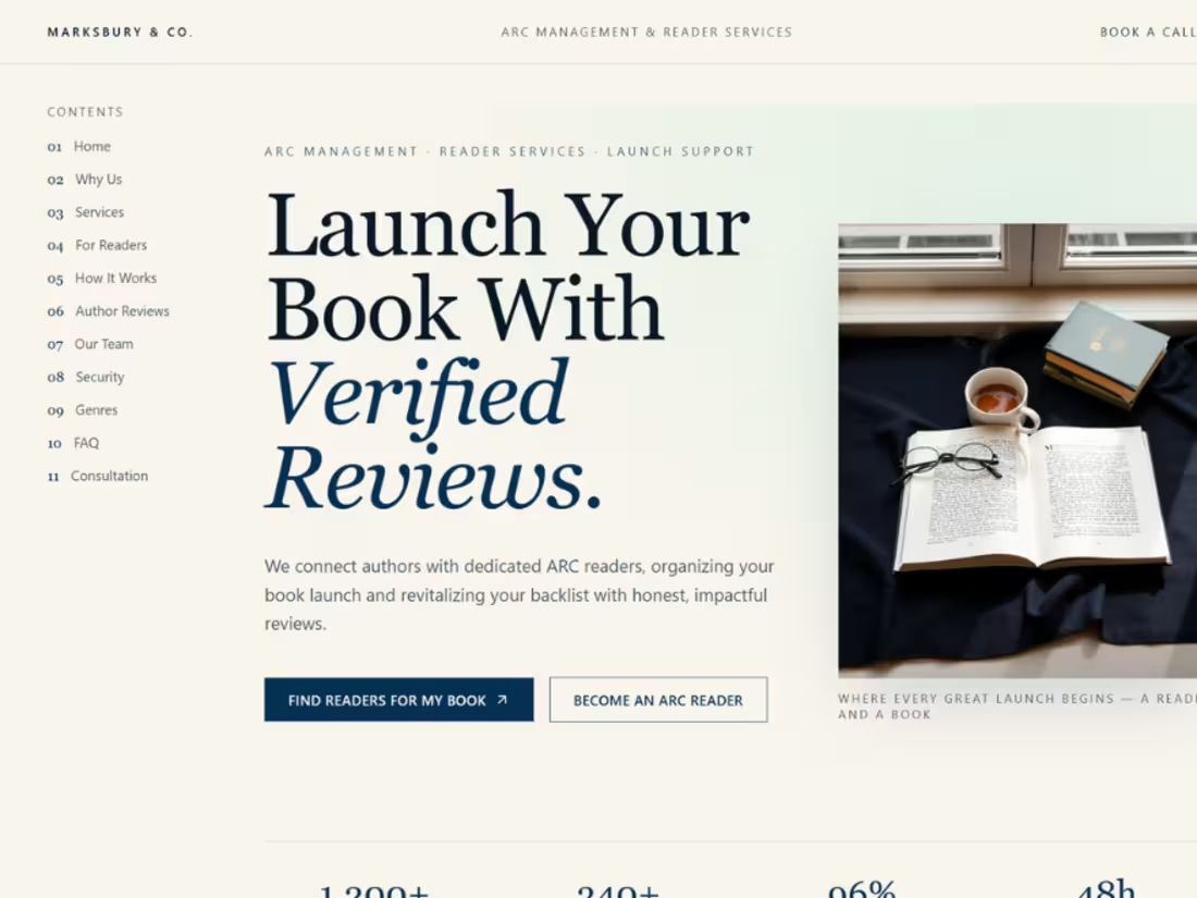
Arc Readers Platform Design & Development
I designed and developed the full web experience for a new author-focused platform, "Arc Readers." The platform serves as a vital bridge between authors and early readers, helping writers launch their books with verified reviews and build momentum before their official release.
My Role
As the lead designer and developer, I focused on creating a clean, trustworthy, and author-centric interface that simplifies the often complex process of book marketing and review management.
Key Features & Design Strategy
Trust-First UX: The layout was built to emphasize credibility, guiding authors through a streamlined flow for managing ARC (Advance Review Copy) campaigns.
Integrated Workflow: The platform features clear "How it works" sections and intuitive dashboards, ensuring that both authors and readers can navigate the marketplace with ease.
Visual Identity: I utilized a sophisticated color palette and balanced typography to ensure the platform feels both professional and inviting to the literary community.
2
62
Abuk is Ukraine’s leading platform for audiobooks, ebooks, and podcasts, offering a carefully curated library of titles, including exclusive releases recorded in professional studios to meet the highest international standards. These exclusives are voiced by talented actors, radio, and TV narrators, creating a listening experience that is both immersive and authentic.
What we did
Developed and refined the UI/UX for iOS, Android, and web
Created a cohesive visual language and brand identity, including product naming
Designed original audiobook covers, balancing expressive visuals with clear readability on mobile screens
Produced social media and marketing assets to support brand communication
Provided continuous design and product support for the client
0
33
Netti is a mobile app for measuring internet speed and key connection metrics in real time. It provides insights into download and upload performance, ping, latency, signal strength, and data routes.
What we did
Conducted market and competitor research to align the product with user needs
Desig:ned user flows and core UX to simplify complex metrics
Developed a mobile interface with custom visuals and interactive elements
Built a promotional website to support the app launch
Provided ongoing support and design consulting during development
0
41

A custom site to support ambitious growth
Brighton Jones came to us with a new brand book and a question: how can we turn this into a website? We knew our design would have to be modular Brighton Jones is growing fast, both as a firm and as a web presence. Whatever website we launched would be pretty different within 12 months: more services, new locations, tons of fresh content. We didn’t want to design anything that Brighton Jones would quickly outgrow.
We took a modular, component-based approach to the design, creating a library of 25 customizable “blocks” the team at Brighton Jones could mix and match to build visually cohesive, content rich pages on the fly, as well as custom feeds for the blog, webinars, and downloadable resources.
In addition to a new design system and custom Word press implementation, we also developed two custom integrations with Marketo and Lytics to help streamline their lead generation campaigns.
0
68
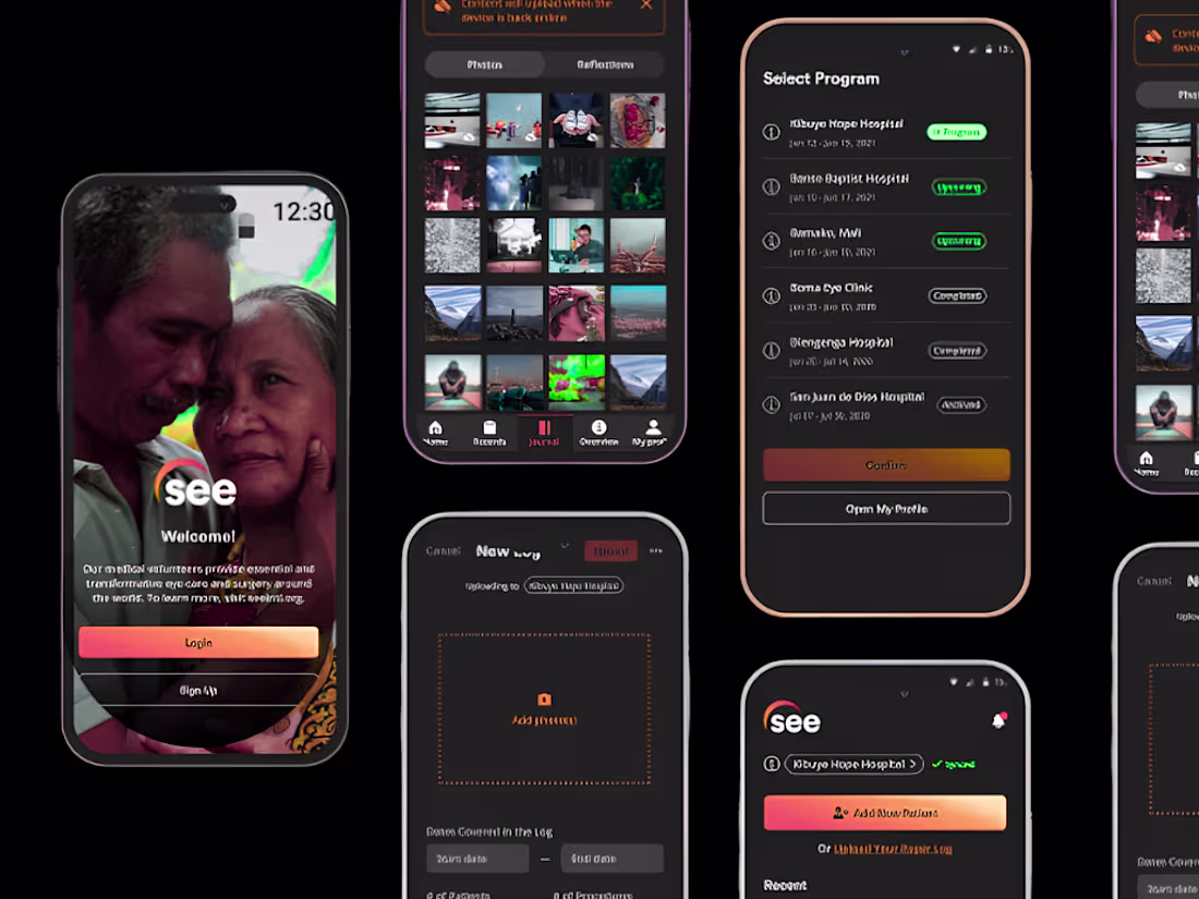
A Mobile App to Help SEE Coordinate Care Worldwide
SEE International is a global nonprofit that connects volunteer humanitarian eye surgeons with communities in need around the world. After redesigning and developing their website, we were invited to tackle one of the organization’s long-time wishlist items: a mobile and web application to help coordinate care and document stories across volunteer medical staff at home and abroad.
0
67
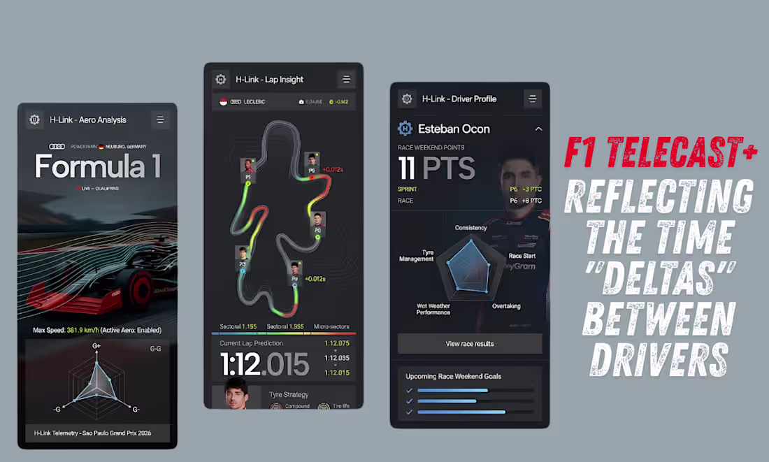
Visual Hierarchy & Skim ability
The design leverages a highly structured hierarchy where structural elements vanish so that data can take center stage:
Scale Contrast: Massive, high weight typography is reserved for the primary telemetry values. This ensures that if a user glances at their phone while watching a race on a larger screen, the most critical live data is instantly readable.
Progressive Disclosure: Secondary information such as tyre compound strategy, upcoming weekend goals, and text descriptions is compartmentalized into distinct, low-opacity cards at the bottom of the screens. This prevents the interface from feeling cluttered despite the dense amount of data.
0
84