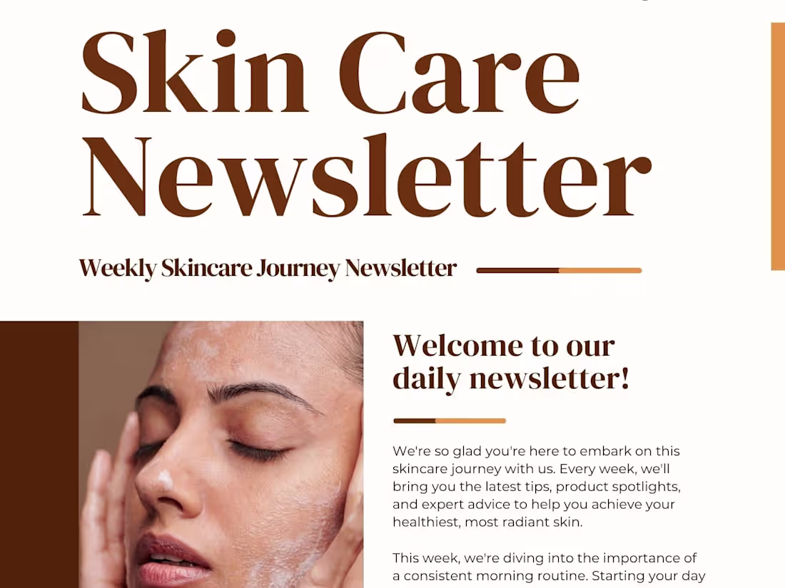
For this project, I designed a visually appealing newsletter for a skincare brand, aimed at engaging subscribers and promoting products, tips, and updates. The design uses a clean, fresh aesthetic with soft colors and elegant typography that reflects the brand’s luxurious and soothing identity. The layout balances product highlights, educational content, and promotional offers in a structured yet visually inviting format, ensuring readability and enhancing user engagement. The newsletter is fully adaptable for email platforms and optimized for both desktop and mobile viewing.
1
7
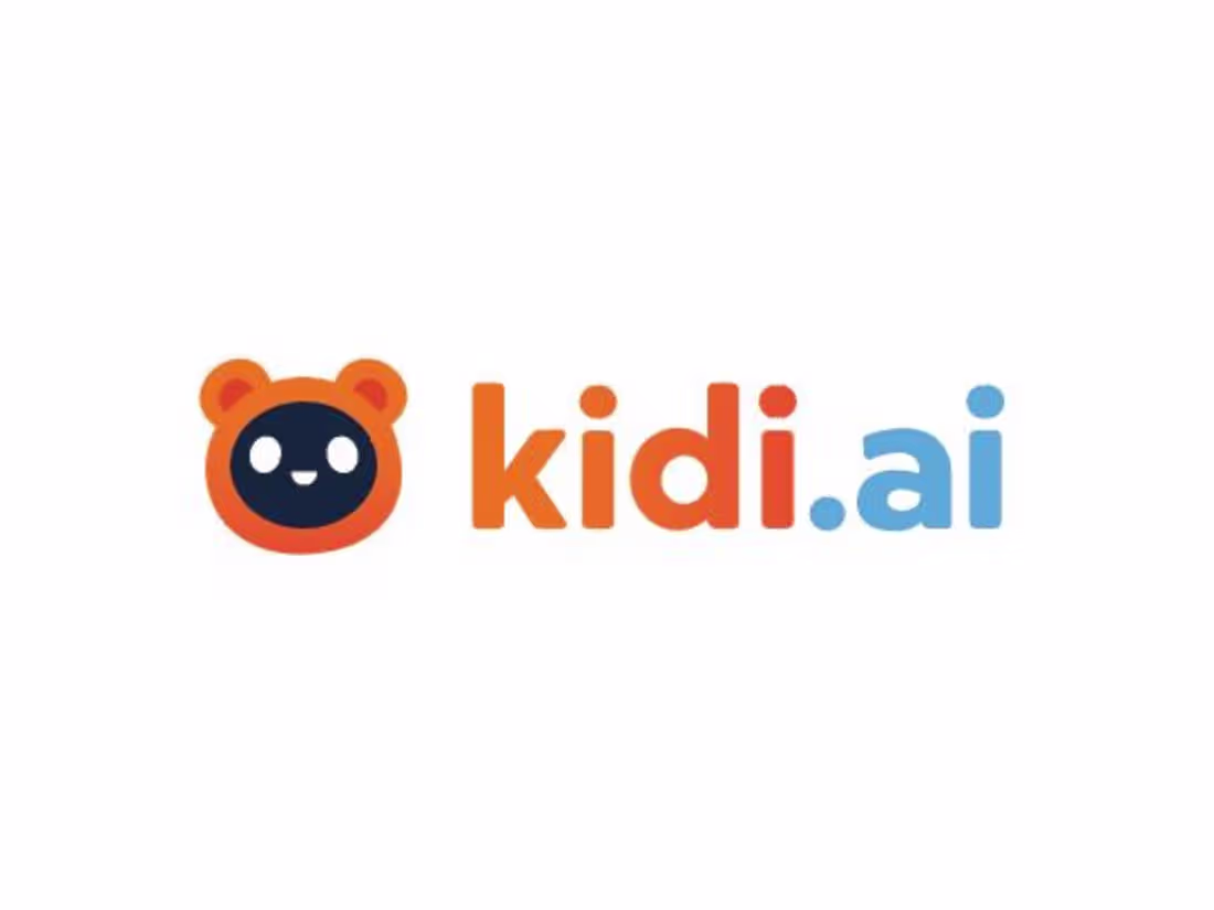
For this project, I designed the logo for Kidi.ai (http://Kidi.ai), a playful and engaging brand focused on kids’ toys and educational products. The logo features a friendly, approachable mascot with bright, cheerful colors, combining orange and blue to evoke energy, trust, and creativity. The design emphasizes simplicity and recognizability, making it versatile for digital apps, product packaging, and promotional materials. I also created multiple logo variations, including full logo, icon-only, and app-ready formats to ensure consistent brand presence across all platforms.
0
9
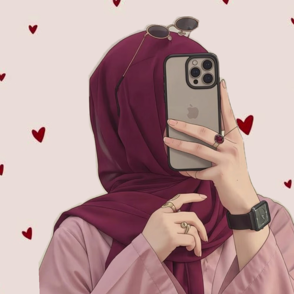
For this project, I designed the full visual identity for LuveCrush, a modern dating app aimed at connecting people and turning crushes into meaningful relationships. The logo combines a heart with a chat bubble, visually representing both love and communication in a simple, memorable symbol. I created multiple variations, including full-color, black-and-white, and app-icon formats, ensuring scalability and versatility across digital platforms. The design balances playful energy with clean, professional aesthetics, making it instantly recognizable and suitable for app stores, social media, and marketing materials.
1
15
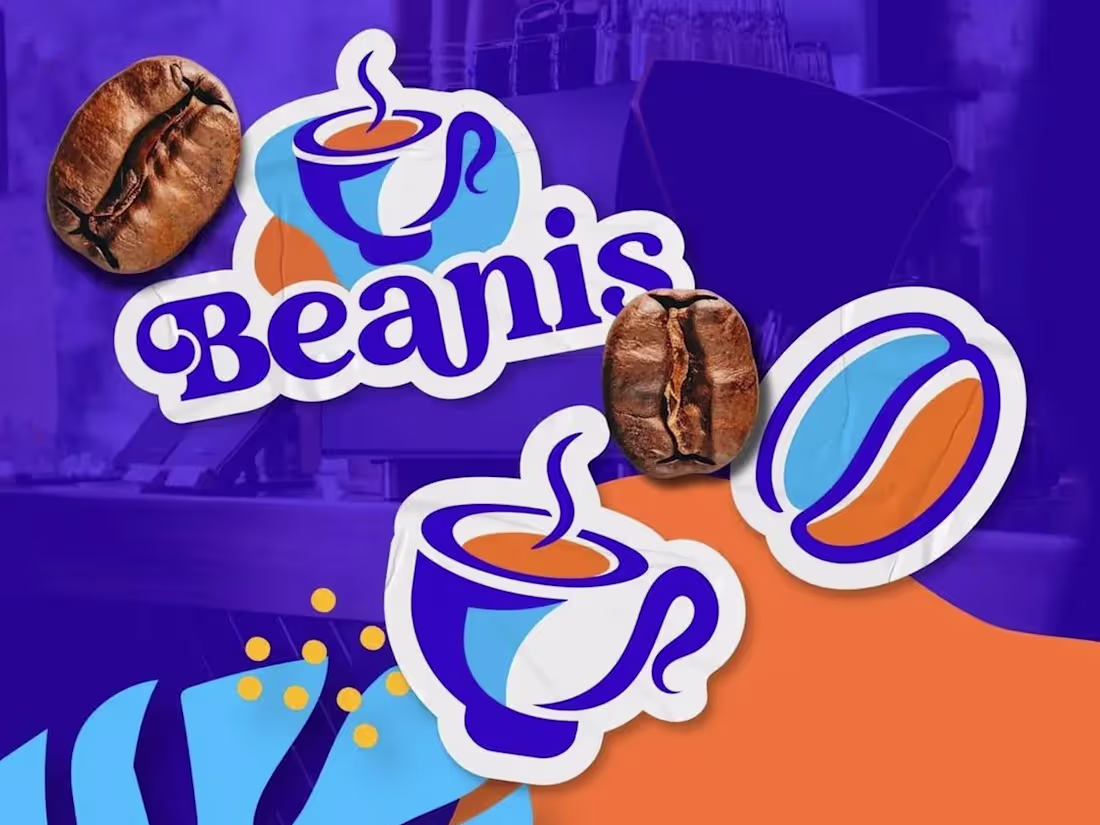
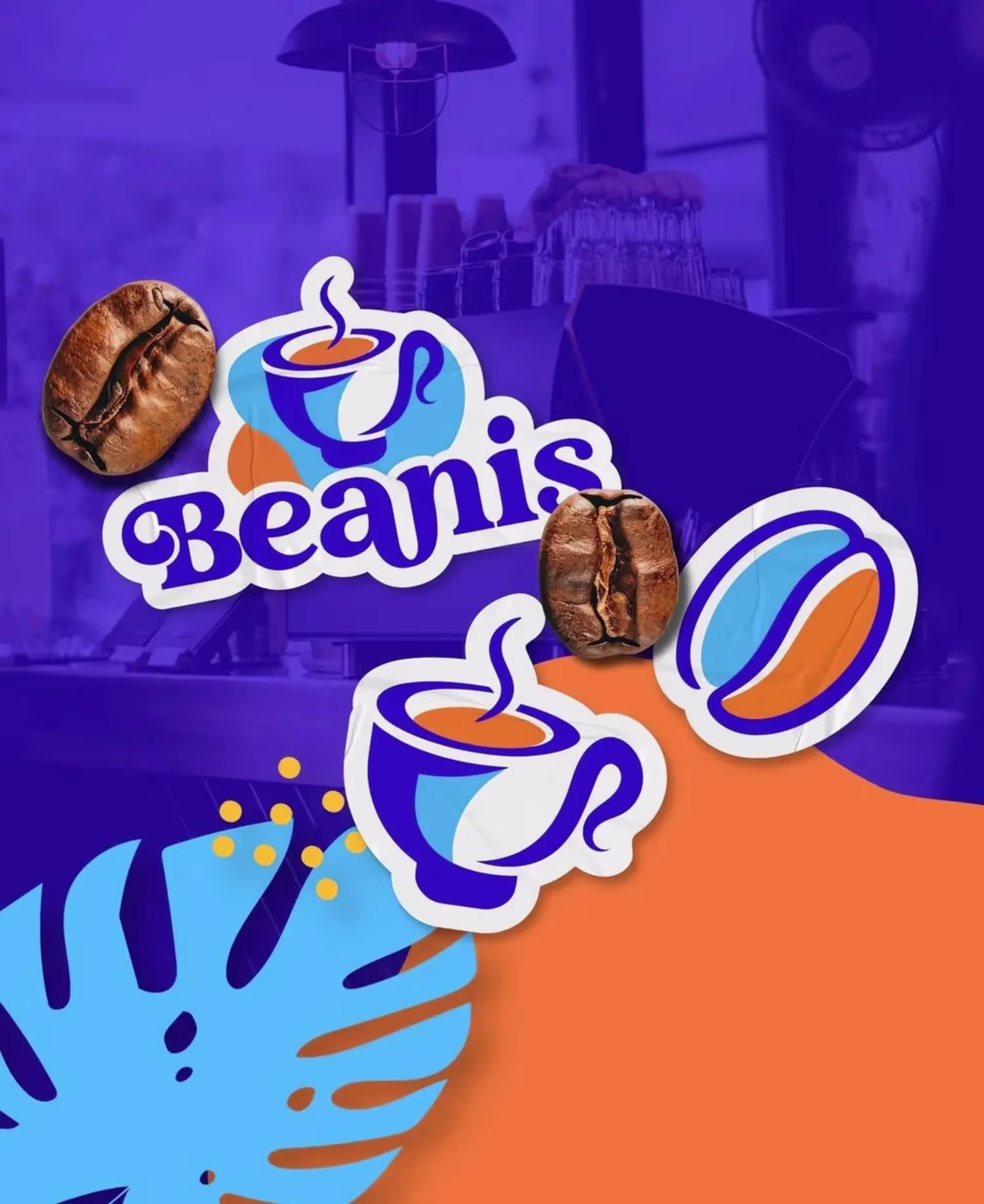
For this project, I created the complete branding and packaging design for Beanis Coffee, focusing on vibrant, modern aesthetics that appeal to coffee enthusiasts. The design incorporates bold, contrasting colors and playful geometric elements to create a fresh, eye-catching visual identity. The packaging highlights the product’s origin with clear messaging (“Brazil Coffee” and “100% Arabica”), while integrating illustrative elements like coffee cups and beans for instant brand recognition. The brand visuals were carefully crafted to stand out on shelves, evoke energy, and communicate quality and authenticity.
1
23