
Faridah Abubakar
Data Analyst cleaning, organizing and understanding data.
New to Contra
Faridah is building their profile!

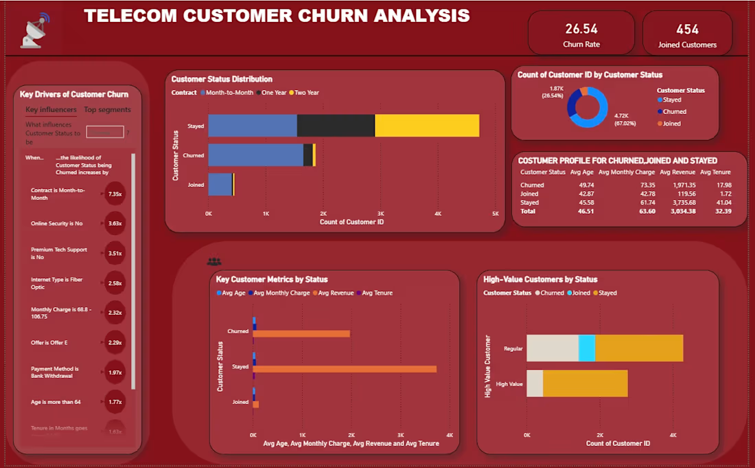
Telecom Customer Churn Analysis Dashboard
I recently completed a Power BI dashboard focused on customer churn analysis in the telecom industry.
Key insights from the project:
✅ Identified customer churn patterns
✅ Compared profiles of joined, stayed, and churned customers
✅ Analyzed key drivers of customer attrition
✅ Evaluated high-value customer retention risks
✅ Developed data-driven retention recommendations
This project demonstrates how data visualization can help businesses understand customer behavior and make informed decisions to improve retention and revenue.
0
10
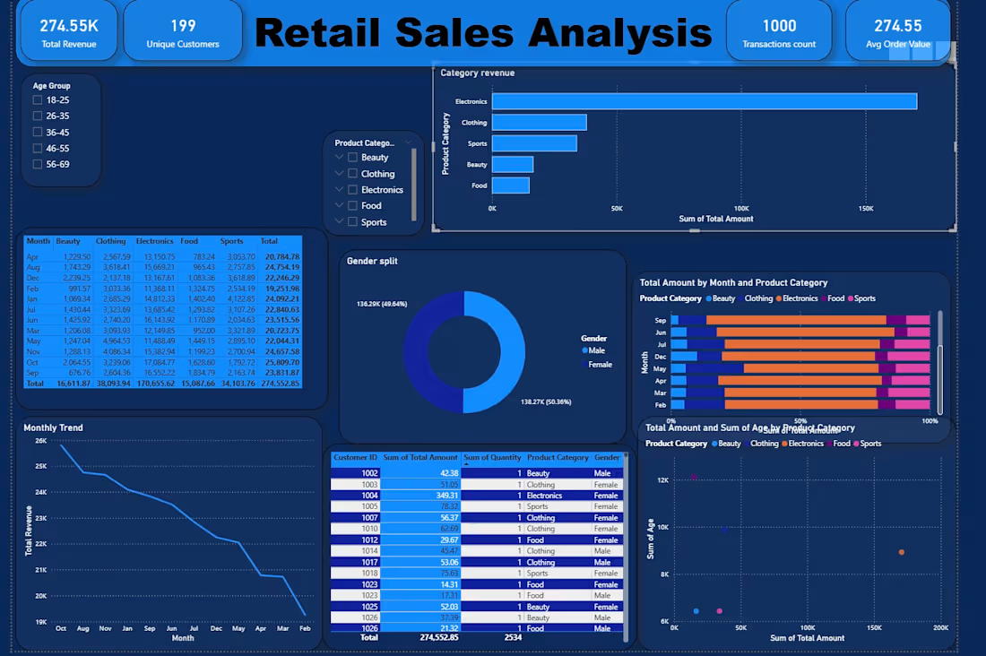
📊 Retail Sales Analysis Dashboard | Microsoft Power BI
Recently completed a Retail Sales Analysis dashboard in Power BI focused on understanding customer behavior, product performance, and sales trends.
🔍 Business Questions This Dashboard Answered:
✔ What was the total revenue generated?
✔ Which product category performed best?
✔ How did monthly sales trends change over time?
✔ Which age groups contributed most to revenue?
✔ What was the gender distribution of customers?
✔ Which customers had the highest spending patterns?
✔ How did each product category perform monthly?
📊 Key Insights:
Total Revenue reached 274.55K
Electronics generated the highest sales
Sales showed a gradual monthly decline trend
Customer purchases were almost evenly split by gender
Certain age groups contributed more strongly to category sales
This project helped me strengthen my skills in transforming raw retail data into actionable business insights using Power BI.
0
11
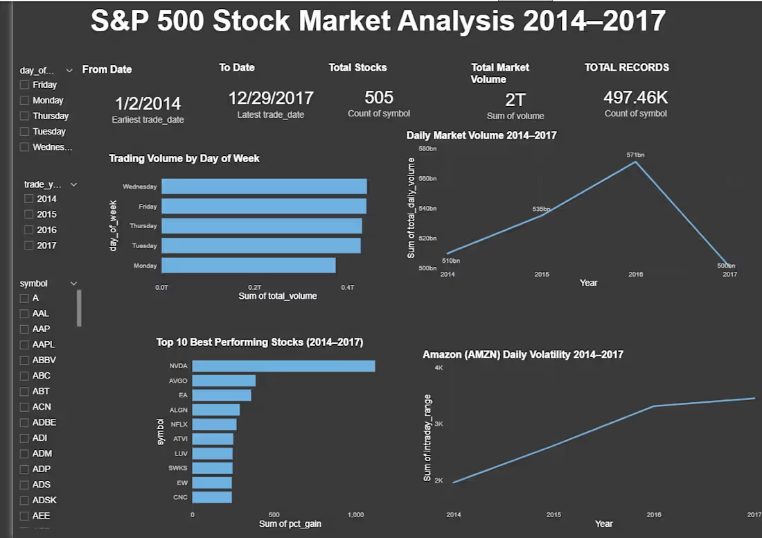
This is an end-to-end analysis of S&P 500 stock prices from 2014–2017, covering 505 companies.
Getting here wasn’t a straight line. I hit MySQL connection errors, forgotten passwords, password mismatches, and slicers that refused to filter my charts. Every error message became a small lesson in how SQLAlchemy, MySQL services, and Power BI relationships actually work under the hood. I didn’t just copy steps — I troubleshot my way through each one until I understood why it worked.
The pipeline I built:
🔹 Python (Pandas + SQLAlchemy) to load 497K rows into MySQL
🔹 SQL for data cleaning, quality checks, and analysis
🔹 Power BI for an interactive dashboard with 5 visuals and 3 slicers
Here’s what the data revealed:
📌 The single highest trading volume day was August 24, 2015 — “Black Monday” — when a global market sell-off triggered 4.6 billion shares traded in one day, led by Bank of America and Apple.
📌 Wednesday consistently sees the highest trading volume, Monday the lowest — markets ramp up activity as the week goes on.
📌 Amazon’s most volatile day was June 9, 2017, with an $85.99 swing between its daily high and low.
📌 And the standout investment story: if you’d put money into Nvidia (NVDA) on January 2, 2014 and held until December 29, 2017, you’d have seen a +1,120% return.
This project pushed my SQL and Power BI skills further than any tutorial could — because real data (and real errors) force you to actually understand the tools, not just follow steps.
0
27
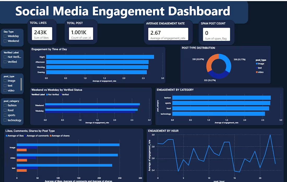
I created this Social Media Engagement Dashboard to analyze how different types of content perform across social media. It gives a quick overview of key metrics like likes, posts, and engagement rates, while also showing how engagement varies by post type, category, time of day, posting hour, and verified status. The goal is to help identify what content performs best and when audiences are most engaged.
2
51