
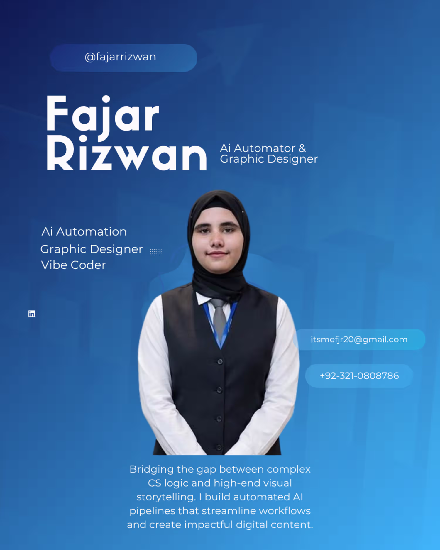
Fajar Rizwan
CS student & designer automating the future with AI.
New to Contra
Fajar is ready for their next project!
Taking corporate email automation beyond basic template generation. 🚀
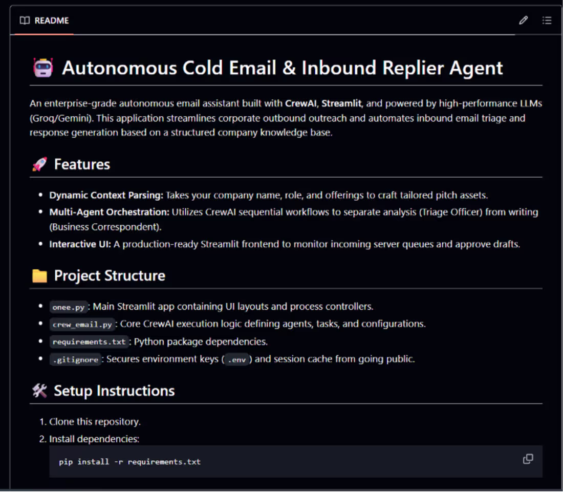
I just open-sourced a new project: Autonomous Cold Email & Inbound Replier Agent! This is a modular, production-ready system built completely in pure Python using CrewAI for multi-agent orchestration and Streamlit for a clean, modern interactive UI.
As shown in image_ea414f.png, the system moves away from single-prompt generation and splits the operational workload into specialized, sequential steps to ensure high-quality enterprise triage:
Dynamic Context Parsing: Ingests dynamic company names, specific roles, and product offerings to craft completely personalized pitch assets based on an internal knowledge base.
Multi-Agent Orchestration: Uses a CrewAI sequential flow to separate analysis from execution. A Triage Officer handles data categorization while a Business Correspondent handles context-aware drafting.
100% Free-Tier & Cost Compliance: Powered entirely by high-performance models via free-tier API orchestration (utilizing gemini-2.5-flash via Google AI Studio and Groq Cloud AI as a high-speed secondary model).
Interactive UI Safety: Features a polished Streamlit interface (onee.py (http://onee.py)) to monitor active server queues and act as a human-in-the-loop gatekeeper to approve drafts before they go live.
The repository is modularly structured, completely production-ready, and optimized with strict exception handling to respect rate limits safely.
🔗 Check out the code here: https://github.com/26FajarRizwan/Cold_Email_Replier_Agent
#CrewAI #Streamlit #AIEngineering #Python #GenerativeAI #LLMs #OpenSource #Automation #GoogleGemini
0
19
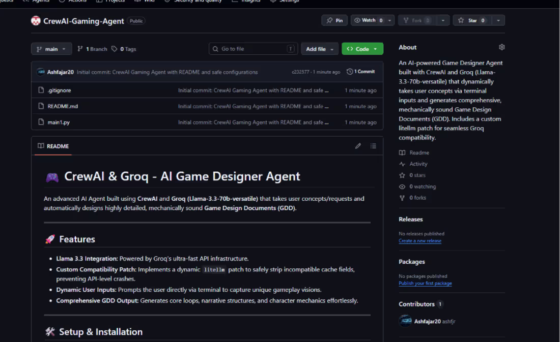
🎮 Level Up: Built a Multi-Agent AI Game Designer with CrewAI (https://www.linkedin.com/company/getcrewai/) & Groq (https://www.linkedin.com/company/groq/)! 🚀
I'm thrilled to share my latest projecta modular hashtag#AI (https://www.linkedin.com/search/results/all/?keywords=%23ai&origin=HASH_TAG_FROM_FEED) Agent system designed to transform a simple text idea into a full, production-ready Game Design Document (GDD)! 🕹️🤖
As game development gets more complex, brainstorming core mechanics, balance, and narrative loops manually can take days. I built this automation agent to instantly structure wild game ideas into comprehensive design blueprints.
🛠️ How It Works:
Dynamic Terminal Prompting: Captures unique, raw gameplay ideas directly from user input via the terminal.
AI Game Designer Agent: Powered by Groq’s lightning-fast Llama-3.3-70b-versatile model, it acts as a veteran designer with 10+ years of AAA experience.
Custom Stability Patch: Implemented a robust dynamic litellm execution patch to strip out incompatible caching fields, ensuring 100% crash-free API calls.
Structured GDD Output: Automatically generates core gameplay loops, combat systems, character arcs, and world-building documentation.
🏗️ Modular Architecture & Tech Stack:
Framework: CrewAI (https://www.linkedin.com/company/crewai-inc/) (Multi-Agent Architecture)
Inference Engine: Groq (https://www.linkedin.com/company/groq/) API Cloud
LLM: Llama (https://www.linkedin.com/company/ai-deepseek/)-3.3-70b-versatile
Environment Management: Python (https://www.linkedin.com/company/learn-python-programming/) hashtag#python (https://www.linkedin.com/search/results/all/?keywords=%23python&origin=HASH_TAG_FROM_FEED)-hashtag#dotenv (https://www.linkedin.com/search/results/all/?keywords=%23dotenv&origin=HASH_TAG_FROM_FEED) & hashtag#strict (https://www.linkedin.com/search/results/all/?keywords=%23strict&origin=HASH_TAG_FROM_FEED) .hashtag#gitignore (https://www.linkedin.com/search/results/all/?keywords=%23gitignore&origin=HASH_TAG_FROM_FEED) protocol to ensure zero leakage of private hashtag#API (https://www.linkedin.com/search/results/all/?keywords=%23api&origin=HASH_TAG_FROM_FEED) credentials.
By separating my automation projects into clean, isolated ecosystems, I'm building a highly scalable portfolio of production-grade AI tools.
📂 Check out the GitHub Repository here: https://lnkd.in/dFecvgBc
(https://lnkd.in/dFecvgBc)What kind of game would you ask this agent to design first? Let's connect and discuss the power of fast inference in creative automation! 👇
hashtag#AI (https://www.linkedin.com/search/results/all/?keywords=%23ai&origin=HASH_TAG_FROM_FEED) hashtag#GenerativeAI (https://www.linkedin.com/search/results/all/?keywords=%23generativeai&origin=HASH_TAG_FROM_FEED) hashtag#CrewAI (https://www.linkedin.com/search/results/all/?keywords=%23crewai&origin=HASH_TAG_FROM_FEED) hashtag#Groq (https://www.linkedin.com/search/results/all/?keywords=%23groq&origin=HASH_TAG_FROM_FEED) hashtag#Llama3 (https://www.linkedin.com/search/results/all/?keywords=%23llama3&origin=HASH_TAG_FROM_FEED) hashtag#GameDesign (https://www.linkedin.com/search/results/all/?keywords=%23gamedesign&origin=HASH_TAG_FROM_FEED) hashtag#Python (https://www.linkedin.com/search/results/all/?keywords=%23python&origin=HASH_TAG_FROM_FEED) hashtag#Automation (https://www.linkedin.com/search/results/all/?keywords=%23automation&origin=HASH_TAG_FROM_FEED) hashtag#ArtificialIntelligence (https://www.linkedin.com/search/results/all/?keywords=%23artificialintelligence&origin=HASH_TAG_FROM_FEED) hashtag#SoftwareEngineering (https://www.linkedin.com/search/results/all/?keywords=%23softwareengineering&origin=HASH_TAG_FROM_FEED)
0
19
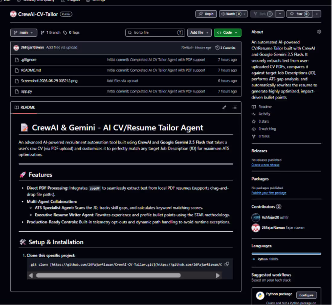
Just Built: A Multi-Agent AI CV/Resume Tailor using CrewAI & Google Gemini 2.5 Flash! 📝
Huge thanks to Skill2Success for giving me this platform and helping me in making these type of projects and also Zarmina Sanam for guiding me in best way!!!!
Job hunting is tough, but tailoring your resume for every single job description shouldn't take hours. To solve this real-world problem, I built an automated multi-agent system that optimizes resumes for ATS algorithms in seconds!
🛠️ How it works:
Local PDF Extraction: Uses pypdf to read the candidate's resume directly via file paths (supporting drag-and-drop inputs).
ATS Specialist Agent: Analyzes the target Job Description (JD), evaluates keyword density, and flags technical or formatting gaps.
Executive Resume Writer Agent: Automatically re-architects and rewrites resume bullet points using the impact-driven STAR methodology without fabricating skills.
🏗️ Tech Stack:
Orchestration: CrewAI Framework
LLM Backbone: Google Gemini 2.5 Flash (Ultra-fast & accurate processing)
Security: strict .gitignore configuration to safeguard personal API credentials.
This project isolates production environment workflows perfectly and delivers tailored markdown resumes ready for corporate submissions!
📂 Check out the GitHub Repository here: https://lnkd.in/dvT4BK2S
Let's connect and discuss building autonomous agents for productivity workflows! 👇
1
33
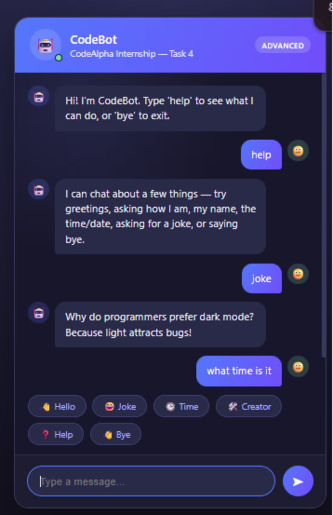
rule-based chatbot built in Python that replies to greetings, questions, and casual conversation using keyword matching — no AI/ML involved. Includes an advanced version with jokes, time/date, and emotion responses, plus a bonus HTML/CSS/JS chat UI. CodeAlpha Python Internship Task 4.
0
20
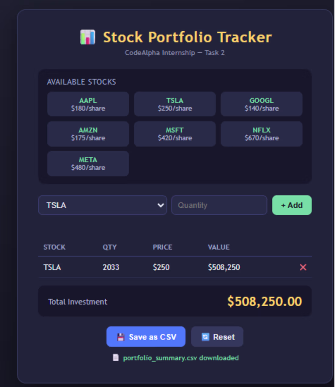
📈 Sharing Task 2 of my Python Programming Internship at CodeAlpha (https://www.linkedin.com/company/codealpha/)!
This project is a Stock Portfolio Tracker built in Python. The user enters stock names and quantities, and the program calculates the total investment value using a hardcoded dictionary of stock prices (like AAPL, TSLA, GOOGL, and more).
It validates input, lets you add multiple stocks, displays a clean summary table and optionally saves the results to a .txt or .csv file.
I also built a bonus browser-based version using HTML, CSS, and JavaScript with a live-updating portfolio table, a dropdown to select stocks and a one-click CSV download feature.
Through this task, I got hands-on practice with:
✅ Dictionaries for structured data storage
✅ Input/output handling and validation
✅ Basic arithmetic for real-world calculations
✅ File handling (.txt and .csv export)
✅ Translating backend logic into an interactive front-end
Thankful to CodeAlpha for this practical learning experience on to the next task!
🔗 GitHub repo link: https://lnkd.in/dswwqvYU
(https://lnkd.in/dswwqvYU)hashtag#CodeAlpha (https://www.linkedin.com/search/results/all/?keywords=%23codealpha&origin=HASH_TAG_FROM_FEED) hashtag#PythonProgramming (https://www.linkedin.com/search/results/all/?keywords=%23pythonprogramming&origin=HASH_TAG_FROM_FEED) hashtag#Internship (https://www.linkedin.com/search/results/all/?keywords=%23internship&origin=HASH_TAG_FROM_FEED) hashtag#LearningByDoing (https://www.linkedin.com/search/results/all/?keywords=%23learningbydoing&origin=HASH_TAG_FROM_FEED) hashtag#SoftwareDevelopment (https://www.linkedin.com/search/results/all/?keywords=%23softwaredevelopment&origin=HASH_TAG_FROM_FEED) hashtag#StudentDeveloper (https://www.linkedin.com/search/results/all/?keywords=%23studentdeveloper&origin=HASH_TAG_FROM_FEED) hashtag#BSCS (https://www.linkedin.com/search/results/all/?keywords=%23bscs&origin=HASH_TAG_FROM_FEED)
0
20
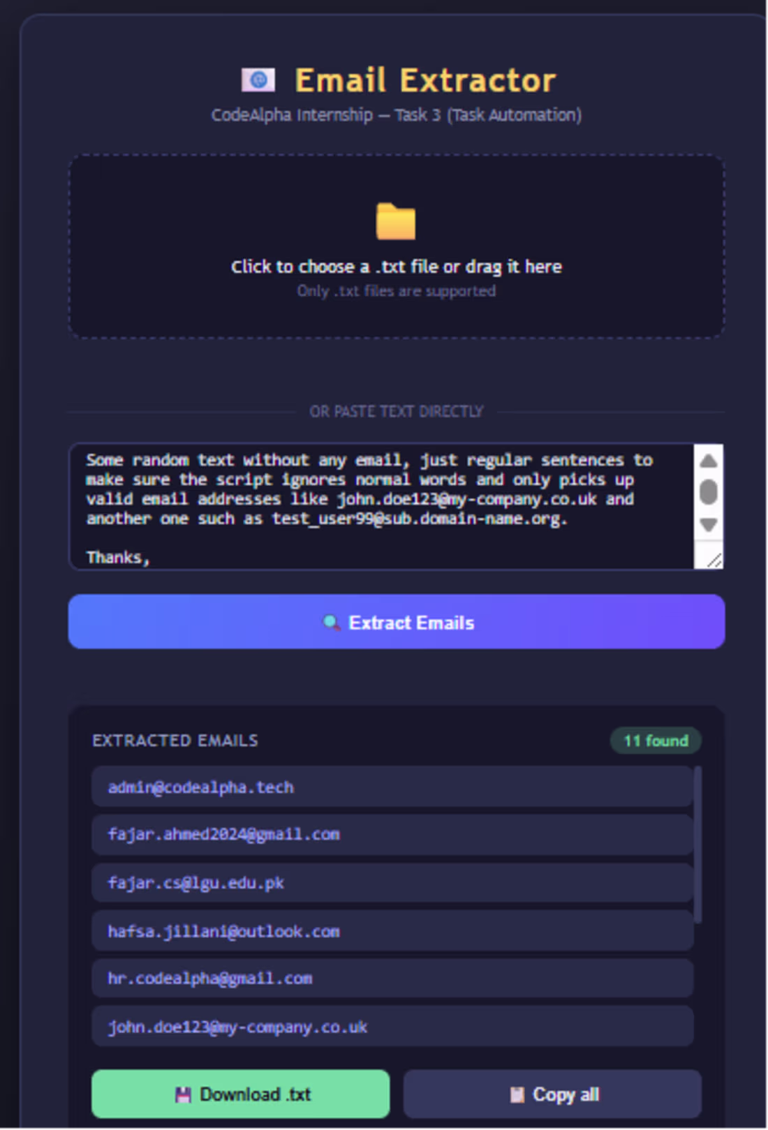
I'm excited to share my latest project an Email Extractor built as part of my virtual internship with CodeAlpha (https://www.linkedin.com/company/codealpha/)!
Manually scouring through large blocks of text, documents, or data dumps to find contact information is incredibly time-consuming. To solve this, I built a utility tool that leverages Python and regular expressions (Regex) to instantly scan, parse and extract all email addresses from raw text data.
Key Highlights: Efficient pattern matching using Regex. Saves hours of manual administrative work. Clean and modular Python codebase.
This project helped me sharpen my skills in string manipulation, data parsing, and building practical automation scripts that solve real-world efficiency challenges.
Check out the source code here: https://lnkd.in/er7aph2M
(https://lnkd.in/er7aph2M)I would love to hear your feedback or thoughts on how to expand its functionality!
hashtag#Python (https://www.linkedin.com/search/results/all/?keywords=%23python&origin=HASH_TAG_FROM_FEED) hashtag#Automation (https://www.linkedin.com/search/results/all/?keywords=%23automation&origin=HASH_TAG_FROM_FEED) hashtag#DataParsing (https://www.linkedin.com/search/results/all/?keywords=%23dataparsing&origin=HASH_TAG_FROM_FEED) hashtag#SoftwareDevelopment (https://www.linkedin.com/search/results/all/?keywords=%23softwaredevelopment&origin=HASH_TAG_FROM_FEED) hashtag#Coding (https://www.linkedin.com/search/results/all/?keywords=%23coding&origin=HASH_TAG_FROM_FEED) hashtag#Regex (https://www.linkedin.com/search/results/all/?keywords=%23regex&origin=HASH_TAG_FROM_FEED) hashtag#CodeAlpha (https://www.linkedin.com/search/results/all/?keywords=%23codealpha&origin=HASH_TAG_FROM_FEED) hashtag#Internship (https://www.linkedin.com/search/results/all/?keywords=%23internship&origin=HASH_TAG_FROM_FEED) hashtag#OpenSource (https://www.linkedin.com/search/results/all/?keywords=%23opensource&origin=HASH_TAG_FROM_FEED) hashtag#TechInnovation (https://www.linkedin.com/search/results/all/?keywords=%23techinnovation&origin=HASH_TAG_FROM_FEED)
0
22
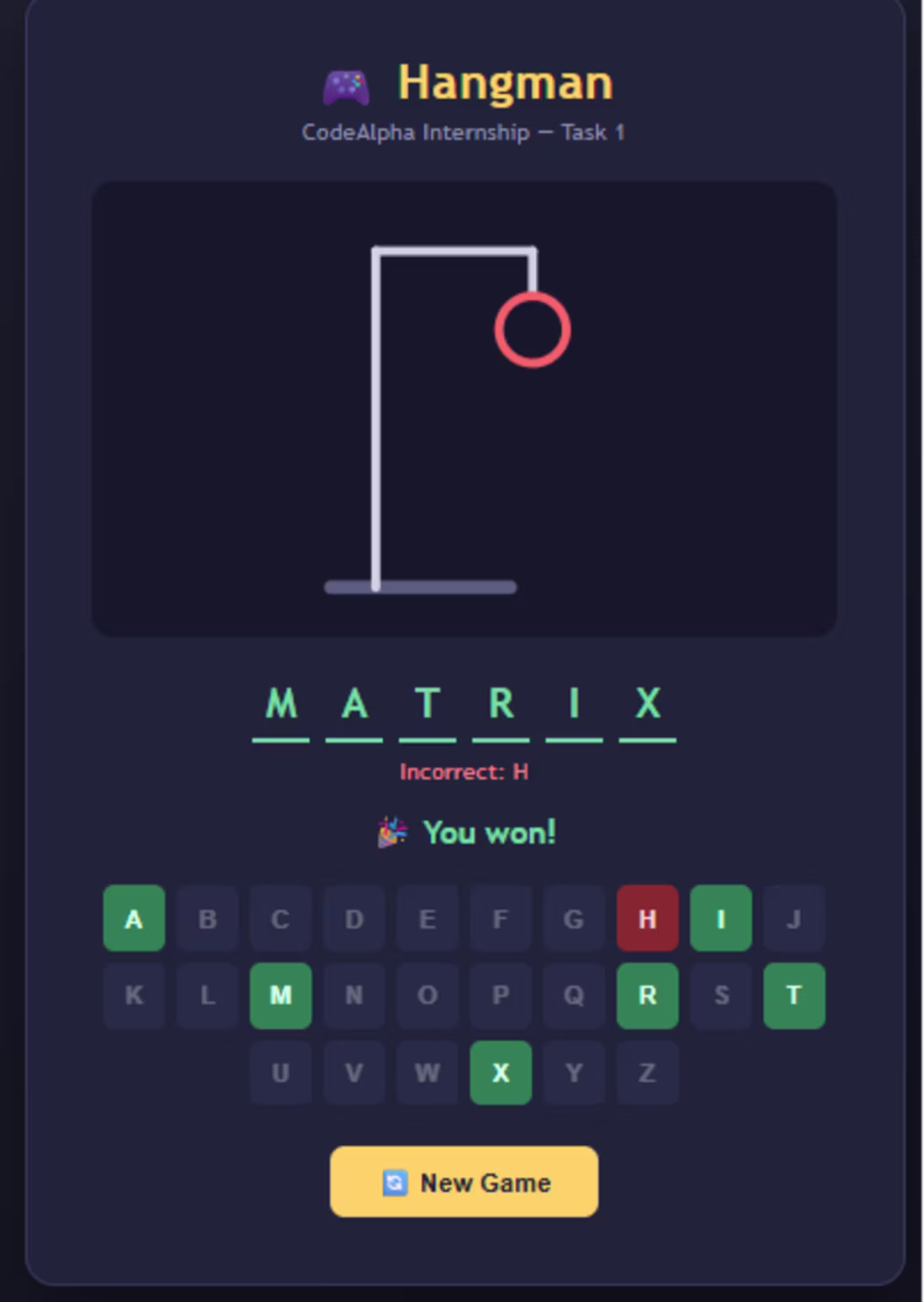
🚀 Excited to share Task 1 of my Python Programming Internship at CodeAlpha (https://www.linkedin.com/company/codealpha/)!
I built a classic Hangman Game from scratch in Python the player guesses a hidden word one letter at a time with a limited number of wrong attempts before the game ends. Along the way, I worked with core programming concepts like loops, conditional logic, string manipulation and Python's random module to pick a different word each round.
To take it a step further, I also built a bonus interactive version using HTML, CSS, and JavaScript complete with an animated SVG gallows that builds up with every wrong guess, a clickable on-screen keyboard, and a clean dark-themed UI.
This task helped me strengthen my understanding of:
✅ Control flow (if-else, while loops)
✅ String and list handling
✅ Input validation
✅ Translating console logic into an interactive front-end
Grateful to CodeAlpha (https://www.linkedin.com/company/codealpha/) for this hands-on learning opportunity! Looking forward to tackling the next tasks in this internship.
🔗 GitHub repo link: https://lnkd.in/dpN93hRV
(https://lnkd.in/dpN93hRV)hashtag#CodeAlpha (https://www.linkedin.com/search/results/all/?keywords=%23codealpha&origin=HASH_TAG_FROM_FEED) hashtag#PythonProgramming (https://www.linkedin.com/search/results/all/?keywords=%23pythonprogramming&origin=HASH_TAG_FROM_FEED) hashtag#Internship (https://www.linkedin.com/search/results/all/?keywords=%23internship&origin=HASH_TAG_FROM_FEED) hashtag#LearningByDoing (https://www.linkedin.com/search/results/all/?keywords=%23learningbydoing&origin=HASH_TAG_FROM_FEED) hashtag#SoftwareDevelopment (https://www.linkedin.com/search/results/all/?keywords=%23softwaredevelopment&origin=HASH_TAG_FROM_FEED) hashtag#StudentDeveloper (https://www.linkedin.com/search/results/all/?keywords=%23studentdeveloper&origin=HASH_TAG_FROM_FEED) hashtag#BSCS (https://www.linkedin.com/search/results/all/?keywords=%23bscs&origin=HASH_TAG_FROM_FEED)
0
15
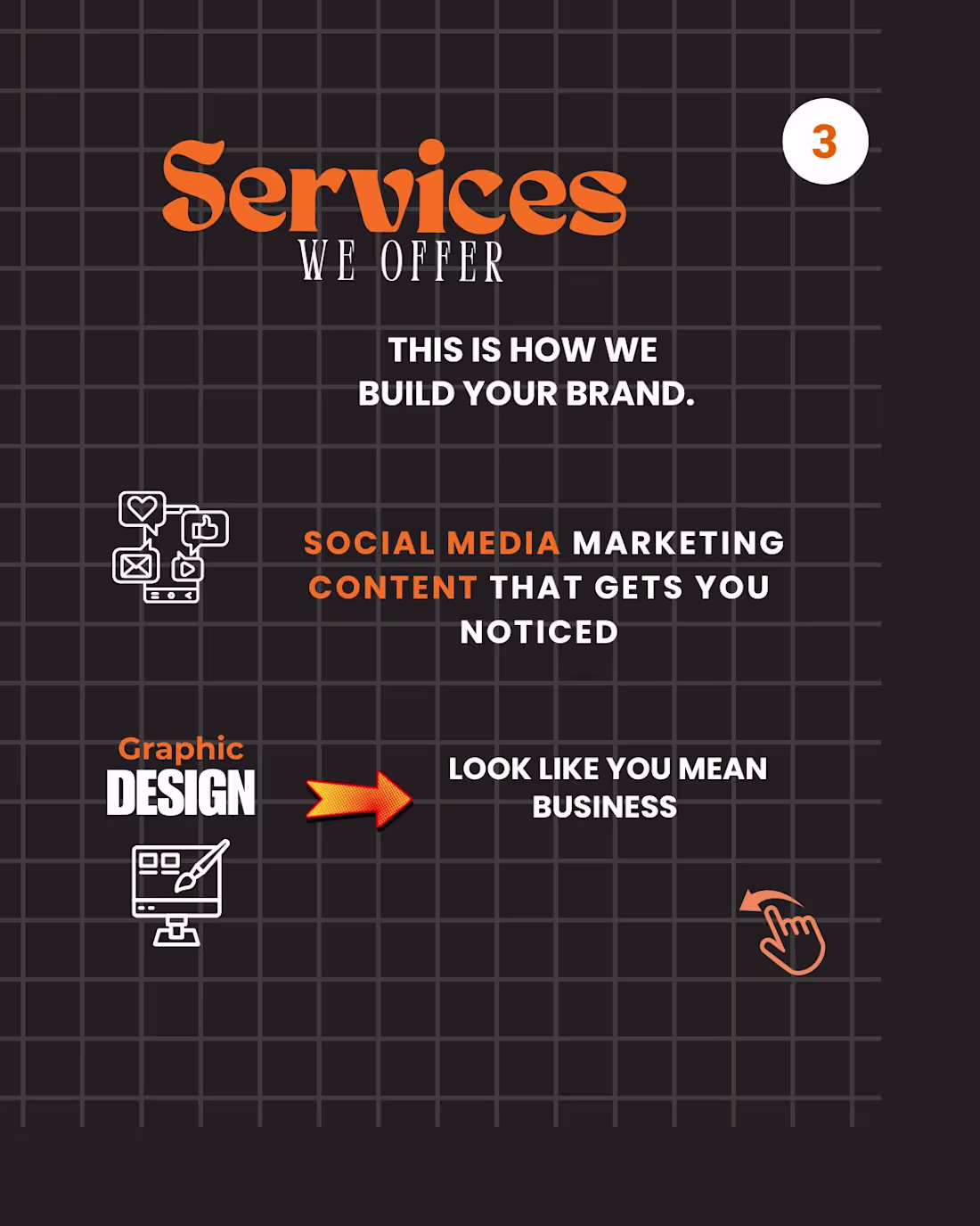
Project Title: "Don’t Just Fetch Coffee" – Creative Recruitment Campaign
The Design Brief:
The goal of this project was to design a high-visibility internship recruitment poster for TechTide Co. The client wanted to move away from boring, corporate HR ads and instead create something that resonates with Gen-Z developers and UI/UX designers. The message was clear: this is a place for builders, not just observers.
My Creative Approach:
I used a "Scrapbook/Journal" Aesthetic to make the internship feel like an active, hands-on journey. Key design elements include:
Tactile Textures: I incorporated digital "duct tape" and polaroid-style frames to give the design a raw, creative, and "work-in-progress" energy.
Themed Copy Design: I used technical puns like "Speaks in tags" and "Dreams in Figma" to instantly filter and attract the right niche talent.
Typography & Hierarchy: The bold purple and blue palette provides a modern, tech-focused vibe. I used a mix of heavy sans-serif and handwritten-style fonts to balance professionalism with a youthful, approachable feel.
Engagement Loops: The stamp-style "Upgrade your portfolio from MEH to MODERN" acts as a strong value proposition, giving potential interns a clear reason to apply.
The Results:
The final asset is an "eye-catching" recruitment tool designed for social media and campus distribution. It successfully bridges the gap between a corporate professional environment and the creative hustle of a modern tech startup.
0
44
Since you mentioned Part 1 was about the "Psychology" and the "Problem," Part 2 needs to be about the "Solution" and the "Action." This makes you look like a designer who doesn't just point out flaws but actually knows how to fix them.
Here is the professional English text for your Part 2 Contra post:
Project Title: The "5 Confident Clicks" Framework – UX Case Study (Part 2 of 2)
The Design Challenge:
Following the psychological groundwork laid in Part 1, this second installment focuses on the practical execution of a high-conversion user journey. The challenge was to visualize a framework that balances speed with user certainty, ensuring that every interaction leads the customer closer to a "Confident Yes."
My Creative Approach:
In this concluding part, I transitioned from identifying myths to presenting actionable architectural solutions. My design strategy included:
Framework Visualization: I designed the "5 Confident Clicks" roadmap, using a step-by-step visual flow to show how information should be staggered to prevent user overwhelm.
Blueprint Detail: I maintained the blue-on-white technical aesthetic to ensure continuity from Part 1, signaling to the audience that this is a data-driven design solution.
Clarity over Speed: I utilized custom icons and directional cues to demonstrate that "Certainty Converts." The design illustrates that a guided path, even if longer, significantly reduces cart abandonment.
Conversion Optimization (CRO): The final slides focus on the "Visit" and "Contact" CTAs, transforming the educational experience into a direct lead-generation tool for the client.
The Final Result:
This two-part series serves as a comprehensive masterclass in modern UX. By the end of this installment, the viewer isn't just informed—they are equipped with a tangible framework to audit and improve their own digital storefronts.
Series Conclusion:
This completes the "Psychology of Conversion" series. While Part 1 challenged the status quo, Part 2 provides the roadmap for the future of digital interaction.
“Mystery kills the sale. Certainty converts.”
1
50
This project is the perfect example of UX Design Psychology. It challenges common misconceptions about sales funnels and digital interaction. Since you want to mention that this is only the first half of the series, we will build anticipation for the next post.
Here is the professional English text for your Contra post:
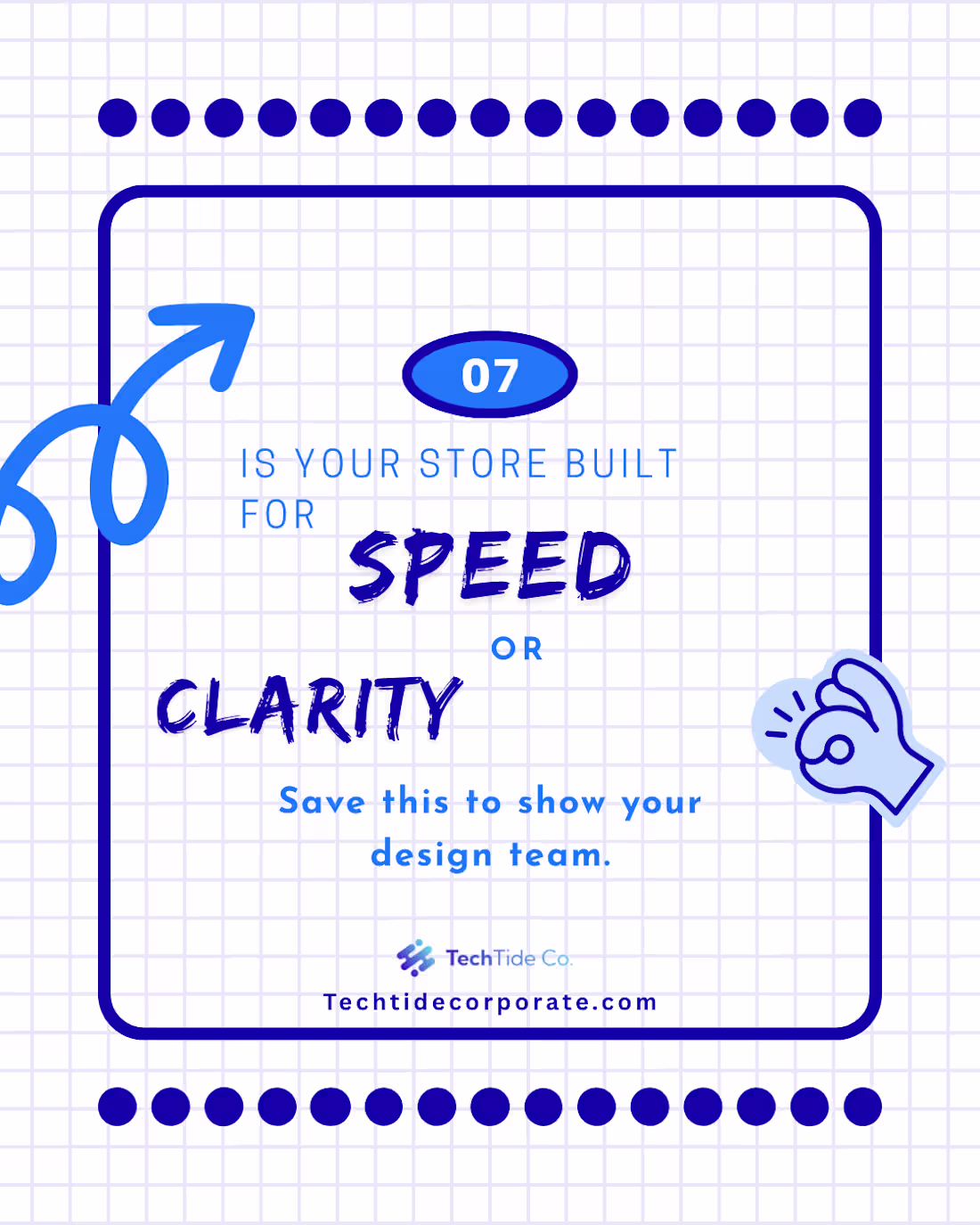
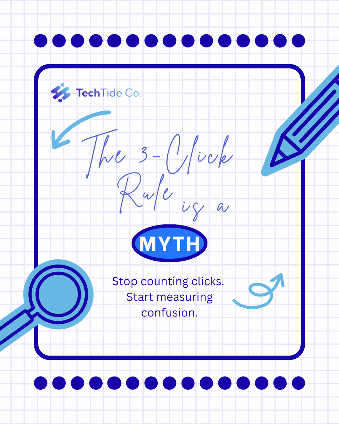
Project Title: The Psychology of Conversion – UX Case Study (Part 1 of 2)
The Design Brief:
The goal of this series was to educate founders and digital marketers on the hidden complexities of user experience. Instead of following the "fewer clicks = more sales" myth, this project explains why user certainty is the real driver of conversion.
My Creative Approach:
I utilized a clean, blueprint-inspired aesthetic to emphasize the "Engineering" side of design. Key elements include:
Visual Myth-Busting: By using bold typography and contrasting "WRONG" vs. "WE PREFER," I created an immediate mental shift for the reader.
The "Confident Clicks" Concept: I designed these visuals to explain that a longer path with clear guidance is better than a short path that leaves users confused.
Blueprint Aesthetic: The blue-on-white grid layout reinforces the idea of "Building" and "Strategy," aligning perfectly with a professional B2B audience.
Anticipation Loop: I structured the narrative to end on a cliffhanger, ensuring the audience is primed for the deep-dive solutions coming in the next installment.
The Results:
This first half of the project successfully establishes the "Problem" and the "Psychology" behind poor conversion rates. It serves as a lead-magnet, positioning the brand as an expert in behavioral UX design.
Important Note:
This is Part 1 of a two-part series. In this post, we uncover the flaws in traditional funnel thinking. Stay tuned for my next post, where I will reveal the "5 Confident Clicks" framework and how to apply it to your store.
1
46
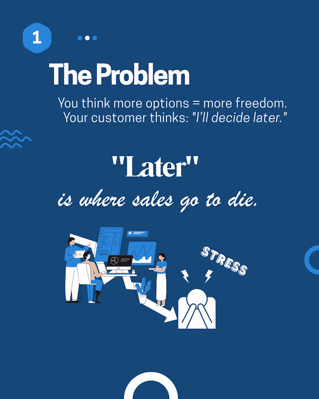
Project Title: Corporate Strategy & Workflow Optimization Visuals
The Design Brief:
The goal of this project was to create an educational and persuasive social media series for TechTide Co. focusing on business optimization. I was tasked with visualizing complex concepts like "Checkout Flow Detox" and the difference between a "Scavenger Hunt" store versus a "Straight Line" customer journey.
My Creative Approach:
For this project, I adopted a Corporate Tech Aesthetic using a professional blue-and-white palette. My focus was on making abstract business concepts tangible through:
Conceptual Illustration: Using flat-design characters and metaphors (like the puzzle-lightbulb) to symbolize problem-solving and collective intelligence.
UX-Driven Copy Design: I highlighted phrases like "Scavenger Hunt" and "Straight Line" to create immediate cognitive contrast, helping the audience understand UX flaws instantly.
Modern Minimalism: By using clean lines and plenty of whitespace, I ensured the focus remained on the "Call to Action" (Tag a Founder / Visit the Website), which is crucial for B2B lead generation.
Information Architecture: I structured the slides to follow a logical "Problem → Stress → Solution" flow, guiding the viewer toward a feeling of clarity and resolution.
The Results:
The final delivery consisted of a premium carousel deck that positions the client as a thought leader in the corporate space. These visuals are optimized to build authority, simplify high-level strategies, and encourage professional engagement.
1
50
This new set of designs has a Fashion & Lifestyle vibe with a focus on Marketing Strategy (Offers, Sales, and Growth). It looks like a "Launch Campaign" or "Promo Kit."
Here is the professional English text for your Contra post, focusing on your role as a Graphic Designer:
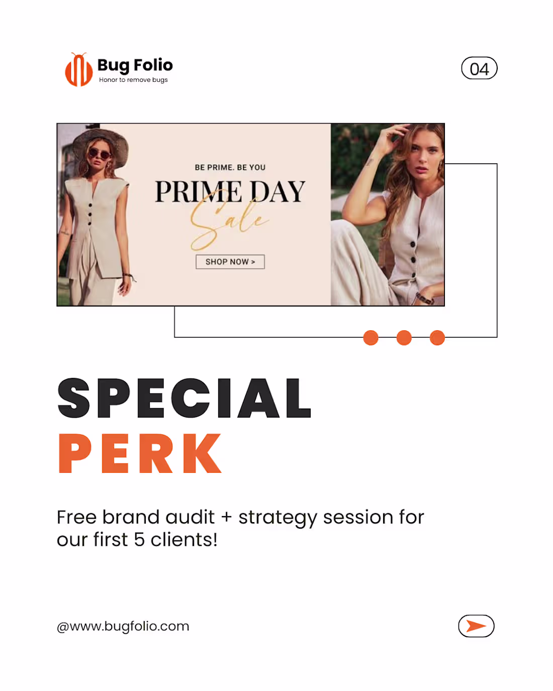
Project Title: Fashion E-commerce Branding & Promotional Campaign Design
The Design Brief:
The goal of this project was to design a high-conversion promotional campaign for a fashion-forward brand. I needed to create a visual identity that felt premium yet accessible, focusing on driving "Growth" and "Sales" through clean, modern aesthetics.
My Creative Approach:
For this project, I moved away from abstract doodles and focused on High-Fashion Editorial Layouts. My design decisions included:
Editorial Minimalism: Using a clean white base with bold, structured typography to give the brand a "luxury" feel.
Strategic Call-to-Actions (CTAs): Designing the "Ready to Grow" and "Special Perk" sections to stand out using high-contrast orange tones, specifically aimed at increasing conversion rates.
Lifestyle Integration: Carefully selecting and framing imagery to ensure the product (fashion) remained the focus while the text provided the strategic marketing value.
Consistency Across Assets: Ensuring that the brand audit and strategy session offer looked cohesive with the "Prime Day Sale" visuals, creating a seamless user journey.
The Results:
The final delivery included a set of versatile marketing assets tailored for social media and web banners. These designs don't just look good—they are engineered to stop the scroll, build professional credibility, and convert cold traffic into loyal clients.
1
32
Project Title: Strategic Visual Storytelling – Brand Awareness & Engagement Campaign
The Design Challenge:
The objective of this project was to create a high-impact social media campaign for Bug Folio. The goal was to move beyond "pretty pictures" and develop a visual narrative that addresses core business pain points—specifically the high cost of a weak brand identity and the lack of digital trust.
My Creative Approach:
As the Lead Graphic Designer on this project, I focused on a "Minimalist-Bold" aesthetic to ensure the message was the hero. My process involved:
Visual Hierarchy: Utilizing high-contrast typography to draw the eye immediately to key phrases like "Your Brand EXISTS" and "Weak Branding Costs You."
Grid-Based Layouts: Implementing a structured dot-grid background (visible in the design) to maintain technical alignment and professional balance across all slides.
Conceptual Illustration: Incorporating metaphors like the megaphone and hand-drawn doodles to humanize the brand while maintaining a "stop-the-scroll" quality.
Psychology of Design: Using negative space strategically to ensure that complex information regarding social media presence and website conversion remained digestible for the audience.
The Results:
I delivered a cohesive set of educational carousels designed to convert viewers into leads. The final assets bridged the gap between brand strategy and visual execution, providing the client with a professional identity that builds instant authority in their niche.
1
27
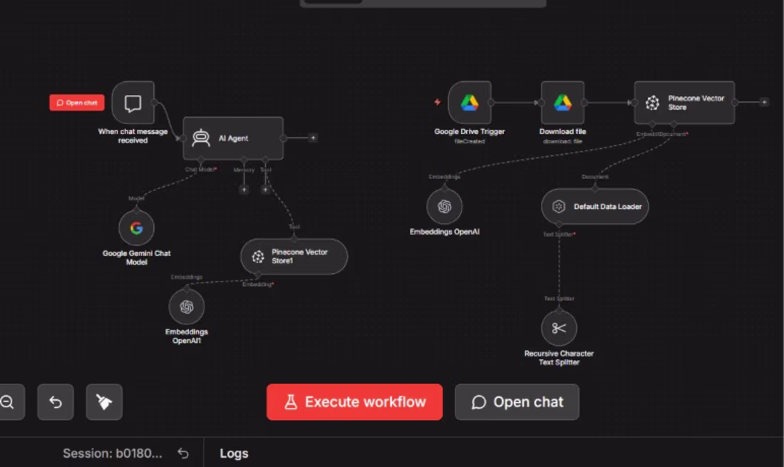
Project Title: Engineering an Automated Intelligence Pipeline (RAG Workflow)
The Challenge:
In a world drowning in data, the problem isn't having information; it's accessing it instantly. Most businesses leave their most valuable assets buried in Google Drive folders where they remain static and underutilized. As a CS student and designer, I saw an opportunity to bridge the gap between "stored data" and "active intelligence." I wanted to build a system that doesn't just store files but understands them.
The Solution:
I engineered a sophisticated Retrieval-Augmented Generation (RAG) pipeline using n8n for orchestration. This isn't just a simple link-up; it’s a multi-layered architectural approach to data automation:
Data Ingestion: Automatically triggering on Google Drive updates to ensure the AI's "brain" is always current.
Vector Processing: Implementing a Recursive Character Text Splitter to ensure data chunks maintain semantic meaning.
Memory & Storage: Utilizing Pinecone Vector Store for high-speed similarity searches, allowing for near-instant retrieval of relevant context.
Model Integration: Leveraging the power of Google Gemini as the reasoning engine, supported by OpenAI Embeddings for high-precision vectorization.
The Intersection of Design & Code:
Being a 4th-semester BSCS student, I focused heavily on the logic of the workflow—ensuring the recursive splitting didn't lose context and that the vector database was optimized for performance. However, my background as a Graphic Designer allows me to visualize these complex backend processes into a user experience that feels intuitive. I believe that an automation is only as good as its usability; if the interface is clunky, the power of the AI is lost.
Why This Matters for Your Business:
This workflow effectively creates a "Custom Brain" for your organization. Imagine chatting with your company’s entire history, SOPs, and technical documents as if you were talking to an expert teammate. By automating this pipeline, I eliminate the need for manual data entry or tedious searching, allowing teams to focus on high-level creative work while the AI handles the information retrieval.
Technical Stack Used:
Logic: n8n Workflow Automation
LLMs: Google Gemini & OpenAI
Database: Pinecone (Vector Search)
Storage: Google Drive API
Theory: RAG (Retrieval-Augmented Generation) & Semantic Search
1
27