
Eviation Marketing
Branding studio built on strategy and craft.
New to Contra
Eviation is ready for their next project!
The "before it looks good" phase!
We got to shoot @wearnou's new collection campaign right here in Goa and honestly it was such a vibe — here's a little BTS of how the day went!
0
50
After working with 30+ brands across India & the UAE, we’re now officially opening slots for Branding Identity System projects globally.
At Eviation Marketing, we don’t just create logos — we build cohesive brand systems designed to shape perception, improve recall, and help businesses show up with clarity across every touchpoint.
From strategy-led identities and visual systems to typography, colour direction, packaging aesthetics, and brand guidelines — every element is built with intention, consistency, and long-term scalability in mind.
Whether you’re launching something new, refining an existing brand, or repositioning for growth, we’d love to collaborate.
If your brand has evolved, maybe your identity should too.
https://contra.com/s/oQergvgA-brand-identity-system
2
2
146

Silverline Creation - Branding & Visual Identity
0
2
In 2024, we built a version of Eviation that once felt right.
But somewhere along the way, we outgrew it.
Two years on, this identity is shaped by everything we’ve learned,
every doubt we faced,
every decision to evolve instead of settle.
And now, we’re ready to share it with you — with more clarity, more intention, more honesty.
Eviation, realigned.
𝙄𝙛 𝙮𝙤𝙪’𝙧𝙚 𝙚𝙫𝙤𝙡𝙫𝙞𝙣𝙜 𝙩𝙤𝙤, 𝙩𝙝𝙞𝙨 𝙤𝙣𝙚’𝙨 𝙛𝙤𝙧 𝙮𝙤𝙪.
#Rebranding #LogoDesigning #BrandingAgency #SocialMediaMarketing
13
17
597
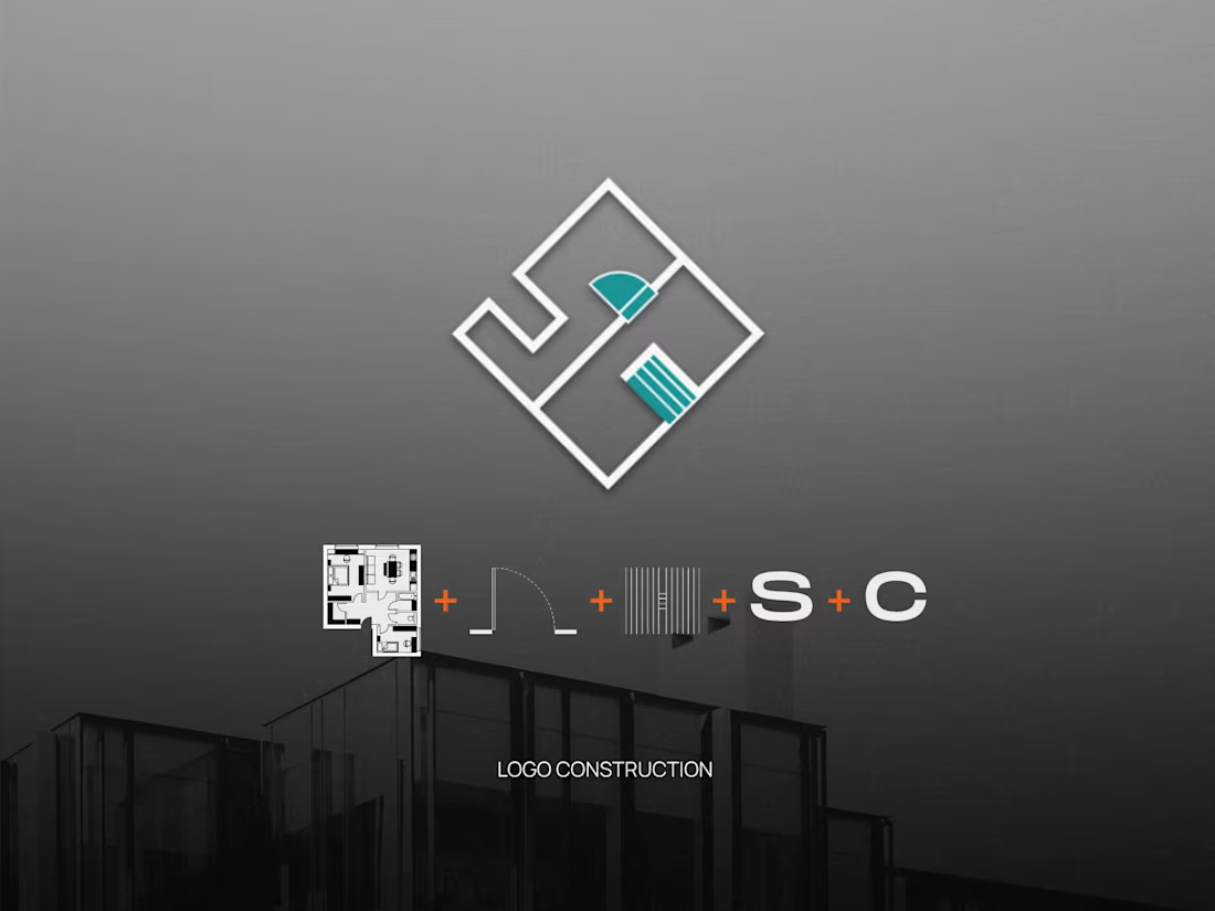
Evolved from initials to identity.
Silverline Creation started with a sentiment-led mark, we rebuilt it into a structure-led system. Using real construction cues like plans, forms, and spatial geometry, we shaped an identity that feels industry-true and built to be remembered.
When branding shifts from personal to purposeful — it shows.
If your brand has outgrown its old skin, maybe it’s time to rebuild.
Let’s build it right.
Checkout https://www.eviationmarketing.com/
1
92
Client spotlight: Silverline Creation, Goa
Our first showcase as we shift focus to the work behind the brand.
Silverline Creation came to us at an early stage—with a strong name, a personal story, and a vision rooted in construction. What they needed was a brand identity that truly reflected where they were headed.
The original logo held emotional value, built around the founders’ initials. But as the brand grew, it no longer aligned with the industry, scale, or positioning they were stepping into.
So we rethought the identity from the ground up.
The new mark draws directly from construction fundamentals—floor plans, stair structures, door curves—woven together with the initials S & C, creating a logo that feels intentional, architectural, and unmistakably relevant.
Paired with a refined colour palette and a cohesive visual system, the identity translated seamlessly across digital and on-ground collaterals—and most importantly, felt right to the client.
View the complete project on our Behance profile: https://www.behance.net/gallery/243586791/Silverline-Creation-Branding-Visual-Identity
Silverline Creation × Eviation
Designed to last.
1
90

Repositioning Hotel Èden for the Digital World
0
4